A few shots from a recent photo walk on the streets of Paris. Looking for some constructive criticism.

  1. Wanted to highlight the colour of the monk’s robe.
  2. I don’t know why I clicked this. Seemed like a good subject.
  3. Liked the colour of his shirt. Used it to highlight him.
  4. Liked the feel of the store.
  5. Liked the attire and subject.
  6. Ah! Paris, the city of love.
  7. One photo, 3 stories.


9. Again, the colour of his jacket.

10.

2 Likes

Hi @Tarun thanks for posting. I like the following.

I think the ones where you see peoples backs are generally not so interesting unless there’s something else in the frame. (see runner) The monk one is probably my least favourite one of the ones I picked. However the soft lighting on the building is nice.

I quite like the soft post processing and subdued exposure, is it a Portra lut?

  1. Missing focus unfortunately made it look like a throw-away :confused:
  2. yeah, but framing is weird…
  3. NICE
  4. nice
  5. not feeling it
  6. quite nice
  7. nice
  8. not feeling it
  9. quite nice indeed.
  10. good street shot IMO.

I like your editing. Can you say more about it? What you use, how you process etc?

I think you’ve managed to pull out some interesting scenes there. I particularly like the couple on the bridge. I have to disagree about the editing, however, as it is the weakest point for me. The color casts and lack of contrast just feels unfinished, but that’s purely a matter of personal preference.

I would also argue that the backs of people going about their business need not be uninteresting. However, I agree that there needs to be more going on in the scene, e.g. the couple on the bridge. I think the monk at the Louvre could be really great with some straightening and, sorry, different editing, except that he’s simply not in focus.

@johnny-bit you are to interested in people and not interested enough in buildings! :wink:
In my view the shot would be worse with the monk in focus. It would have been just another back.

In one way or another, all of the images suffer from poor framing or timing: I found myself thinking if only this or that…

I don’t know your background. Personally, I often take duds because I am shy, nervous, hesitant or physically unprepared to commit the shot. My suggestion to you (and myself) is to go back and try to recapture these scenes. Sure, different subjects and weather but practicing makes perfect (or better, as one grade school teacher put it).

PS The last image resonates with me. I check my effects to see if I have forgotten something while commuting.

IMO if the monk was the focus of the image he should have been in focus. With the monk even closer to the corner (the bright colour gives him quite a bit of visual weight so you can get away with it here) and in focus, it could have been an image of both the monk and the buildings opposite (with the monk looking into the picture). The tip of the pyramid would have made a nice secondary focus point. At the edge of the image it’s a bit of a distraction.

1 Like

Did you use any filter to wear out the photos ?. The color seems nice, the pictures are giving a very soothing texture. If you talk about professionalism then the photos have some flaws. The clarity is not enough and some of the photos have wrong framing ratio. Apart from that I really liked the outlook and the angles that you took the photos from.

First time on a (constructive) criticism, so I will exercise caution with what I say.

Most of what I am going to talk about deals with composition. And composition is a really subjective and personal matter, so if you like what you’re doing and you are fond of it, just keep going. But as you’re asking for advice, here we are…

The first rule of composition is that composition rules are meant to be ignored, but sadly that only truly applies when you fully understand and master them.

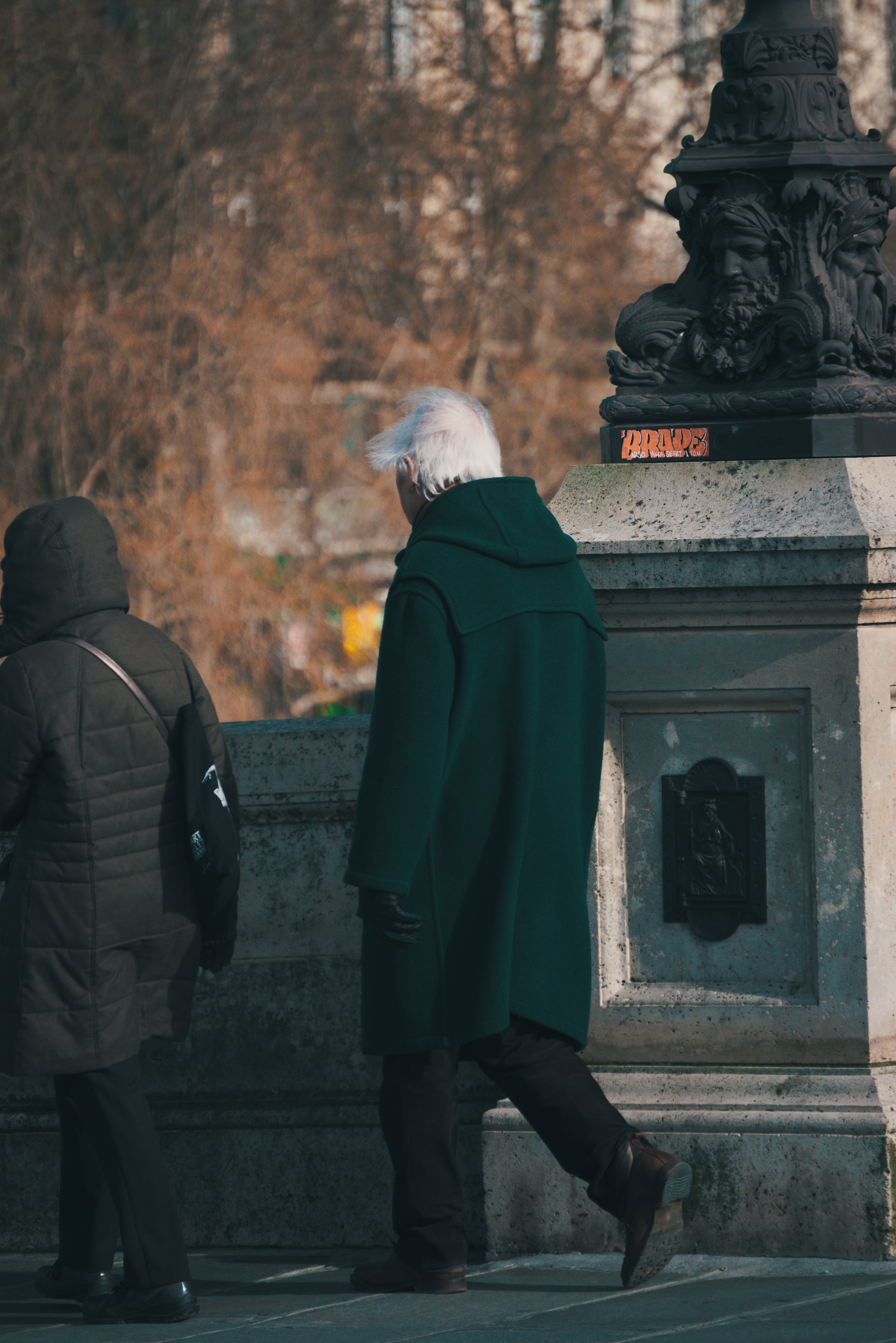
I personally don’t shoot people, but rules still apply. The first comment is about people, indeed: when you look openly at somebody, instinctively you will scan his/her face and will look at his/her eyes (even if you do that really really quickly and don’t even realize about that fact). And the eyes are so powerful that most probably you will wish to look at whatever that person is looking at:

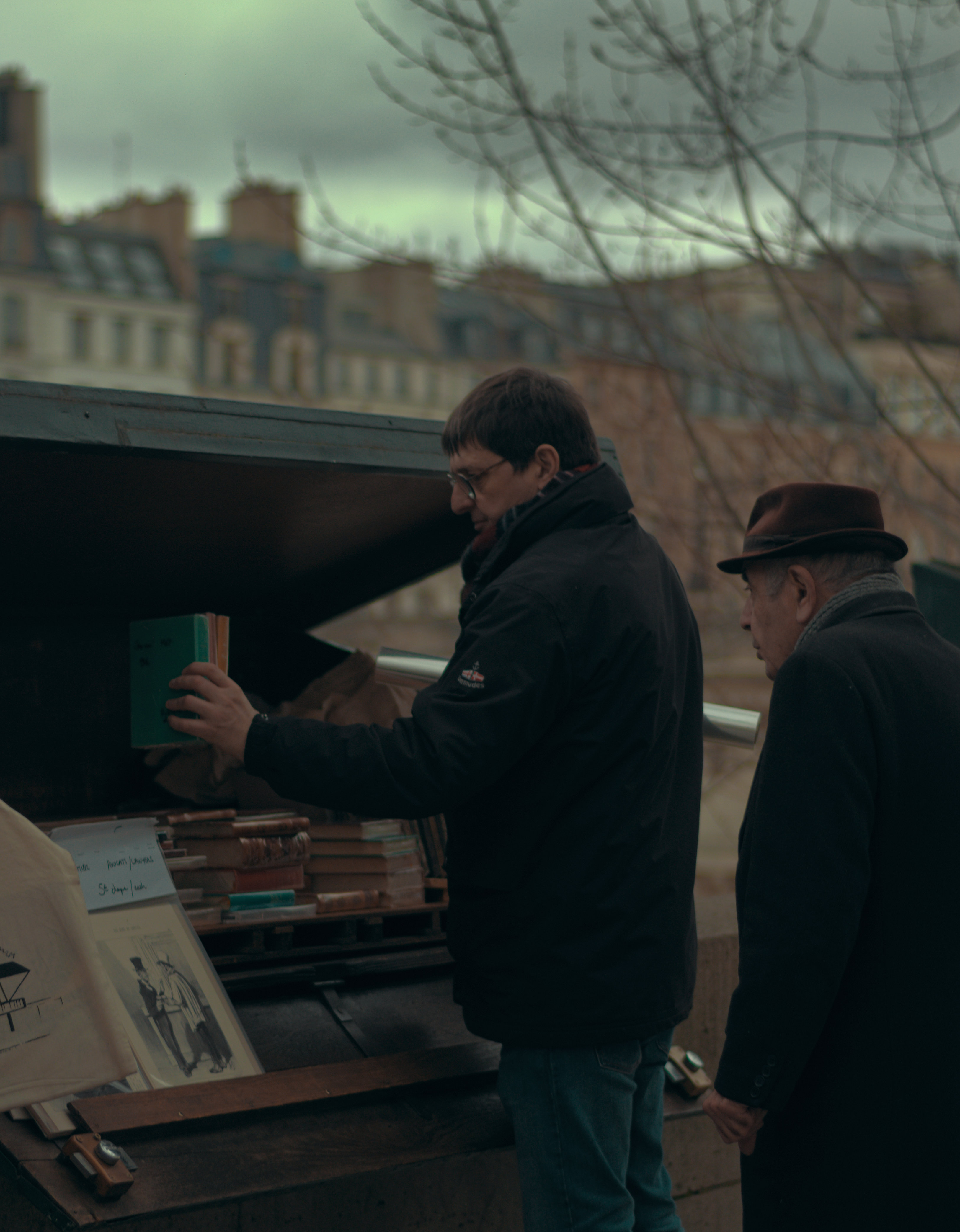
With some cropping and some help of RT crop tool guide type aid, you will end up looking at those books, mostly just because the two men are looking there. I have also get rid of the too distracting text of the left side bag.


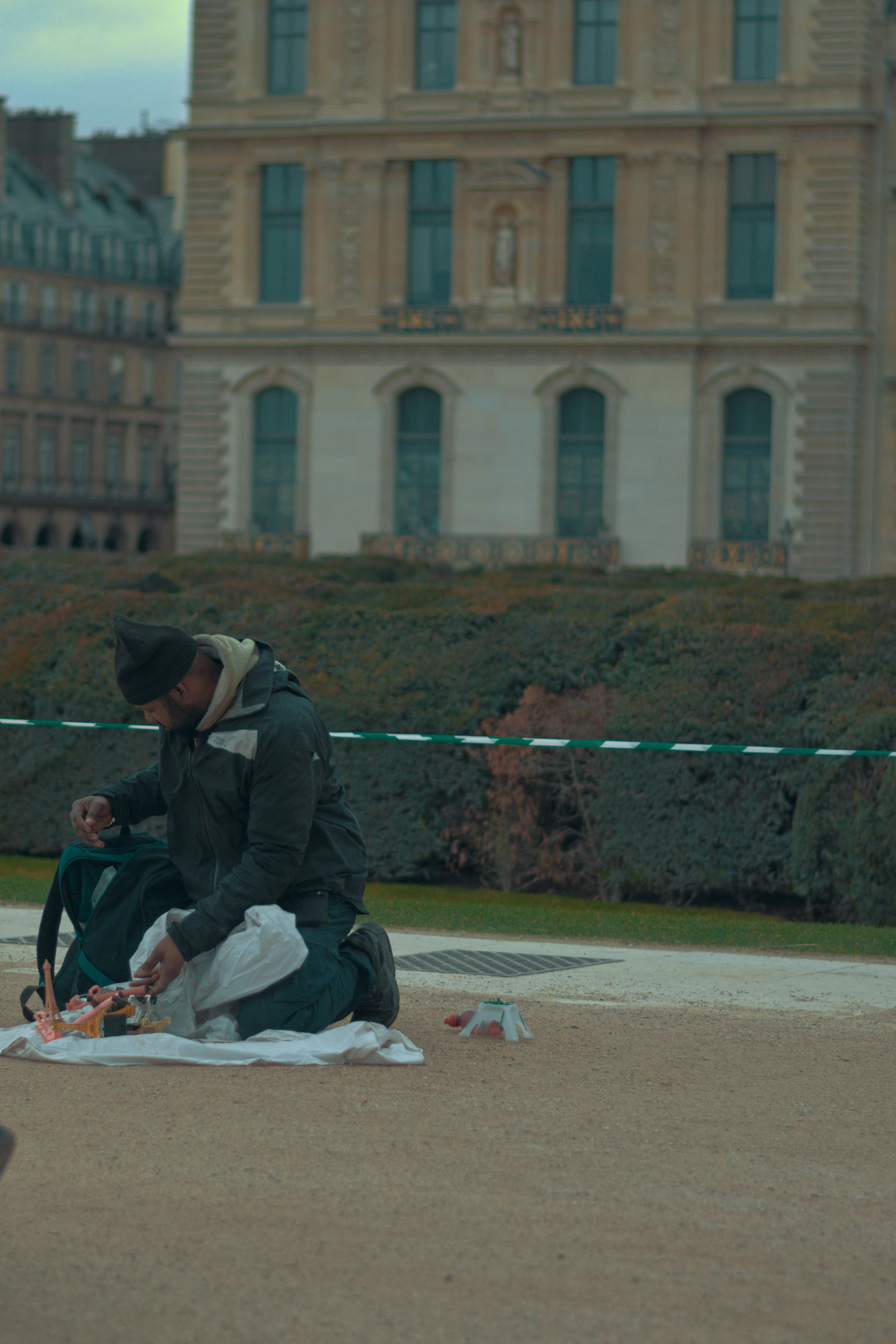
As already said, there should be anything really interesting to justify looking at that man’s back. It may be the backpack, but to me that’s not strong or interesting enough. What I always end up looking at is the map. Why? Because that’s what he’s looking at.


Now, with this tighter crop I think you draw attention to the real focus point of the shot. The rest of the people are meaningless the way they’ve been captured, and the green traffic light is too distracting. You can still see he’s on the street, and he stands out of the blurred background.

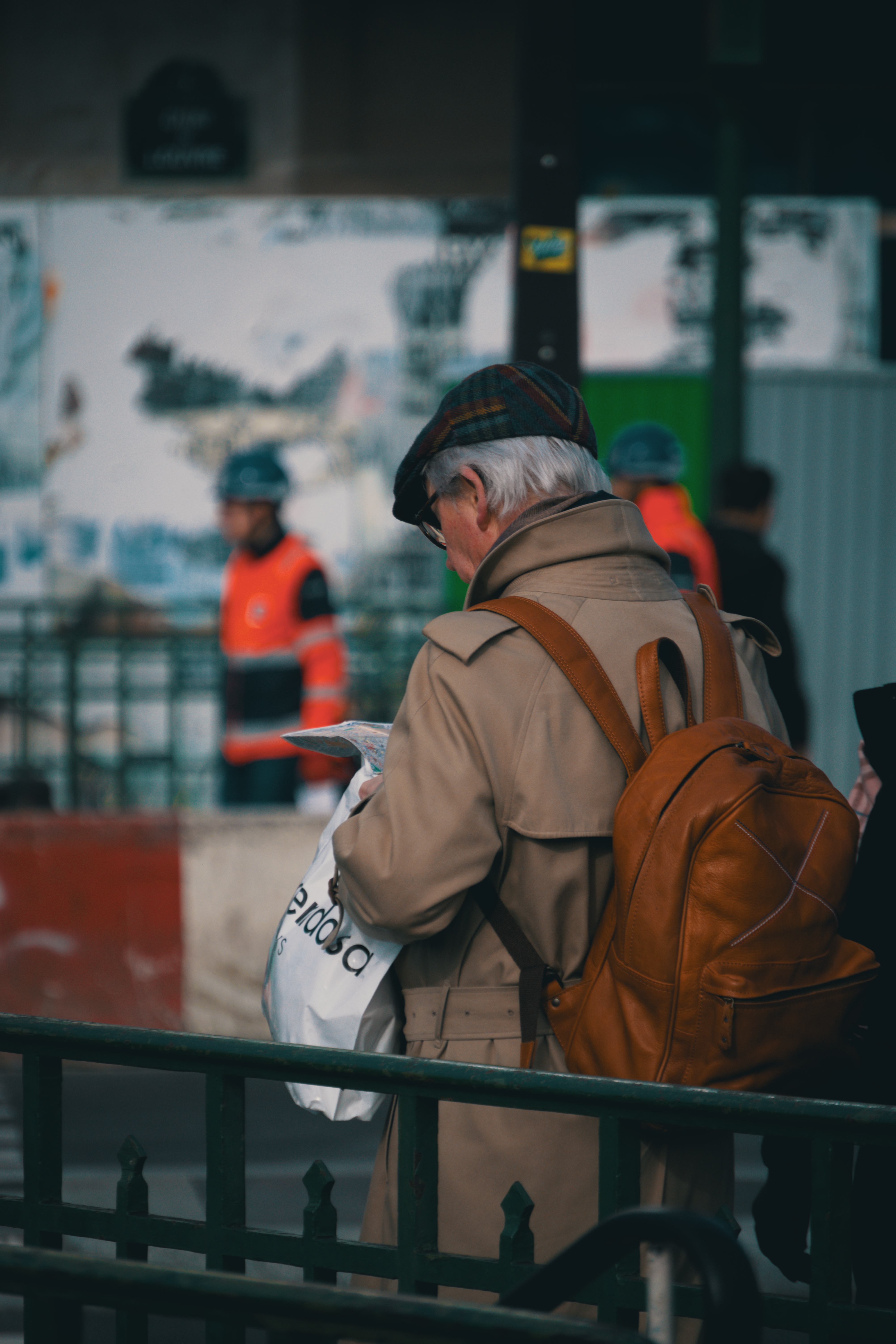
In your 7th picture…, well, you really have missed half the picture:

  • the woman with the child: you really leave her out of the shot, or let her completely in, but don’t crop her as that’s annoying (or a mistake) if she’s part of the story
  • what is he looking at? It’s a strong look. The reason for it is so strong that he has turned his head to look at it. Why aren’t we allowed to see it too?
  • and he is even looking at something outside the picture, so we want to look outside the picture, and that means leaving it

The only situation I’ve seen when somebody looking outside a picture doesn’t encourage you to leave the picture is when the subject has a blank stare (or as we say here: looking at nowhere).

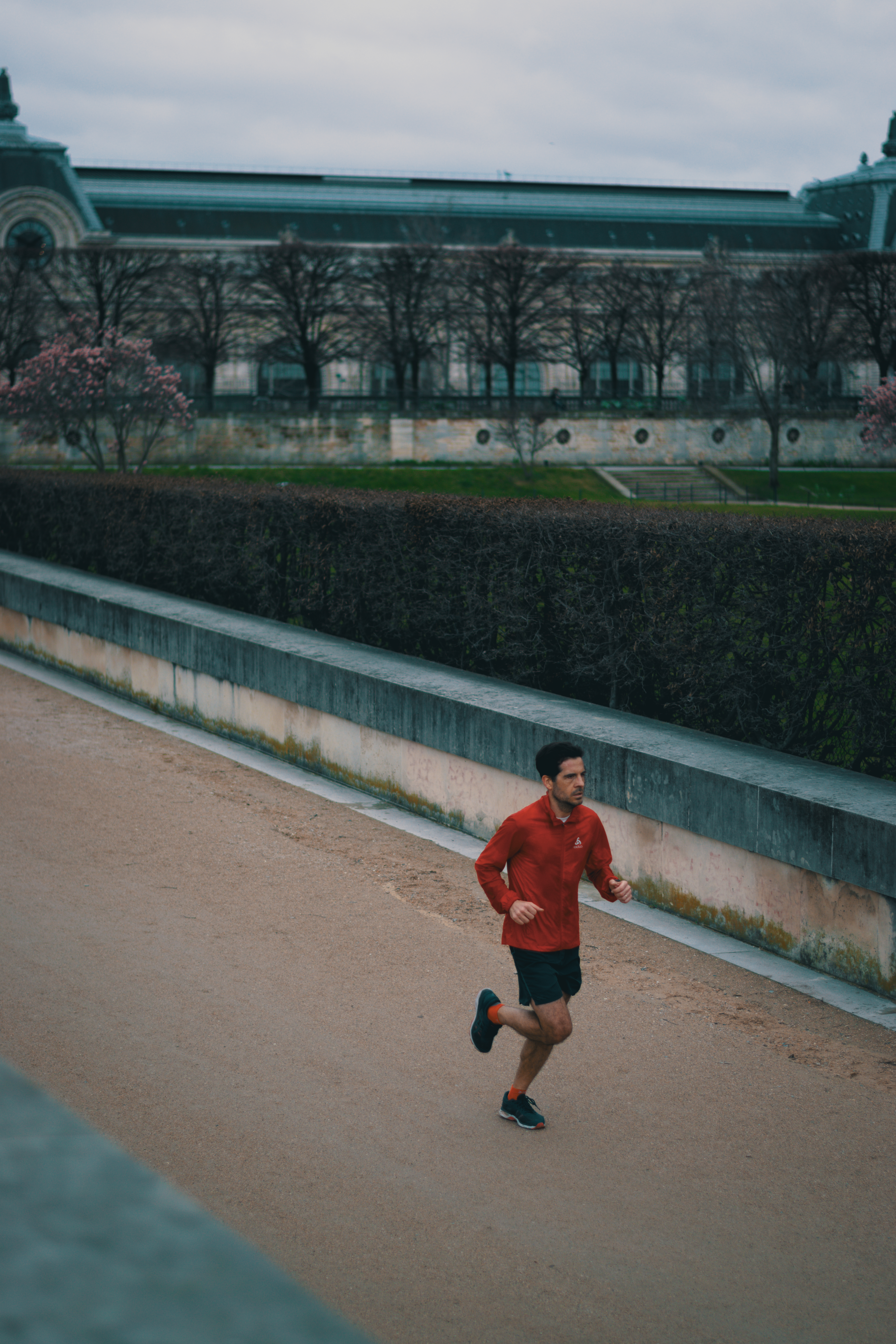
Another composition technique is to allow the subject to breathe inside the picture itself. That means that whatever the subject is doing, it should be inside the picture:

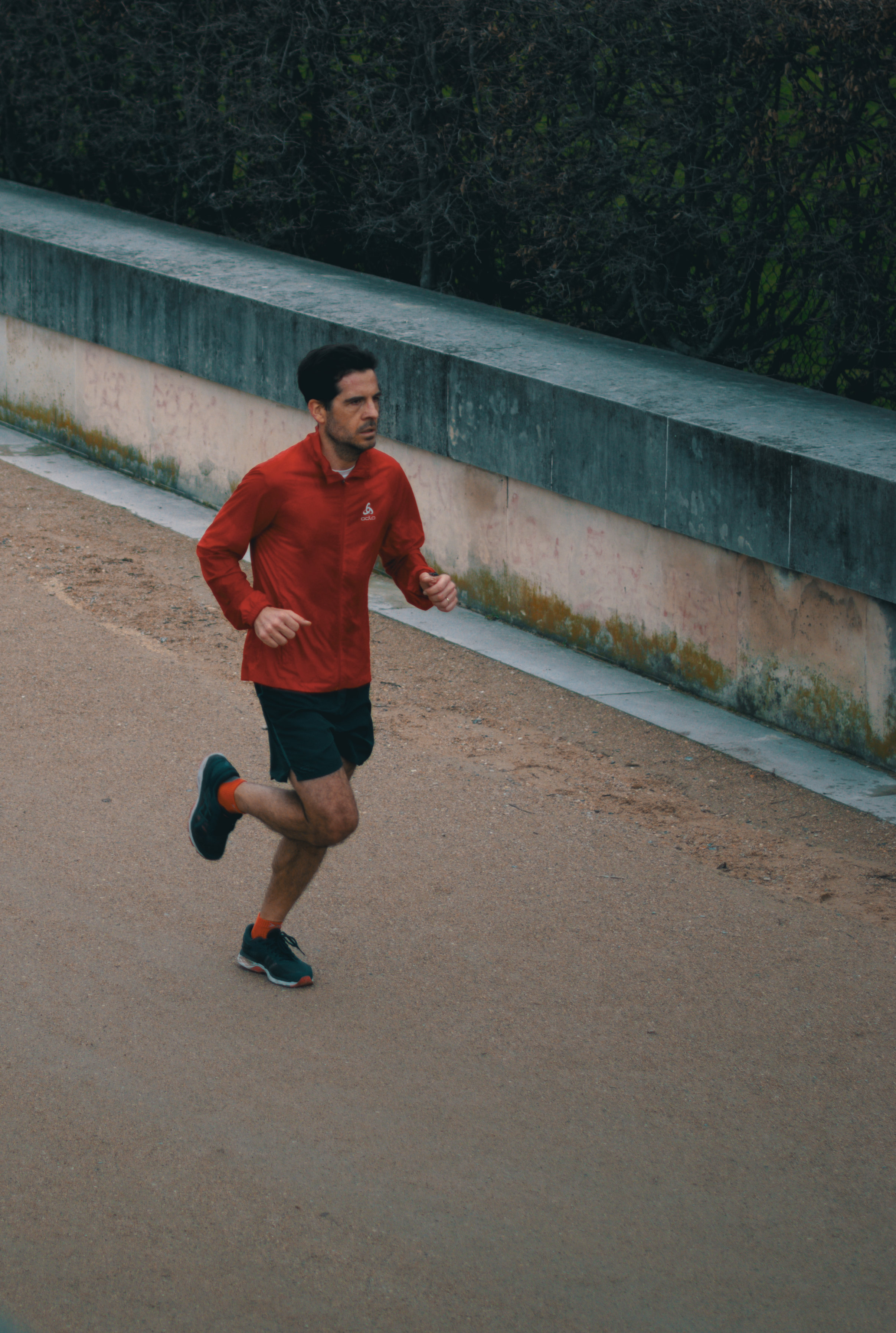
When there’s a movement in a picture, it’s better that the movement flows inside the picture, or that the subject moves towards the center of the picture. If the subject is near the exit side, the feeling is that you have arrived late, or that it’s better to leave the image.


Here I have also cropped the shot to remove uninteresting or distracting parts that doesn’t add anything (like the tree stump, the bin, the electric wire, or empty water). The main idea is: what is the true focal point of the picture? The runner. So let’s get rid of anything that steals focus on the runner.


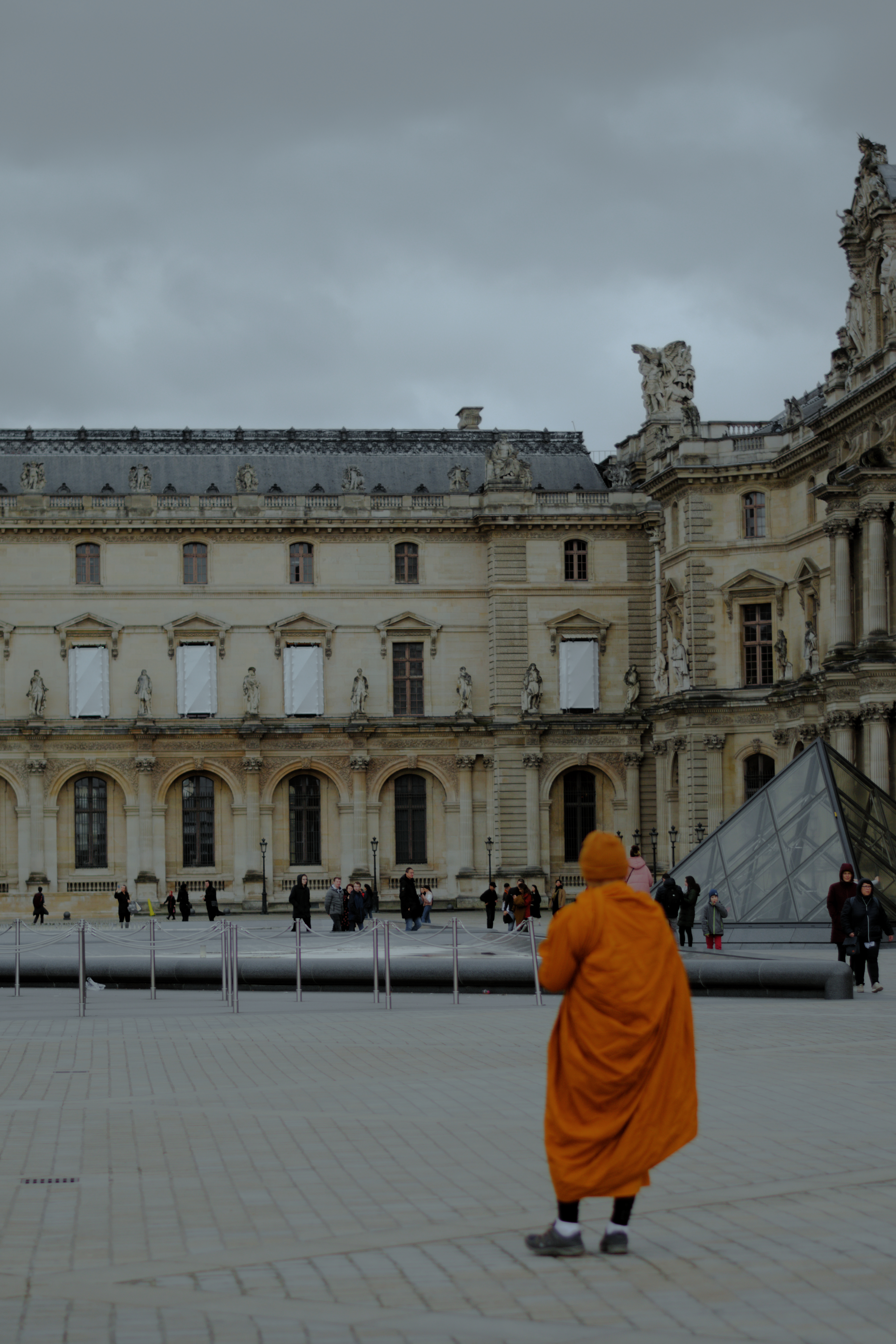
Here is a small problem with unfocused areas:

  • if the main subject is the building, make sure it’s absolutely straight in post: as the roof doesn’t give a good result, I’ve straighten the columns
  • if everything has the same importance in the image, everything should be in focus
  • if there’s one part important, and the rest is secondary, the important part should be in focus, and the rest should be completely, undoubtedly on purpose out of focus. If it’s just a bit out of focus, the viewer tends to see it as a mistake. But that means your lens has a big enough aperture. If not, you may need to play with different perspectives, like shooting closer to the unfocused person, while focusing at the building.

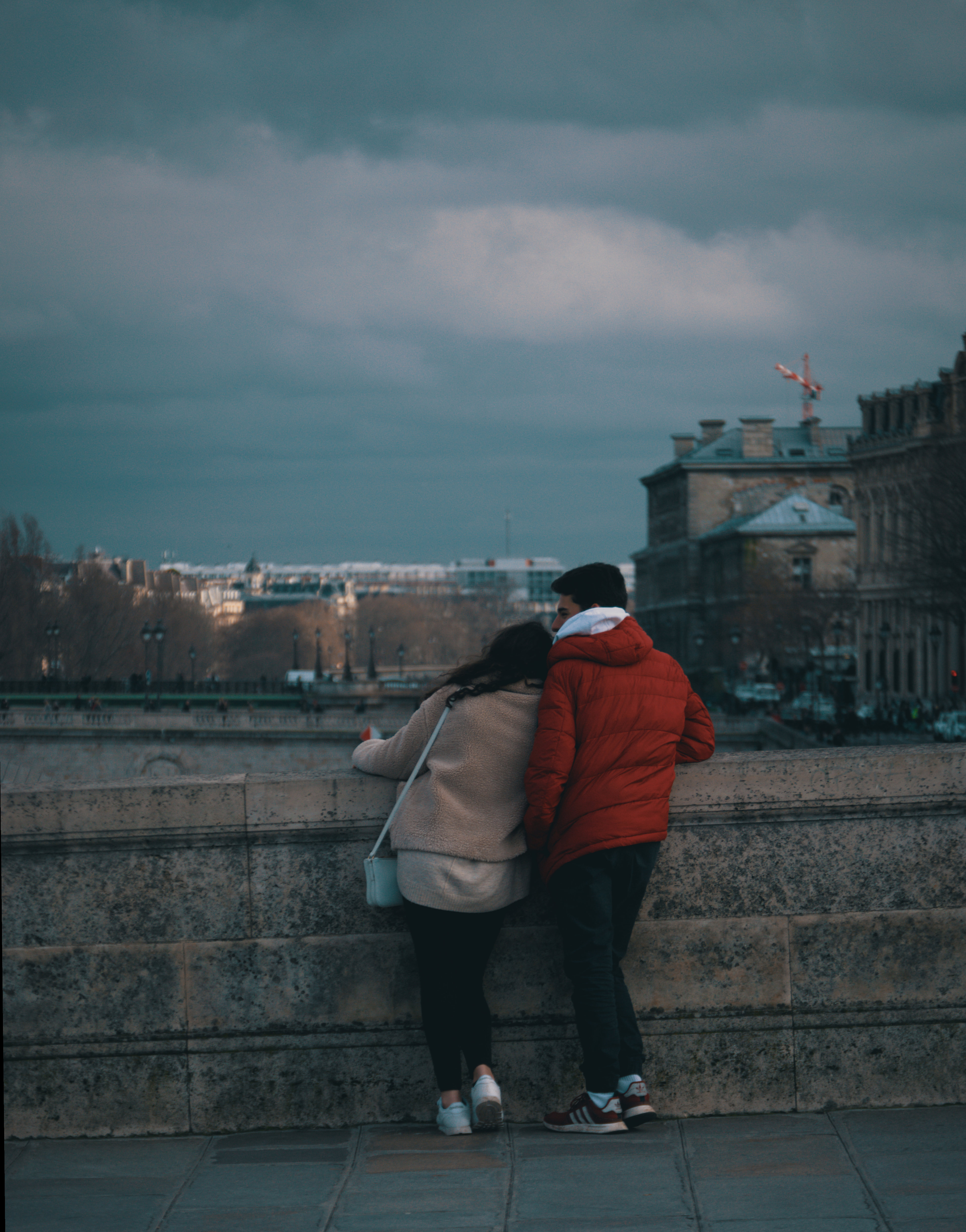
And my last comment: in the couple shot, I’ve cropped a bit the image to remove some unnecessary parts that doesn’t add anything, and I have straightened the white roofs (maybe I’m too sensitive to straight lines :wink: ).

5 Likes

I pretty much agree with what @XavAL said.

What I would do a little differently is leave some more breathing room around his crop, which I find a bit on the tight side. It is fine in most cases, save for images 3, 9 and 10.

Let’s start with the runner. In 3, there is a world beyond the retaining wall and hedge: a garden in front of an administrative looking building. Cropped, the lone runner is confined, almost as if he were in a penitentiary; running yes, but to nowhere. Same goes for 9, without the other objects, the wall, railing and water seem to go on forever in all directions, fencing the poor man. The rings on the wall don’t help either because they remind me of the ball and chain. Of course, there is not much else; however, with a few more objects, more front-side and height, it feels less of a solitary confinement scenario.

Lastly, the man looking through his files, the one I can related to, as I said previously. It is already an awkward thing to do, you see that in his closeness to the curb and his gait. I think cropping out the passersby is a mistake.

He might have bumped into them, or avoided them but veered toward the open road closer than he would have if he had paid attention. His next step seems to on the verge of correcting that, with the right foot pointing away from the curb. We may be interested in what he is looking at but we should also take note of where he is going with his feet.

Passersby + feet = no crop. In fact, I would say that we could take several steps back or zoom out. I think many of the images would benefit from a zoom-out, by lens or by your feet! That would help with the breathing and out-of-frame activity problems.

1 Like

image

I like the out-of-focus monk.
It brings me a feeling that everything this monk represents blurs against everything represented by the solid, populated, in-focus background.

I agree with others regarding framing issues.

Also, in general, I have issues with telephoto lens in street photography. It brings me the feeling that I, the photographer, am not part of the scene, a feeling of alienation.

1 Like

Agreed :smiley:

I was mostly only pointing to what could be done with the images as they currently are. Obviously there could be many things to be made the moment you take the shot, e.g. with that people passing by the main subject: I would have included many more of them, well within the frame (not cut almost in half), and the more of them taken backwards, the better (it would have been a good contrast to the subject, walking towards the camera). But I wasn’t there! :smiley:

There are many different approaches when framing a scene, and which one to choose is the shooter’s privilege. After that, you could only crop what is not desirable.

And yes, sometimes I like a bit tight crops :wink:

As for the leave-me-alone-I’m-just-chillin monk. :stuck_out_tongue: The folds of his robes don’t need to be tack sharp. The blurriness also makes the frame unique. I like it!

(Okay, the GIF is a little annoying because it loops. Source: https://en.wikipedia.org/wiki/Tonkatsu_DJ_Agetarō.)

Achievement acquired! :medal_sports: