I have a question for all people here doing portraits as their main interest. I have been shooting portraits for quite a while now (~ 20 years) but still consider myself a noob concerning professional handling of the the shooting and white balance of the images. Do you bring a color checker with you and shoot it in every location you shoot? I am constantly annoyed how good the camera jpegs look color wise and how I am incapable to get really close color wise. I mostly get quite near but the final touches aren’t there. Light and other things like composition I am quite happy with my skills. So I’d love to get some insight in how other people do this.
I am mainly doing adjustments in filmic, colorbalance rbg, local contrast, lens corrections, brightness of course, contrast equalizer, tone mapper from time to time that’s it.
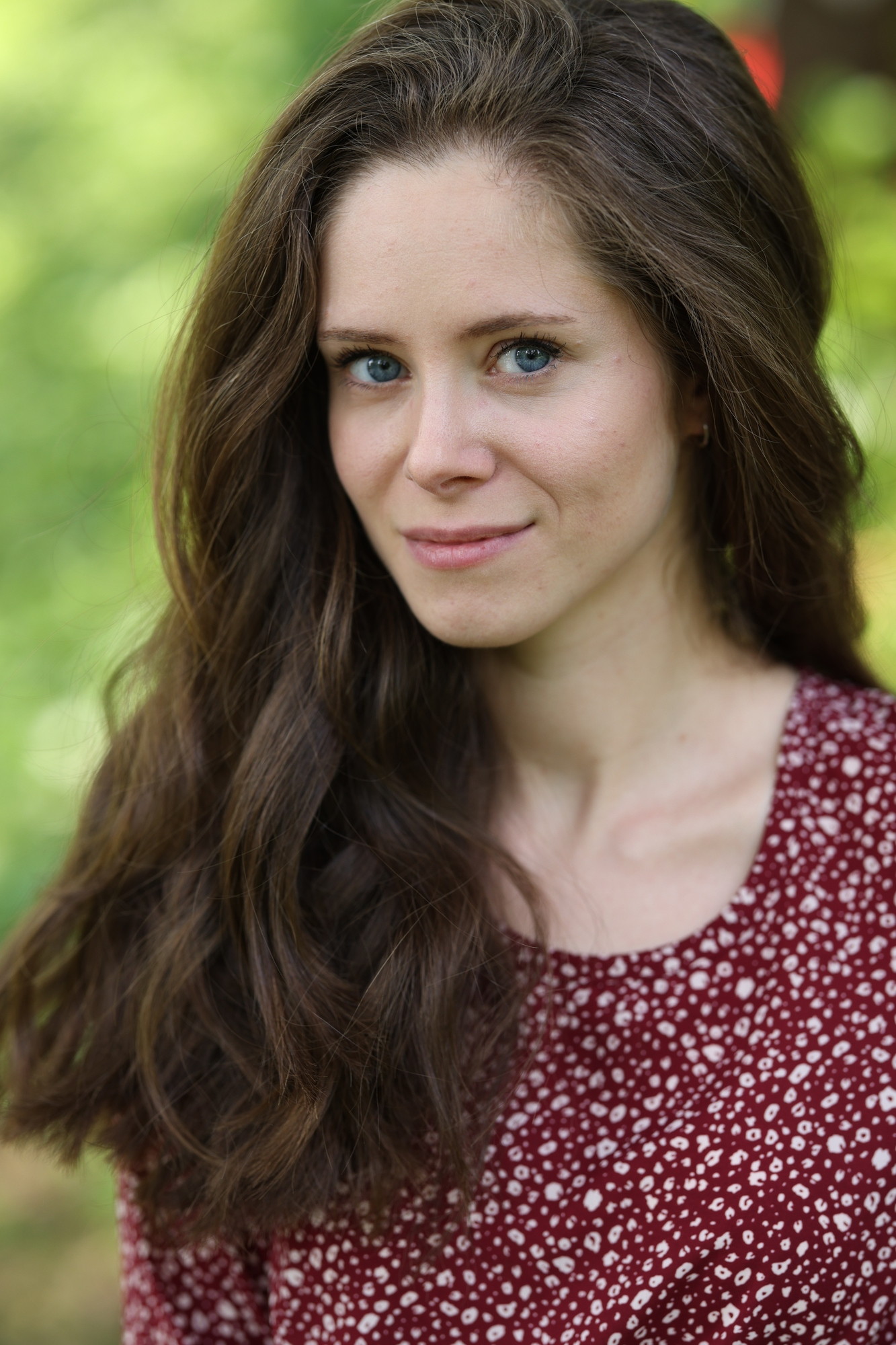
To illustrate me splitting hair, I don’t know how to get rid of the yellowish tones which can be seen in the greens. Also the red tone of the dress is slightly off:
I’m not trying to recreate the out of camera jpeg look but trying to understand which knobs to turn to achieve this. Playing with the color calibration module feels weird when not using a color checker so I’d adjust by taste when not bringing it to the shooting. What would you recommend?
Also please feel free to criticize. I’m here to learn not for kind words
As far as I see, you’re making a very good edit already! It surpasses the camera JPEG in most (if not all) ways for me.
Since there is very little green in the face, hair and dress, you could create a second instance of rgb colorbalance, make a parametric mask on the greenish hues and tune them.
Thank you I like the brown of her hair better in the original jpeg and the greens, otherwise I am happy that the colors pop more than in the camera jpeg. Will try to do what you suggested.
I too prefer your edit to the oocj. Only thing I like better about the oocj is the softness and darkness of the hair. Softness is easily achieved by masking sharpening modules out of the hair. Darkness could be achieved in tone equaliser.
Does adjusting the white balance (color calibration) improve this?
If not, you can either do as Roel suggested and knock out some of the green/yellow by adding its opposite (magenta/blue) in color balance rgb 4 ways tab.
Or, you can use the channel mixer part of color calibration. Since yellow is the colour we want to adjust, go to B tab (as Y is the opposite of B), and since we want to effect yellow of the greens, go to the green slider, and move it to the right, making the greens more blue. If you want neutrals to stay neutral, compensate by removing the same amount from either red or blue slider:
Both solutions work fine, I’ll certainly play more with masks, something I tried to avoid so far. And the channel mixer really helps a lot. Thank you to both of you!
You can also try a couple of quick things…In the old color balance I used to find the auto picker for hue on highlights often corrected the cast just activating it for the whole image. I would also try it on her neck…just draw a box or try it on the background …just to see where you land…you can tweak it then by adjusting the saturation slider for highlights. Also color zones I often try the auto desaturate on the skin when there is a cast and with the mix or opacity dial that in…it can help…those are just quick things…I do have a set of presets in the channel mixer colorzones and rgb tone curve module mostly to deal with green’s in foliage and skin correction…if you experiment and land on a nice setting just keep it as a preset…for skin we have the vectorscope now so its even easier to check and adjust… You can even use the same approach as I mentioned above with color calibration and set the WB based on the skin…draw a box on the skin and then using the hue chroma sliders adjust the result by adding or subtracting chroma until the skin looks good…this can often be a nice WB setting
EDIT I took a quick fix with just color balance rgb and color calibration…


 I like the brown of her hair better in the original jpeg and the greens, otherwise I am happy that the colors pop more than in the camera jpeg. Will try to do what you suggested.
