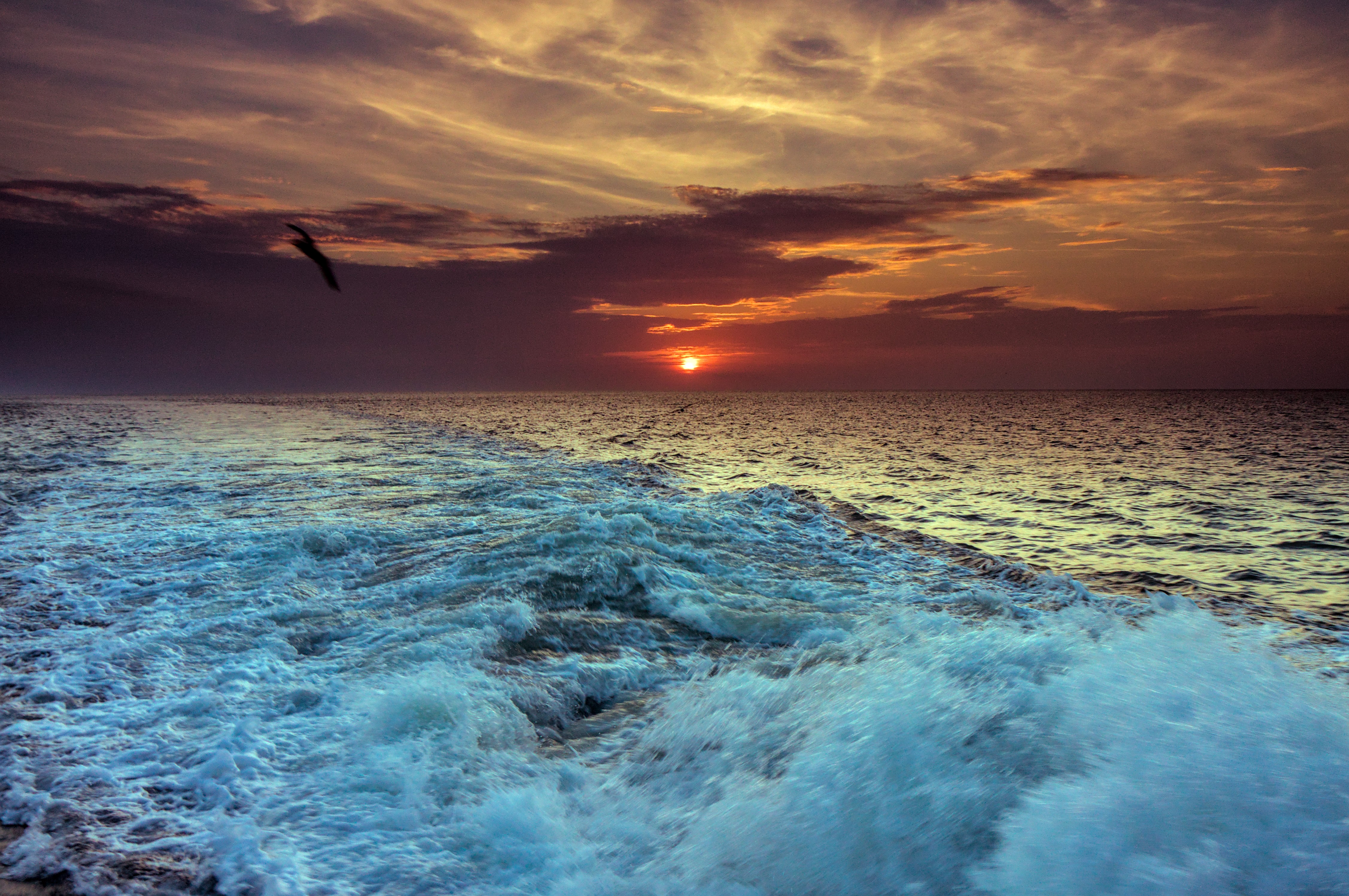
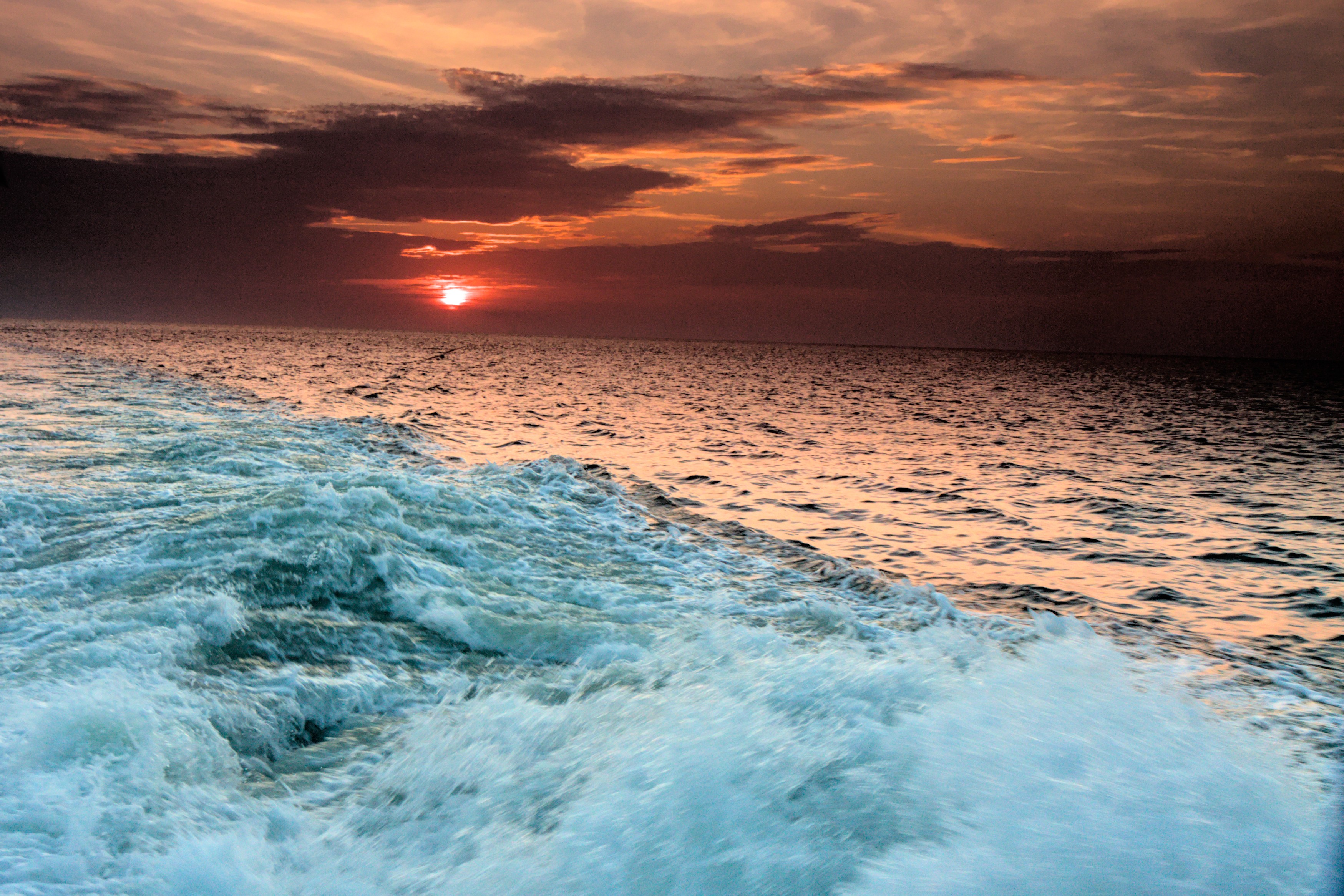
I’m looking for help in adding color that wasn’t present originally in an image (preferring scene-referred modules like color calibration and color balance rgb). For more details, see this thread. For this RAW file, I just missed the sunset but would like to try and add color to the sky that isn’t present in the image to make this sunset more spectacular.
I’ve also been learning more about color theory and would like to try and add color to this image using a color harmony, e.g. by using Adobe’s tool or Paletton to pick a set of colors that work well together and provide better contrast (e.g. complementary colors).
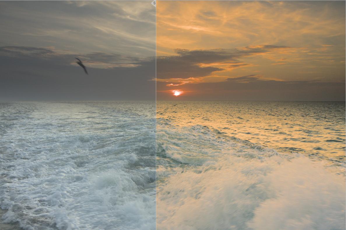
I made the attached quick attempt at doing this; I tried to use a Split Complementary color harmony but I don’t think this the best choice for this photo - it’s just what evolved as I started working on tweaking the sky.
This was a very difficult task, because you had to do a lot of corrections before you could do the color task. And the result is accordingly rather bad.
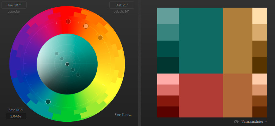
Based on the original colors, I think a tetrad with a primary pair (pastel blue-green) and a complementary pair (saturated red-pastel brownish) fits here:
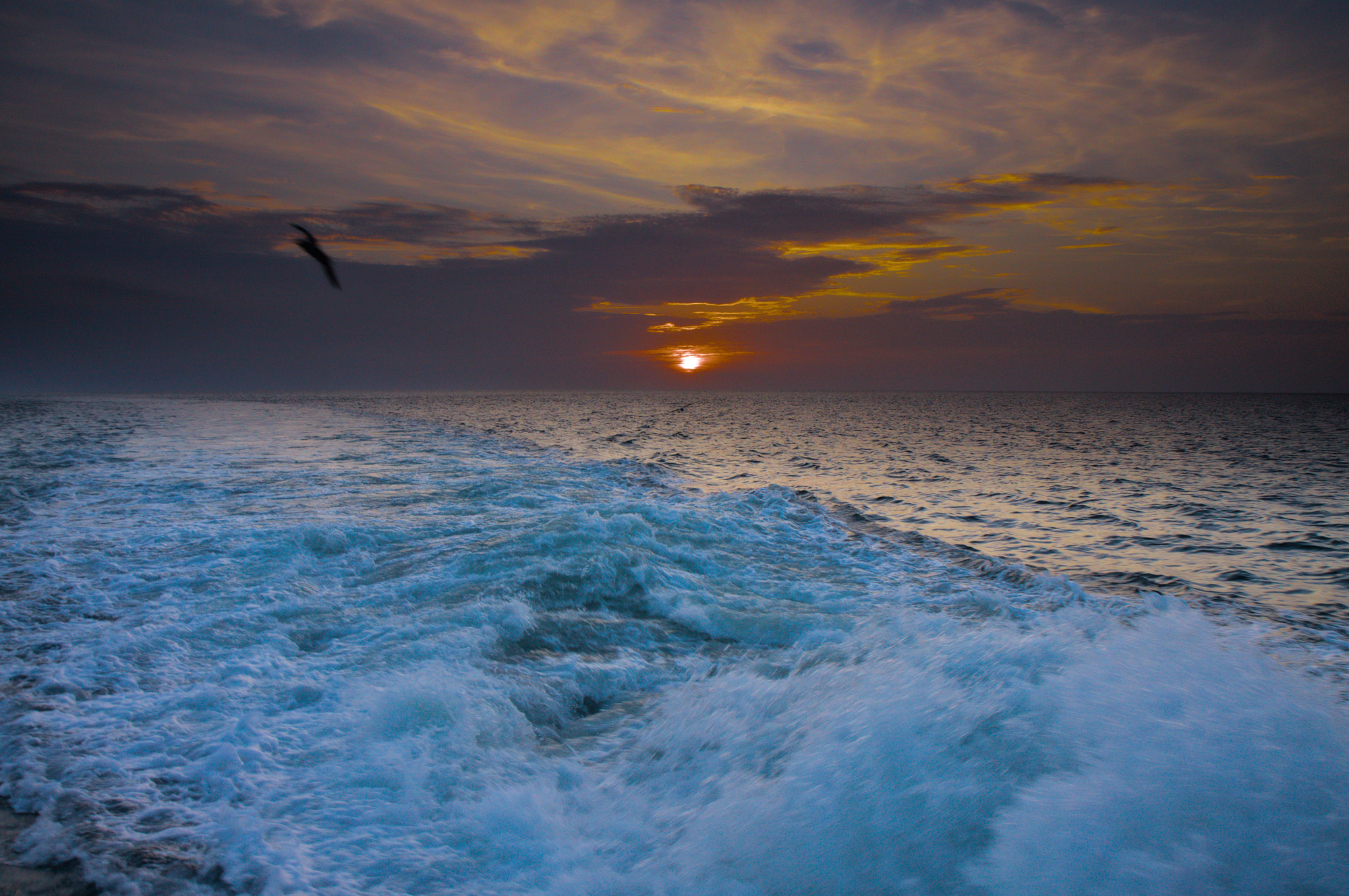
Simple tools, I just cranked up the HSL saturation a bit, and used a second white balance to crank down the blue and crank up the red. A contrasty filmic, and 'ere y’go, in rawproc:
Another attempt in GIMP. I made a selection of the sky and then gradually increased the saturation of various regions using my saturation mask plugin. It is slightly more realistic than my previous try, but I am still not convinced by the result!
@s7habo I’m not sure what you exactly do to come from a paletton palette from their website to the exact adaptions in darktable, but that didn’t keep me from trying it by:
clicking together a suitable set of colors and color harmony on paletton website
trying to come as close to the colors with darktable modules color calibration and color balance RGB - but just using my eyes
Is there a more “scientific” or measureable way of changing an image to meet an color harmony created on paletton?
Please do not! Use the color harmony only as orientation / inspiration. Do not limit yourself unnecessarily. You will already recognize yourself whether the colors fit or not.