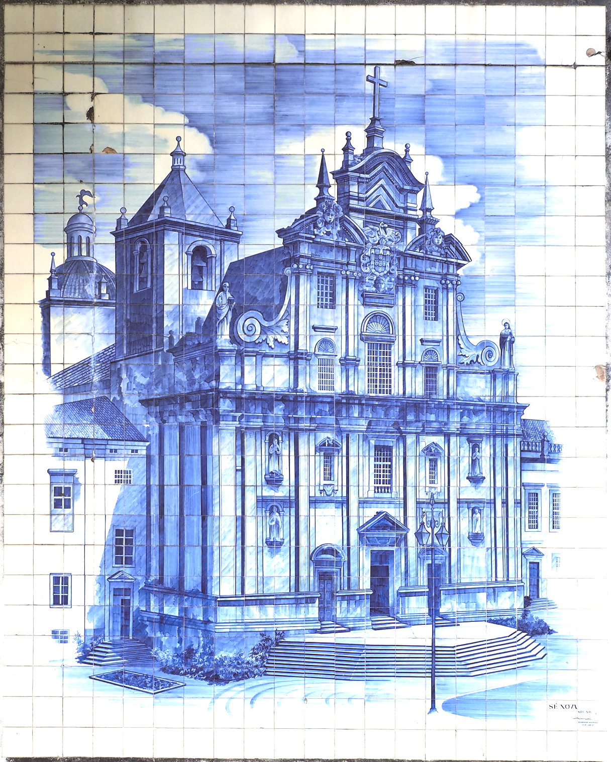
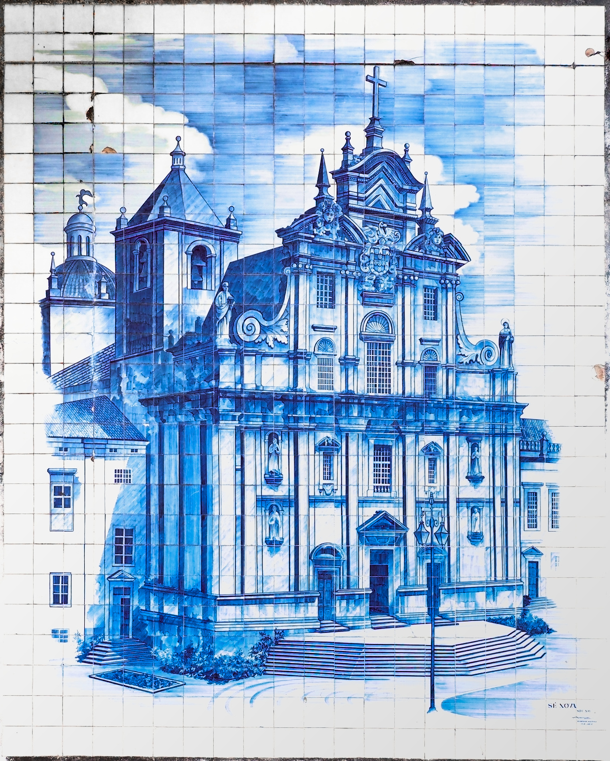
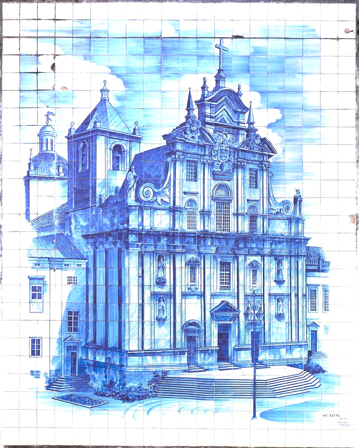
I took this photograph of a tiled wall in August of last year. It was a sunny day, but there were clouds moving during the exposure (the original is a HRES shot - this is a small export). I’ve interested in knowing what people think is the best strategy on optimizing it.
The upper left corner has a dark shading. An you progress from upper left to lower right, the exposure increases. In reality, the spaces between the tiles are filled with stained grout that’s dark, and a sort of reddish/brownish/yellowing color.
I’ve tried a number of things, including hand-drawn and color-specific masks, but I keep ending up with portions of the image being unacceptable.
As I say, it’s the strategy that interest me. I’ve been a Darktable user for a couple of years, but most of my edits have been elementary.
Could you share this image as a playraw with the raw file and suitable licence. I feel it could be improved using an instance of exposure with a gradient mask to darken the exposure in the bottom right corner and brighten the exposure in the top left. I also feel the yellow coloring could be reduced and brightened in the top left corner.
The bright parts seem white (from my phone), i would try the exposure module with a feathered/blurred/gradient mask and pheraps with color balance rgb and/or color equalizer to fine tune the colors eventually.
I have used the graduated density module with a negative strength to brighten such darkened corners (and even fix colour casts). Or you could brighten the image, and use it to darken the opposite corner. Or add exposure with a gradient mask.
I placed pickers on the corners in Lab mode. 3 were already white. I adjusted the strength and the colour + saturation until the top-right corner became near neutral and bright. You’ll find the settings in the sidecar.
A combination of exposure and graduated density seems to be working. I’m having to adjust the white balance a bit, because I’m trying to match shots o 14 different murals (all taken on the same day).
Okay, thanks everybody for your help. My challenge was to preserve all the tile lines, plus keep the base tile colors consistent (a particular blue and an acceptable white). But there are some tiles whose imperfections I wanted to keep.
For this image As I say above I used five different exposure panels: 4 on smaller targeted areas, and one for the full image. The graduated density helped me keep the tile lines on the lower right. Finally I used a color correction on a few tiles in the upper right (the actual mural has this color difference from plant pollen being washed down by the rain for years and years).
It still looks a little washed out on the right, but that’s something I have to handle often.