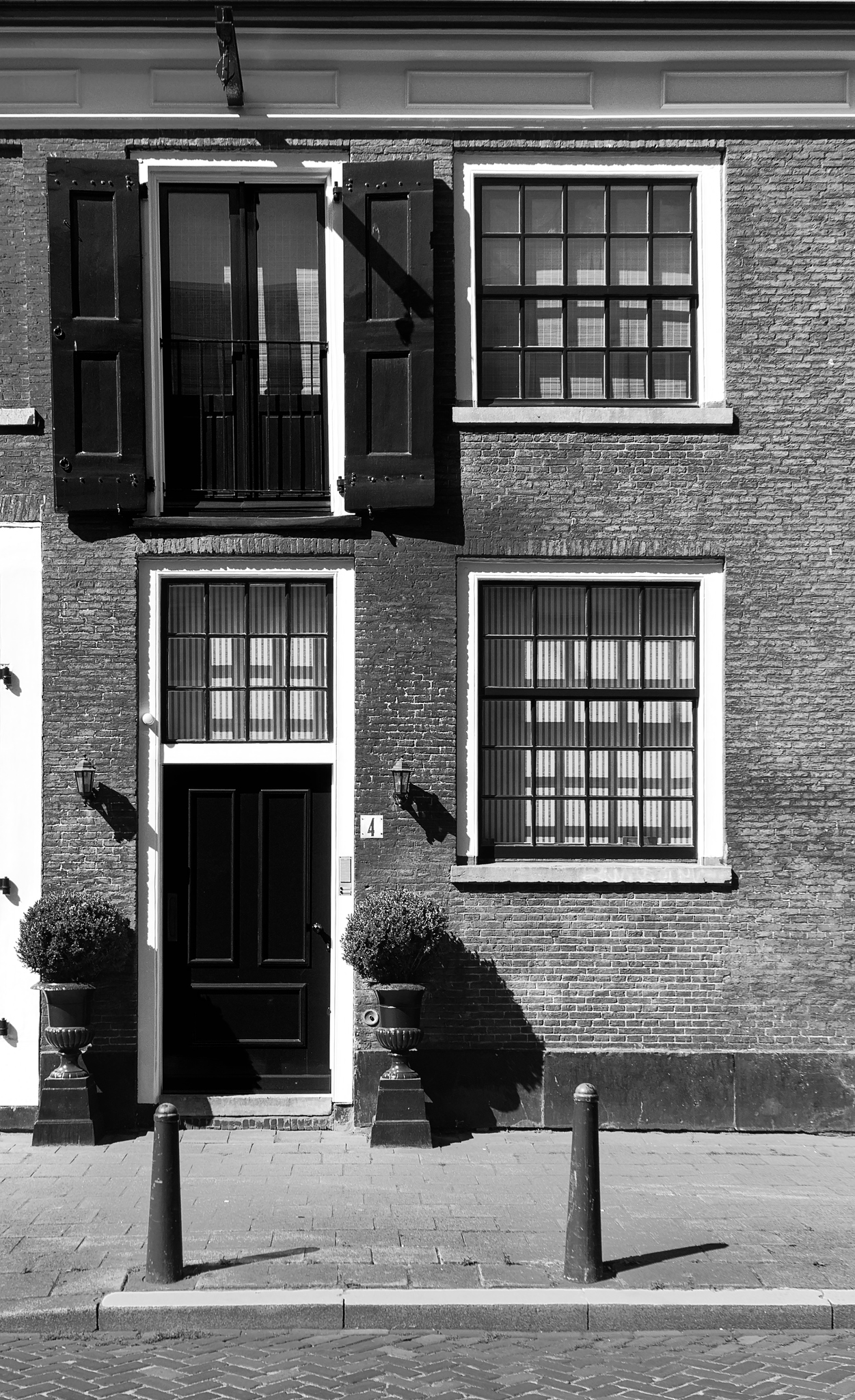
Decided to take the shot even though the conditions were far from optimal: A harsh, almost midday, sun and some very deep shadows. Knew then and there that this would be an interesting edit…
Very curious how others will tackle this.
BTW: Anybody know of a site that explains the aesthetics of frames/borders? I always seem to struggle with the ratios. I use my gut feeling, which might (or might not) result in a nice total picture.
Images with harsh light tend to make me want to do a monochrome treatment but I’m not sure I’ve quite got it how I want. Still getting to grips with channel mixer. Here’s my attempt anyway…
I struggled with this one, particularly correcting the distortion!
I would have liked to increase the canvas size so that, after correcting for the distortion, I would not lose so much of the image but could not find a way of doing that in RT.
In GIMP I used Luminosity Masks to try to recover detail in the darkest areas and to increase contrast in the mid range.
david.
I try to take inspiration from classical typography, e.g. type area calculations (I did not find an english language wikipedia article, but the images in the german language article should give some hints what to look for and a dutch language article is available as well: Satzspiegel – Wikipedia). Especially, it does not always make sense to put the image into the geometric center.
Thanks for this, gave me an entry-point to some further reading/info.
Not sure if I’m going to use this for (single) images, though. All this is based on the aesthetics of a 2 page (or side by side / mirrored) layout. Not using the geometric centre for a single image doesn’t work for me.
I do see the beauty of this method when using 2 images, be it in a single frame or 2 separate frames, especially when using the golden ratio rule (as shown in the Dutch wiki: Gebruik van de gulden snede).
For single images it is typically the vertical position that has to be off center (shifted upwards) to appear visually centered. The two page layouts would give some inspiration for multi image framing.
I also do not use this 1:1, but as an inspiration.
I did realize that vertically was meant when talking about a single image (the way Thomas framed his edit).
In my head all these methods work both horizontally and/or vertically, depending on the situation. I need to learn that people aren’t able to look into my head / follow my though process…
Hm, his frame is white and I did not realize that his edit is framed before you mentioned it as it is white on a white background here . But yes, that’s an example.
Hm, seems I have the same issue when writing here (or elsewhere). So it’s likely that it is nothing too special .
For both art and photography the framing is an important part of physical exhibitions. Generally speaking they use the framing as a language that play against the content based on the history of art and photography. It links the work to artistic movements epochs or expressions. This is done either as a playing against or with the referenced art. Sometimes frames are also picked individually just for the formal aesthetic qualities and how they play against the work.
As a brutal compression of the ideas I’d say that frames are about separating the art from the world. Full bleed frame less is often used to convey a directness and being of the world. The thicker the frame the more the picture can create it’s own world and is given space to breathe independently of the things next to it. It can calm the impression of the image.
In my personal judgement your frame above is uncomfortably in between. (this can of course be used to good effect) I suggest making it either slightly less than half it’s current width or a third or more wider. Your white is delineated by a black line. Similarly to the frame width I think it’s in between. A hairline thin grey line or a thicker black line would be more decisive about how you want the picture to relate to the world.
I’m looking at two prints of mine that I’m a bit annoyed with and they also have this in between width border.
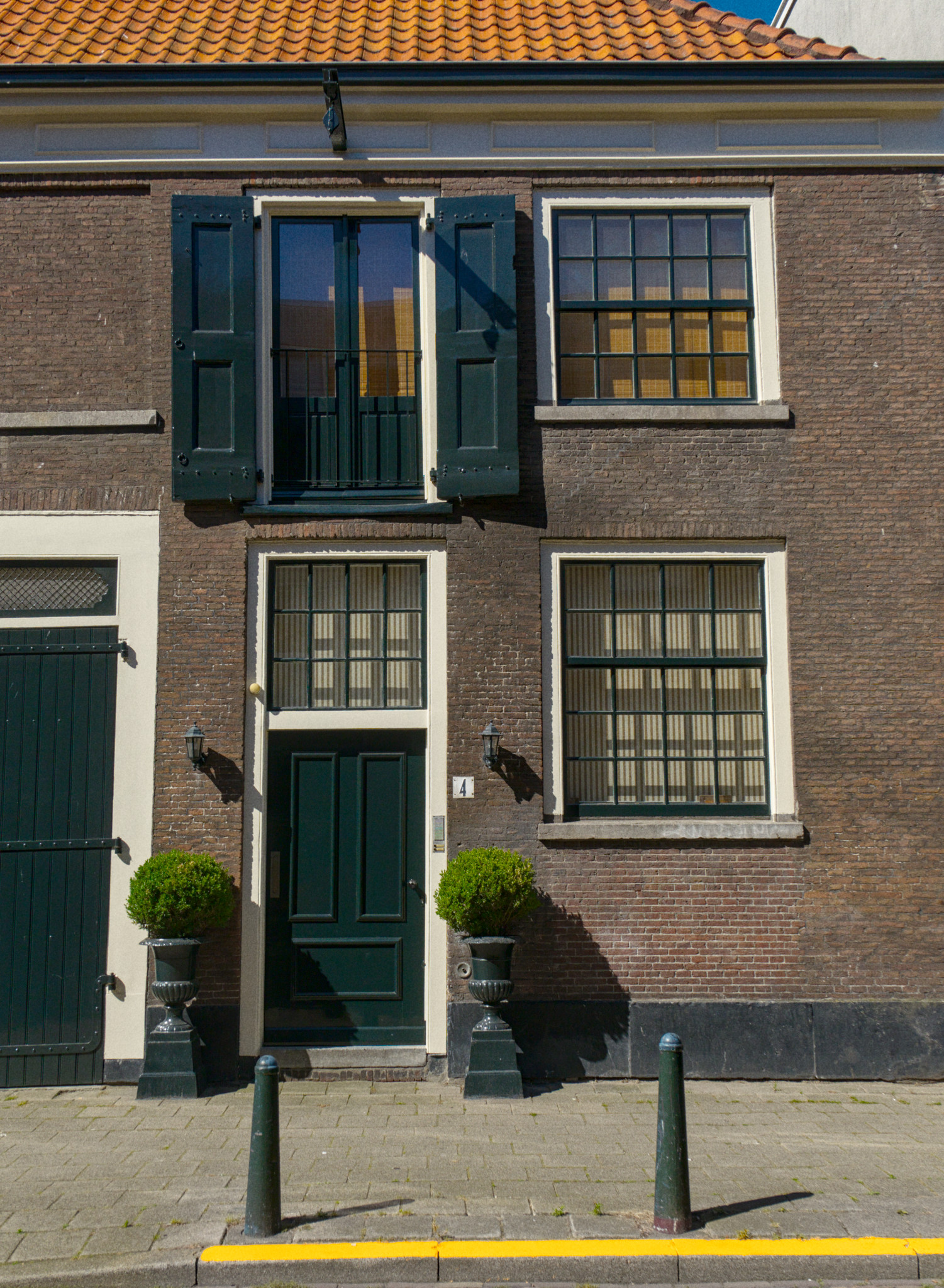
I’m by no means a dutch expert but the proportions of the windows look more square than I’m used to when thinking dutch. But for me I guess dutch is mainly Amsterdam and Rotterdam.
This also look like it could be a place someone worked (manually) and lived. A taylor or something like that.
These are definitely Dutch. Many of these houses used to be work and live combined, I’m talking 18th and 19th century. Nowadays most are renovated to be luxurious houses (the above one being an example).
I’ve seen many of these in the Randstad and a lot of these are on the Rijksmonumenten list. This means they are part of our national heritage and protected as such. This specific one is in The Hague, where I live at the moment.
If you travel eastwards, where I was born and raised, you leave the historically rich and industrialized parts and go into farm country, which has its own style of, often large farms and/or very old mansions (Rijksmonumenten in Dinkelland).