I’m curious whether a UI overhaul is somewhere on the horizon. I have seen several gtk3->gtk4 migration tickets on github, but migrating to a new platform doesn’t necessarily (or at all) imply improving the UX in any meaningful way. It seems that nobody wants to touch that area until the migration is complete, but at the same time it seems there’s very little progress in that direction. I’m wondering if it could be prioritized in some way.
Darktable is reaching the feature set quite comparable to the commercially available options out there, but the only reason I can’t recommend it to anyone is its lackluster, god awful UI.
And I’m saying this as someone with over 12 years of experience in developing user interfaces. I would be willing to put effort and leverage my skills to improve the UX, but the code base is strongly coupled with the processing modules by design. I’m not great at code bases written in C, but if you asked me what would bring closer a UI overhaul, migration to a new library or architecturally decoupling the existing code base, I would bet on the latter.
As a user I don’t find the UI any more awful than any other program I have tried. But as a user I would not be resistant to a UI change if it solves a problem, but I am not seeing a problem myself.
Jokes aside, it’s not clear if you mean that (1) the interface is not “cute”, or (2) the user experience is not optimal.
You mention UI, so probably you mean the former. In this case, be aware that it’s fully customizable with CSS, so you have quite some latitude in making it look nicer (according to your taste, that is).
Concerning UX, this would need to be a much longer discussion. The UX is pretty much optimized for those who use it. If you start using it and learn how to use it (as you learned the other tools before) you will see that it is actually not that bad.
Of course, as always, there are a lot of rough edges and things that can be improved. If you read the release notes you will see that there a lot of UX improvements also in this new release.
If you have some more specific complaints, feel free to open an issue on github, and even better to start contributing. “It’s ugly” is not a very actionable feedback, I guess you can do better than that.
i don’t think it is a terrible UI but maybe I’m just used to it.
I do notice that compared to Lightroom 6.14 perpetual I still have, or even Affinity, there is just something about those UIs that looks a bit more upmarket. Maybe it’s just tiny graphic design touches?
It doesn’t bother me but to newcomers maybe it all looks a bit, erm, open source?
But none of this detracts in any way from an immensely powerful product that is really the only option if one has a fear that some commercial company is just one day going to decide to kidnap your edits.
One thing that would be nice, would be the ability to re-organise the ordering of processing module visually without affecting the pipeline. The customisation features in darktable are superb, that would be the last tweak for me: the ability to choose whether moving the modules around is purely cosmetic or changes the pipeline.
The thing about UI is it is very idiosyncratic. Linux allows you to fine tune your OS UI and that leads (inevitably) to wanting to fine tune your application UI. It may really be unfair to the devs and an unreasonable request, but the desire is still there!
I can understand that. My opinion is based on the modern UX standards and not everyone likes them. Not even the overuse of whitespace type of thing, even just the “how many clicks does it take to apply exposure for a {new,intermediate,experienced} user”. The fact that it takes 3 clicks for someone who already knows how to locate the required module (read: it would take 3 times the number of clicks for a new user), before you can even judge the image you’ve just opened, is quite awful by the modern standards.
Worse yet than just the UI/UX, most things in darktable have awful naming that is incompatible with the naming used in the industry long before darktable even existed (notably the filmography industry). For me it surfaced a few days ago when I decided to reconfigure my layout and was greeted with this:
And it struck me that, outside of the fact that if it weren’t for the fact that I’m spending 20h+ a week in darktable for years now, I wouldn’t be able to tell what any of these modules mean and which one I need, it’s also that none of these modules do the thing that is written on the tin, and that close to none of these are the industry-standard terms.
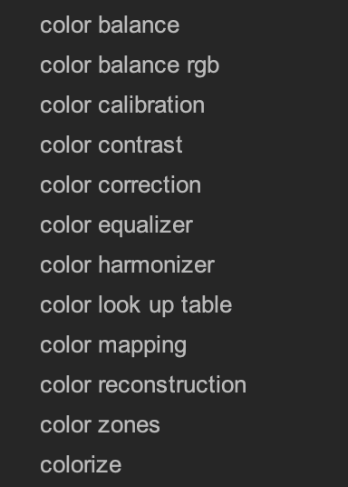
It also doesn’t help that darktable tries to pack different functionality into one module, which in my opinion defeats the whole purpose of the module-based system. Why am I accessing the basic channel mixer, which is called “color calibration”, as a secondary tab to the module where I set the white balance, also under the name “color calibration”? It’s things like these that are the main force against adopting darktable as your main software if you already have experience in the colour grading industry, however insignificant.
I think that I am not wrong if I say that I am one of the most vocal people around here when it comes to discussing usability and UX in general. So, as I said above, it’s not that there is no margin for improvement.
That said, let me point to you that you clearly speak like someone who is trying to use darktable as they would use, say Lightroom or whatever it is that you are currently using. darktable has a very different philosophy and does things in a different way. But you have to learn this way before you can appreciate its value.
For one thing, it is very much keyboard centric, and as far as exposure go you can adjust it without clicking on a single panel. Just assign a shortcut to the right slider and here you go.
Another important difference is that darktable does not assume anything about you when you first run it. You have to customize it to fit your workflow (as opposed to Adobe’s or Affinity’s workflow) before you can start using it really productively. I think that this is an excellent introductory video in this respect:
So, it’s not “bad UX”, it’s “different UX”. Then, within the way that darktable does things there are some inconsistencies and a few half baked cakes, which we (as a community) are trying to improve as we go.
All these things have been discussed one zillion times. I suggest you get you a nice drink and go through the forum, it will be fun and instructive.
That is how I see it. I have chosen to learn DT and the learning has rewarded me with a better program for my uses than other programs. I don’t want or expect DT to be a clone or replacement for LR, Affinity, or any other program. The fact that UI is customizable is an excellent idea.
I have a Canon R7 and I have adapted a style to start the editing process of my CR3 files. Many images are complete and ready to export in less than a minute. The UI works for me. But if it can be improved then all the better.
I’m not trying to use darktable in the way I would use any other software (and I don’t use any other software). I’m trying to use darktable as a piece of software in 2026, not in 1998 back when UI design was still a mystery and it was simply more efficient to get around with keyboard than remember the “programmer design” that went into designing the UI. For a 2026 software, the UX is objectively awful in many ways that don’t even begin to touch the modern UI trends (which do also have questionable UX).
The primary way of communicating with software visually is the mouse. Keyboard is a non-visual communication tool. With keyboard shortcuts, you think of an action and evoke it. This goes beyond the scope of UI. With the UI, you see it, move the pointer to it and click on it. This is a basic truth and unlike with some software like text editors, developing photographs or videos is a purely visual endeavor. Therefore optimizing the UX for the most efficient and apparent use of the UI in a software that is already pivoted around visual editing, is what I consider crucial.
This sounds good and I generally would be open to proof of concept to demonstrate it if you have the capabilities to do it. I certainly embrace the new ideas coming to DT and a new UI could be one of those if someone is willing to put the work in. But possibly what one person likes others will hate.
Point and click is more visual, not more efficient. Anyways, you seem to have decided already that darktable is unusable and that its UI is hopelessly flawed, so I won’t try to convince you that this is not the case.
While I do think that darktables UI and UX can certainly improved I tend to not agree with your reasoning here. Darktable is a technical program made by (and for) advanced users. It is much more of a woodworking shop with tools that need setup and special training then a beginners tool - at least that what it feels like to me. And I love that.
I have setup extensive keyboard shortcuts for almost everything I do in dt and bounce around with my left hand on the keyboard all the time. This way I can keep my eyes on the picture much more then when I point-and-clicked my way around LR back then.
God (or whoever) gave me two hands, it’d be a waste to not keep the left one busy with shortcuts .
I’ll explore the idea of throwing together something like PoC of the UI the way I see it being done today.
Not quite sure where you got this from, and it’s the second time you express this opinion.
I agree with that, but I also fail to find the connection between it being a complex software and it not needing a more standardized, easy to use user interface? In fact I would put more emphasis in this area the more serious the software is. Take for example the stock trading UIs, they’re quite complex and yet their UX is quite good. Another example would be the CAD software, which is also some of the most complex software out there, and they also come (more often than not) with decent-to-great UX.
One of my students who is a talented painter described another popular photo editing program as a cookie cutter editing process that produced quick and easy results by just moving a few sliders to set exposure, brighten shadows etc. That same person described DT as a real artist’s tool that produced individual results based on the user’s skill levels.
I like the description of DT as a workshop with the tools that you must choose and learn to use rather than a paint by numbers program. The UI doesn’t hinder a user willing to put the effort in to learn. At least that is my view. I am not trying to disrespect alternative opinions.
I and probably many others agree with you that there is room for improvement. Especially on the UI side. Maybe to a lesser extent on the UX side.
I would love to see some headway in these departments but it takes someone to actually do the work and not just have an opinion on it. Of those there are more enough available. So I am eager to see what you will come up with.
I wonder what standardized means. Are we talking Microsoft Office Standard? Photoshop standard? Davinci Resolve standard? LR standard?
Not trying to be difficult or argumentative here. Just wondering if “standard” really exists. And would today’s standard be dated in the future when something better comes along?
It is also possible to have a workshop that is attractive to work in.
I have never been able to use keyboard shortcuts beyond ctrl c / ctrl v. I have been in IT for 40 years and I must be the worst typist in existence. The idea of having to move back and forth between keyboard and mouse terrorises me. A few versions back darktable introduced a new customisable keyboard shortcut system. I never touched it, which suggests I have no working keyboard driven commands available. Intuitively I want to drive everything from the right mouse click and never touch the keyboard. But one of the beauties of the open source ecosystem is that it can actually accommodate personal idiosyncrasies. I can choose to redesign my module tabs. Amazing! love it!
I use very few keyboard shortcuts because most of them are too difficult for me to remember. I am certainly not against improving the UI if it can be done, but I have no real problem with the UI at the moment except a couple of little niggly bits (maybe). I really like how the modules can be customised by the individual user. The various tabs remind me of Microsoft Office or word where I have tools grouped together by function such as tone, color, correction, sharpen & denoise. Some people use a favourites tab.
Moved this to a new thread. When the comments are associated with an article, please try not to be off-topic because comment visibility is much higher and could alienate people just wanting to download dt from the website. Thanks!
When it comes to UX, I’m as well thinking, that there is some room for improvement. I’m the guy who is always searching for the modules even though I made my own tool set, because I simply have no clue where the modules are located in the pipeline. I would find it very helpful to have a possibility to get my modules sorted in alphabetical order or even in a self chosen order.
A small checkbox, “edit Pipeline order” would be enough to show it in the way the modules are sorted inside the pipeline and could be used for moveing modules to another place there.
I think I have suggested something like that a long time ago, but it was more or less treated like blasphemy .
Anyway all in all I don’t find the UX of dt bad. It’s a bit different and you have to get used to it.
Maybe it would makes sense to brainstorm a bit how we could improve the UX with smaller things and where there are painpoints, which should be tackled. I think overhauling the whole UI isn’t really necessary.