Yes, that’s been annoying me for a while. As I’ve already invested quite a bit of time into the white balance / color calibration issue, I may have a go at fixing it. But… it may not be very relevant, as my aim is to actually make white balance the primary source of… white balance.  That is, you’d be able to apply custom white balance pre-mosaic, and proper chromatic adaptation (in color calibration) would still happen, but you’d normally pick your neutral spot in white balance, not in color calibration. We’ll get back to it now that 5.6 is out.
10 Likes
which is what many people do anyway… so, as it is, darktable still leaves the freedom to append re-adjustments. In general, I have noticed that many long term users have a very freestyle kind of approach, where the end result matters more than the way you get there. Which makes sense,
As I said, any proposal for a change must consider the backlash, or at least the criticism, of those who have built their own workflow on the current structure.
1 Like
That’s what we call learning.
1 Like
But to me it looks even worst… that’s what have been said here already, there is quite a lot of subjective feeling. Too much for approaching a possible step forward.
2 Likes
I don’t think we need to be fair to Andy, I’ve been watching his “Darktable haters” guide and he hasn’t done much to help people better work the program because he’s spending more time scoring cheap points at the developer’s sense than actually explaining things. But I get that it’s all part of the fun and he does that with everyone else, and that’s how the YT business seems to work for some people. I will give him credit that he’s at least trying to learn the program and present things accurately.
1 Like
Apart from the “industry-standard” argument, which again, I find quite unconvincing, I agree with you on almost everything.
But there is one big catch: all of this, besides not being a pure UI revamp, implies a deep restructuring of the modules and the way they work together.
It could easily lead to a much better application overall, but it means breaking the workflow of a lot of people, and that must be agreed upfront. And probably for this single reason, it will never happen.
2 Likes
Well, ep 1. was an introduction and explained the pixel pipe, and ep 2. explained the scene referred concept. In between he shared his theme, which may not be your choice of colours but is objectively clearer than the stock theme, and also reviewed the new AI features. So that’s not a bad start.
2 Likes
Andy’s videos are outspoken and thought provoking. There are also entertaining. And if anyone thinks he hates darktable (he does; he says so) they should see what he has to say about software that he absolutely detests! 
His comments on the pixel pipe and scene-referred processing were simple and clear. My only criticism was that one can (and probably should) start using dt without immediately breaking the head over those things. I shall go on watching him, for photography, processing/editing packages, and even life in general 
1 Like
I haven’t actually seen anything 5.6.0-specific in this thread. Perhaps the thread should be renamed “dt UI/UX discussion” or similar?
1 Like
Andy has a lot of territory to cover if he really wants to get into the aspects of what really matters. He’ll need about 15 episodes at this pace.
That’s the problem with most reviews. They tend to stay at the surface but never get deep enough to uncover the very best aspects of an editor and the nuanced shortcomings that may not be recognized without a lot run time on the part of the user.
I would say that applies to reviews of all editors and not just Darktable. Andy is probably one of the few who can cut to the core, so we’ll see.
1 Like
This is unnecessary.
Would this work? Is this possible with the interchangeable module concept of darktable? For example, another comment:
but those particular color controls must happen within the tone mapper (sigmoid has a set of them too for similar reasons), correct? Some of this sounds like completely redoing the concept of the pixel pipe. When the creator of darktable wanted to move to a node-based editor concept with complex wiring between nodes, they created vkdt, instead of trying to change something so fundamental about dt (over-simplified retelling, I know).
Over-broad statements aren’t helpful; name-calling (even unintentional) is the opposite of helpful. “Objectively bad” and phrases like it are opinion stated as fact. Specific actionable ideas with an understood path forward, like kofa saying
are the little steps of improvement that will make an actual difference, without alienating those of us that really do love the way darktable works.
The Quick Access Panel was added to address some of these workflow criticisms. I’m not sure I’ve even seen it mentioned in this thread. Are panel configurations sharable? Would a well-crafted quick access panel make progress at addressing any of the issues that have been brought up? Perhaps that feature could get a bigger spotlight.
Oh, boy. I haven’t been quite this vocal around here before…
3 Likes
I think a compromise would be to fork Darktable into 2 projects. The Main project would see a module consolidation and UI / UX overhaul and a legacy project which would maintain the old ui / ux , code , maintain compatibility with older edits.
I feel for me, less discussion about the UI from me and on to the important editing of my photos which DT 5.6 does so well. 
2 Likes
That is more or less Ansel.
2 Likes
I think back and forth on many of these things but it feels like to me that a serious UI/UX overhaul would come from a fork and then porting in a set of modules to work in that frame work…
Sometimes you rennovate and sometimes you tear things down and start from a new build…
Rapidraw is a new UI and I think the young developer has ported in a bit of code… but some cues could be taken from that
There have been some suggestions proposed for new icons and UI elements
Ansel is certainly AP’s idea of the UI and module set to use.
As also mentioned above, so as to work unbounded and in a new UI framework with nodes and GPU acceleration, vkdt was born…
So this breaks the legacy aspect but maybe that is what is needed at some point to move on??
I guess it will be the task of those with the interest and the skill to make a run at a rennovation or rebuild of the UI…
I have so many years of using old custom software running instruments in the lab, often with little or no GUI that I have just approached this as another set of functions to learn and apply… the UI doesn’t get in my way for what I do but for others or new, maybe younger users it might seem archaic and dated??
I have no idea if under the current developement platform something like this could be added as a tool for those that might benefit and turned off by others…
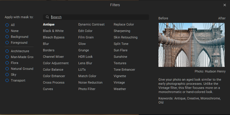
This comes from ON1
When you are in the effects tab… a sort of equivalent to modules in DT there is an add filters button…it opens this fly out that has an alpha list of modules, a static before and after visual cue to show what the module function, search box, related keywords for context and in their architechture you can specify the mask if you are applying it locally vs globally…
DT might not need all of those elements but I suppose it could be useful to address some of the module confusion and it could be something that you could perhaps allow to be configured and of course disabled… but using it as a “guided” mode for those that are starting out and might need the extra context and cueing…
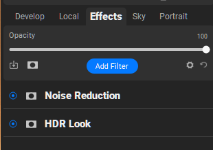
Again, not being a programmer and not being familar with the ui building blocks this might not even be possibe or even desired I guess…
1 Like
Does anyone highlight commonly used buttons with CSS, or grey out uncommonly used buttons? That would save little time but significant annoyance. This (excessive button real estate) is one of the things that AP rightly criticized, even if I have doubts about using menu items to solve it.
If this has been addressed, please just ignore my comment. I’ll read the whole thread tonight.
What buttons do you mean?
I would hide most of “Actions on Selection”. In fact, I only use a button that’s added by a lua plugin: show image in file browser. If I could move it, I would just collapse Actions on Selection.
This isn’t a general need, it’s just the way I use the program. If I made it bright or bold, I wouldn’t need to hunt for buttons. Along with the few others I use in every session, if there even are any.
Edit: I don’t mean to say it’s excessive as in “bad”, just that finding what I want takes longer than instantaneously. “Ample or generous button real estate”
Am the only person here who likes the UI. I have come to learn and understand the UI. It performs the edits the way I want. I struggle with Affinity, Rawtherapee and other programs because their UI is not the same as Darktables, but I don’t see that as a valid reason for any software to change the UI to make it easier for a new user who is unwilling to learn the ways of a new program. If I want to use Rawtherapee then I have to learn its UI.
Now if the UI is hindering the editing power of Darktable then please change it. But I am more interested in new and improved modules and masking capabilities than a new UI.
12 Likes
I think the UI is overall very good. It has a lot of little glitches and quirks, features that have been implemented but never really polished, corner cases that are not handled very well, and most importantly some discoverability issues. But these are all things that can be fixed with targeted incremental improvements, without reinventing the wheel. And, all in all, I think it is far superior to anything else that I have used. Not simpler - by design - but considering how much stuff it packs AND that it evolved (1) incrementally an (2) only with voluntary, unpaid, loosely coordinated contributions by its own user base the UI is holding up incredibly well.
If I were to reimplement the UI from the ground up I would probably wire things differently (definitely, better math/UI decoupling so that the UI can be reworked more easily and without compromising the processing logic) but I would probably not piece together a radically different UI.
11 Likes