Are we talking about the individual colour horizontal sliders that appear when you middle click the graph? If so, I find your comment surprising because Color EQ was essentially a new module that launched with those features. As far as I know at least, the horizontal sliders were implemented before the module was officially released, weren’t they? Apologies if I’m wrong, but I’m surprised that they became “legacy” so quickly.
To be clear, if those sliders were removed, I wouldn’t mind too much, and I would just use the graph. This is not a big issue for me. If it’s people like me using them that prevents the module from becoming more streamlined and code getting bloated, then I’d happily give up using them. But because they are there as an option, I tend to use them.
My feature request would simply be just to keep the Options sliders at the bottom of the H,S,B tabs permanently, rather than move them to a new tab. In a way, I think this actually simplifies the module from its current state. It strikes me that the current “create new tab if horizontal sliders are shown” feature has actually added more complexity and code than if the guided filter sliders were just kept as a dropdown.
Ah, got it.
Honestly, if you wanted to remove those sliders to remove code burden, just do it. I won’t mind
As for tabs, I understand that they are necessary sometimes, but I’m not a fan of them if it means frequently switching to use the module properly. Historically, this has always been a major complaint with Tone Equalizer because the mask needs to be manually adjusted every time (now less of an issue with the moved sliders).
I understand that vertical height is a problem for some users, but it’s not always an issue for those with 4K+ monitors.
And with any module that has Hue/ Saturation/Lightness adjustments or similar, I would prefer them to be all accessible at once because for me it’s usually a holistic adjustment where I want to adjust all three at the same time, not one by one. That’s why I’m a fan of the Color Lookup Table. I think my ideal colour adjustment module would be a scene-referred version of that.
Anyway, I very much appreciate your work on Color EQ and DT in general. While I have some thoughts about DT’s UI design, as I said in another thread, I barely notice the UI anymore and just happily use the software.
That’s a good point for design and implementation. Perhaps it’s not so easy once something is in general use, which AP seems to forget sometimes (perhaps a bit more often).
Isn’t your point 2 a direct result from your point 1? Once a module is in an official version, you really cannot remove it anymore… And how bad are those modules in the context in which they were created (display-referred editing only)?
I don’t think the tone curve is bad. It might be bad for lifting shadows in coarse strokes but it’s completely fine when you’re only decreasing points on the curve. A lot of people think it’s bad because it’s not scene-referred and in regards to lifting I agree. But if you’ve already got a well-exposed photo and want to subtly adjust the tones by darkening past a certain point, it’s 10x easier to user than the tone equalizer and simpler too. And comparing it to the TE on thousands of edits I can’t honestly find one downside to the tone curve when used properly and in this more limited scope.
I love the scene-referred approach but the tone curve is still a great tool, when used properly.
Given that modules with similar logic were used for decades in various software, I would hesitate to characterize them as “bad”.
Developing photos is a very practical process with artistic elements. It is very difficult, and perhaps impossible, to derive good solutions from mathematics or first principles, it takes a lot of experimentation and a feedback.
The “linear” or “scene referred” mindset (ie work in linear space, then tonemap) is better for some things, but not everything. Its major difficulty is the following: linear parts will undergo a nonlinear transformation compressing some regions of the color space (and, comparatively, expanding others). But in the linear part you pretend that each region has the same properties. This results in, eg, compressed highlight contrast, color shifts, and all the well-known phenomena.
You cannot design around these in a purely linear mindset, as they require that the modules early in the pipeline would know where the color is mapped in the output. But you of course offer tools that can mitigate them. Whether this is more convenient than the “old, bad modules” is an open question.
Even lifting (in moderation) isn’t a problem for darktable, as it can handle values >1. Where there is a problem is: what do you do when the input is outside the valid range for the module (0…1)?
Those issues do not come from using a linear space. And no, later modules do not “have to know where the colour is mapped in the output”, they have to make sure that within their processing, e.g. a lightness change doesn’t change the hue and saturation. A simple tonecurve applied per (r, g, b) channel does not do that…
Just to clarify, are you saying that the input could still be outside [0,1] if a tonemapper is activated? Genuine question as I’m not sure how it works.
But regardless, the entire outside [0,1] seems theoretical if one uses the tone equalizer and tonemapper, and then later uses the tone curve for fine adjustments. As far as I can tell, input and output ranges don’t make the tone curve any less useful and I’ve never run into a single problem using it.
I honestly would like to hear a real-world use case where the tone curve is actually a problem because I’ve never run into one.
It may be a strong point in terms of code and maintenance, but from a UX point of view, it’s only as strong as the developer’s “vision” and expertise. If that dev doesn’t have a talent for front-end UI design, it can be a very weak point. Diffuse and Sharpen is the classic case for me. It’s a powerful module, but the UI is much less user-friendly than Contrast Equalizer, for example.
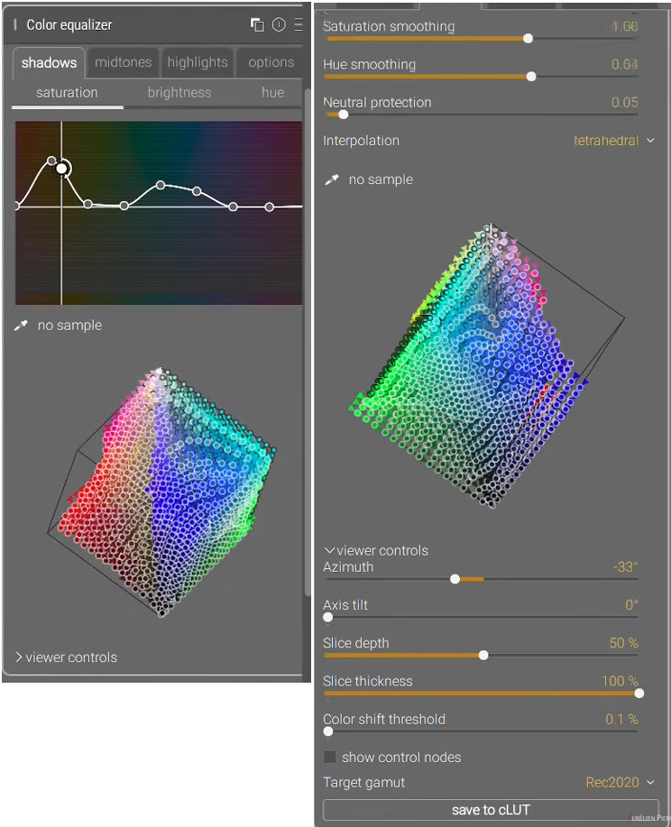
Even the version of Color Equalizer in Ansel brings me out in a sweat. It looks like it’s quite powerful, but there are so many tabs and options! It sounds like you need to think in 9 dimensions. Some people may love it, but I can imagine it’s highly subjective whether it’s a nice module to use or not.
As a side note, while watching this part of the video about the Color EQ, I thought I was listening to Donald Trump when I heard this:
“We have something better… because we are better”
Given a choice I would stay with the current DT design. The Ansel version with its separate shadow/midtone/highlight controls is simply too much to manage. And the cube is interesting but I have no idea how I would use it.
The module feels like an R&D proof of concept that may or may not work out and it’s left to the users to decide.
Why do I need to add a location right off the bat? Why cannot I just browse to a location, and not add it to the saved location list?
Why is the location I just selected not automatically picked for me as the place I want to import from?
If I double click on a location in the “places” list I would expect it to be selected for me and shown in the file list. Instead, it is just added to the folders list. I have to click on it again there to actually select it.
If the “select only new images” is already checked when I pick a folder, I would expect them to automatically be pre-selected when the folder is picked and the file list is populated. Instead, no files are selected. If I uncheck that box, and re-check it, then the new files are highlighted as selected. Why not do that immediately?
I would expect selected image files to be reflected in the checkbox column. Isn’t that what the checkbox column is for - to indicate the files that are selected? Instead, the selected files are shown in a light grey color across all columns, and the checkbox column is empty. Definitely NOT a standard convention.
Sometimes when a list of images is shown in the right-hand list, and a few have been selected, the buttons for “select all”, “select none”, etc are inactive, with no message as to why. The “add to library” is also inactive, even though some files have been selected, with no explanation as to why.
@greymont I don’t know if you were aware of this, but you can drag an image from your folder location and onto a Darktable shortcut and it will add to the library and open for editing.
You can also drag and drop an entire folder in the same manner and it will load without any additional dialog.
This works for me on Windows, at least. I can’t speak to Mac or Linux.
No, then you should be ok.
But the problem still exists if you use no tonemapper or basecurve. And it was an issue when all we had was the basecurve, you had to make sure input was in the range of 0…1 for any tone curve (theoretically, at least, it’s been a long time since I used basecurve).
What exactly does that do? From your description, that would work as “add to library” (i.e. no imported files are copied). What @greymont describes seems to be the “copy & import” tab. But I have never used that tab, so can’t say anything about his issues with it (I download from SD card to the directory where I want the images with digikam, cull, tag and caption them and then edit in darktable).
Yeah, I do agree with that. There could be some problems there. I think the tone mapper and TE are still essential for the first 90%, then just the TC for the last 10% sometimes…
Ah, we have such a different workflow. I have always had one folder for all images (with sub folders), I have never liked an approach with multiple folders in different locations. I also did with Lightroom and Capture One.
Actually, I find I extremely annoying if my editor will expose my full filesystem. I am using my photo editor not my file system editor. I find the library concept very handy (which is used by many more photo editors).
On importing photo’s I prepare everything in a single folder (often shooting multiple camera’s), and I use a separate tool for geo tagging. When everything is prepared, I import everything in one go in darktable.
So I don’t struggling with anything…
Question: In your collection module, do you use the ‘folder’ or ‘film strip’ view?