I think it really boils down to two primary things:
The control of tones in B&W that I love.
The familiar presented in a way that challenges your interpretation of what you’re seeing.
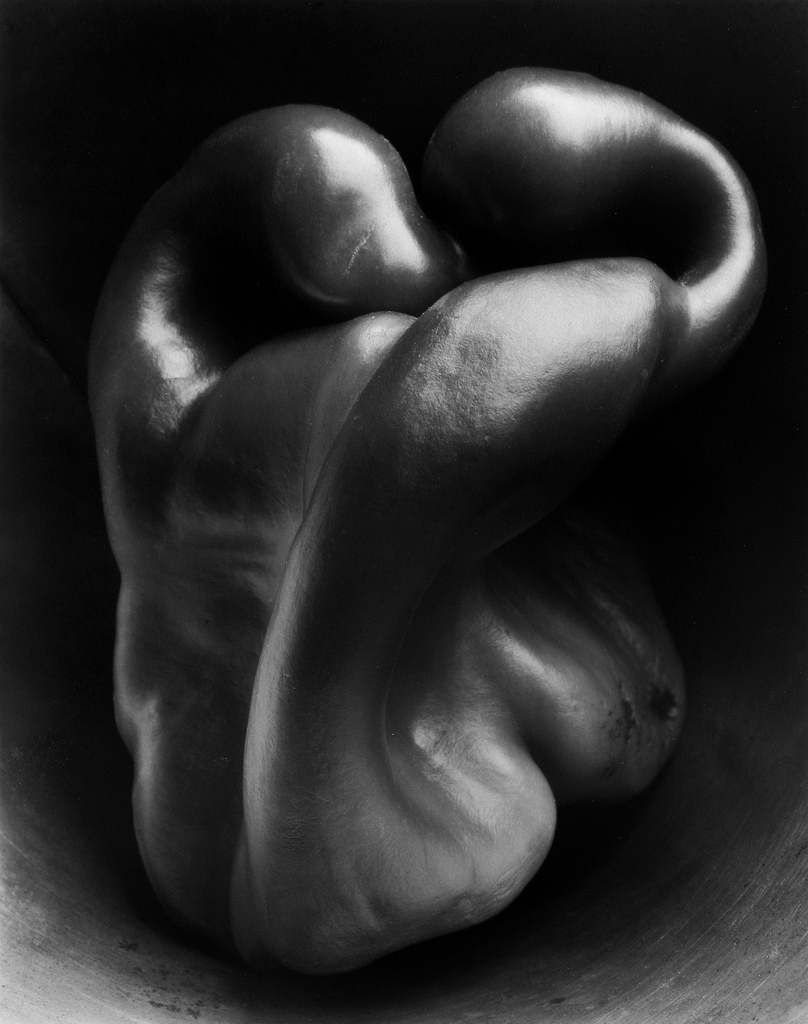
Both of these things are summed up in a photograph that I think was one of the earliest images to inspire me to start photography as a hobby (back in high school), Edward Weston, Pepper #30:
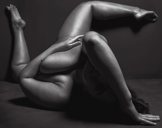
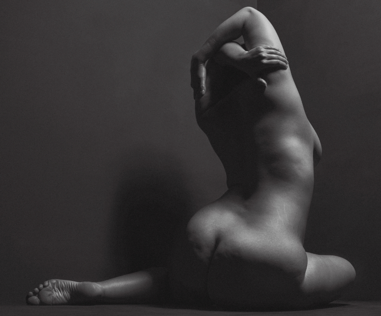
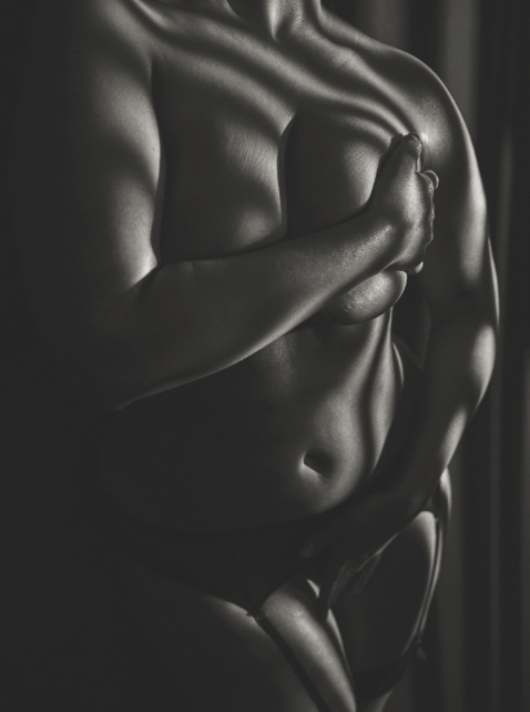
Hopefully it’s not too far a reach to see the abstraction of both subjects through the use of an unfamiliar viewpoint coupled with the unusual shape of the subjects (compared to how you might normally view them)?
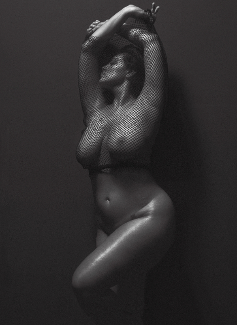
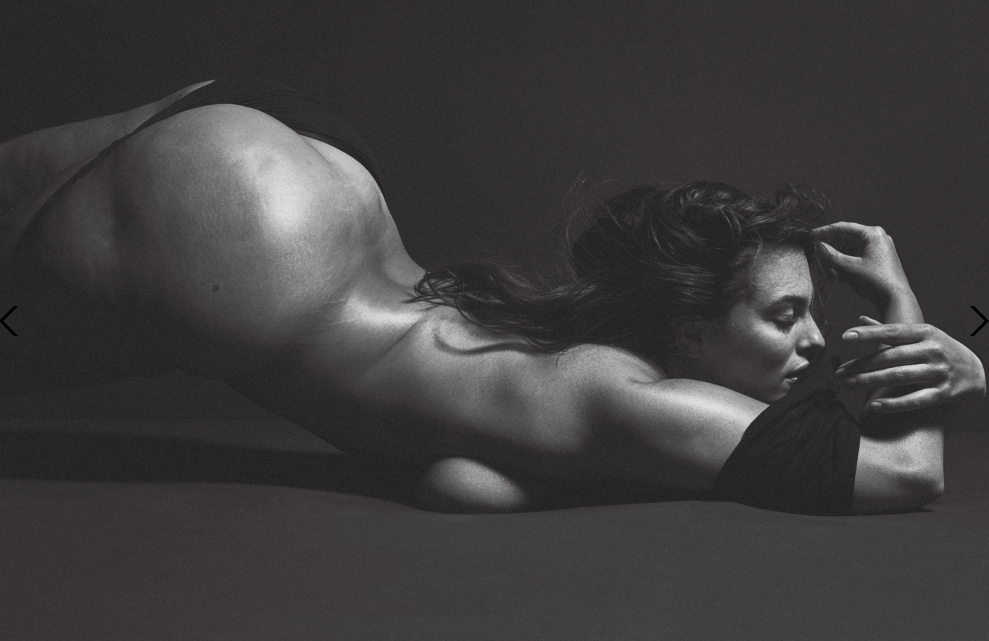
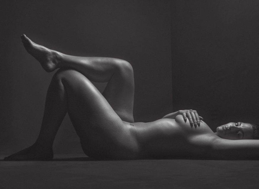
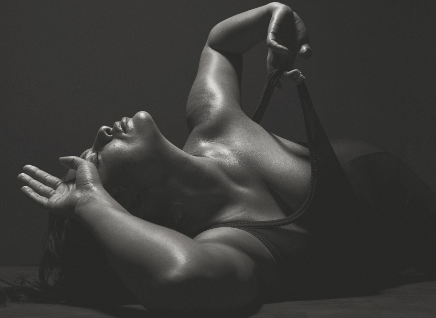
It’s actually funny, but normally I might say that #4 is my next personal favorite from the set, but on reflection I really think it may be more #6 for it’s more classical painterly feeling coupled with that wonderful chiaroscuro lighting and fall-off. Could almost be a Ruben-esque painting…
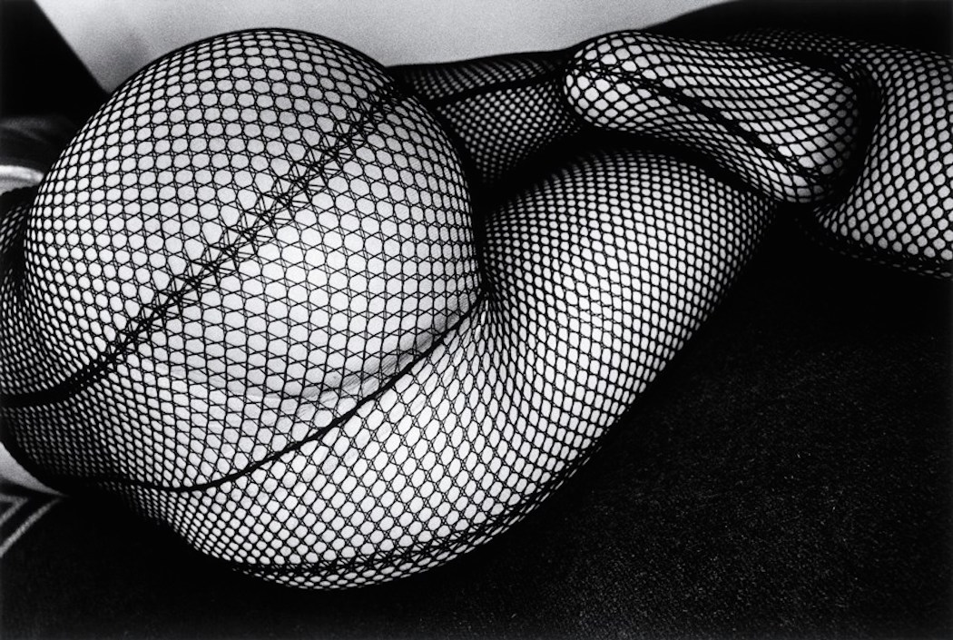
(#4, while also looking semi-abstract, is slightly edged out by #6 precisely because it’s a view that could be considered more commonplace, though from a better framing, and lacks the contortions in the subject like the pepper or #2.)
Does anyone else have a favorite from the set? Any insight as to why? @Elle which one would you have said was your favorite?
When you shared the first image, its appearance looked strangely familiar. Then I saw the pepper. Oh…! And then I thought of GIMP and its pepper brush.
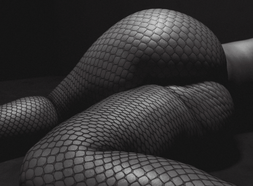
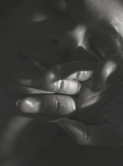
clearly #3 - it’s a sensual pose, even though I am not a fan of that reduced tone-mapping. I still like black to white and feel like grey to grey isn’t enough.
That (very famous) pepper shot has way better contrast. Help me out, those were made on a large format in the 30s or early 40s if I remember things right.
The lowered contrast helps emphasise the soft quality of the work. More blacks and whites would make it all harsh both visually and psychologically. Daido Moriyama did #4 but it feels very different.
I don’t actually like any of those photographs. I’m not a fan of the “twisted pepper” approach to posing and photographing the human body, male or female. Also the tonality is rather dark. The image I was thinking about as “heroic” turns out to not be in that set of images. It might have been from an older fashion shoot of black female models who were actually photographed standing up straight with more or less normal postures and facial expressions.