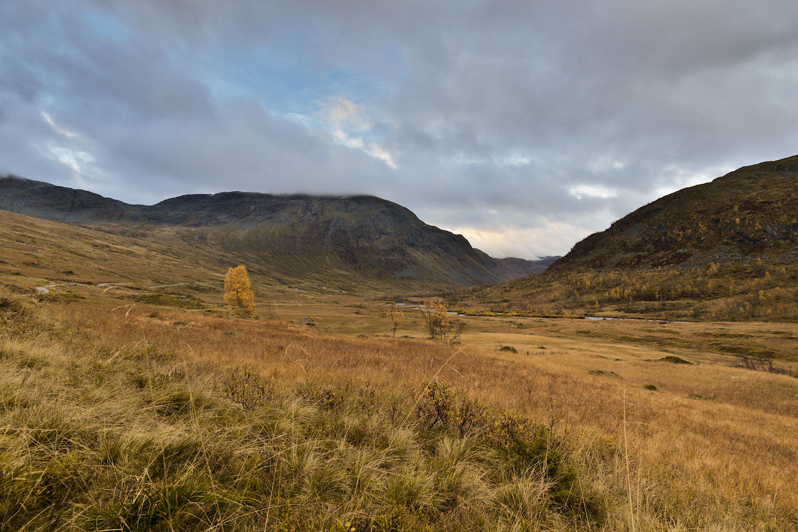
Hi everyone, I’ve been working with Darktable for a while, but I’m always unsure how to edit my images. I want to improve and increase my ability to analyze images and edit them accordingly. I am happy to receive criticism and am also looking forward to your edits and suggestions! Here I have a picture from our vacation in Norway, autumn 2023:
Yes, the colors were very intense and bright. The light kept changing because it was alternately raining and then brightening up again. It was precisely this lighting mood that prompted me to take this photo.
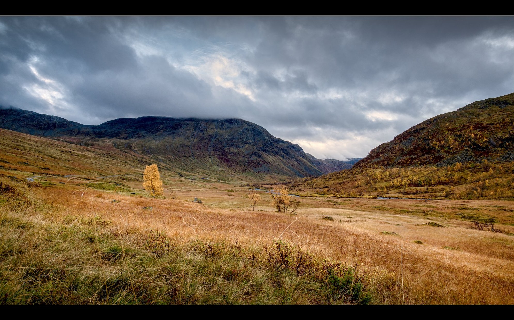
I also like @age’s processing - the colors are nice and soft and balanced. The orange of the meadow should glow a bit more; I would now pull it up a bit more with a mask and the Exposure module.
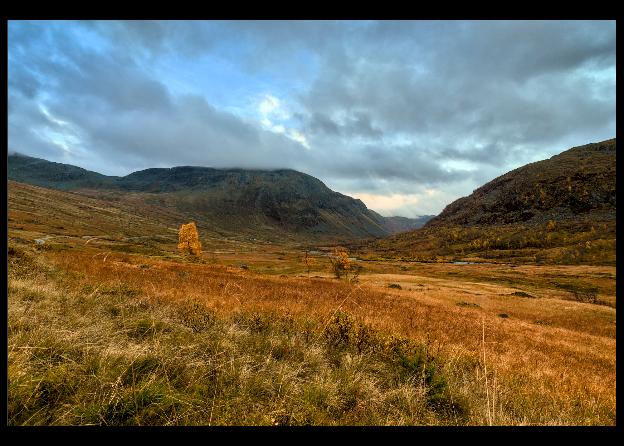
I actually ran into some issues with this that I’m not sure about. I have a drawn mask to bring up the brightness in the foreground with color balance RGB. In the clouds just above the lowest part of the horizon there’s some highlights that were getting affected even though they are outside the boundary of the mask. The feathering is clearly expanding the mask beyond the outer ring of the path. I guess I assumed that outer line was a hard cutoff for the mask, as I’ve never noticed the mask overlay showing outside that line.
Turn on the mask display to check.
Also, if you use mask refinement, that may extend the mask if it finds some surface extends beyond the set boundaries.
If you need more explanation, please open a new thread, let’s not sidetrack this one.
Wow! I so love the range on the left, seemingly like an ocean wave about to break into the valley! A magnificent capture, and - as mentioned previously in this thread - with so many possibilities! Thanks for the play
Your edits are lively and all in all very nice. The foreground on both edits are nearly identical. The skys are very different. The second version of the sky is in my opinion much better. The first one looks like on an aquarelle. Many structures got lost. That doesn’t count for the second version. Anyway the saturation of the second version of the sky is less fitting to the foreground.
The foreground has only one little flaw. I like the liveliness and that it is contrasty. The problem is, that the shadows are changing very quickly into black. Don’t get me wrong. Shadows have to be black and the rate of contrast is right. It’s just the smoothness of transition.
So in my opinion, you don’t have to do much. Take your second version, make the decision, if you want to give the sky more saturation or desaturate the foreground a little bit. Then make the transitions towards black a little bit smoother and you got a brilliant render.
Did you also use the general mask feathering which can do that…the outer feather of the mask is a sort of fade to zero but the feathering slider is an edge aware setting and you need to check it with the mask overlay to be sure…using feathering and bumping the mask contrast usually makes it hug the edges where as more opacity in the mask opacity (not the module) and less contrast will make the mask reach out more…