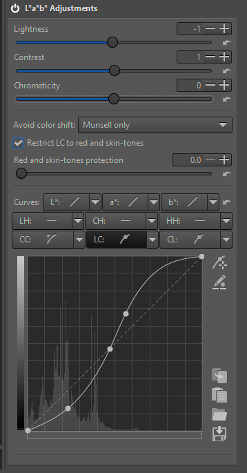
these days i found the L* a* b* - functions very useful and increased my working process to use the curves.
What puzzles me, is the background histogram for CC and LC. Both are covering only 30% of the available space, and indeed, tackling the curves above 30% there is no effect on the picture.
Would be great ot have the full range for better detailled results, isnt it?
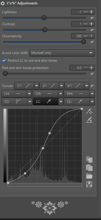
The x-axis is chroma or saturation…not sure of RT calculations but if you don’t have saturated pixels 100% then is will be less than full scale… move the saturation slider and you will see it expand…
thanks @priort , technically you’re correct, but doing so, this alreday will have a huge effect to the picture. My aim is not to spread a histogram, but to do an subtle edit to the picture, at best by the help of a (well visible) histogram.
Ya I was only commenting on what is mapped and why it looks that way not any sort of editing strategy…The less saturated the pixels in the overall image the narrower it’s going to be. if you go negative and basically desaturated the image the graph will disappear all together…
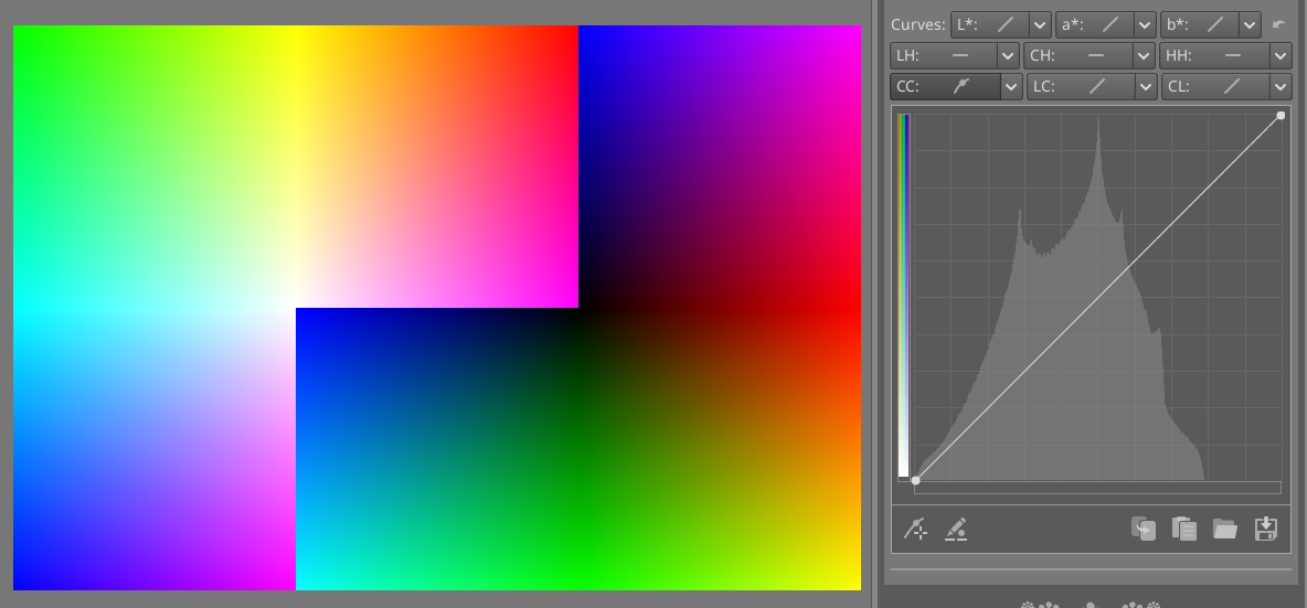
The problem is that the range for chroma is huge in the curves. For most pictures, chroma values are relatively small, and that makes it harder to use. For images of flowers or LED lights, the range becomes more useful.
Here’s how the histogram looks for the most saturated sRGB colors. It covers roughly 80% of the curves.
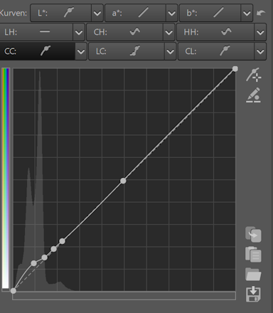
Automatically scaling the x-axis to the image can be problematic in multiple ways. It makes the behavior erratic when copying the pp3 to other images. It’s also hard to scale the axis by a useful amount if there are a couple of pixels with extreme chroma. Maybe a manual scale factor can solve these problems and still be simple enough to use?