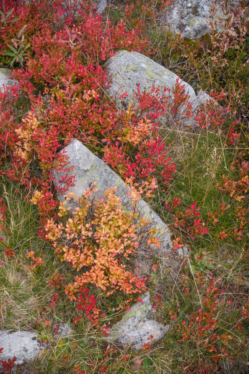
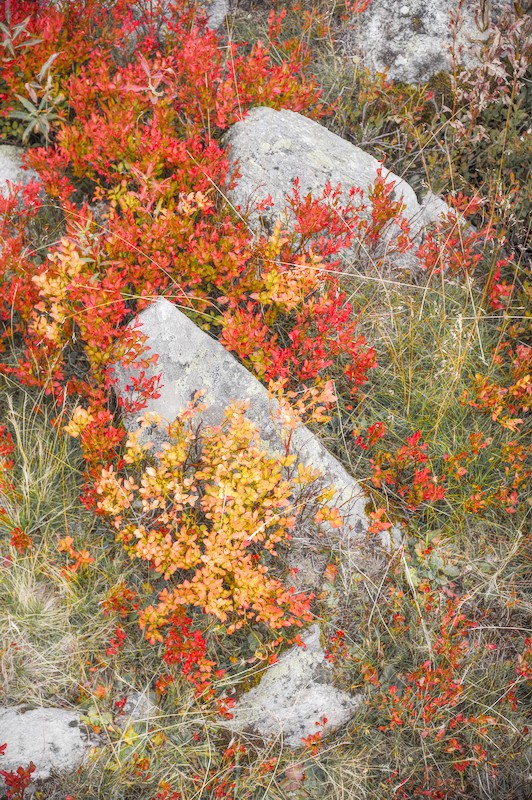
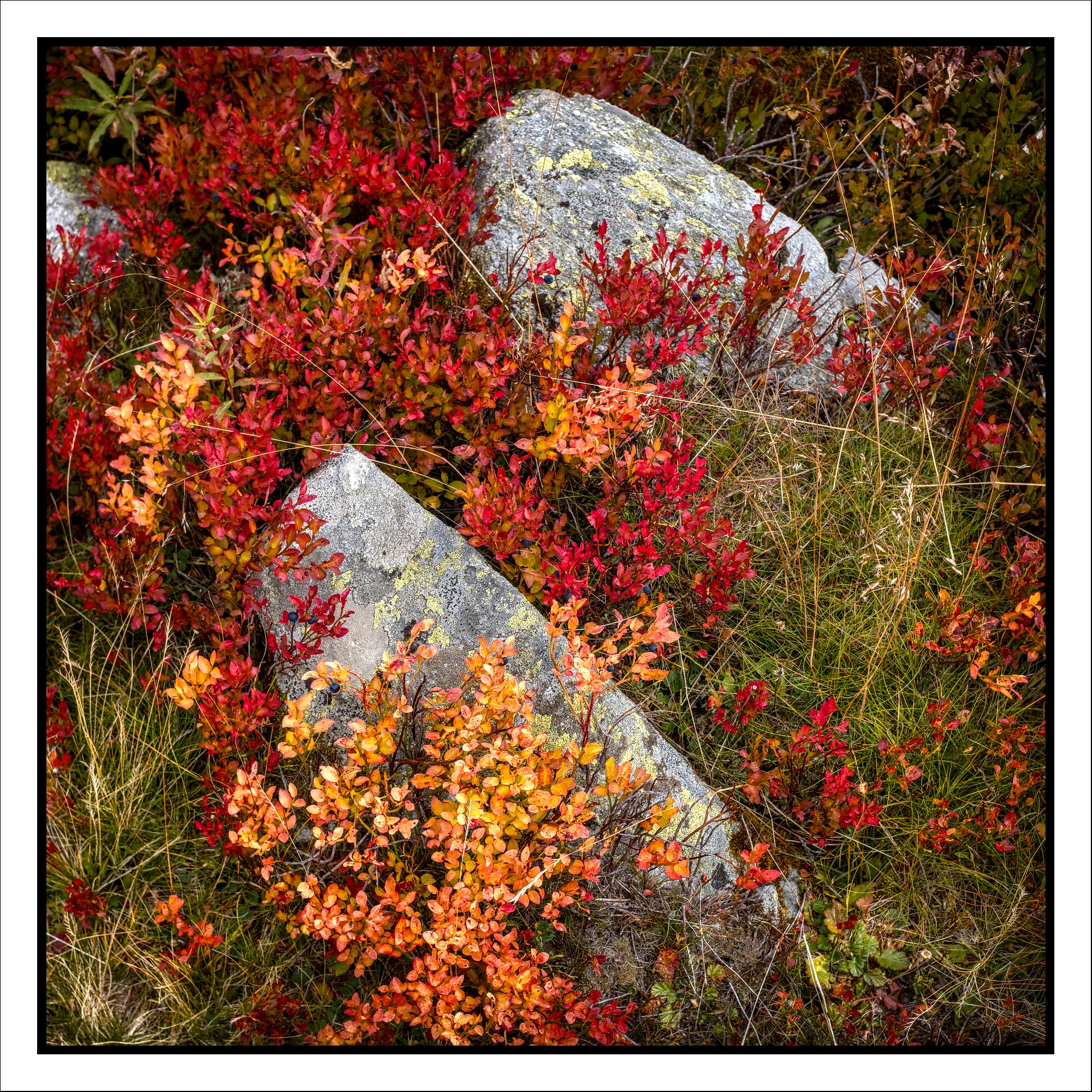
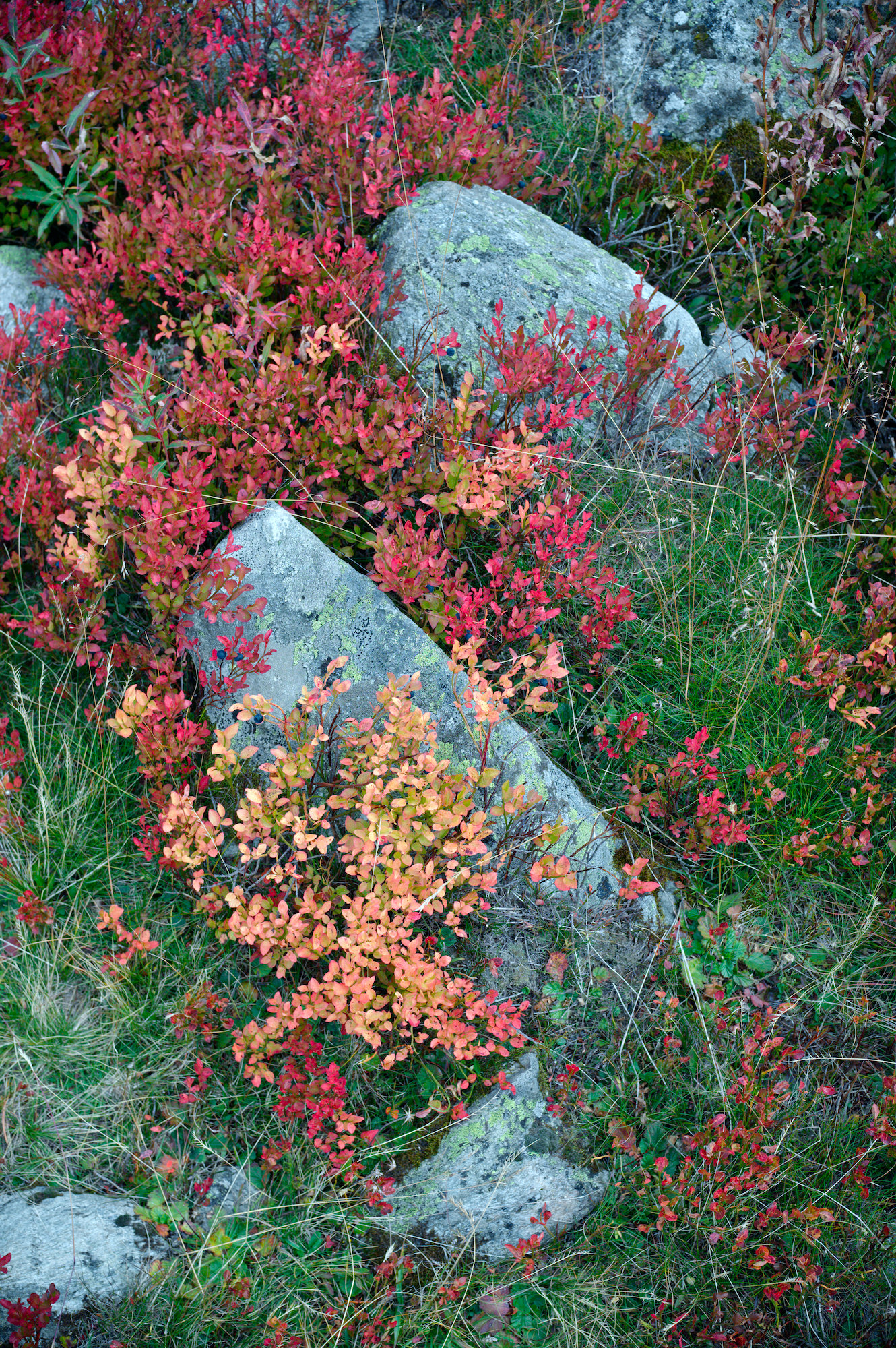
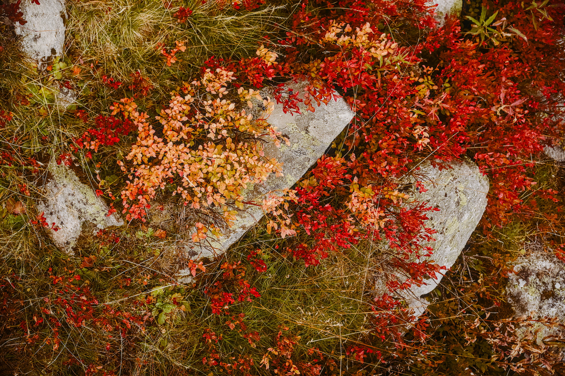
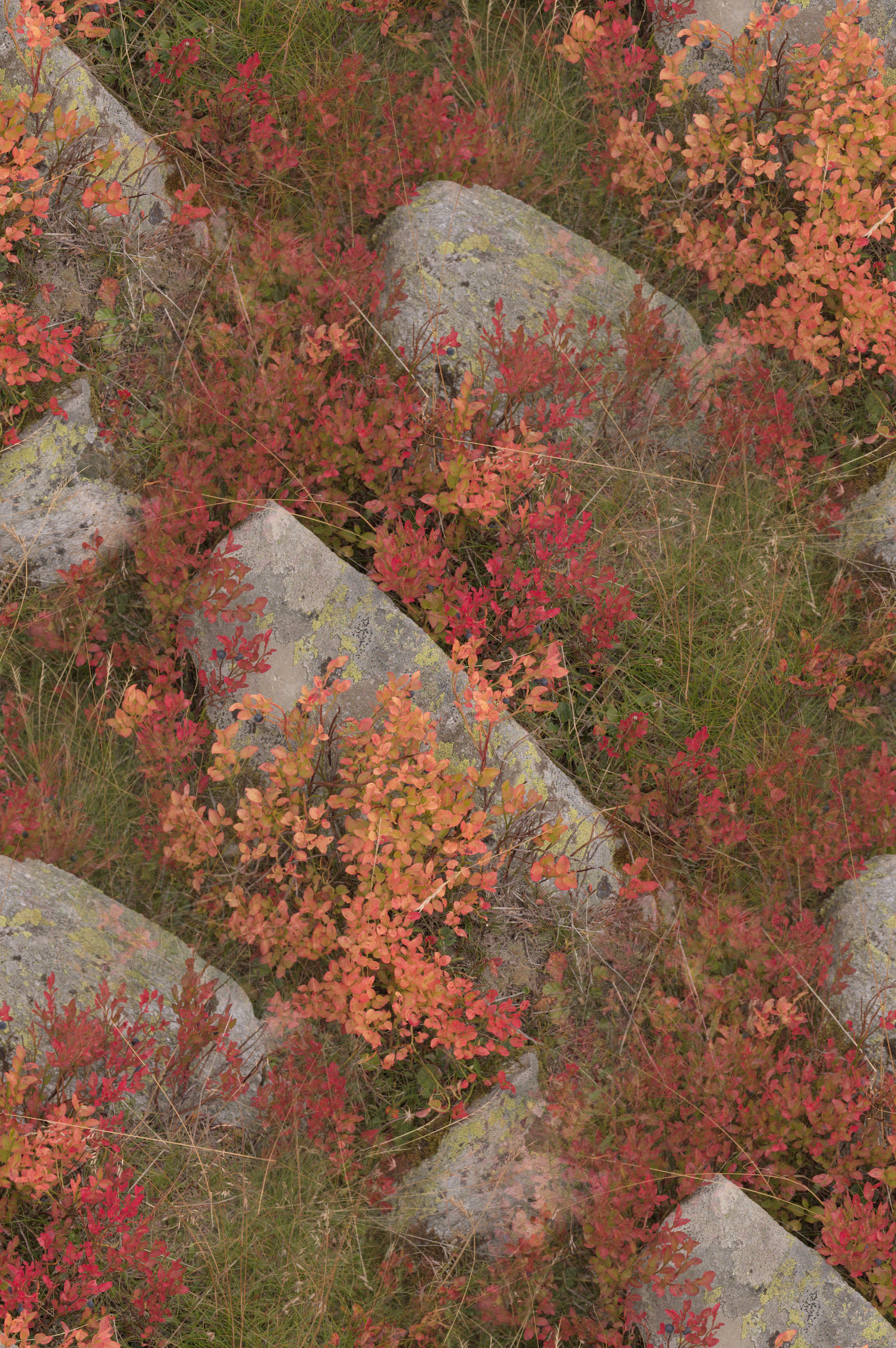
I’ve learned a lot looking at various play raw images here and wanted to contribute too. I have this image of blueberry plants in the Alps and I think it’s a challenging edit: on one hand, the colours of the red and yellow leaves of the blueberry plants as I remember them were extremely strong, so I want to reflect that in the image. On the other hand, it’s tough to make the strong reds stand out without either losing the detail in the leaves, or desaturating the surrounding grass into an unnatural-looking grey.
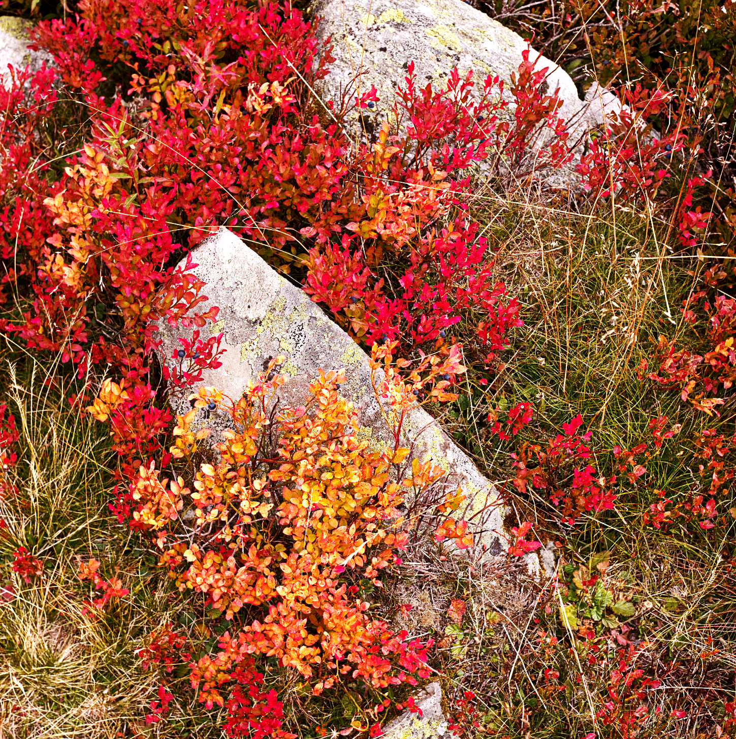
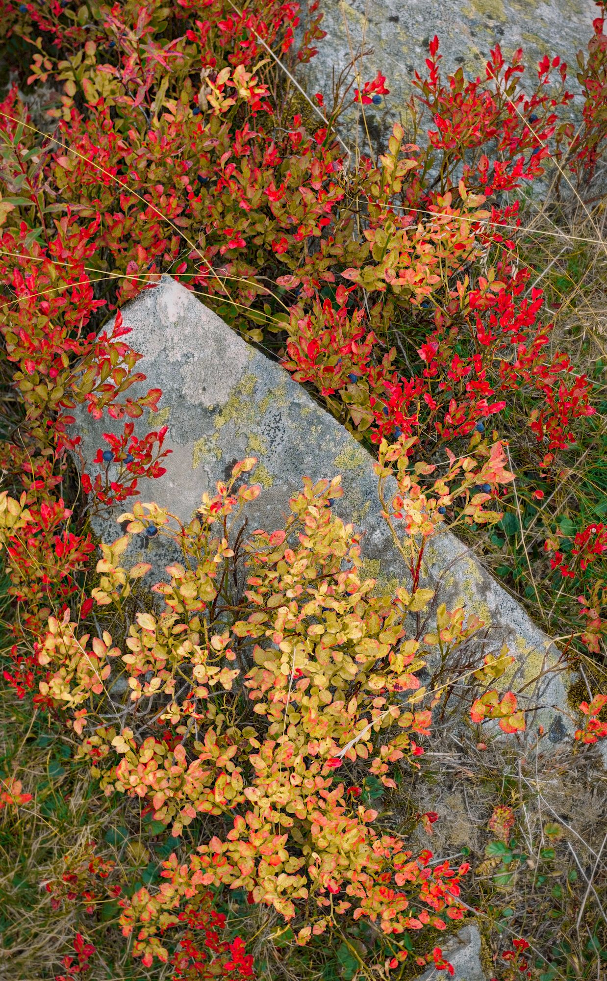
Hi! I’ve had a go getting your saturated reds and yellows. I also tried to accentuate the blueberry fruits too. I do hope I’m getting the right detail with some of my module usage. (colour contrast might just be a little much?)
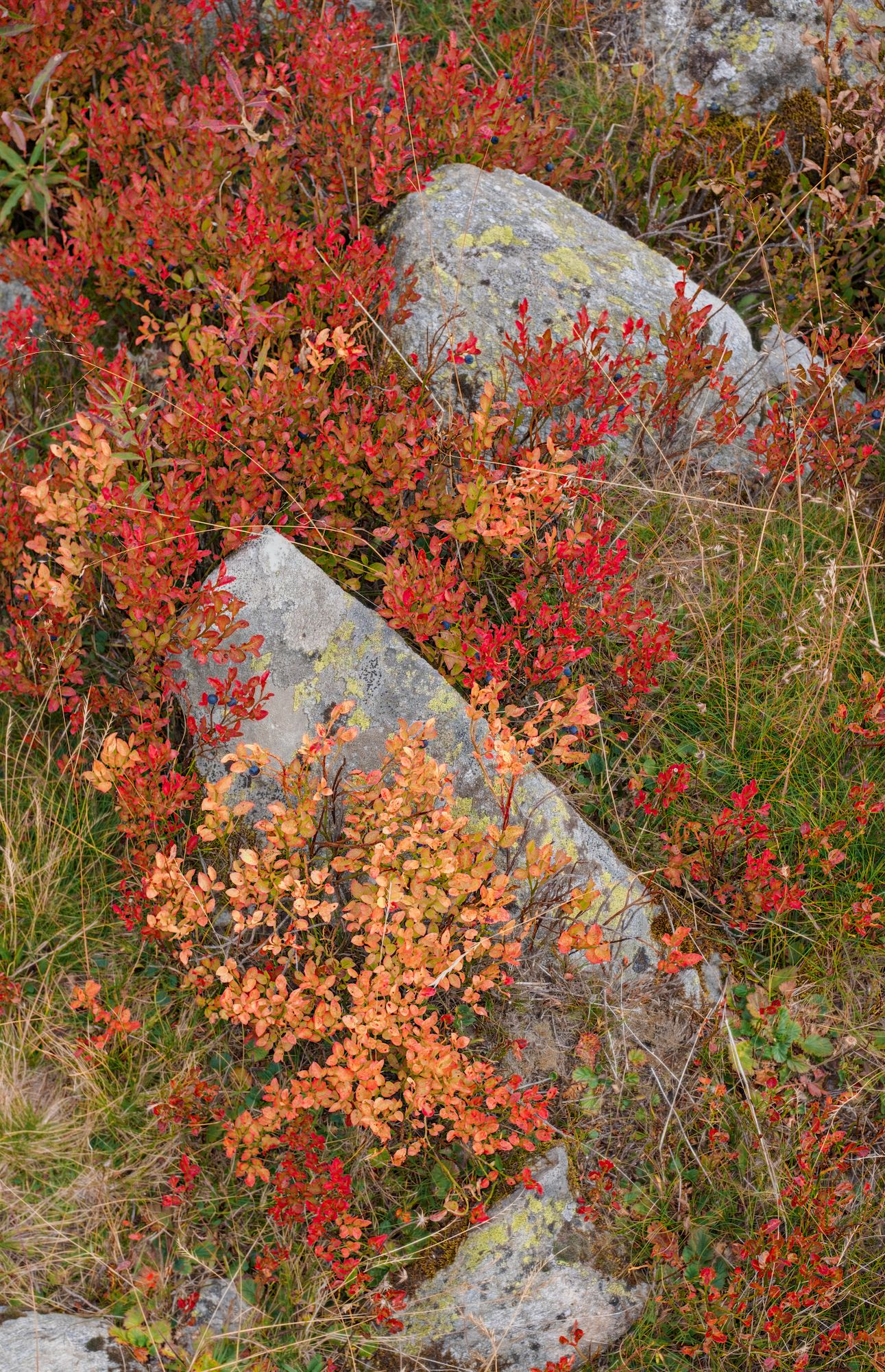
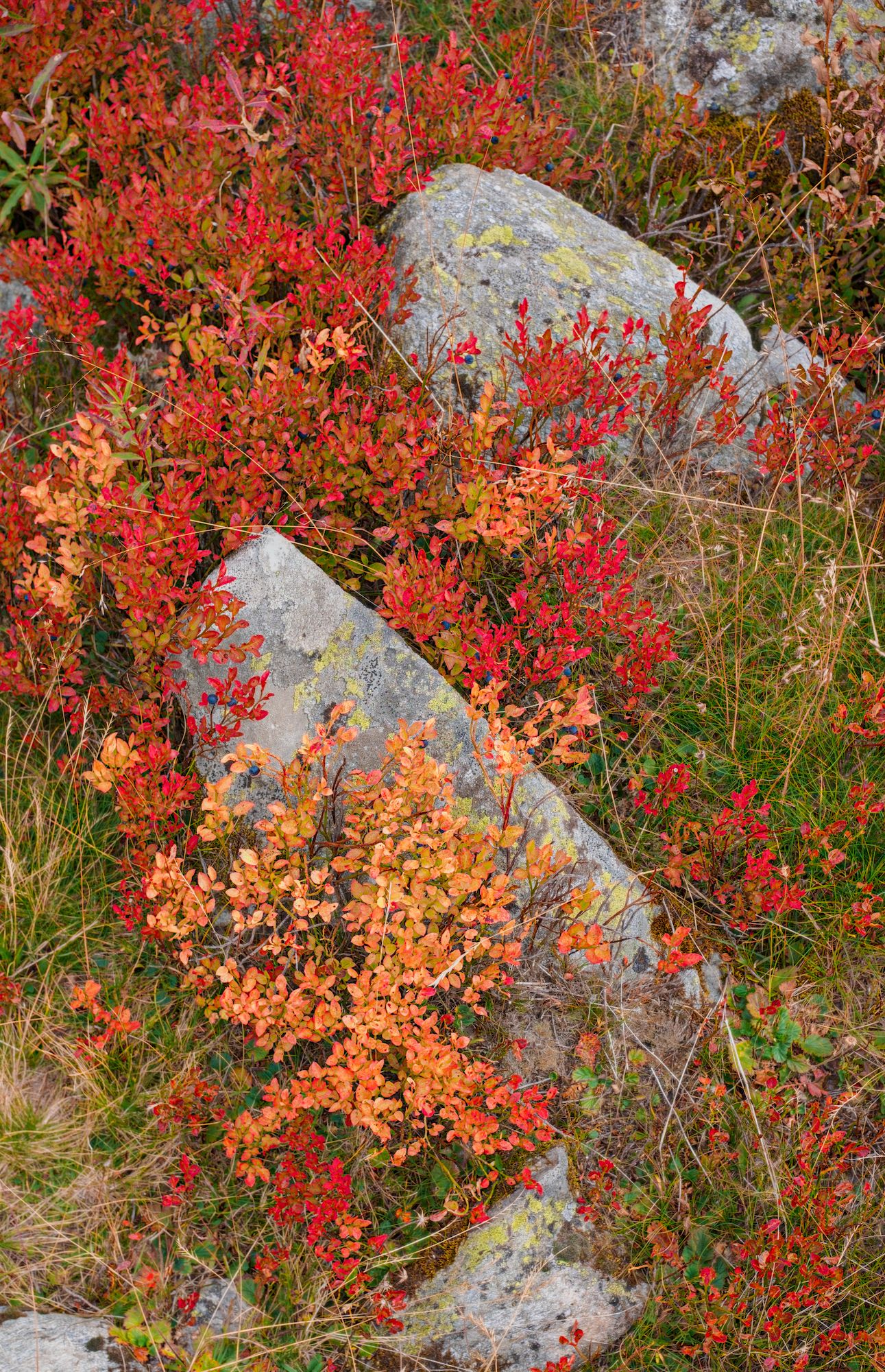
Another thing, my screen has stronger reds than sRGB, it’s far closer to P3. I’ve attached two jpegs, one has a P3 embedded profile, and the other is sRGB. The xmp has one copy of AgX for each set of primaries, and you can switch between the copies.
My reds are pretty much like yours, but the greens are greener. Part of that is from cheating with color balance rgb and the other part is from changing white balance to “as shot”, though I’m still not sure how the different modes interact with color calibration.
Edit: now I see my reds aren’t as red as yours, which is a kind of failure, but the point is that the greens can be made greener with color equalizer, and the reds can be changed however you want with a mask on the hz channel.
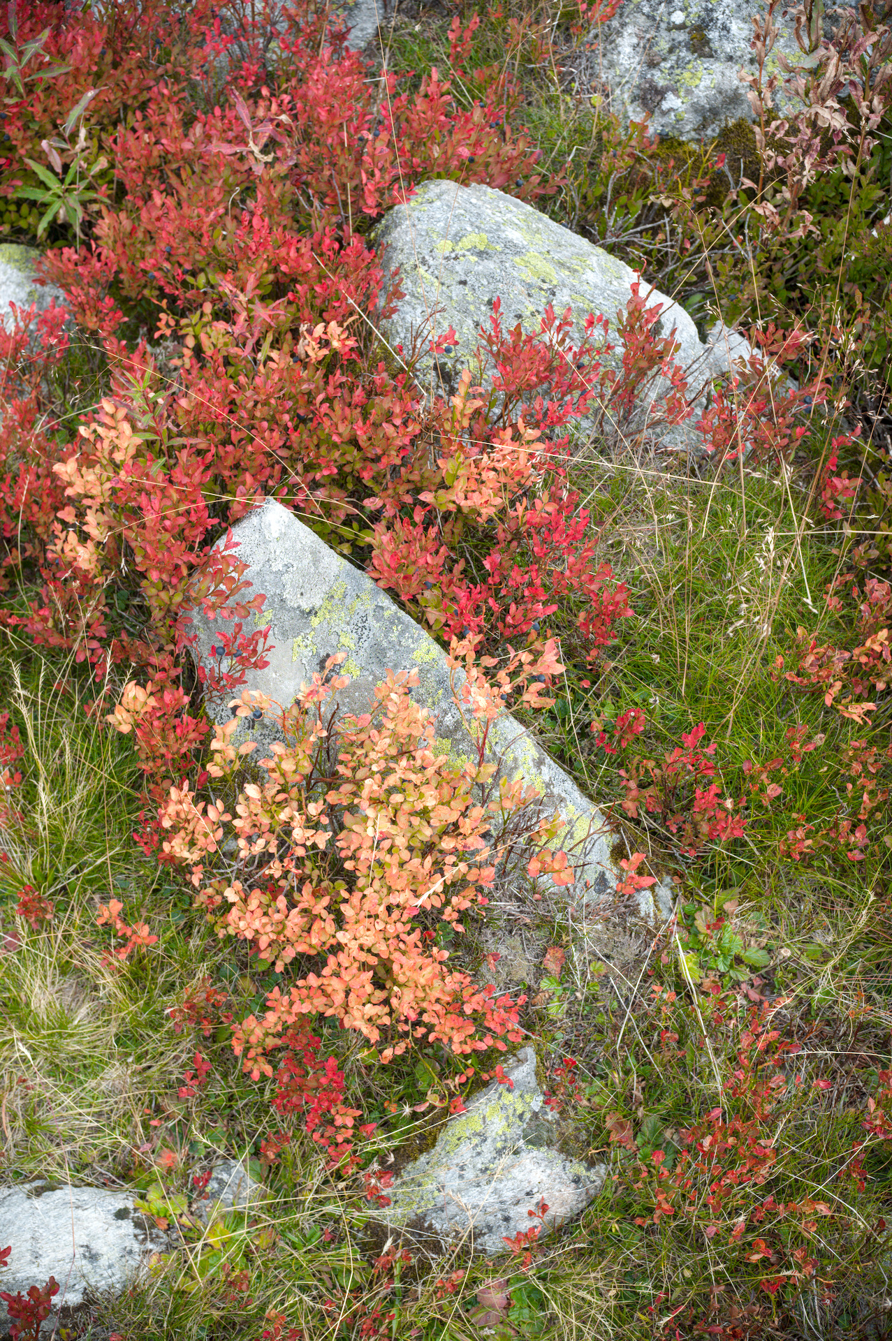
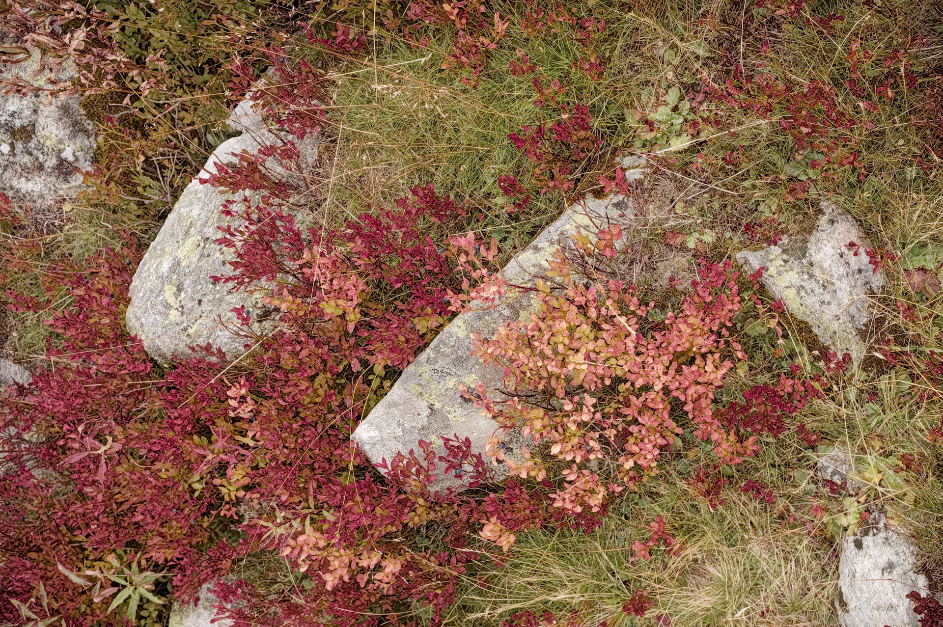
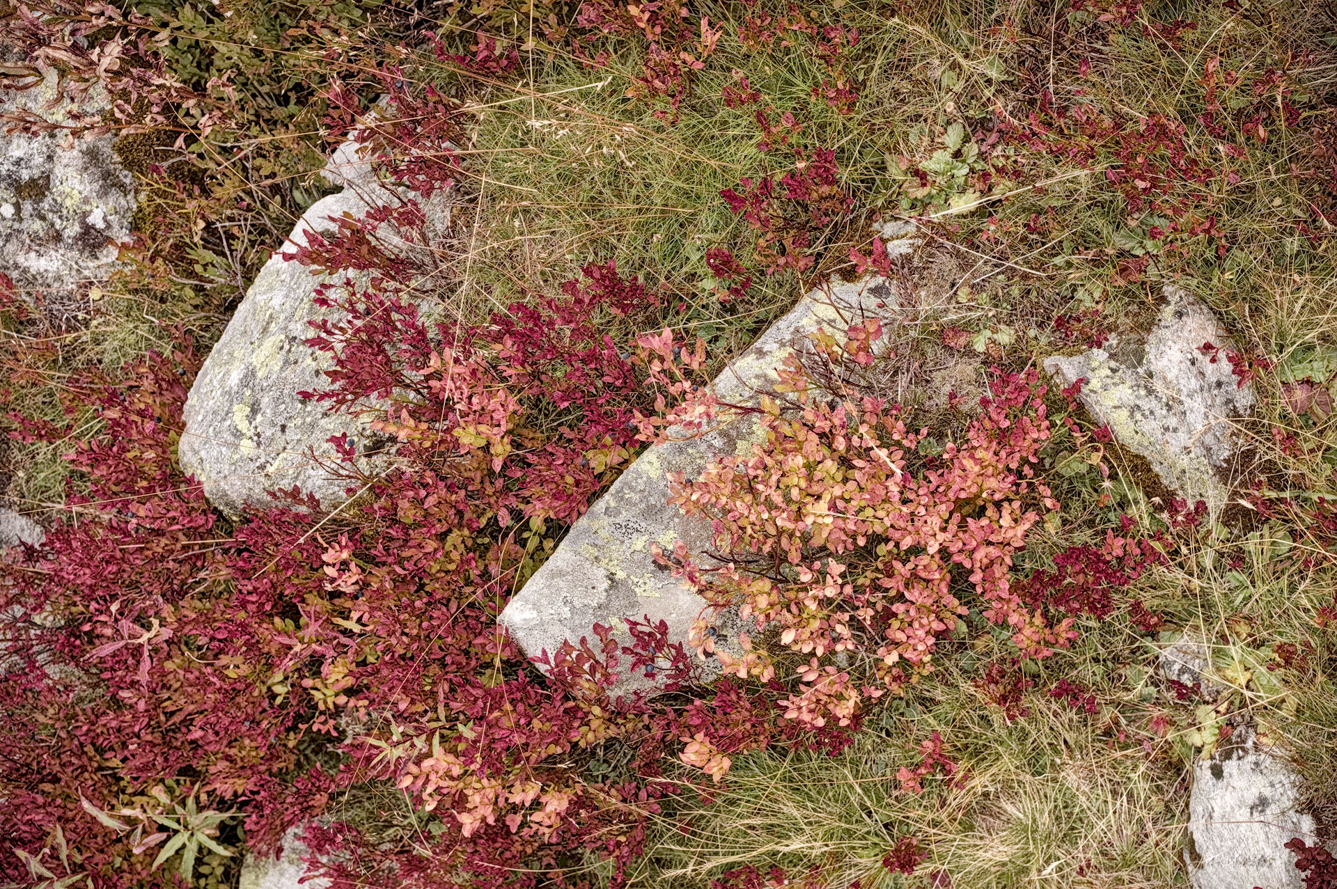
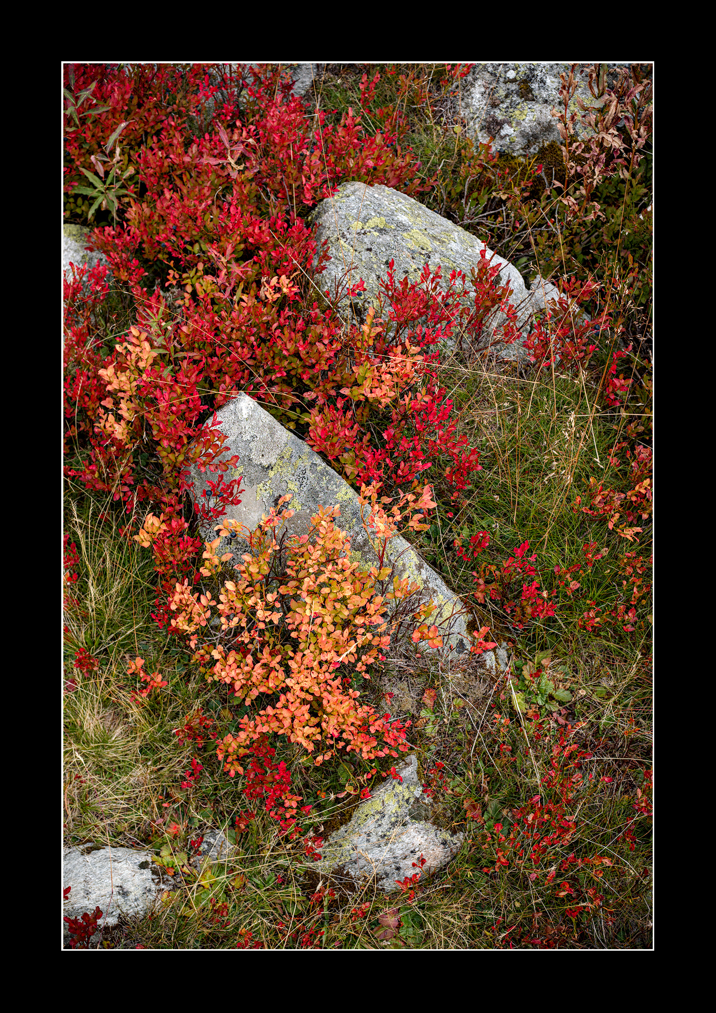
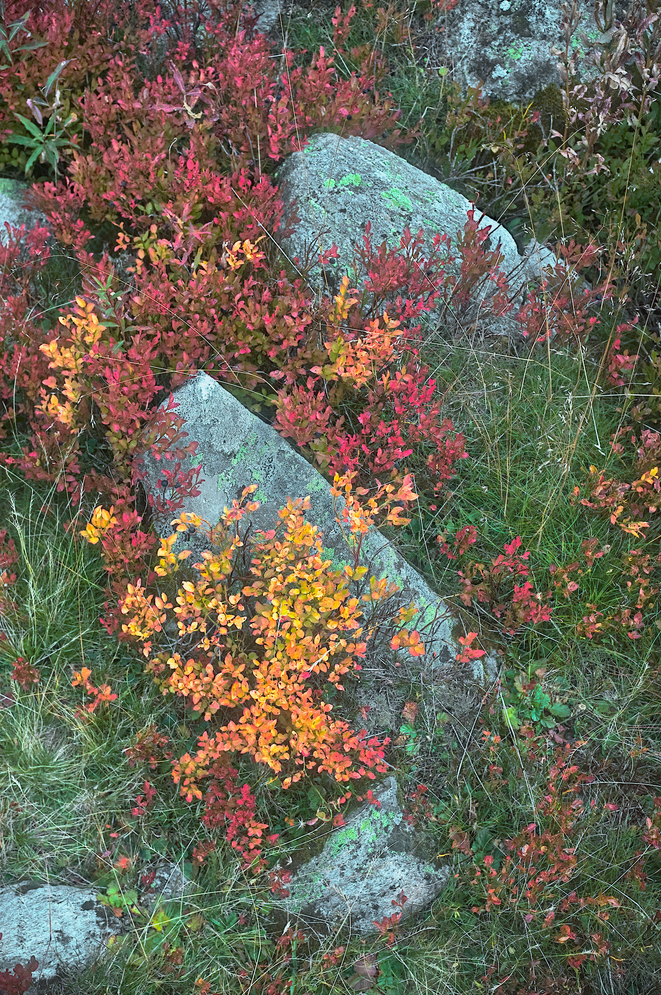
Here’s my own attempt to get this right. Most of the work is done via the colour zones module and the (masked) colour balance module for targetted saturation boost.
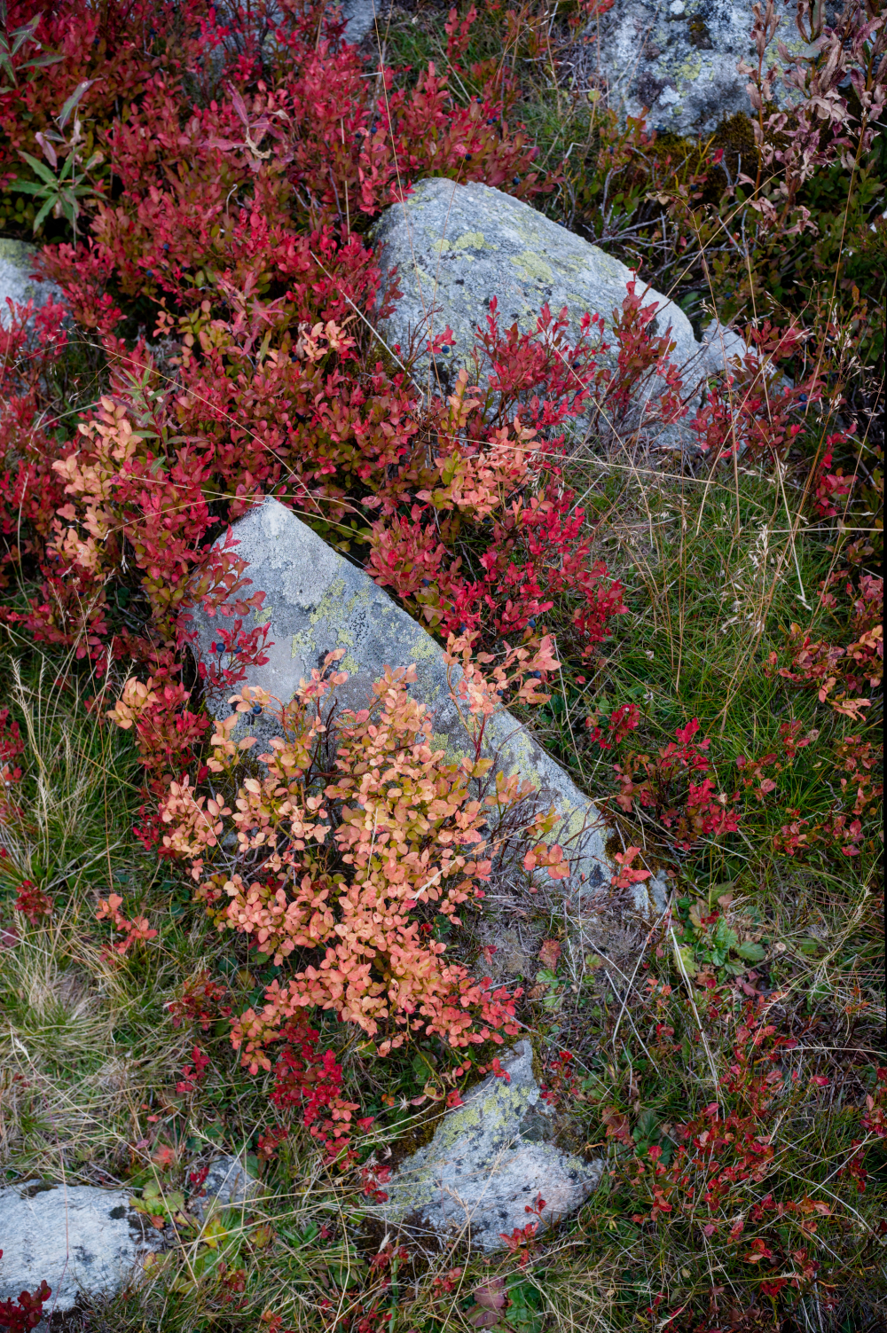
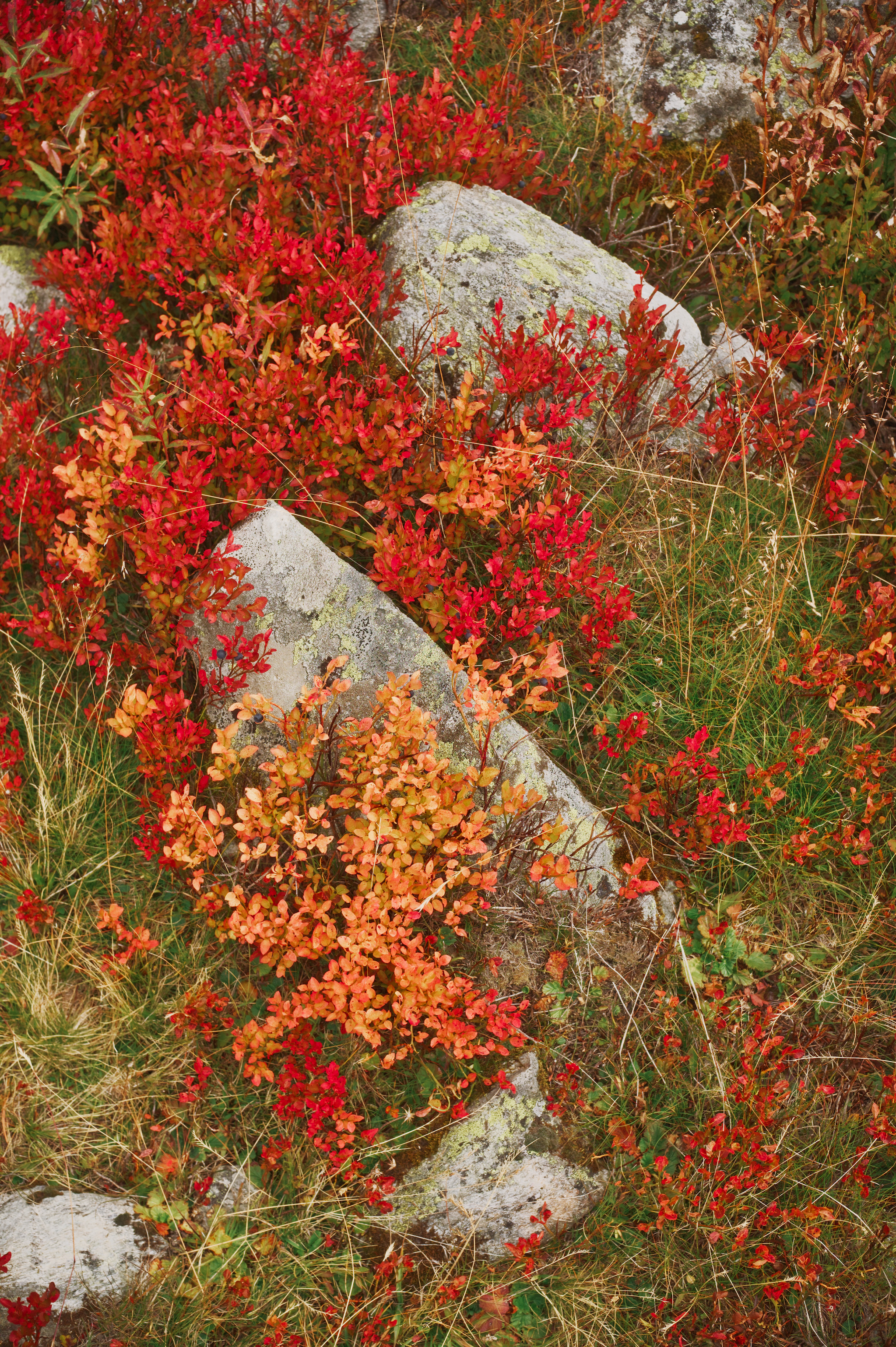
Here is my simple edit. because you stated the reds and yellows were strong I used the color zones module to lift the chroma of these warm zones. The color equalizer module works in a similar fashion as well. I may or may not have added too much texture to the image as I tried to emphasise this as well.
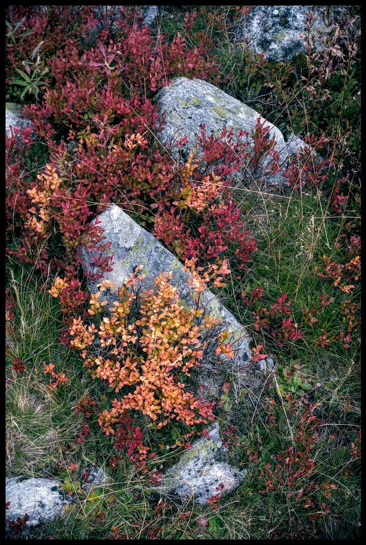
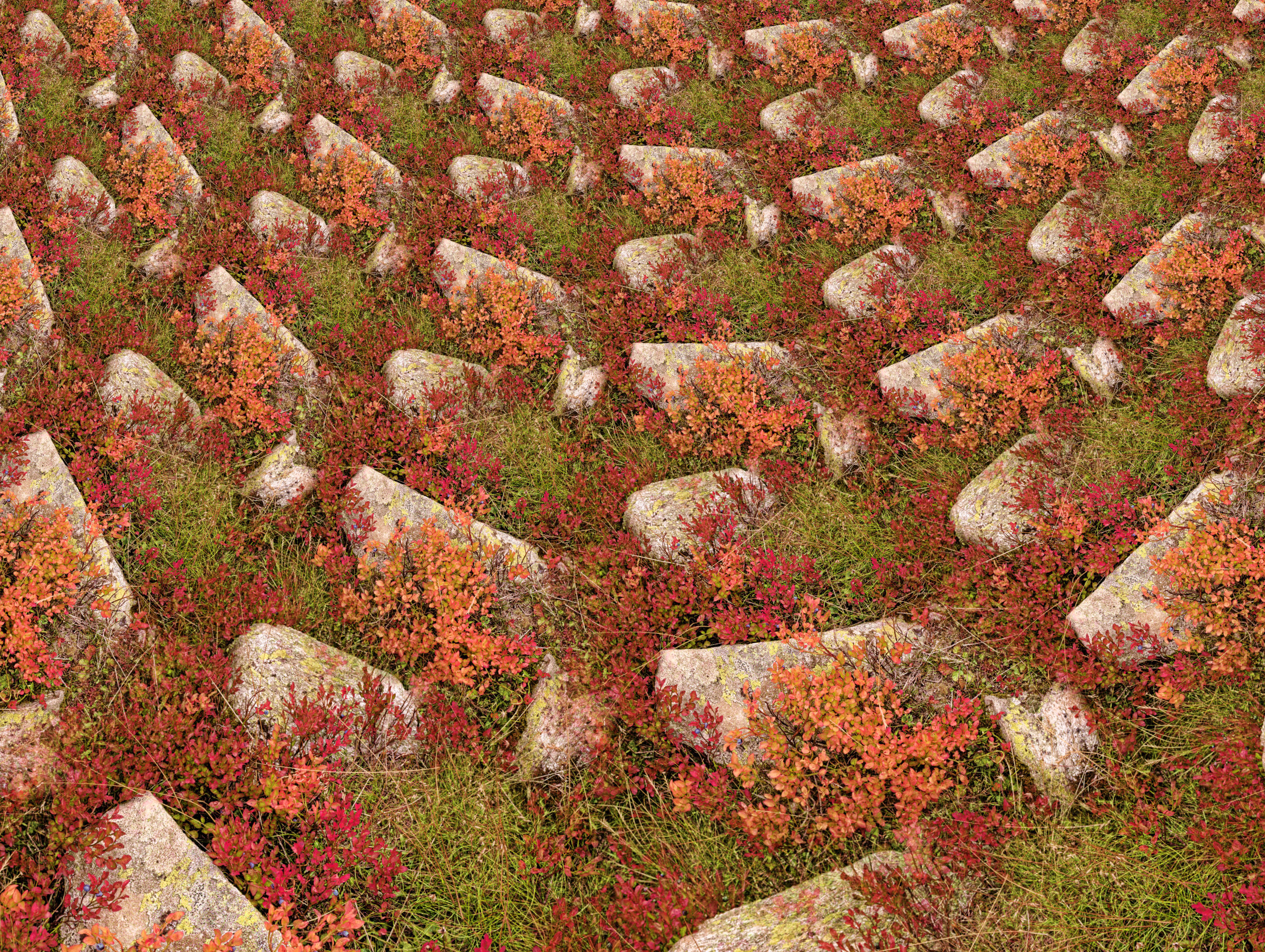
My try . The picture is great by itself, Just played around a bit, brightening the reds and working slightly on the greens. One thing I am not sure, the picture looks inverted because the stones seems to be hanging. Haven’t tried to modify it on that front
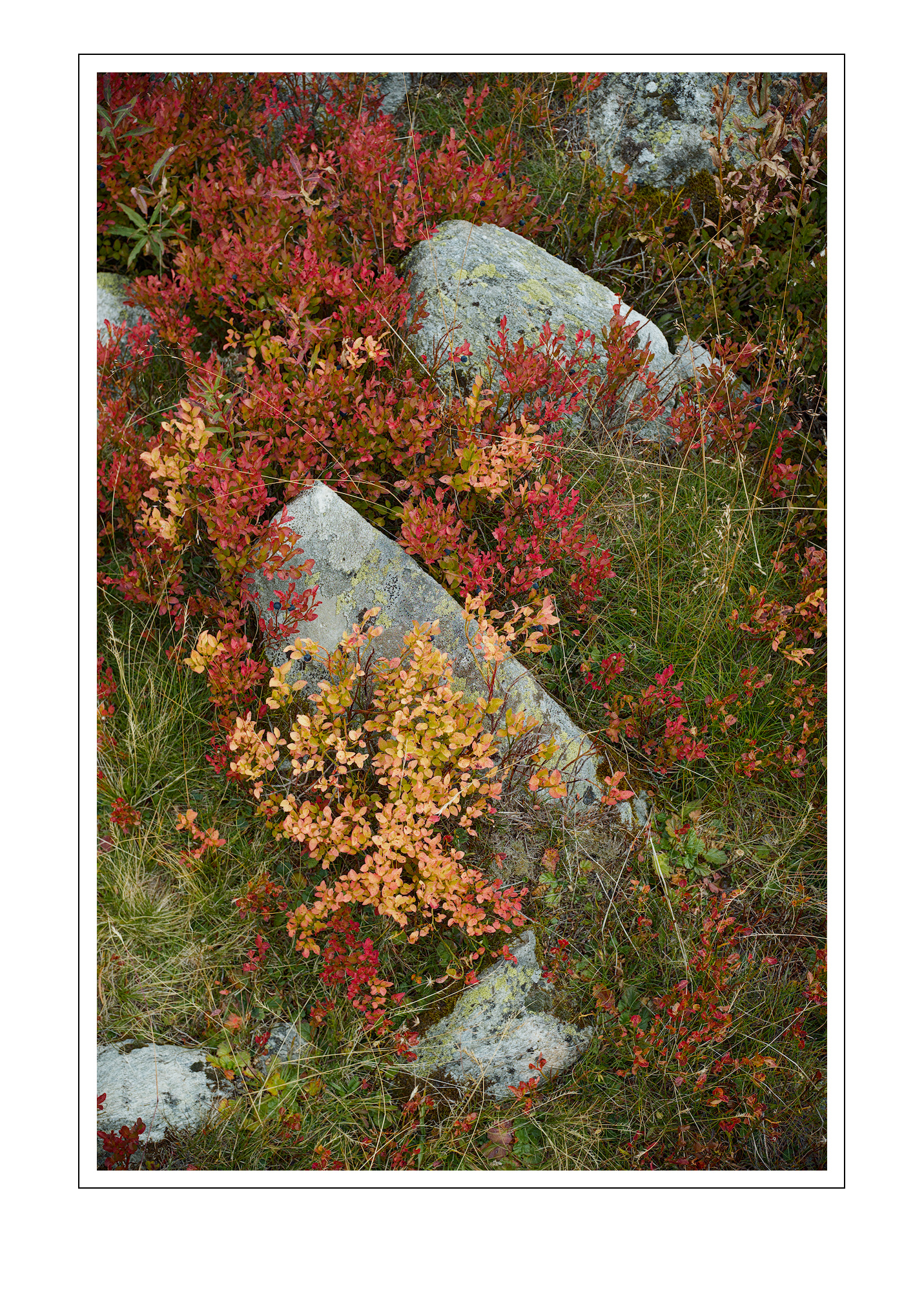
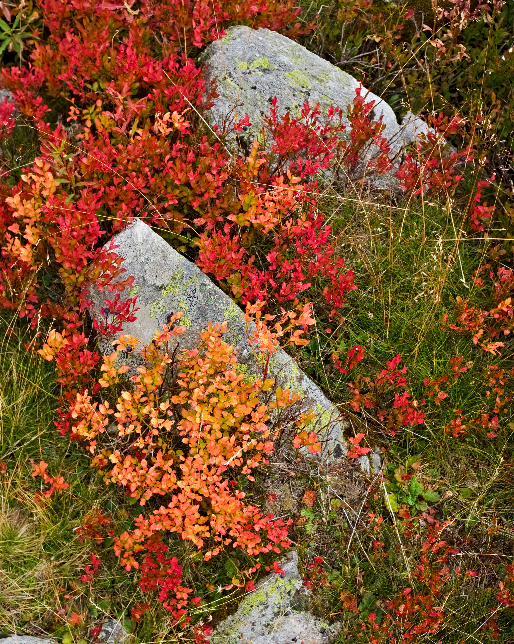
I wanted to give this a bit more effort (‘yellower’ yellow leaves and more pure red leaves and different overall colour balance), so I’ve gone in with the colour picker and rgb curve and colour zones. colour picker is getting up to 255 red in DT, but I think the downsampling on export to jpeg has lowered those a little.