For a physicist, Lab is nice to describe colors we see. For a photographer, it is not nice to apply transformations.
We (and camera sensors) see a trichromatic signal (from 3 different cells, in the eye) and the brain recomposes the lightness by mixing RGB channels. Applying the same transfer function on the 3 RGB channels will actually affect the lightness and the color saturation, but in a “natural way” (for the eye) because the lightness is only a side-effect of the trichromatic manipulation.
In Lab space, the lightness is fully separated from the colors, which could seem nice at first, because you control everything, but will actually result in washed-out results because you need do fix the color saturation according to the lightness in the same way the eye behaves. In the Lab modules of dt (for example : tone curves in auto mode), you adjust the L channel transfer function, and the module will make the assumption that the a & b channels should follow the same function, which is silly because it doesn’t take account of the way we percieve color & lightness. So you will either get desaturated or weirdly saturated color saturation.
Lab is great for special effects, such as creating more color separation, due to the way it represents colors : on the a channel, the more green you are, the less magenta you are, same for blue/yellow on the b channel. So, increasing the contrast in a & b results in more defined colors. But, in portrait, it will just make the spots and blemishes pop out.
90 % of the color, lightness and contrst adjustments should be made (from my taste & experimentations) in RGB, because it’s safe. Once you have got someting natural and good looking, you can run the extra mile in Lab for (delicate) special effects, on separated channels (no auto Lab mode that affects the 3 channels with the same transfer function).
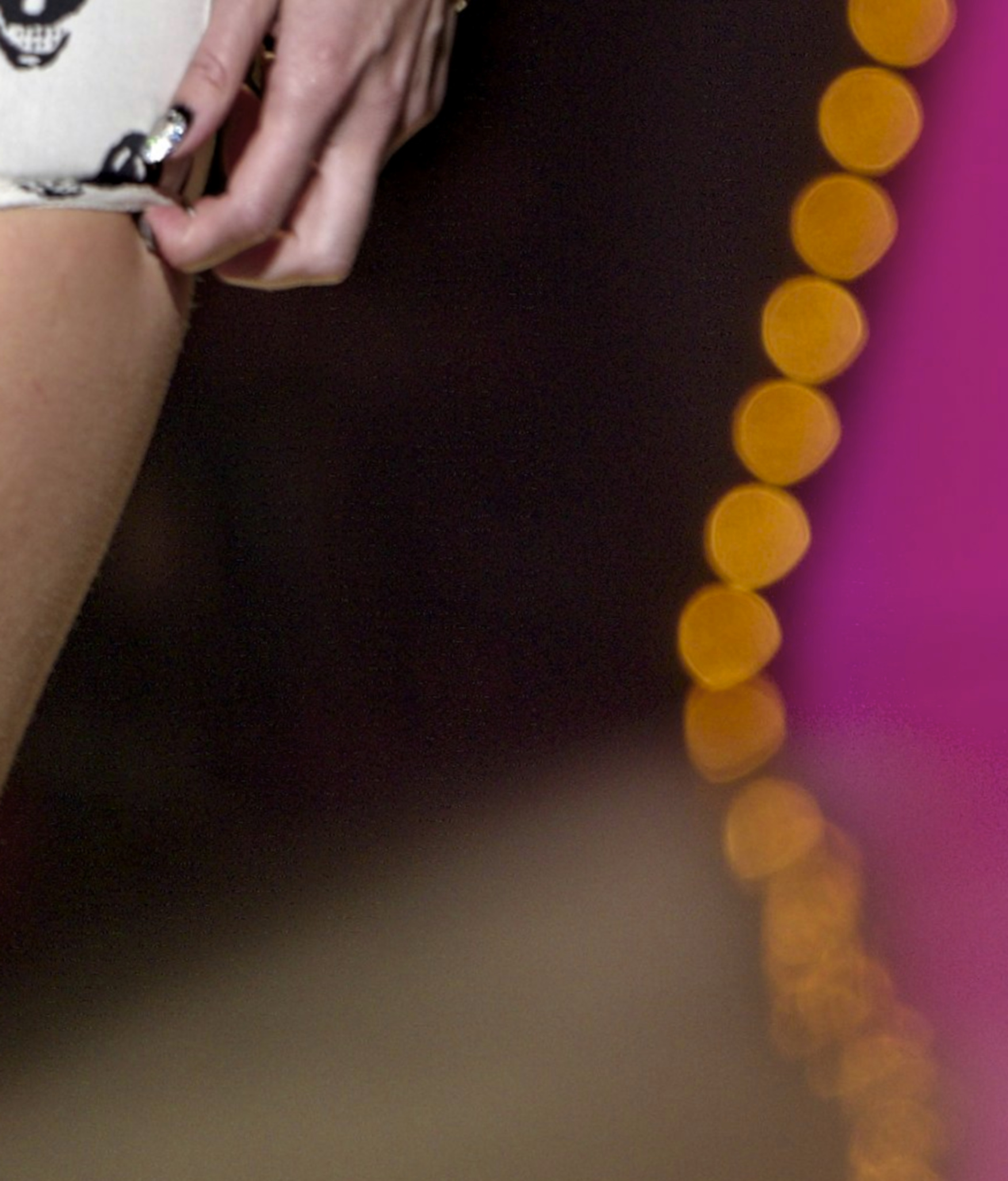
Aaaaah I specifically recovered the deep shadows in the background to bring back the audience. I thought it would add more context and depth to the picture.
It certainly does. But it also distracts somewhat from the model which may not be wanted in fashion photography. Nevertheless, I personally like it (on the left side).
Just the “audience” on the right is for my taste too noisy and the colorful stuff too dominant. That’s why I suggested to change the background.
That may well be. I did this edit on my laptop, which although calibrated, is a little under saturated. Edits from that PC are often a little "colorful" when I watch them later on other displays. But I like playing around with image while sitting on the sofa . Not a good attitude for serious editing …
Had to have a go… RT using new shadows & highlights tool. Then Gimp to tweak, mainly eyes and trying to make left hand tone in better with rest of skin (right hand/wrist untouched, still ruddy).
@chroma_ghost, you are tops, such free thinking!
This is a strange image for me. For one thing, why is the left hand so huge?
I’ve had a few goes at the face colouration and each time I end up with cyan-ish zippy skirt, not white. Presumably it should be white? Now I look at mine again, poor girl’s got 5 o’clock shadow…
Appretiate ur words golden R =)
Yup, the colour difference between the different body parts is personally the most annoying issue, but then we’ve also have “to deal” with the wrong WB, the visual sizing of hands (and seem too close to the body), the very unforgiving shadows (look between her legs, Jesus!!), a good reason to make passarelles light reflectance and slippery, the obnoxious BG and last but not least the attire and accessories. Anyway fashion’s not my cup of tea unless adressed by people like Arnold who knows how to squeeze it / subvert it
Going OT, sorry. In my view Aurelien achieved an almost perfectly balanced base from where start grading; if you for instance look at my version is more “even” and HL respecting but way less appealing and natural looking.
PS
I think it is worth noting that (at least as I experience it) it seems fashion photography freely uses its own documenting medium to express itself (bit tautologic I guess), tweaking, tonning, shading, blasting, subduing, removing, adding, replacing the image’s palette… which can become a contrived fashion / tendency by itself but I can understand how it can also be very rewarding =)
Here is what I could achieve with photoflow, using spot WB, exposure/gamma adjustments, dynamic range compression + tone mapping, and a bit of sharpening:


 a rough try at it