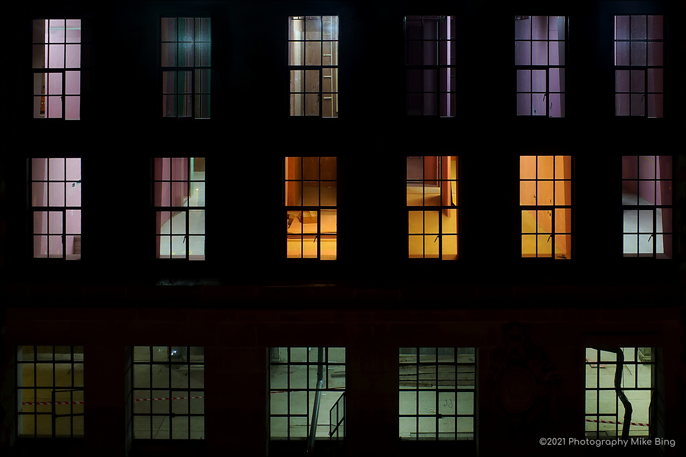
This is an image I shot quite a number of years ago from the window of my London hotel room of the building across the street which was undergoing quite drastic renovation. What caught my eye was that the builders used different colors lighting in the various spaces.
This image was shot in raw (DNG) on the Ricoh GR (16Mp) and I’ve come back to it various times over the past years. With various iterations of software I came closer and closer to the image I had in mind. I now redid it with Darktable, Gimp and GMIC and finally, after all that time, I have reached the image I had in mind.
The result is an almost abstract collection of intensely colored squares on a pitch-black background. The initial symmetry is broken by the last window on the right bottom corner. I almost get drawn in to look into the empty spaces behind the windows, trying to identify what’s going on and why they are lit the way they are.
I have used DT’s awesome perspective correction of course, Gimp’s saturation tools as well as a few small bits of copy paste on windows which had blown-out highlight sections. Finally GMIC for a bit of sharpening. I did use one single non-free tool, NeatImage for Linux, which I still find one of the best at noise-reduction (and a good buy at that).
Update! Shows you what a durp I am…never realized I was losing an entire column of windows due to the cropping after perspective correction. Also, the amount of black around the windows was a bit distracting. So…NEW ATTEMPT!
This time I converted the image in DT without perspective control, resized the canvas to create extra space around the edges of the image on the left and right. Then took it into DT again, this time as a TIFF to apply the automatic perpective correction which left me with an extra column of windows on the left side.
I used liquid resize (in Gimp) twice - once with vertical masks to protect the absolute position of the windows vertically while removing some of the black space between the columns. Next with horizontal masks to do the same for the horizontal spacing. Why separately for either direction? Because I noticed that, when protection-masking the individual windows all at once and then resizing, the windows ended up being placed irregularly.
Finally I literally moved the top left window somewhat to the right so it would line up with its pals in the same column.
I find that retaining all of the windows adds to a more graphic image with better (for lack of a different terminology) “rhythm”.
I actually prefer the middle version, with only 5 columns. As with typography, i think on odd number often works better, and the distortion from the perspective correction seems less distracting there too.
In architecture you usually want an uneven number of openings in a repetitious facade as it allows the entrance to be placed in the center. The greek temples (with one or two execptions I think) had an even number of columns but uneven number of voids.
That tradition and the function of it is I think is one of the reasons five windows seem more natural. A funny quirk of language when you say five columns when in architecture speak it would be six columns. Because columns are the load bearing vertical element not the window.