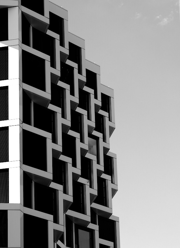
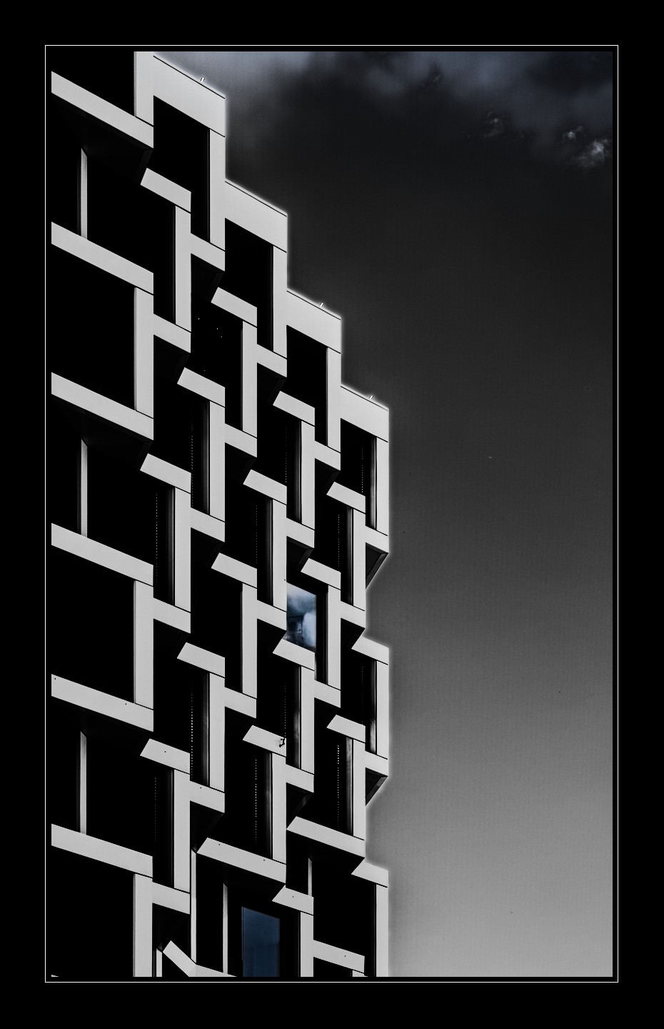
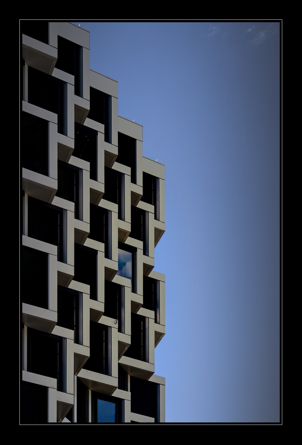
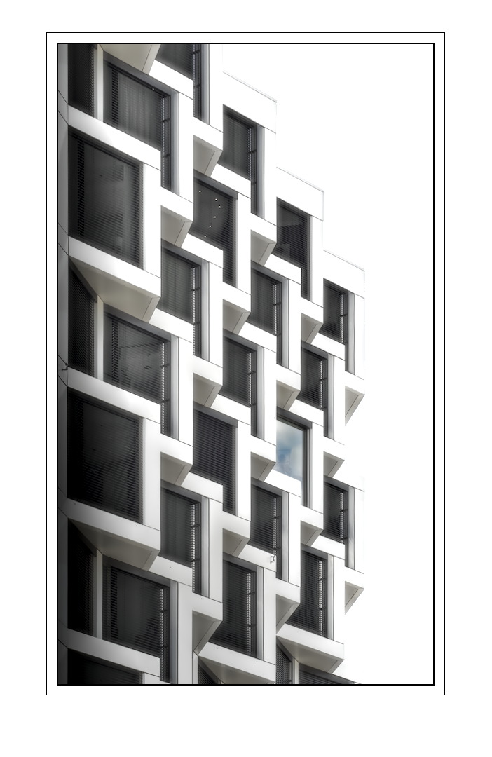
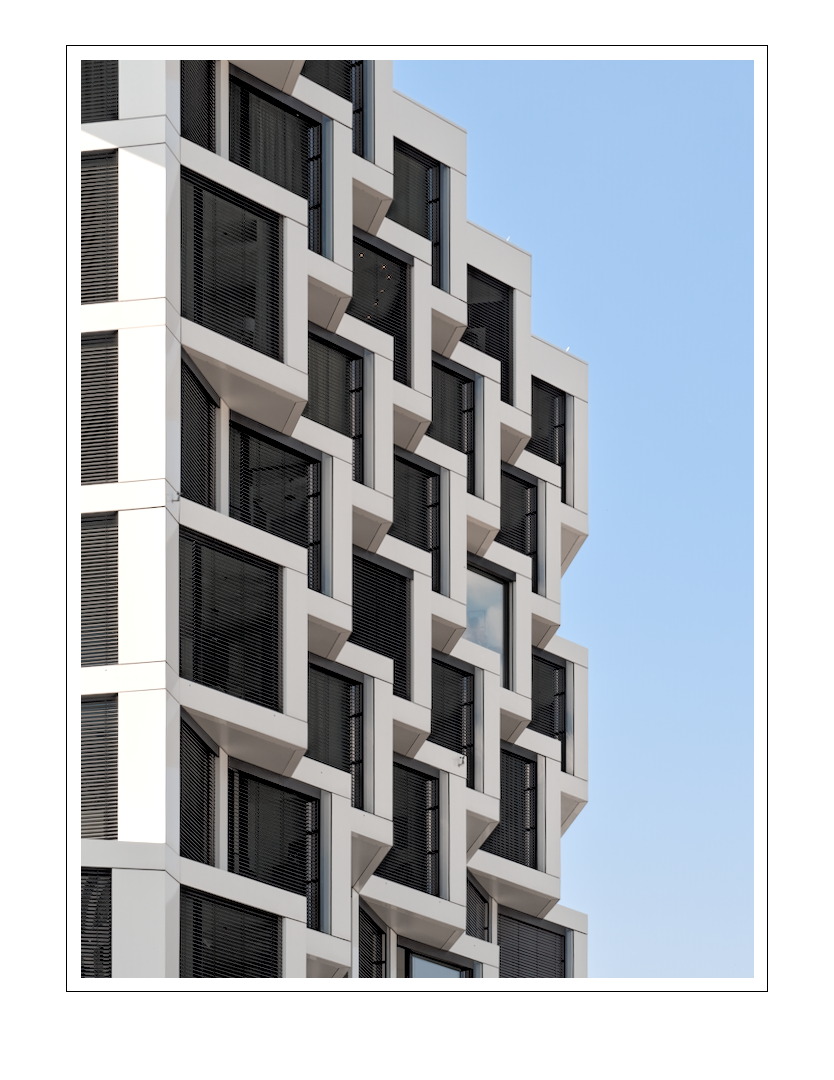
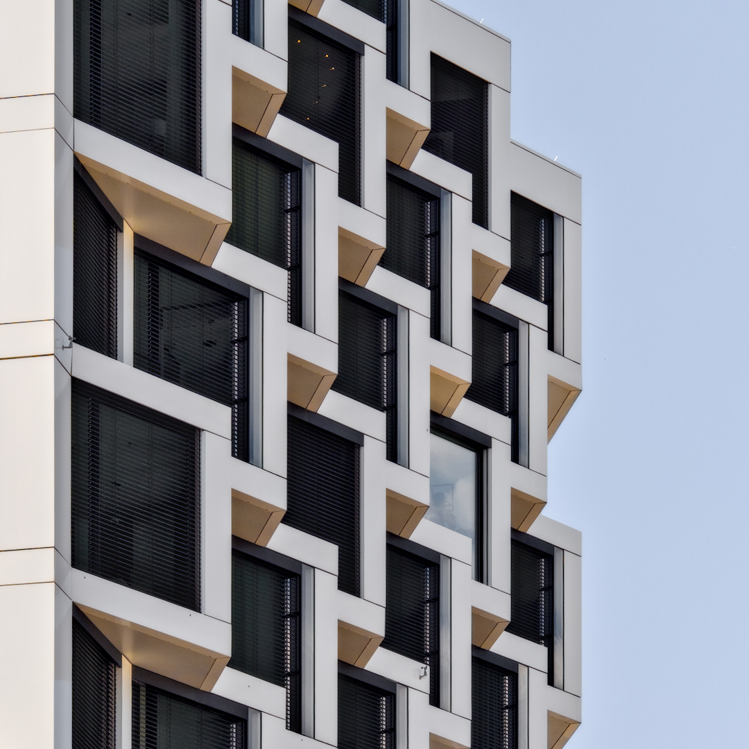
I am not very used to create monochrome images, but this archticture is more or less forcing me to try it 
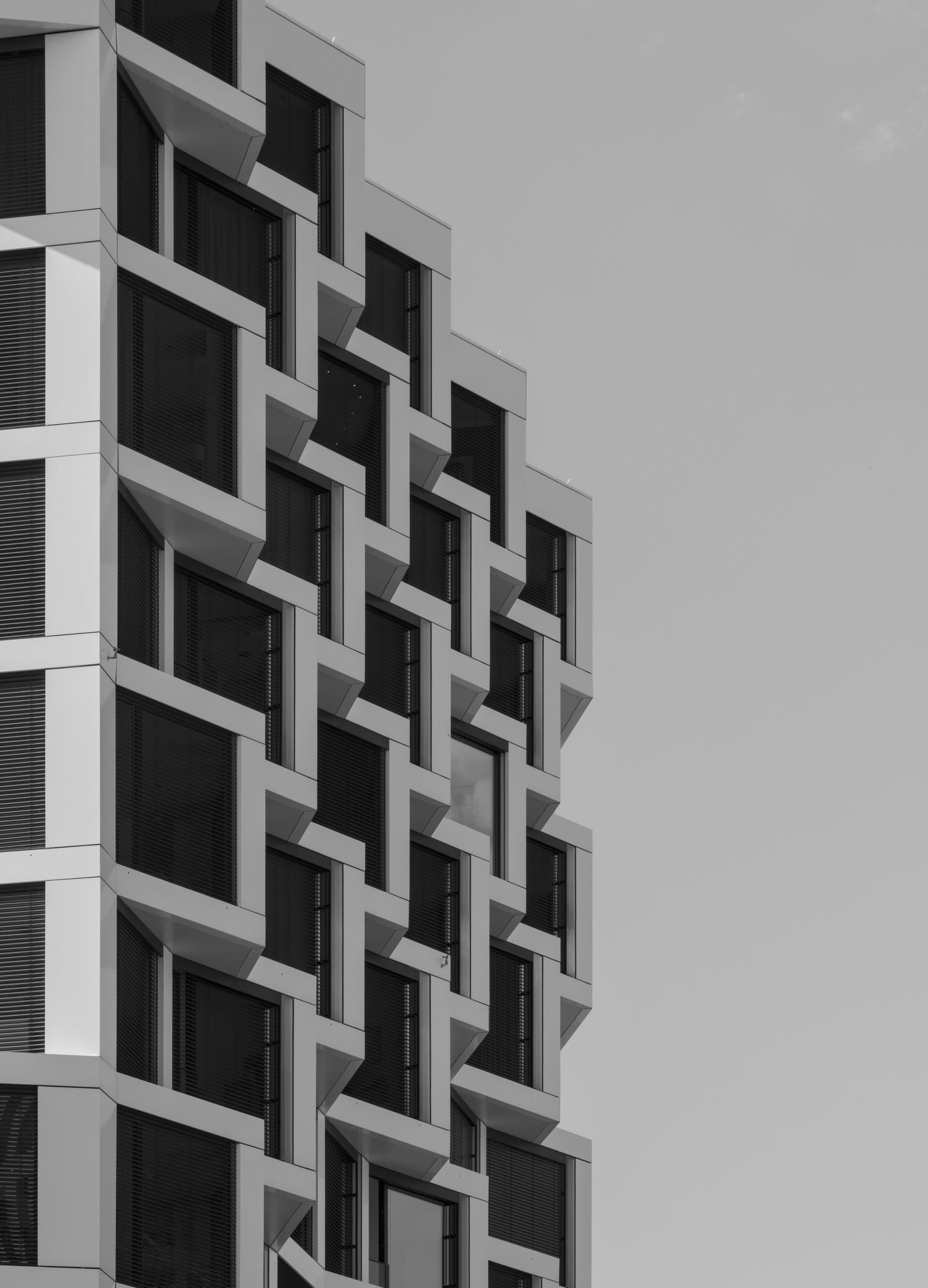
P6200043.ORF (13.6 MB)
P6200043.ORF.xmp (14.3 KB)
I am not very used to create monochrome images, but this archticture is more or less forcing me to try it
P6200043.ORF (13.6 MB)
P6200043.ORF.xmp (14.3 KB)
Good thing about black-n-white is you don’t have to worry about color… 
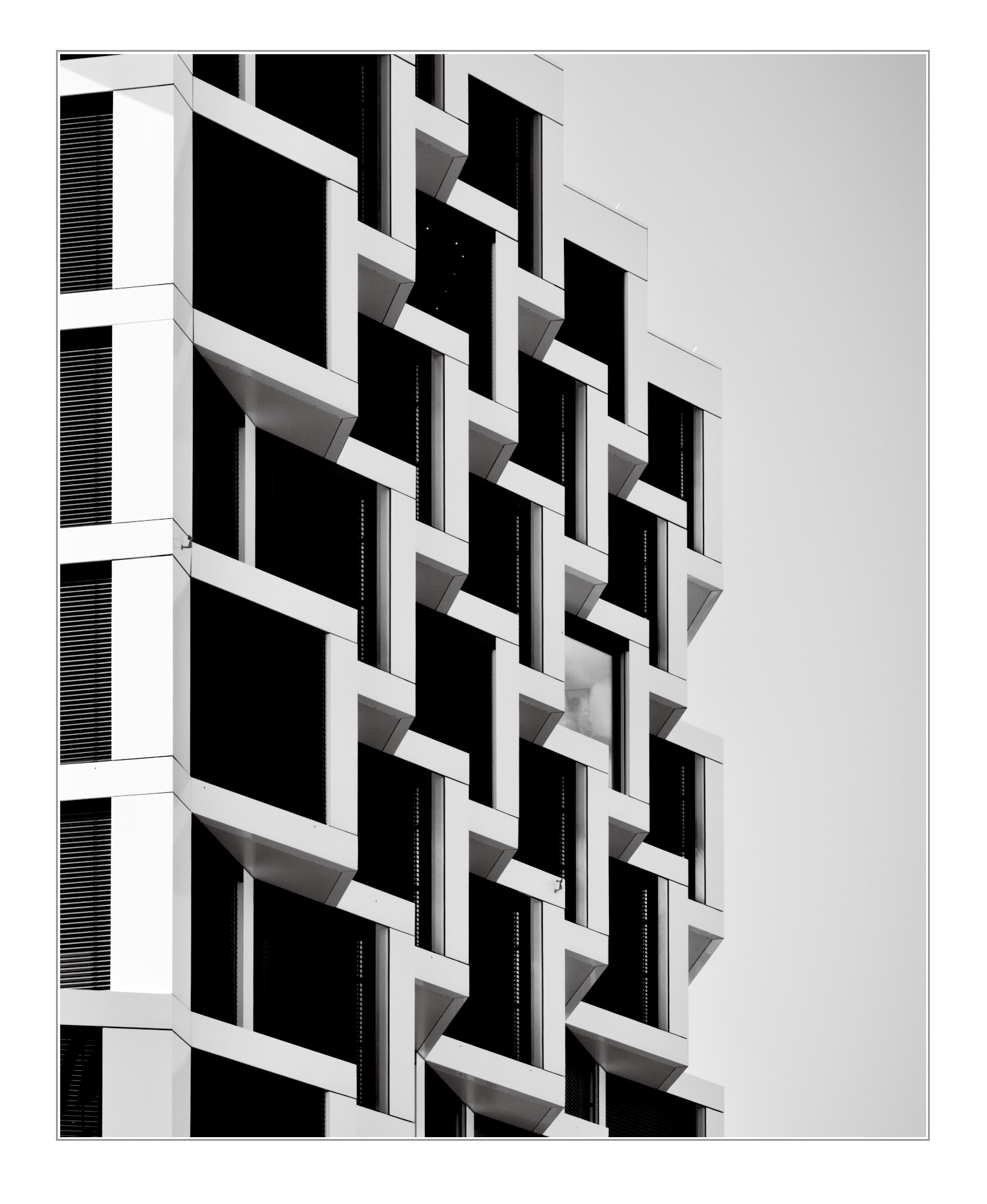
After grayscaling, I rotated it a bit to make the nearest corner vertical, then an aggressive tone curve that turned out to just be an exposure boost, that is, straight-line, to get some contrast going:
I think it’s a great monochrome subject, and a fun composition.
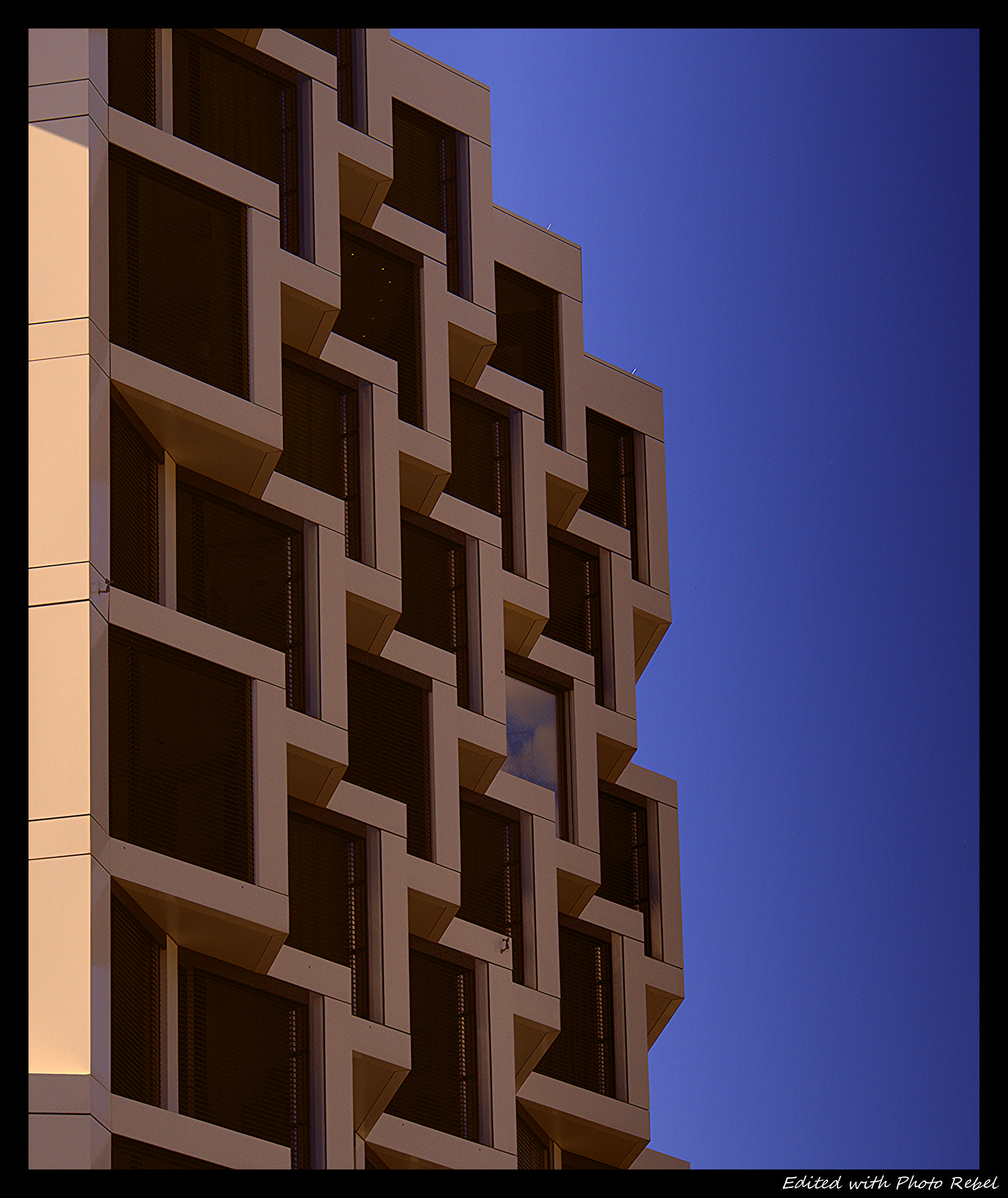
I preferred colourful…
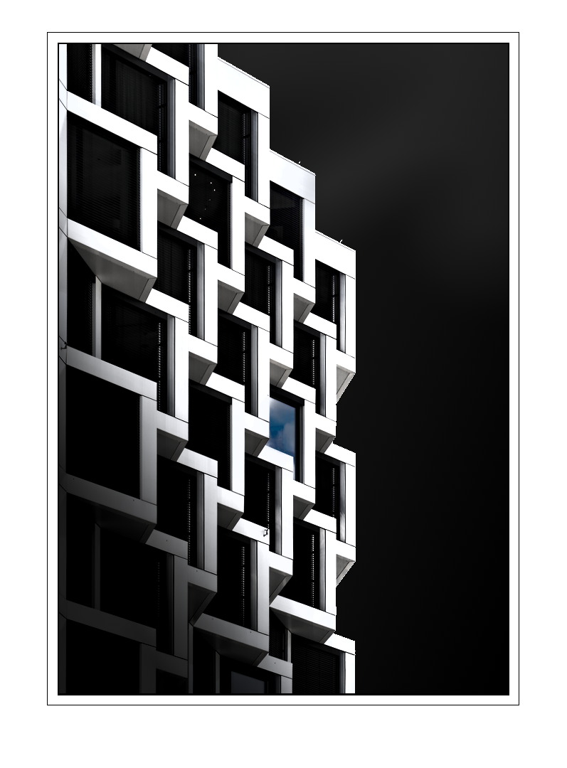
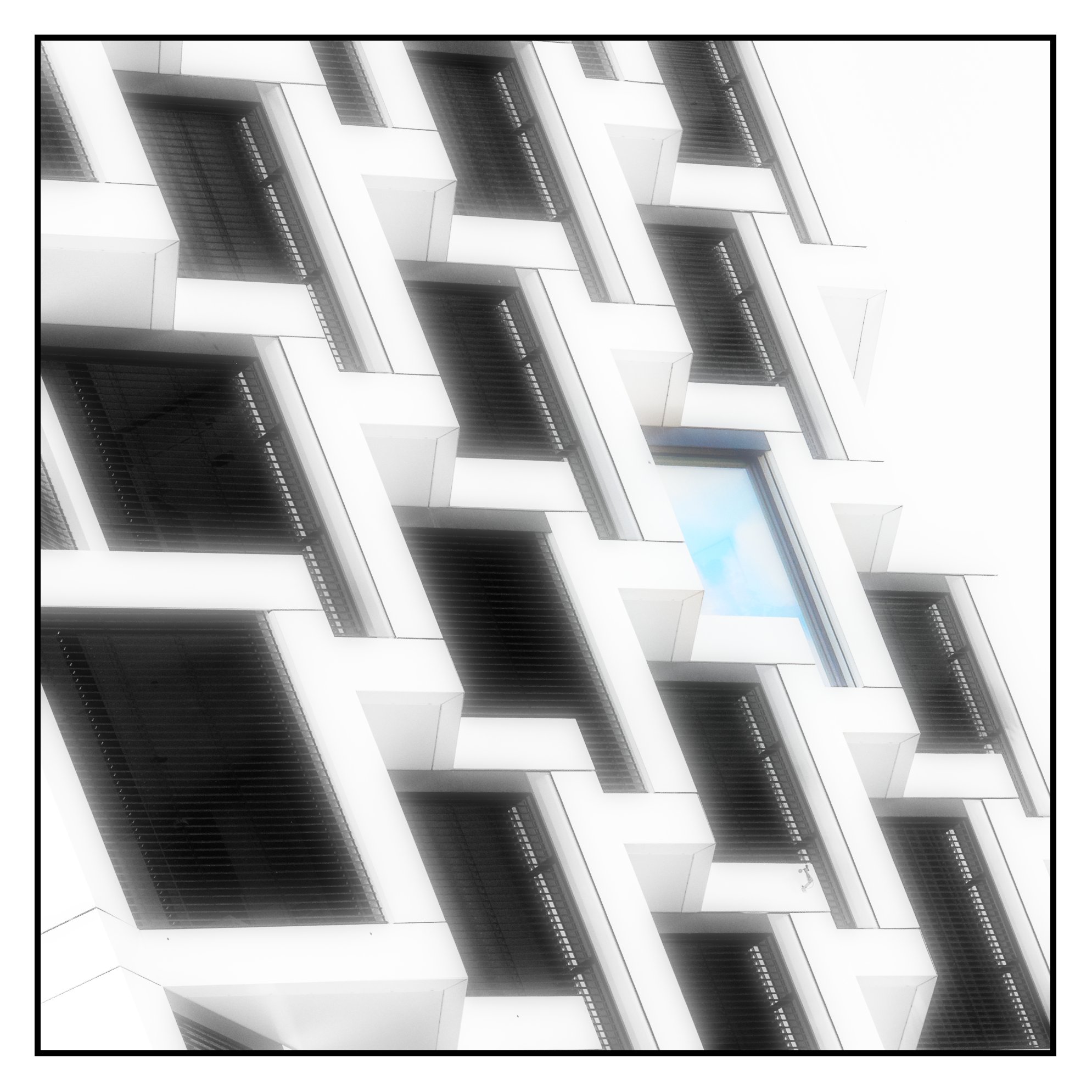
More focus on the only open window, “gradient-ed” the sky. Sharpened to the max.
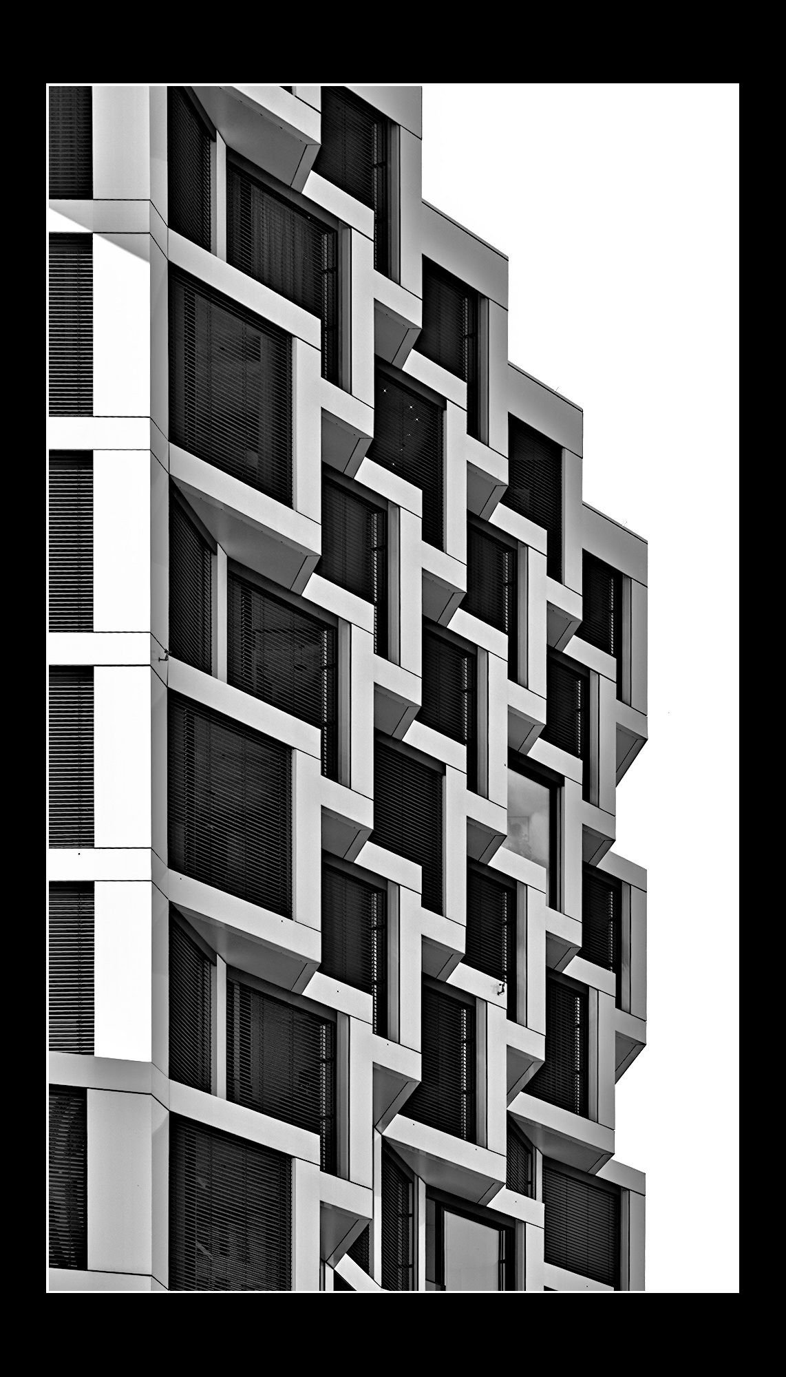
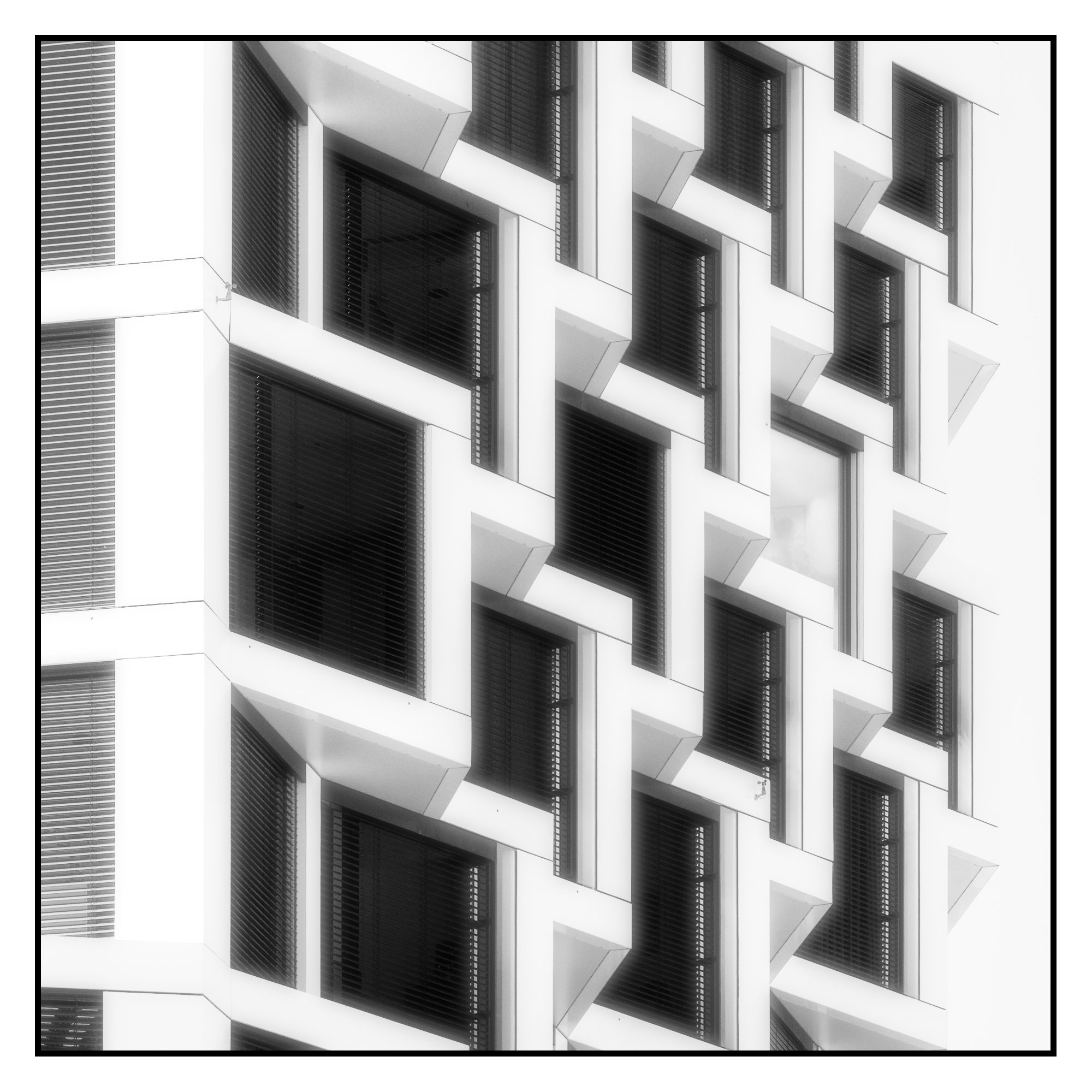
First pass. My edit is a little cliche, but serviceable as a rough draft. I feel like there is a lot you might be able to do with crops and dodging and burning.
My edit in DT 5.6. I used color calibration module for monochrome conversion.
P6200043.ORF.xmp (25.0 KB)
That is more the look that I wanted to achieve… bright sky and many details in the blinds. I did not get that, despite also working with colour calibration. So I will have to invistage your .xmp
I did an AI mask of the sky and brightened the exposure because I had some strange artefact in the sky. I would have used tone equalizer, color balance rgb and shadow and highlights probably to recover the detail in the shadows.
This is a nice interpretation. More abstract than whatever I had in mind. I like also the idea of emphasising the only window with open blinds.
Beautiful!
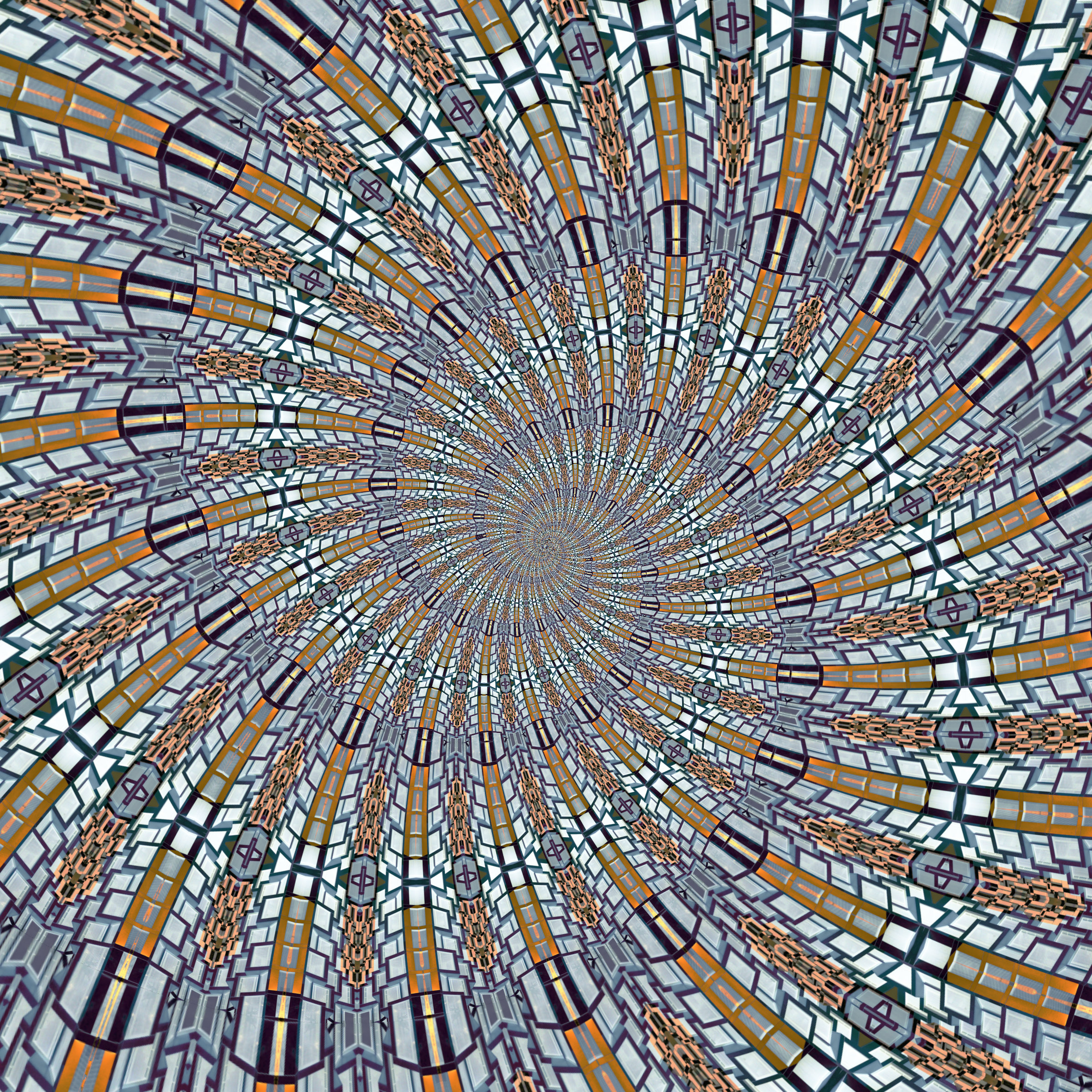
I think Rob’s edit isn’t to top. So a completely different (more abstract) approach:
and a variation of it:
Leaning heavily on the shoulders of @AtaraxicShrug … 
Could not make up my mind, so 2 versions, cropping is difficult too…
Slight preference for the 2nd attempt.
Nice play!
and
As you have said on many occasions, its not a competition!
So these two are trying to keep more in line with this idea. But, the first is still really abstract (based on @Popanz idea):
The second is a color render. Which might be less “dramatic”, but still makes a solid image thanks to the capture:
@Jetze I really like that first one! In the right print maker’s hands, this could be amazing over gold foil.
Thanks Rob, though I’ll have to look up what gold foil exactly is…
The other thing is, I had something golden in mind when seeing this picture, hence the yellow color in the second version.
I formulated misleading. Sorry.
I would have usually developed in a similar direction as you did. But I think your edit has so many things in the right place, that I can’t show really new aspects, when I would have gone in that direction. Therefore I chose a completely other route, to show further possibilities. That was, what I wanted to point out.
Language is too rich for us all - so hard to formulate without risks - specially when not writing in one’s mother language…