Blender AgX in darktable (proof of concept)

Because without an S shape the toe and shoulder power controls lose their functions.

I get the feeling that the overall mapping curve (from log to linear), once we take the gamma into account, remains largely the same.

gamma 2.2

The two compared using a snapshot:

And a completely crazy gamma = 1 (though, in most images, I only ever saw the code setting a gamma > 2):

1 Like

Thank you for voting and sorry about introducing the change without asking.

4 Likes

This is what the various gamma settings result in (from -10 EV to 6.5 EV, with Pascal’s recommended contrast of 2.8 and toe/shoulder power 1.55), if the default gamma, 2.2, is applied to the linearised result (note that auto-gamma internally scales the user-specified contrast to deliver the same contrast around the pivot):

dotted line: gamma = 1 (never really produced by the auto-gamma)
red line: gamma = 2
green line: default gamma 2.2, for reference
black line: gamma = 5

Except for the low-gamma line, they do run rather close together, with the rather extreme gamma = 5 delivering somewhat deeper shadows and brighter highlights, indeed.

4 Likes

PR merged, thanks @Pascal_Obry !

9 Likes

I’m sorry to bother you. I know much less about image processing/theory in general, and AgX in particular, than you, so I’m wondering:

Isn’t that irrelevant, though, since in darktable the output is linearised (using a power function with the provided gamma), passed on to the next modules, which expect data encoded in linear, and then finally the output encoding re-encodes that with whatever transfer function (typically, the sRGB curve) is needed? At that point, in my eyes, the ‘gamma’ becomes a convenience/technical parameter. Given that the end results are very similar, almost independent of the ‘gamma’ value, at least in midtones (as demonstrated in Blender AgX in darktable (proof of concept) - #2015 by kofa), does this really render the procedure broken?

In my mind’s eye, I already see newcomers (who did not read through the 2000+ messages in this topic) asking why shoulder power does not have any effect on highlights, which can easily be the case if the white relative exposure is much lower than the black one, causing the pivot to be pushed close to the right edge of the curve, and contrast not being enough to reach white: (1 - pivot x coordinate) * slope < (1 - pivot y coordinate), forcing the curve into ‘inverted shoulder’ mode. This is exactly what happens in the picture of the lady posted many times, most recently in Blender AgX in darktable (proof of concept) - #2011 by kofa.

We said the defining feature of AgX is not the curve but the manipulation of the primaries. Troy also confirmed that recently in his comments:

the primaries component is vastly more important than a random “curve” implementation
(Finished first draft with all controls described · kofa73/dtdocs@9404099 · GitHub)

the curve really doesn’t matter at all
(Finished first draft with all controls described · kofa73/dtdocs@9404099 · GitHub)

If this is what a particular user want I don’t see a huge problem with it, but I still feel a bit weird having it turned on by default.

The thing is, why are we able to “linearize” it by using a power curve? Isn’t this amazing?

We start with linear data, then we apply a log curve, and then the sigmoid. If we want to “linearize” it, why not apply the inverse sigmoid, and then inverse log curve? In actual practice, we apply an additional power curve, and we say that we “linearized” it.

My personal answer is that, the picture is formed at this state by us “pretending” the picture is designed for a particular display. Under this assumption, we are able to call the power curve an EOTF. It doesn’t have to be a power curve, if we pretend it’s for sRGB piecewise transfer function, we can apply the piecewise EOTF, it’s completely fine.

Troy even has an idea that we can just “pretend” the result is in HLG, and straight up apply HLG EOTF to “linearize” it to be a Rec.2100 “HDR” picture.

If you completely throw away the “target display” meaning of it, then it just doesn’t make sense anymore why we can “linearize” the picture with a power curve.

If we enforce the meaning behind the “linearization”, the “keep pivot on identity line” feature really is dynamically changing the native state that the picture is formed in.

Again, I don’t think it’s “wrong”, I just think it’s weird to be set as default.

I think it’s reasonable to say that the parameters work together, so parameters would influence each other’s results. I don’t think this would really be an issue.

Also, I don’t think people should touch the exposure range too often, at some corner cases people might need to turn the max exposure down because the RAW footage has hardware sensor clipping issue below the default +6.5 stop max. For other cases I really don’t think people should use the picker to do the auto exposure range thing. Like what Troy posted in the comment you linked to, perceptual “whiteness” can occur at any code value, you don’t need to put the max of the original data to the max of the picture code value to make it “white”.

That’s exactly why I think “keeping the curve an S shape” is a weird requirement.

1 Like

I don’t get it, sorry. What you write above sounds like completely inverting the process, going from scene-referred to display-referred and then back. By applying a power function, we linearise the encoding of the now display-referred, tone-mapped (0…1) data.

OK, that is a major point. What is the recommended approach to edit the picture of the lady, where the brightest point is less than 3 EV above mid-grey, if I recall correctly? How do people work in Blender, where the params of AgX are fixed?
I’m asking because my current ‘recommended workflow’ in the documentation says one should start by picking the exposure boundaries; this habit / method comes from darktable’s filmic, though. As far as I’m aware, that’s how most people use the module (anyone: feel free to present alternative approaches, so the docs can be improved). At one point, while discussing the module with Boris @s7habo, I asked him if maybe the highlight brilliance in color balance rgb should be used to raise highlights instead of adjusting exposure, which he tried and said that it did not work well.

Thanks for your patience and help!

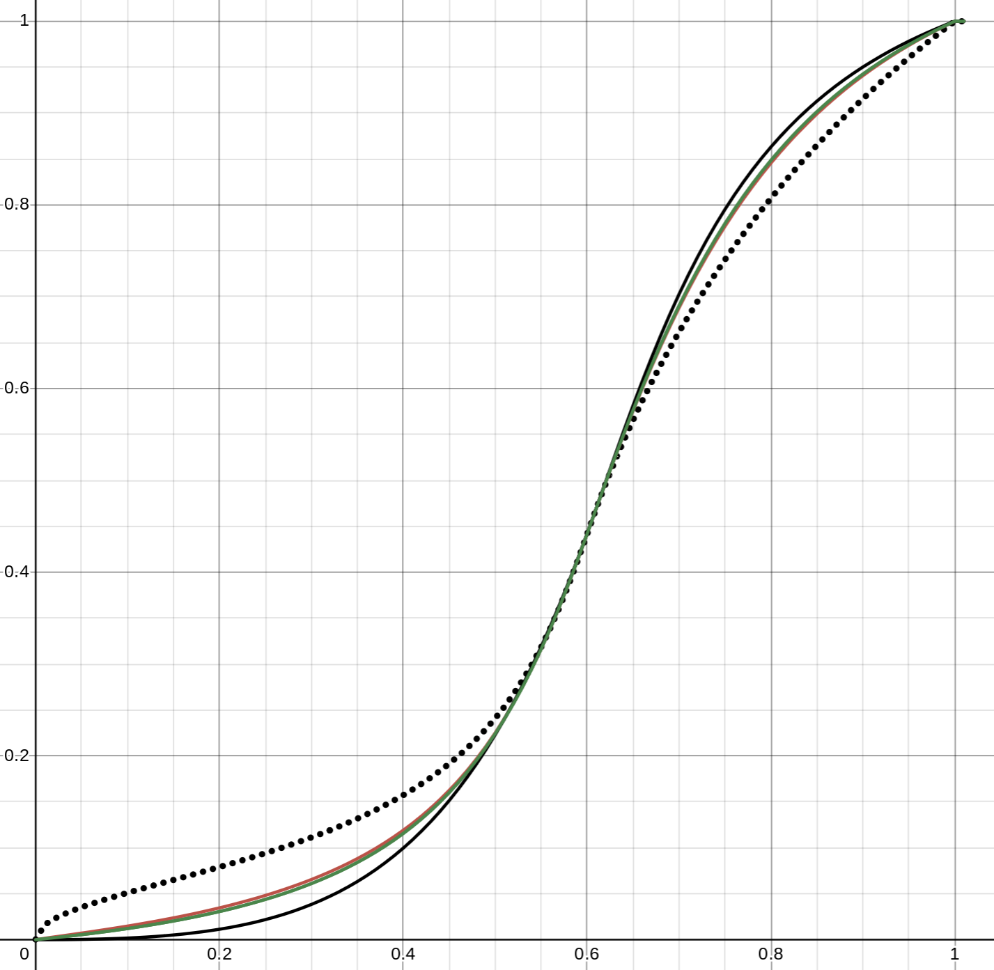
What exactly makes it “display referred”? The curves? I don’t think so. My answer is that, it’s our interpretation of it that makes it “display referred”.

We chose to interpret it as “encoded in sRGB 2.2 inverse EOTF”, so we can apply the forward sRGB 2.2 EOTF to decode our “pretended” encoding.

Like I said, you can even pretend the result is encoded in HLG encoding, and decode it by applying the HLG EOTF, this interpretation will give you a Rec.2100 “HDR” version of the picture.

This interpretation holds the meaning of the picture we are forming.

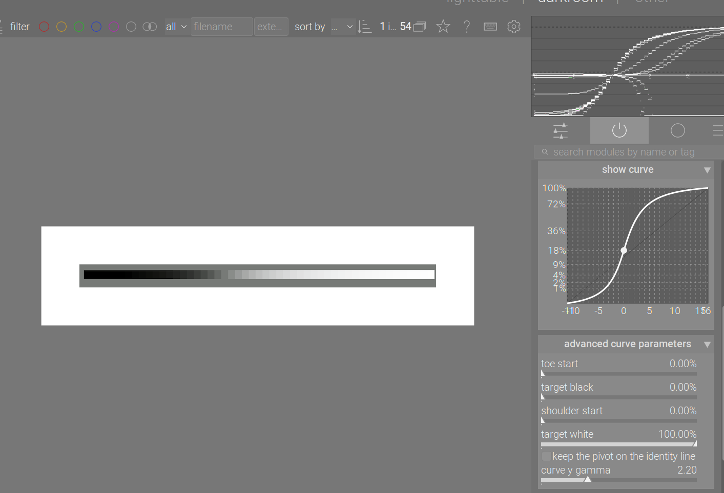
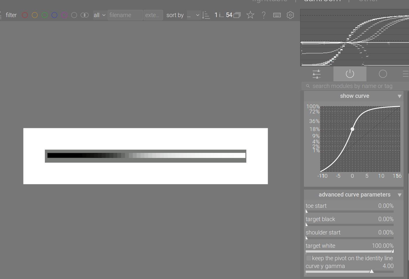
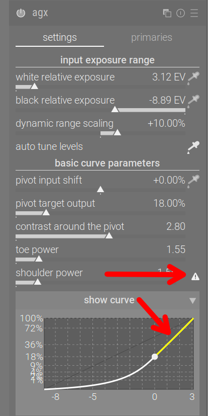
In Blender, if people want to have different “contrast looks” they can choose in a pre-made list. They can also adjust exposure. In Darktable module, it simply means user can adjust the general contrast, toe, and shoulder power parameters to arrive at a good result. It’s just that in Blender, people get the advantage of being able to adjust the lighting setup at any point, while a photographer working in Darktable has already past the process where they can adjust their lighting setups.

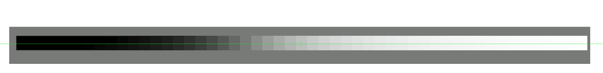
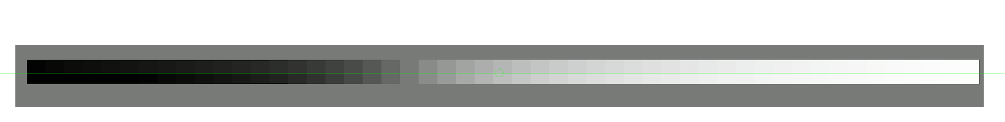
Still, I would repeat Troy’s point there about how whiteness occurs at any code value. Even when the “highlight” is lower than the max, it would still be percieved as white.

I expect photographers to understand this point better than a pure CG artist, since taking a photo of a white wall won’t always give you max pixel output in a picture on screen. AgX is like a “camera” in this sense, just with the ability to be used with various different sensor hardware, that’s why I said in case the sensor clips below the default max, it’s probably okay to adjust.

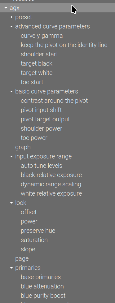
Exposure range can definitely be used for artistic purposes. For example, a classic movie shot can be like, an explosion happens, there goes the mushroom cloud, and the whole frame gradually gets brighter and brighter until the entire frame is a solid block of “white”.

The exposure range parameter can be an artistic control of where that “gradually getting brighter” process would end. It serves as a visual narrative tool here.

That’s why I think the exposure range parameters can be useful, probably not in the “auto range” way, but rather in a more artisically decided way.

Feel free to disagree though.

2 Likes

Perceived white: a movie is typically viewed in a darkened room; it may be a movie theatre, or it may be one’s living room, but mostly, the main light source is the screen. Whatever is brightest there will be perceived as ‘white’ (at least that’s how I understand). HDR projectors / screens will deliver a high dynamic range.

A picture / photo, either when hung on the wall, or posted on a website (Instagram, Facebook…) with a bright background, is often viewed under circumstances (in a room with average illumination) where not mapping the brightest part of the image close to white will make it appear dull/dark/lacking contrast/underexposed. Also, paper and today’s common screens, combined with the common JPG output format, will not be able to deliver a range comparable to movie projectors / HDR screens.

Do you edit using agx in darktable? If so, could you please share a few edits as examples (incl. sidecars)?

I know I’m a pain in the neck. I am not arguing for argument’s sake. I don’t know enough to fully understand what you write, and have even more difficulty understanding Troy. My usage patterns are rooted in many years of using filmic rgb, where picking exposure is pretty much step #1. Perhaps that’s why my view of this module is kind of ‘filmic with better colours’ or ‘sigmoid with a more flexible curve’. Which probably does not do it justice. By getting good docs / guidelines, we could help others avoid making the same mistake.

1 Like

That’s another can of worms. most theatre-targeted picture formations put the middle gray at about 10% instead of 18%, for compensating the viewing enviornment. It’s irrelevant to our topic.

That’s also irrelevant, the HDR in Rec.2100 is not the same as HDR as in EXR exposure files. Rec.2100 HDR refers to the gap between the so-called “reference white” (commonly defined as 100 or 203 nits) and a given max nits of the target display. It’s completely irrelevant to the exposure range. People tend to confuse them since they are both called “HDR” in different contexts.

I think a very important aspect is the context of the scene itself.

Although the photo is dark overall, we still perceive the woman’s sweater as white:

If we now only lighten the skin tone, despite the fact that the brightness of the sweater has not changed, it appears more light gray because we do not expect the skin tone to be lighter than white:

In other words, you don’t gain much in terms of the perception of white by brightening the highlights as long as this difference in brightness between skin color and sweater remains.

11 Likes

In order to help new users, I would like to add the following: if the shoulder or toe is inverted,

  • add a warning that provides useful advice via a tooltip
  • paint the corresponding part of the curve in yellow

I’d add a preference, so seasoned users can disable this.

This is only to prevent questions like ‘On some images the shoulder power has no effect’ and ‘I was editing an image and all of a sudden the shoulder power adjustment stopped working’.

Would that be acceptable?

  • Don’t: it’ll just lead to more confusion, like the ‘white balance applied twice’
  • Good, as long as I can turn it off
0 voters

Edit: sorry, this time the voting is public, I forgot to turn off the visibility of voters, and after 5 minutes it cannot be modified. I won’t hold your vote against you. :smiley:

2 Likes

Thanks for voting. I’ll post the update soon.

The tooltips:

the curve has lost its 'S' shape, toe power cannot be applied
target black cannot be reached with selected contrast and pivot position
increase contrast, move the pivot lower (reduce pivot target output or
curve y gamma), or increase the distance between the pivot and the left edge
(increase pivot shift, decrease relative black exposure (set a larger
negative number) or increase relative white exposure)

------

the curve has lost its 'S' shape, shoulder power cannot be applied
target white cannot be reached with selected contrast and pivot position
increase contrast, move the pivot higher (increase pivot target output
or curve y gamma), or increase the distance between the pivot and the right
edge (decrease pivot shift, increase relative white exposure or decrease
relative black exposure (set a smaller negative number)

Is that understandable? I left out adjusting target black/white, as I think if someone alters the default, they do that with a firm intention.

4 Likes

They are a bit wide, but we usually have more width than height on the screen:

I think I won’t set a module-level warning, like the ones you can get with white balance:

Do you think we could shrink the section names text? I’m trying to see how to address the GitHub Issue I started with QAP.

1 Like

I’ll see how the GUI can be rearranged.
color balance rgb has these sections:

but they don’t show up on the quick access panel:

The shortcuts are also arranged differently:

vs shortcuts of agx:

1 Like

I wonder what you think of this idea I suggested? Is it doable?

Sorry, I missed it (and have not addressed your comments regarding the manual, either, or not all of them). Yes, it’s doable, and not difficult. I’ll try to do it tomorrow.

Would you also hide the ‘master’ sliders of the reverse settings, or only the individual RGB controls?

I think the master sliders would also get hidden as well. I think this might reduce the user’s burden when they’re trying things out.