add the checkbox, hiding all reversal sliders; if ticked, reversal settings are as if 100% were set for master controls, red/green/blue purity boost_ controls were set to the same value as the corresponding attenuation sliders, rotation reversal were set to the same value as rotation)
add the checkbox, keeping the ‘master’ sliders visible (some control is retained, e.g. over purity), other settings behave as above
don’t add the checkbox
0voters
I’ll close the poll on Monday evening CEST (UTC + 2).
I’d like the preset setting in primaries tab be changed by a combo box with some different settings. (Led, Skin tone…).
Why?
Because this is a hack and the real implementation should be a partial preset which would be more generic. But until then, and before different hard coded hack spread in dt I think it is better to remove it there.
I agree this is a hack, but the current implementation supports the user’s own presets, as well. Every now and then, I do use that functionality to reset just the primaries to those of my own preset. I may be alone with that, though.
If you insist, we can replace the combo with one that contains the predefined sets of primaries (blender-like, smooth, unmodified). But could we keep this until the partial preset application arrives?
But could we keep this until the partial preset application arrives?
No because the partial preset will be hard to implement and there is no decision to implement this at this stage. This will require a strong design before. That’s why I think the hack should be avoided right now.
A combo with some base primaries is certainly sufficient and anyway one can have presets if needed. So better use only what is supported by dt for now.
It just needs a little punctuation to indicate where the sentence breaks are.
The curve has lost its 'S' shape, toe power cannot be applied.
Target black cannot be reached with the selected contrast and pivot position.
Increase contrast, move the pivot lower (reduce the pivot target output or
curve Y gamma), or increase the distance between the pivot and the left edge
(increase the pivot shift, decrease relative black exposure (set a larger
negative number) or increase relative white exposure).
and
The curve has lost its 'S' shape, shoulder power cannot be applied.
Target white cannot be reached with the selected contrast and pivot position.
Increase contrast, move the pivot higher (increase pivot target output
or curve Y gamma), or increase the distance between the pivot and the right
edge (decrease the pivot shift, increase relative white exposure or decrease
relative black exposure (set a smaller negative number).
I have also changed the “y” to upper case, this then matches the case in “S shape”
I’m not sure about “set a larger negative number” and “set a smaller negative number”.
I would change “decrease relative black exposure (set a larger
negative number)” to “raise the relative black exposure” and “decrease relative black exposure (set a larger negative number)” to “lower the relative black exposure”. Working out what “larger” and “smaller” mean when it comes to negative numbers is tricky.
That’s exactly my point: we don’t know when this will happen. Nevertheless, you are the one responsible for guiding the overall design, so I respect your decision. The change will be in my next PR, providing only primaries of the built-in presets. (I did not like the code/approach for the hack, either, only the functionality it provides.)
Thanks, I’ll change them.
The ‘y’ is also lower-case in the label of the slider; the ‘S’ is upper-case to better emphasise the shape, so I think I’ll keep that.
To keep in line with the general UI conventions, I’ll have to revert the starting capitals. See, for example:
(exposure)
gtk_widget_set_tooltip_text(g->compensate_hilite_preserv,
    _("remove the camera's hidden exposure bias in\n"
      "HDR / highlight preservation / dynamic range / HLG tone mode.\n"
      "\n"
      "when enabled, tone mapping (e.g. sigmoid) is required to\n"
      "avoid blown-out highlights."));
...
gtk_widget_set_tooltip_text
    (g->black,
     _("adjust the black level to unclip negative RGB values.\n"
       "you should never use it to add more density in blacks!\n"
       "if poorly set, it will clip near-black colors out of gamut\n"
       "by pushing RGB values into negatives."));
(filmic rgb)
gtk_widget_set_tooltip_text(GTK_WIDGET(g->area), _("use the parameters below to set the nodes.\n"
                                                   "the bright curve is the filmic tone mapping curve\n"
                                                   "the dark curve is the desaturation curve."));
(highlight reconstruction)
gtk_widget_set_tooltip_text(g->recovery, _("approximate lost data in regions with all photosites clipped, the effect depends on segment size and border gradients.\n"
                                           "choose a mode tuned for segment size or the generic mode that tries to find best settings for every segment.\n"
                                           "small means areas with a diameter less than 25 pixels, large is best for greater than 100.\n"
                                           "the flat modes ignore narrow unclipped structures (like powerlines) to keep highlights rebuilt and avoid gradients."));
Ah, the style guide was obviously written by e.e. cummings (the language tool in my browser wants me to capitalise this). Needless to say, I disagree, in that even with full stops, it lowers the readability.
I would also disagree with the hard-coded new lines, this would seem to envisage a specific screen geometry.
Finally, I would ask whether there is actually a style guide for this and other textual elements in DT, but I suspect this is more a question to @Pascal_Obry rather than you. Certainly, looking for a style guide for GTK more generally, doesn’t yield anything definitive.
I seem to have moved from discussing tooltips for AgX, to tooltips more generally
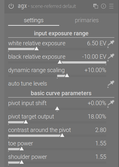
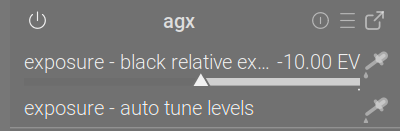
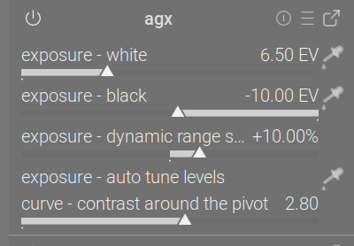
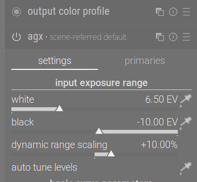
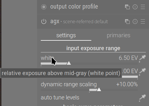
So: we can have section names that are independent of the UI boxes (e.g. it’s possible to keep input exposure range on the UI, but call the section (used on the quick access panel and for shortcuts) something shorter, e.g. exposure:
I could shorten the name of sliders, and then on the QAP we’d have exposure - white, for example, but I don’t see how I could shorten dynamic range scaling (maybe DR scaling?):
I can also use the same ‘logical’ section name, curve, for both basic and advanced curve parameters, to save space on the QAP (you can see that above).
I propose the UI sections, logical sections (for QAP and shortcuts) and labels:
input exposure range (UI)
exposure (logical)
black point, white point, dynamic range scaling / DR scaling, auto tune levels (unchanged) or ‘auto’
basic curve parameters (UI)
curve (logical, shared with _advanced curve parameters)
controls unchanged, except contrast around the pivot → contrast, and maybe pivot input shift → pivot shift, pivot target output → pivot output
_advanced curve parameters (UI)
curve (logical, shared with _basic curve parameters)
controls unchanged
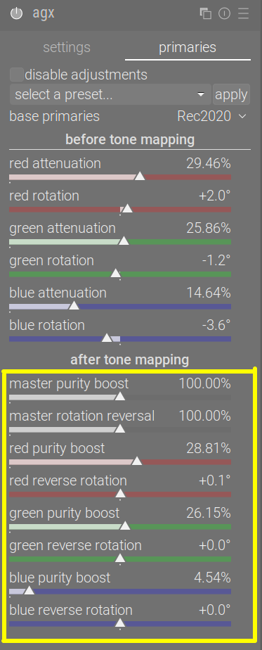
primaries is problematic, as there are many controls with longer names. I could replace red/green/blue with R/G/B, but we still have stuff like master rotation reversal; even if shortened to rotation reversal, it’s long.
I could also remove the logical section ‘primaries’, and list the controls directly under the module. However, I added the sections because previously they were requested.
It would seem that if you want a tooltip of a specific size, then you have to use set_tip_area. I think this may be a case of “le mieux est l’ennemi du bien”.
One could whine about the design of the GTK function, but that would be a waste of time and effort.
How about these? I’ve changed the wording slightly:
move the black point farther from the pivot by raising the relative black exposure or move the white point closer to the pivot by decreasing relative white exposure).
and
move the white point farther from the pivot by increasing relative white exposure or move the black point closer to the pivot by lowering relative black exposure.
The answer is yes, you can style tooltips with CSS.
The version of DT that I use (from OpenSUSE Tumbleweed), doesn’t ship a darktable.css, but it is easy enough to tweak the CSS in settings.
The question then is, would CSS that specified a maximum width for tooltips and hence obviated the need for newline characters in the text be of use going forward?
This is a wider, more general topic. I’m a backend Java guy, and know close to nothing about GTK. If the styling would affect the whole of darktable, it should be discussed separately.