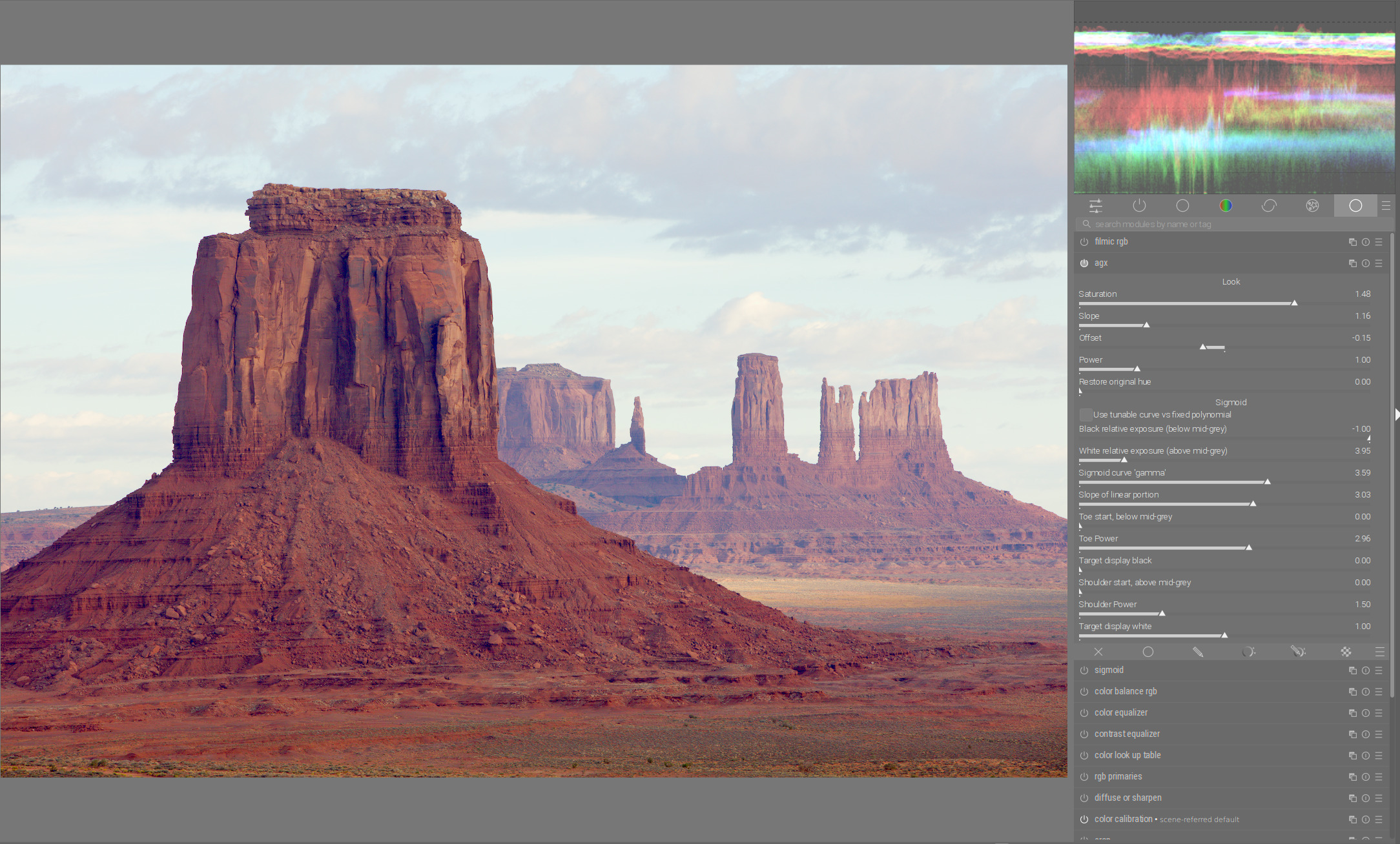
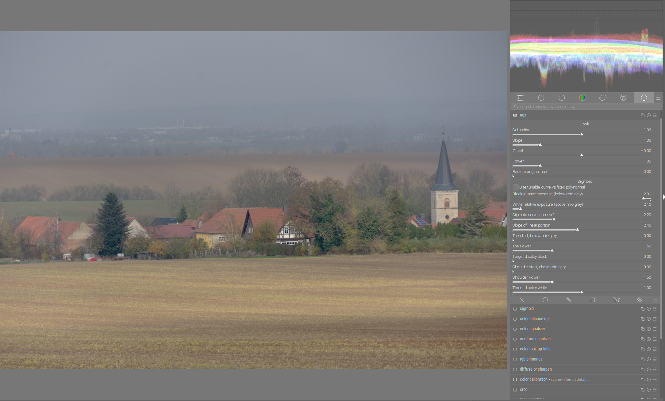
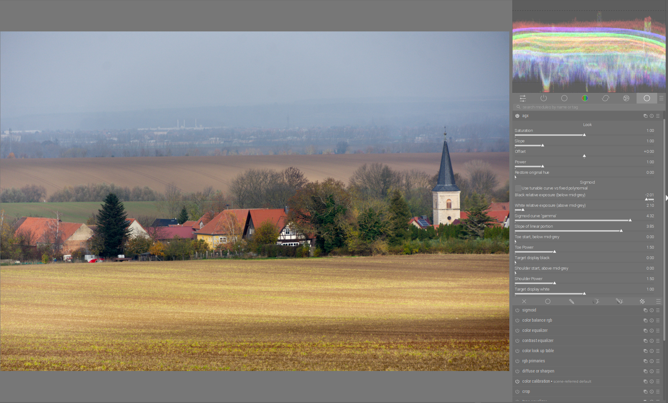
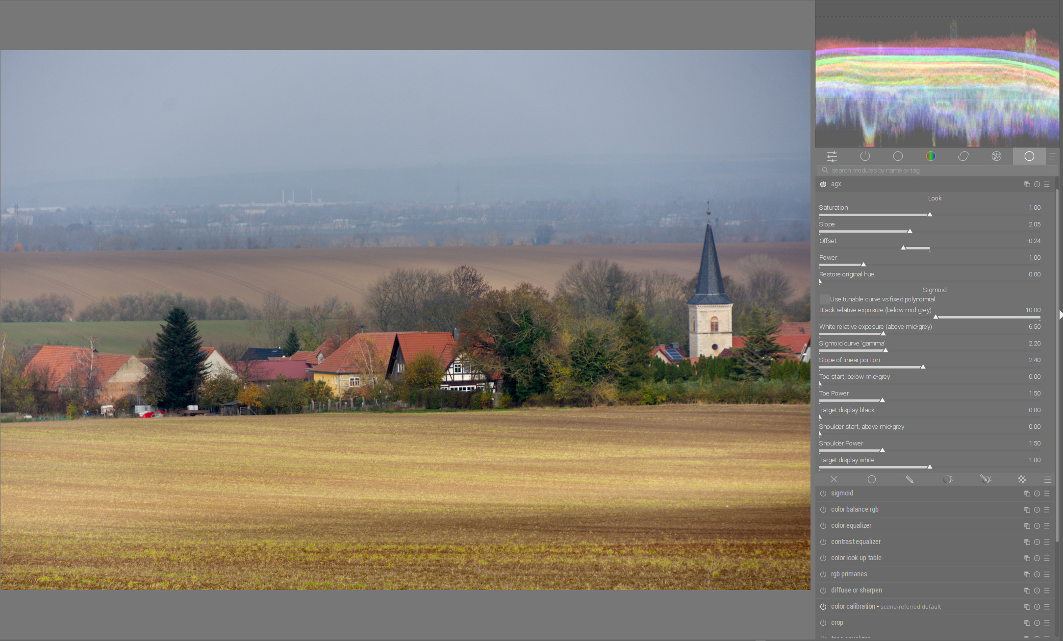
If you ask to power users some suggestions the GUIs usually ends up burdened with plenty of options in order to cover all corner cases. On the contrary, if you ask help to “casual users” they usually want only a few basic “easy” to understand options.
Therefore it is extremely hard to find the right balance
From the UX side I found version 479 very very good.
It was very easy to get a very pleasant result very fast.
I enjoyed especially the “fixed” whitepoint of the offest slider. The only thing which I found a little bit less attractive was that saturation had an impact on the contrast.
Could I get the output that I wanted for every picture? No, but for 98% at least.
So how about returning to that point (but make saturation slider independent). Headline this section with “base settings”.
All the other sliders could be settled beneath under a section “fine tuning”
These are for the remaining 2%, you can’t get the way you want with the base settings.
I think the current set up works pretty well for both. The Look section has simple controls that gives you nice results and the Sigmoid section allows you to deep dive and refine. My questions are more about how the two relate or interplay with one another.
Maybe with a different fall-off (it was linear, could be a curve). Is the toe power not a good substitute, though? That does not affect anything past mid grey.
The ‘look’ code was taken from AgX. It increases the difference between RGB values, which then may change perceived brightness. I have not found that troubling, but if others do, maybe we could look for a different saturation algorithm.
Don’t get me wrong. I’m able to get great results with ANY picture with the actual version. And I’m grateful for any update and for all the work you do.
And I’m aware of that there are still some steps to take until this fantastic module will be in master branch.
What I miss at the moment is this easiness which we had at the beginning. Using just four sliders, I had in no time a point where I just needed some fine tuning on my edit.
At the moment, it takes longer for me to get to this point. Maybe this is my own fault and I should just test more.
Me neither. I wouldn’t change anything there. This is the concept that has stood the test of time and is used everywhere. I’m more in favor of people learning how to use it.
Just because it was done in the past, it has not to be like that in the future.
Anyway the impact of the saturation slider is my smaller concern, I can live with that by leaving it aside. I have at the moment the fear, that the module gets too complex, so that it takes longer to get where I want.
On top I still think that ANY effect should be as good separated as possible. This is simply a matter of control. Exposure isn’t linked to contrast as well, even so if you have more light in real live, there are usually more contrasts.
But we can shift the focus of the contrast to the deeper gray by using power function to shift the middle gray to the highlights and offset and slope functions to balance everything (black point and white point).
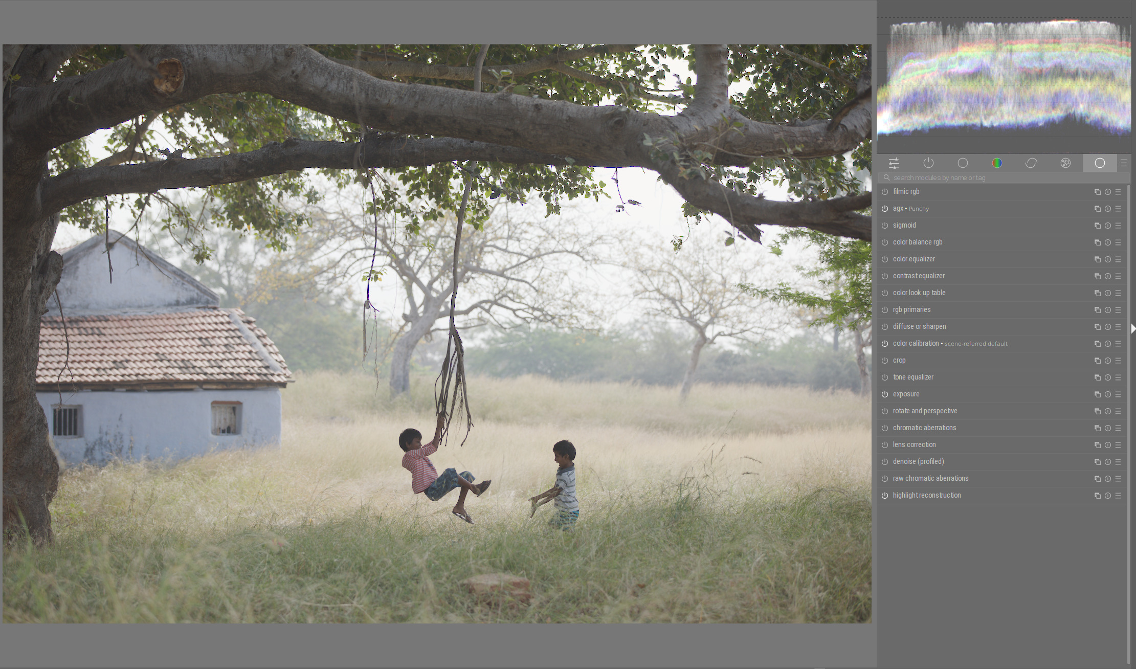
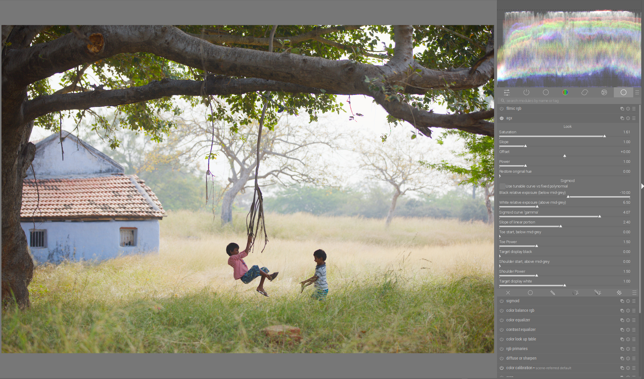
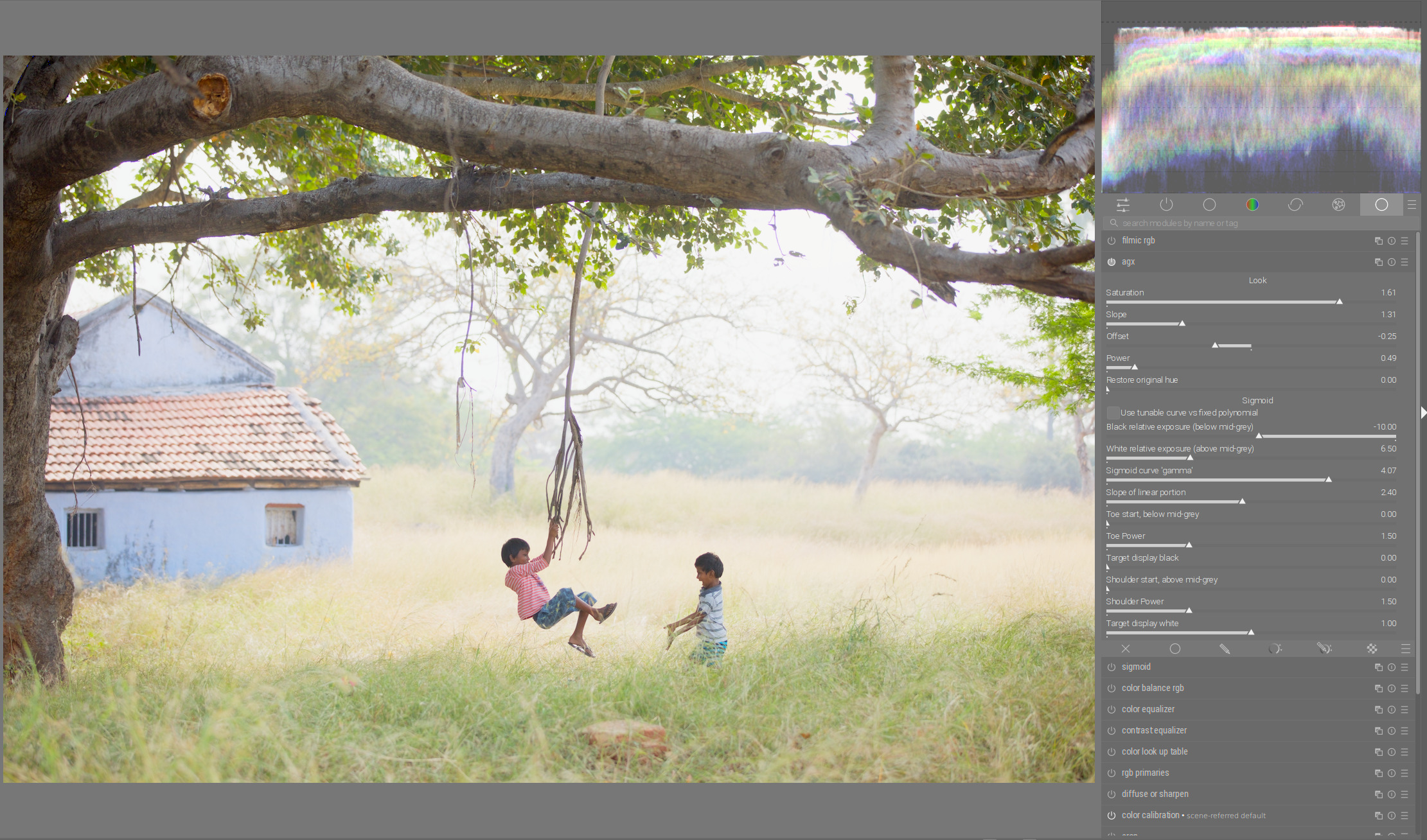
Now the whole background in the place where both children are playing is less intrusive (the trees in the background and the grasses become paler and with less contrast):
@s7habo Those are excellent examples, and pretty much what I’m seeing. But how do you see the black and white relative exposure controls fitting in when compared with the slope slider?
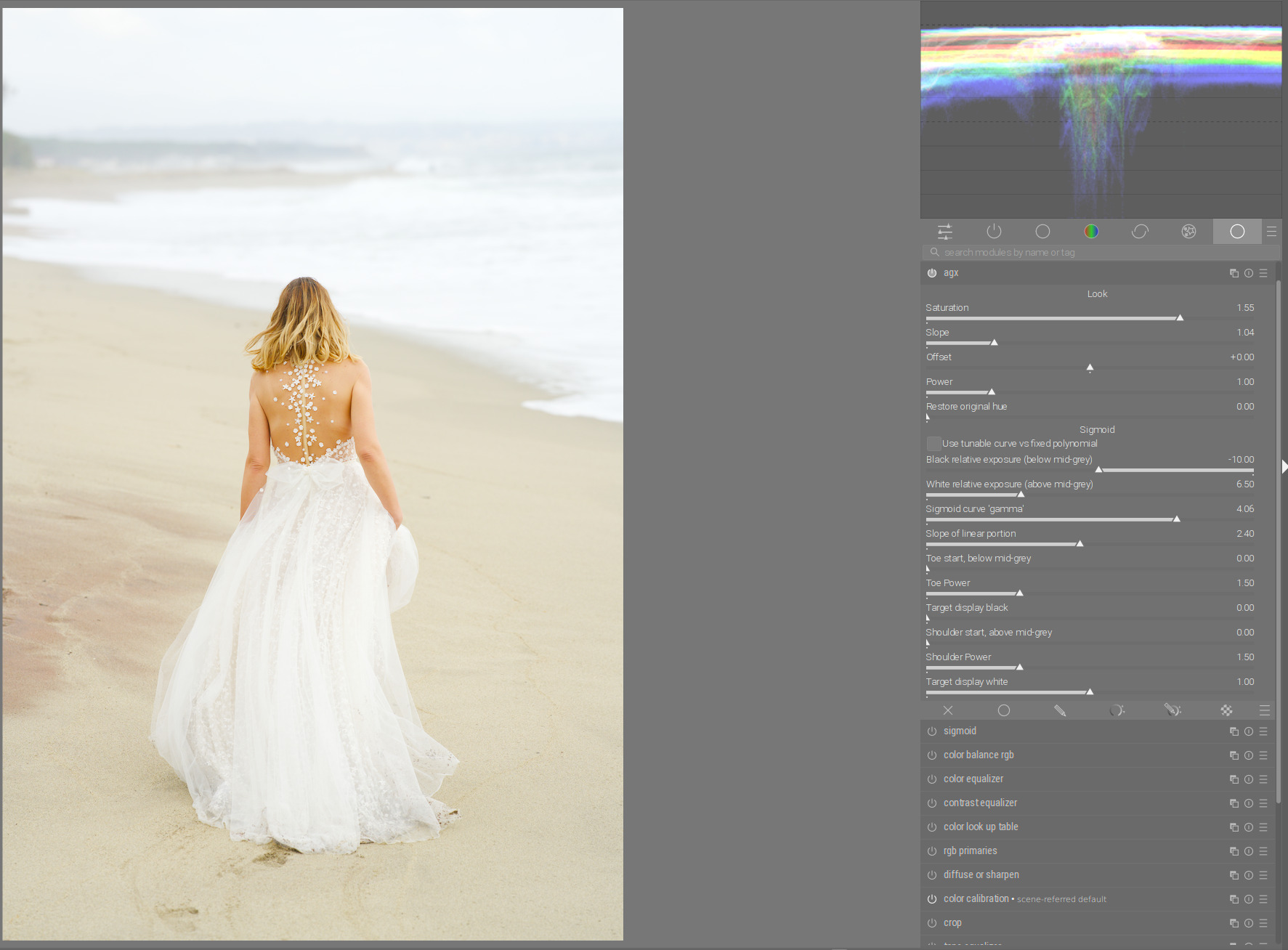
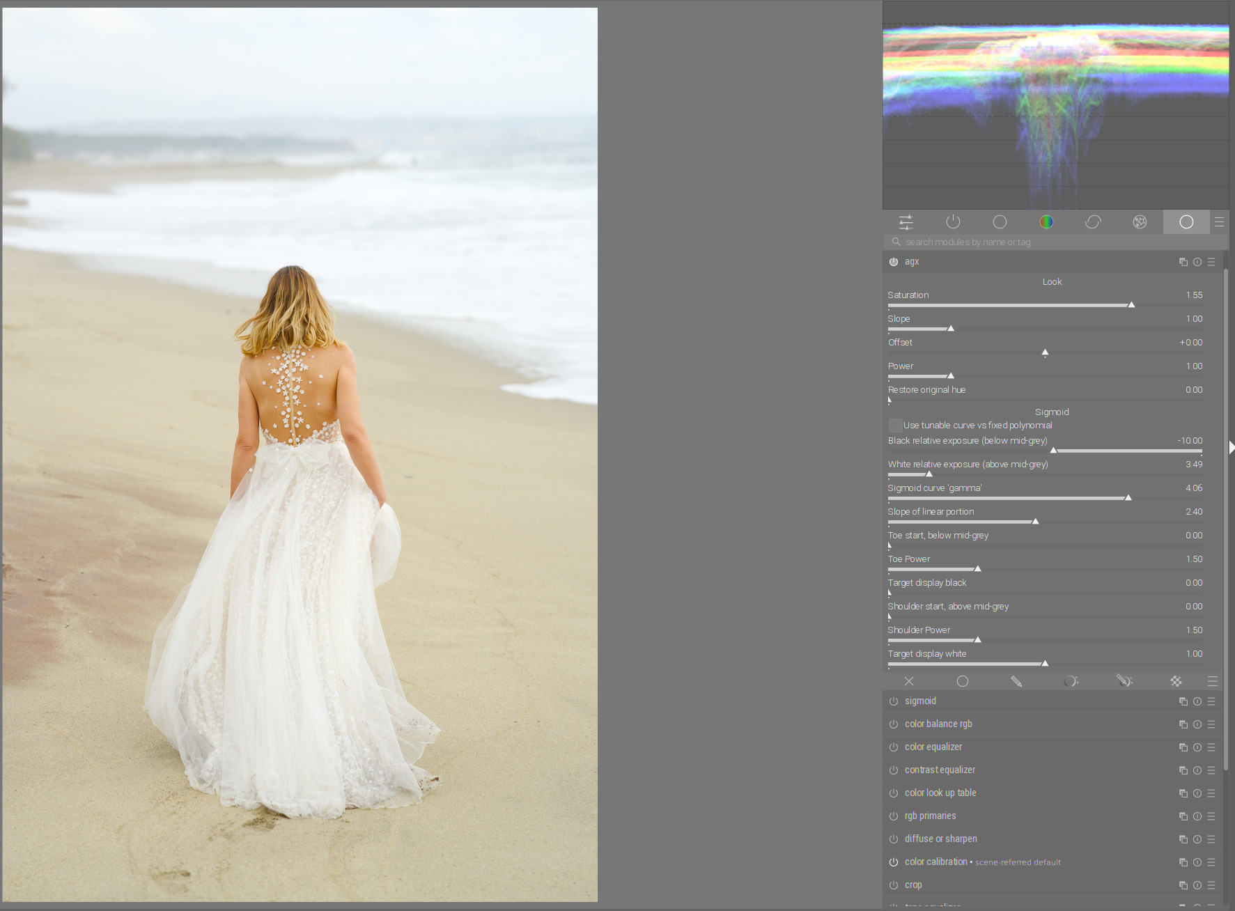
But if I decrease the slope and also the white relative exposure, I am again at the limit of the dynamic range. This time, the image gets a little darker, but I get more detail in highlights:
Thanks, I’ll have to play with those images myself. I had been using the toe and shoulder power to deal with shadow and highlight contrast, and mainly saw the relative exposure sliders as a way to readjust the dynamic range within the Sigmoid section without having to going back to the Look section.
I see this as two different approaches. Simple, where you use only sigmoid functions and “advanced” where you use look options first and sigmoid functions for fine tuning.
I prefer the second one because I have more flexibility.
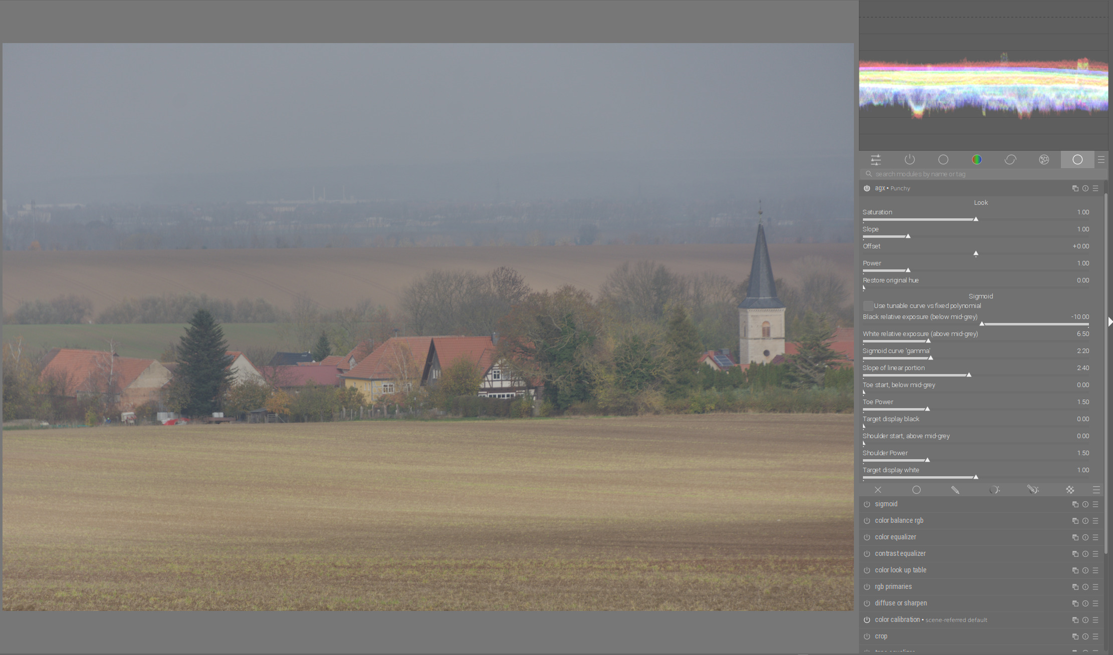
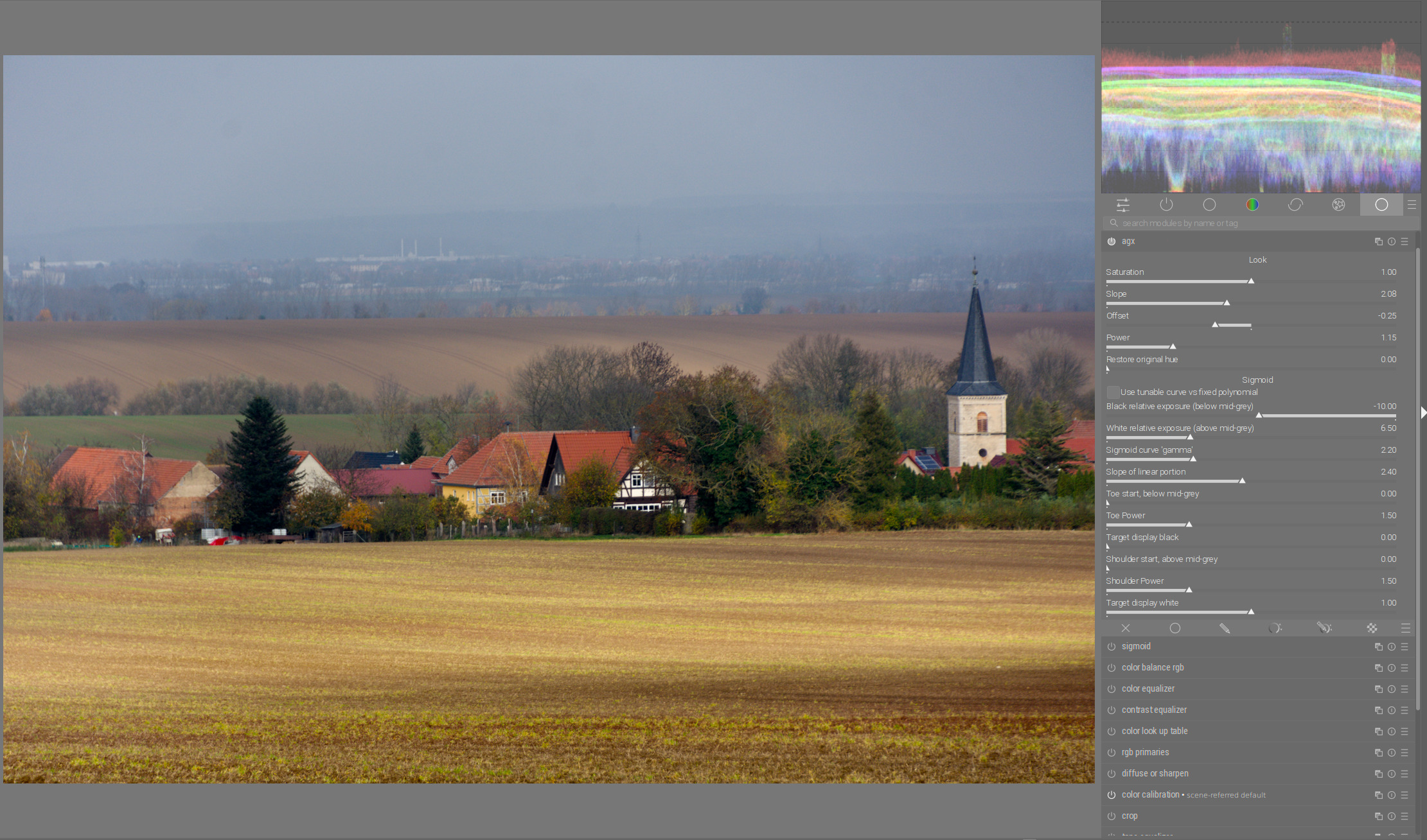
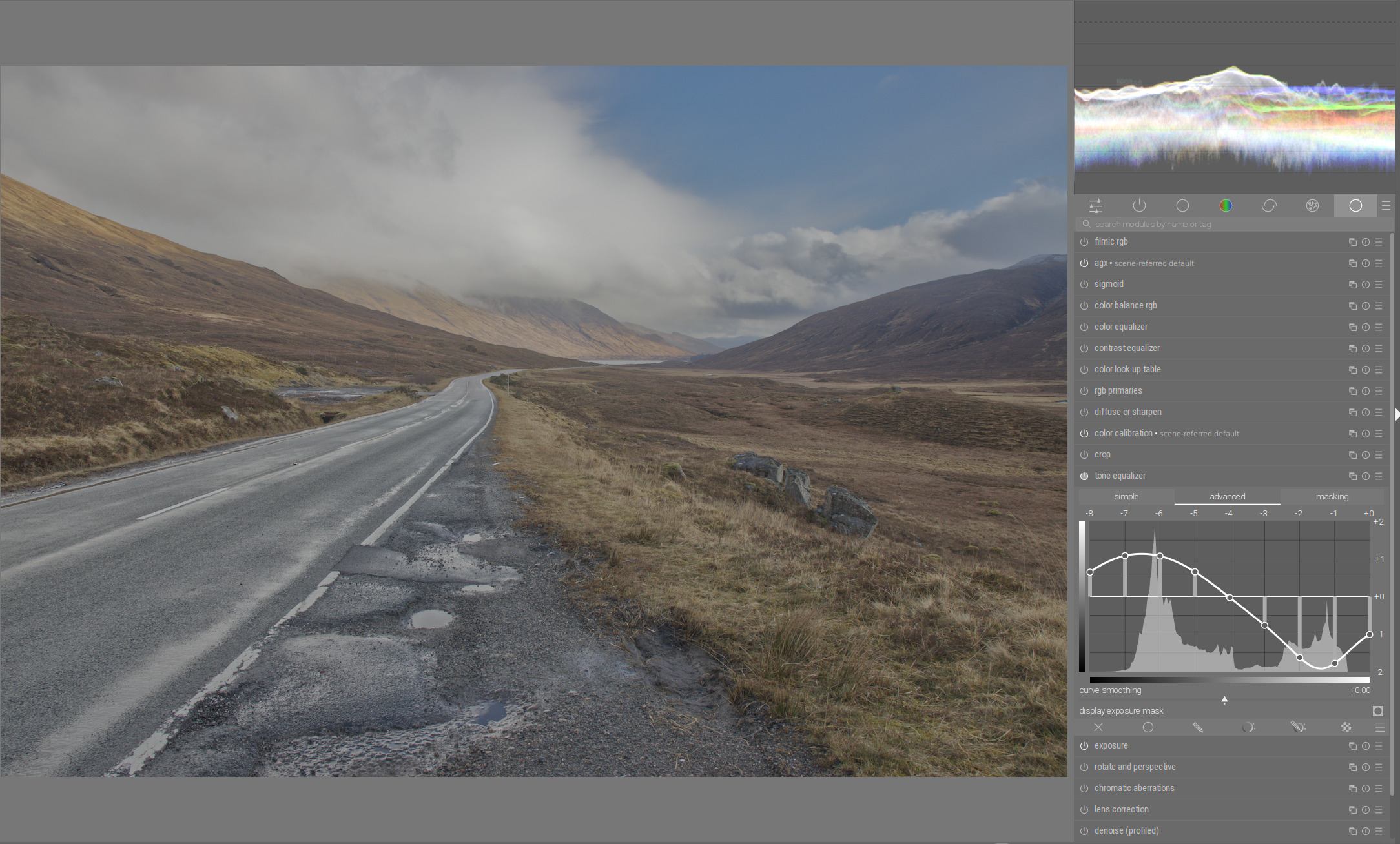
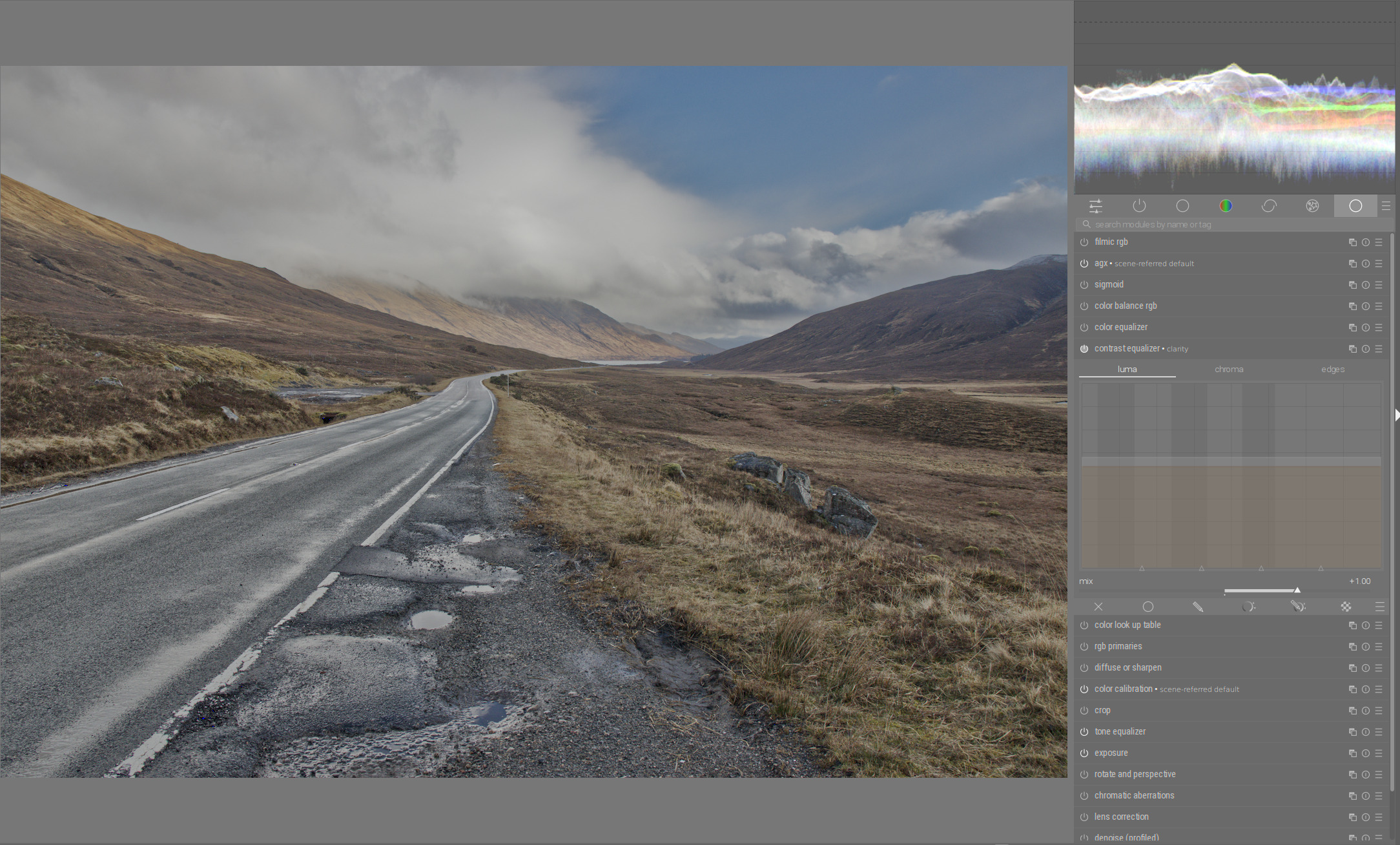
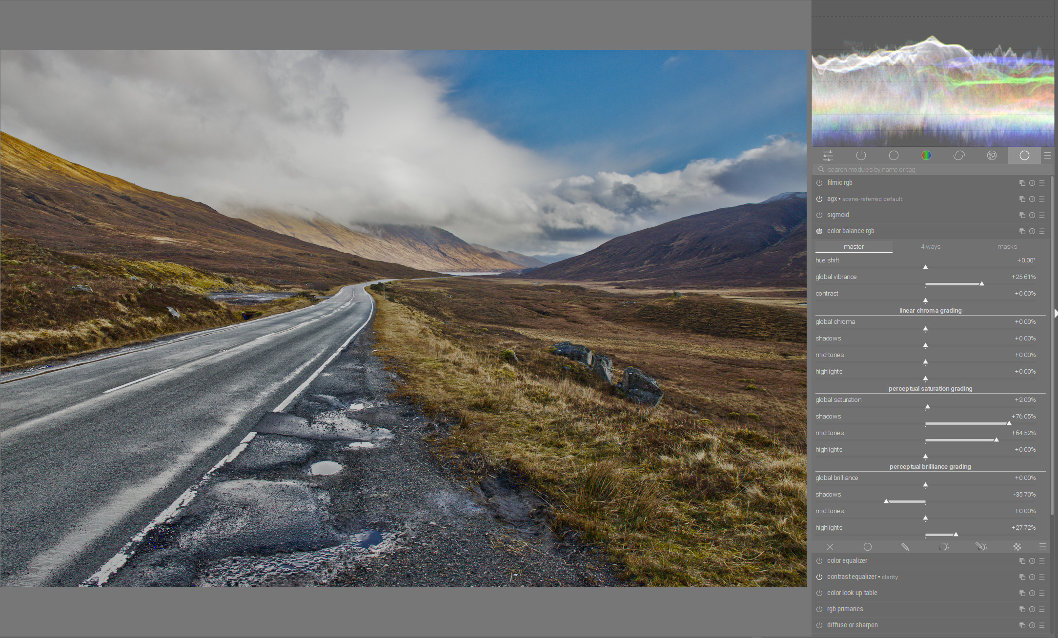
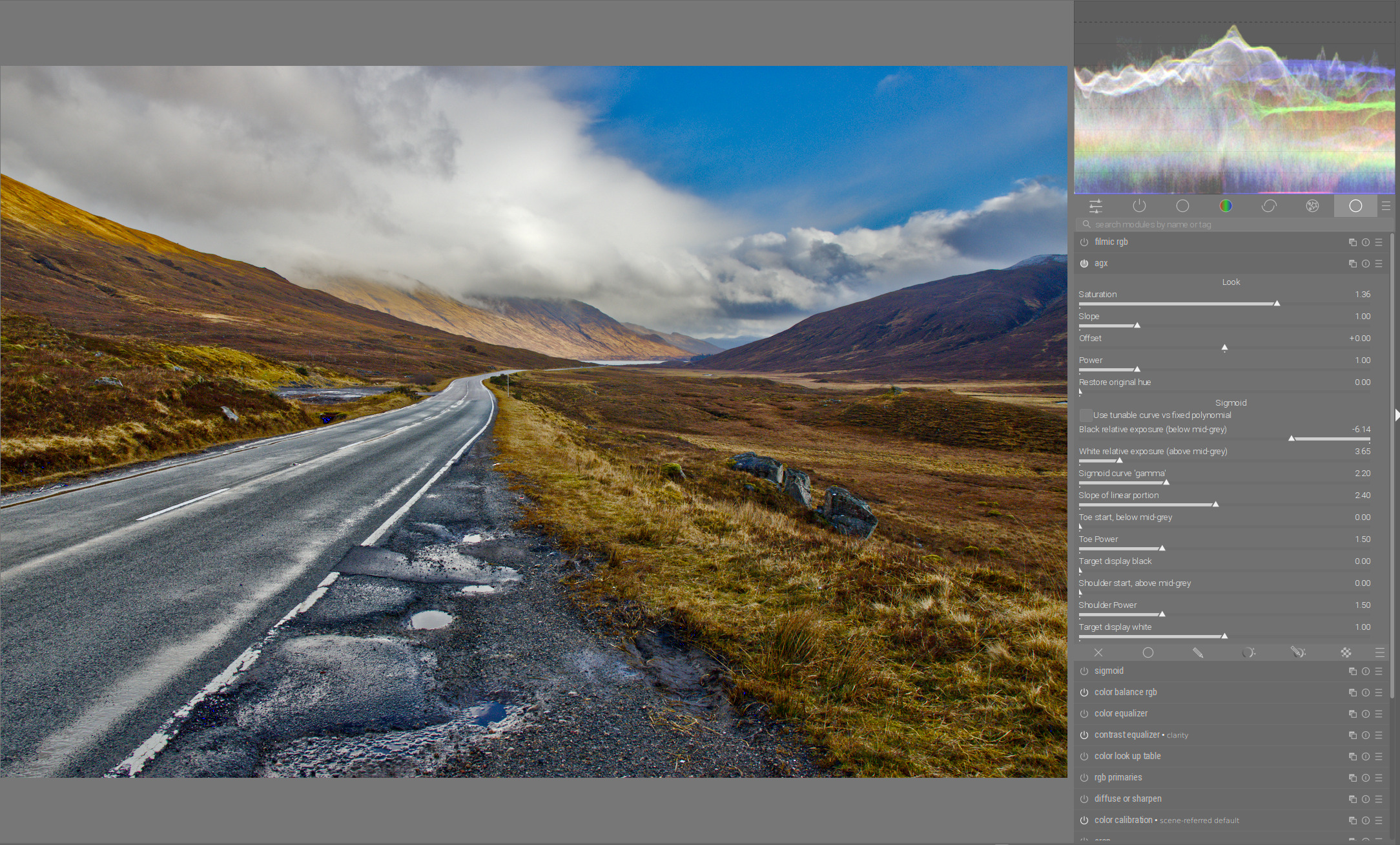
With the actual version of AgX it’s a wild slider ride for me to get anything near, regarding the contrasts in the sky. And I still need the tone equalizer to get there, at least if the landscape should still look similar.
Maybe you can show me how to get there fast and less erratic than my attempts (which lead in the end to a similar result, but more from fiddeling around than acting planfully).
Thanks, that tells me that I’m working in the right direction.
And I think this could help with new users who want to quickly get good picture and later they can move down into better control once they get comfortable with the DT workflow.
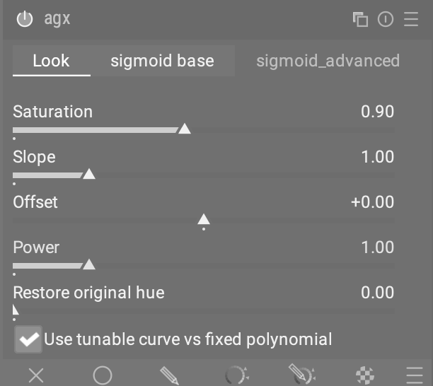
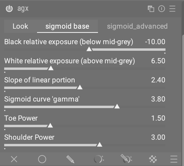
here a result of claude 3.5 using colorbalancergb notebook code as an inspiration to put the sliders to three tabs:
Look first, sigmoid base and advanced on second /third tab.
maybe a way to keep the ui simple for those who prefers the predefined curve but enables others to use the custom curves …
IMO, expandable sections are much better than tabs. If you need to change something in another tab, you have to keep constantly changing from one tab to another and it’s very bothersome.
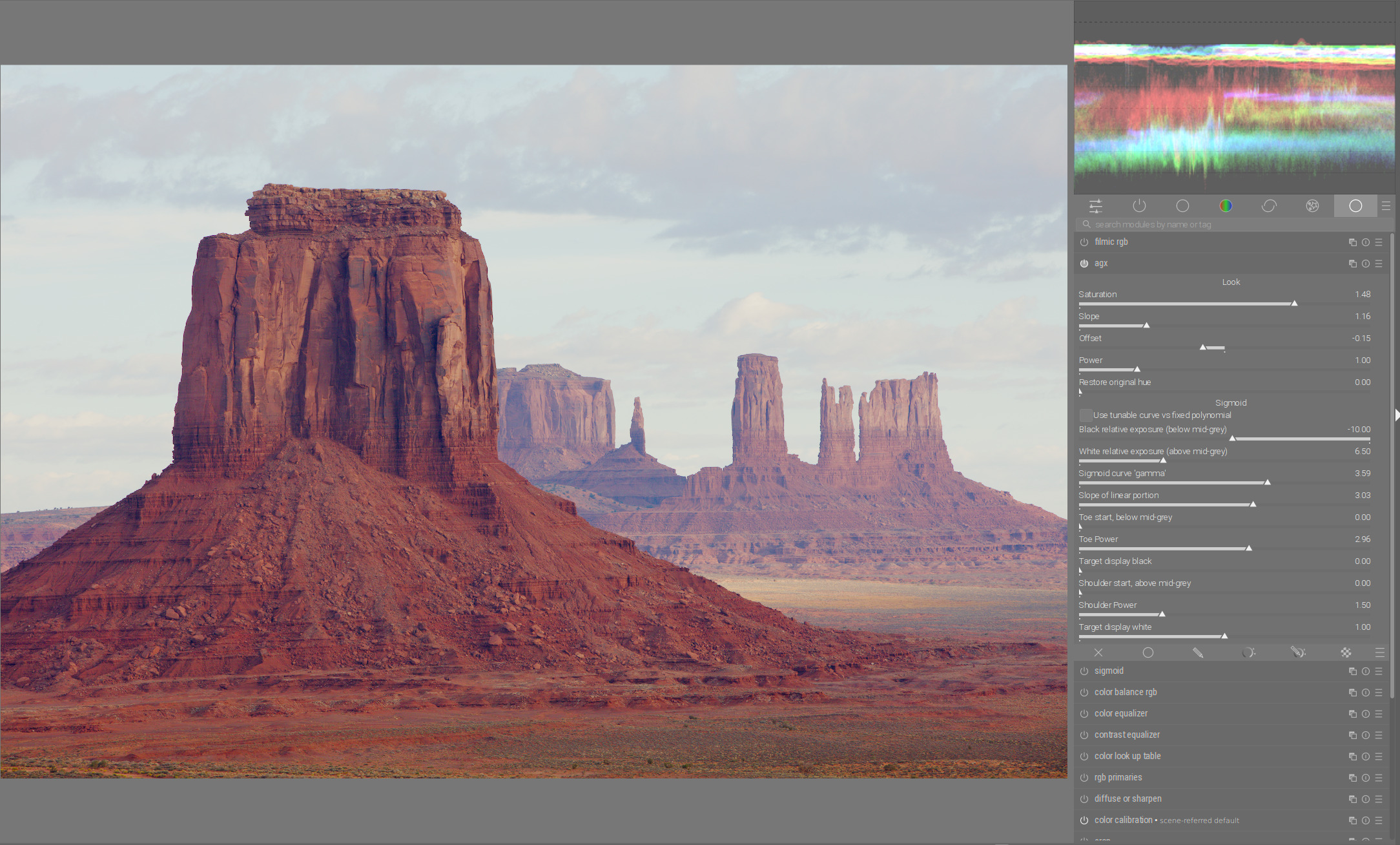
In Agx increase the saturation even more and reduce “white relative exposure” and “black relative exposure” until the limit of the dynamic range is reached:
If I can get there with less modules, I’m asking myself again why use a tonemapper. The key to this picture is the tone equalizer. We both needed it heavily. The tonemapper doesn’t bring a real advantage on this pic.
I plan on trying this out in the next couple of days. Is there anything I need to do to use the appimage alongside my current dt master, to ensure no libraries or databases or configs get messed up, or is it just plug and play?