Yes, I’m waiting for all the changes to be implemented and then I’ll be happy to make a video. ![]()
11 Likes
Ok, with the new version we now have definitely THE swiss knive tone mapper. And I support Dave’s vote as well.
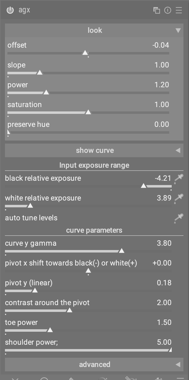
We now have the look segment for the quick and easy edit. All the things below are there for fine tuning or the tougher cases.
And even so I haven’t had a need for target black and target white so far I would still not vote to remove them. They are already in the advanced section and are not irritating anyone.
@PD1 I think it makes sense, but it is too early for that. If the module is nearer to the finish line and there are only code cleaning tasks left, it makes more sense. Otherwise @s7habo has probably more work than necessary.
1 Like
I think this is too premature. Until it gets in master branch of dt, it will just create confusion.
2 Likes
here a gui draft to be able to collapse also the curve to save space:
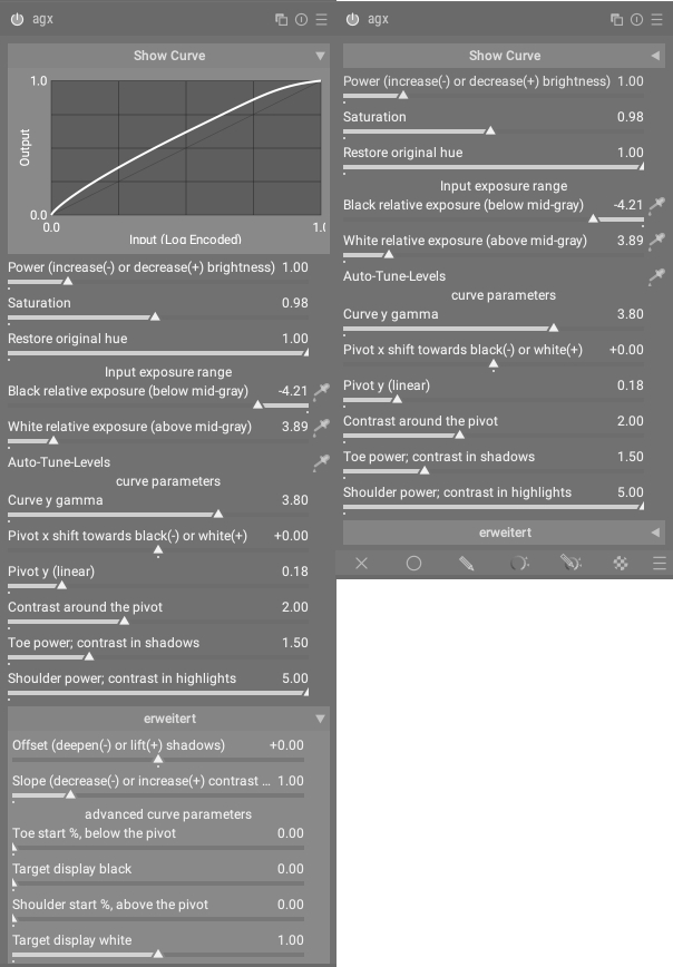
but this requires changes at dt_gui_new_collapsible_section (…) to allow collapsible sections to be placed at the top of a widget. (requires modification in 11 further modules)
seems to be not that easy to find a flexible but space saving gui for that module…
3 Likes
The height of the curve is already adjustable. If it is a bigger problem to make the curve collapsible, I wonder, if that isn’t enough.
Why not place it at the bottom? I don’t think I will ever use it since I prefer to edit my images by looking at them instead of a curve.
1 Like
if you’re limited in space, the curve must be minimized to an unusable amount to be able to use advanced settings without scrolling ![]()
Been messing around with the new build this afternoon; color me impressed.
Thanks to @kofa for all the work and @Dave22152 for the win exe.
One little thingie …
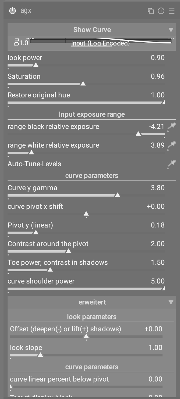
No matter how I adjust the height of the graph the text right below it (“Input (Log encoded)”) is truncated …

2 Likes
placed top due to consistency of handling graphs in darktable. If there’s a graph then the defining parameters are below in all modules
1 Like
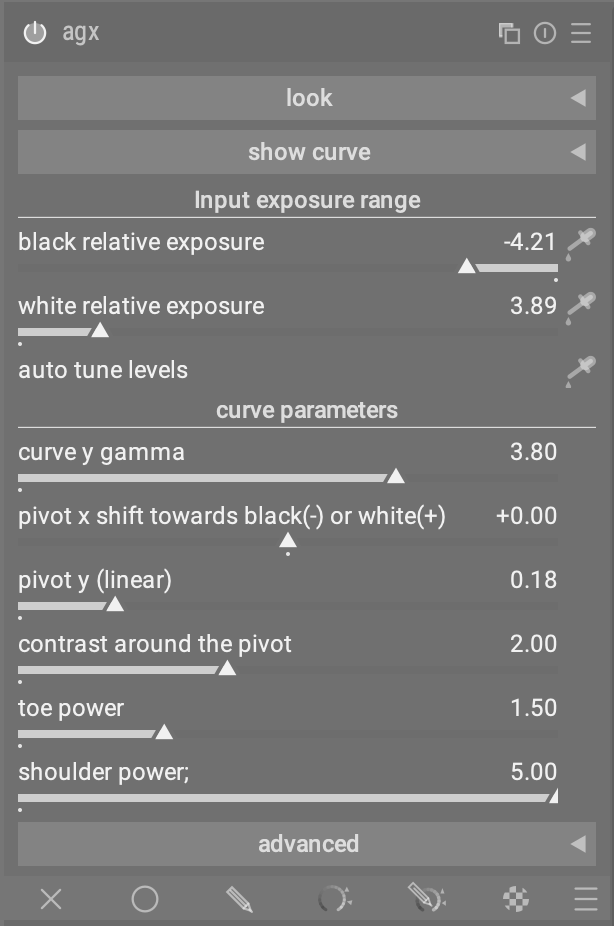
Thank you for your suggestion @MStraeten but I would not change the look section but simply collapse it as a default.
And as you suggested here, show curve and advanced sections too.
Then you would only have this tone mapping section open
But if tone mapping section shall be the main section (which is absolutely fine for me), I would move the look section below it. It’s strange when you have a module, where the topmost section is collapsed.
Sigmoid, or now tonne mapping part is practically refinement of the look section.
And the behavior of the sliders in the tone mapping section also depends very much on the settings in the look section. Furthermore, this hierarchy also corresponds to the internal processing logic of Agx.
And in the end, sometimes only the look functions are enough to get fast results.
Nevertheless, for the majority of cases, the tone mapping section is the best way to get good results.
It could also be organized similar to the filmic RGB module (scene, reconstruct, look, …) with different respective tabs (look, input exp. range, curve parameters, advanced) and the graph always visible on top.
I dislike the graph. It is such a waste of vertical space and it doesnt help me edit an image.
1 Like
I like it. It helps people to understand quickly what the sliders do.
2 Likes
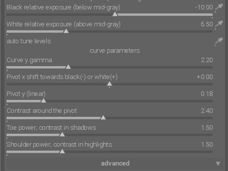
I find it very useful because you can see exactly how the compression is distributed. This makes it easier to decide which sliders could be used to better balance the contrasts.
However, I agree with you that the graph doesn’t always have to be visible. It can be collapsed as a default setting.
3 Likes
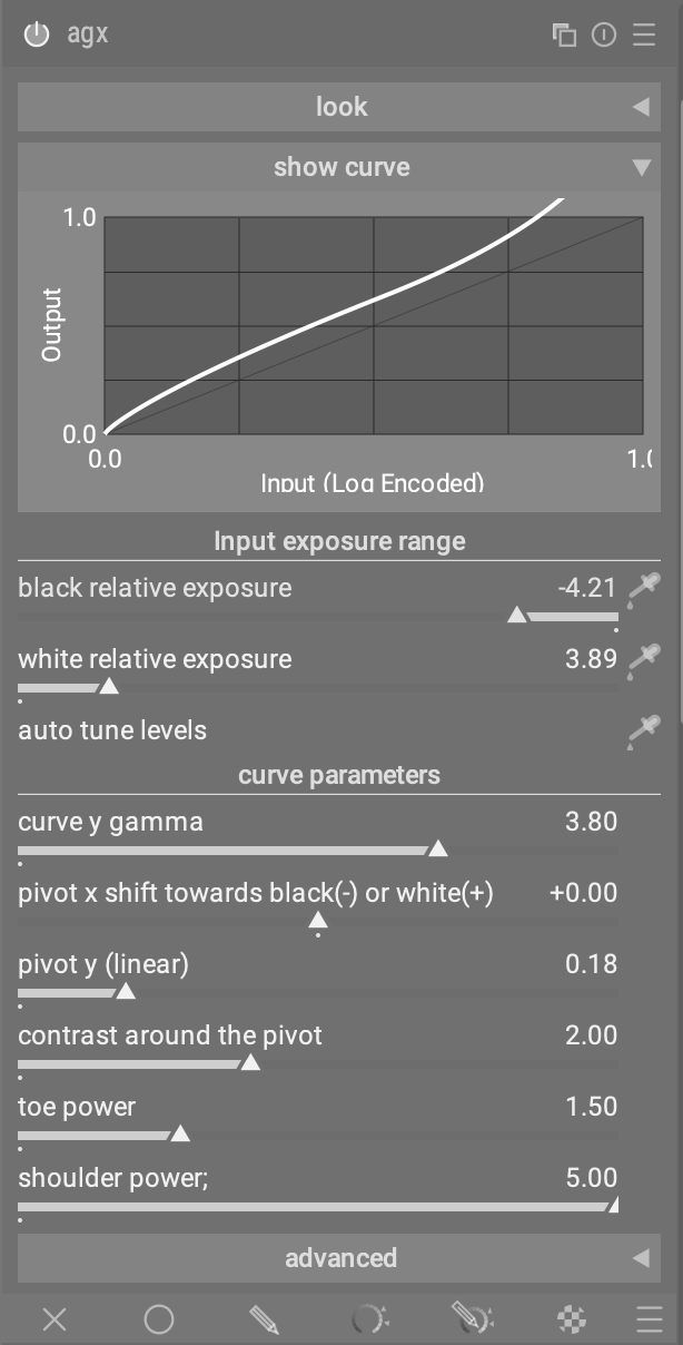
People are likely to have a hard time understanding what the sliders do without graphical representation, even if the effects aren’t apparent on the edit.
This is very clear and not overloaded. Very well organized. ![]()
I disagree, but as long as I could hide the graph, I’m ok.
2 Likes