I hate this trend. While the HDR versions often look fine, the SDR versions of movies and series look more and more lifeless. As if the erasure of color wasn’t enough, now contrast has to go as well…
Absolutely stunning edit! ![]()
1 Like
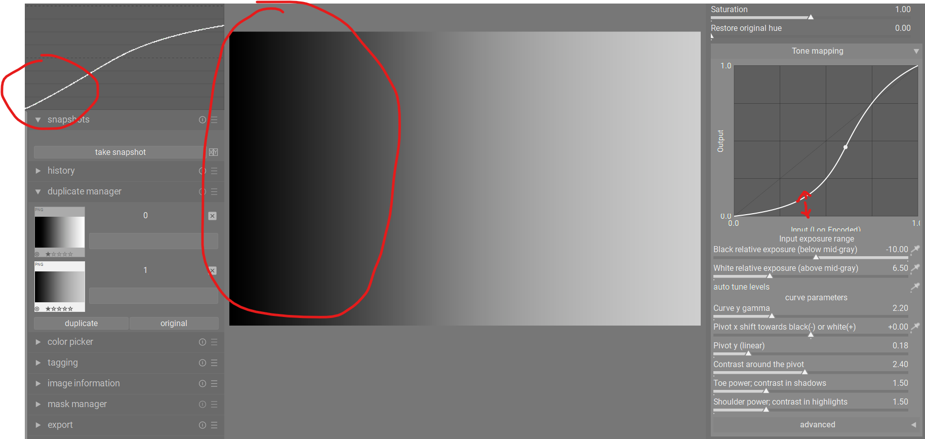
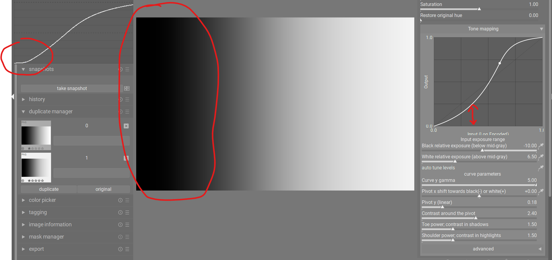
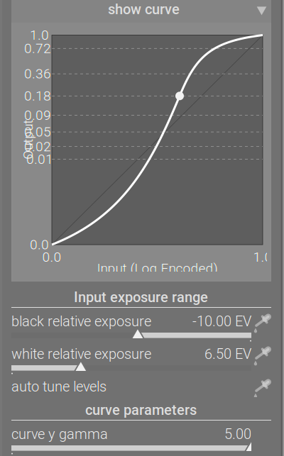
In the brighter image, pivot Y has been raised to 0.46. That means the output value changes (the pivot is not mapped to 18% mid-grey, but to a much higher value).
In the other image, where the curve looks quite similar, the pivot Y is at 0.18. The gamma of the curve does not change the value the output linear brightness the pivot is mapped to, it is still 18% or 46% or whatever is selected. It changes the point that represents that value on the graph, and with that, changes how internally, inside the tone mapper, contrast is distributed.
I know this is confusing, and that is why I was reluctant to add the control to the module: there are two sliders that move the displayed pivot point, but with different effect.
This new build will hopefully make the difference clear. ![]()
https://tech.kovacs-telekes.org/dt-agx/Darktable-5.1.0%2B732~g9596b9237d-x86_64.AppImage
@Dave22152 or @priort (please discuss, who is available), @MStraeten , please update your builds.
2 Likes
I’m back in town and I’ll start working on it
1 Like
You type faster than me…I can also do it if you are busy, but not for about 2-3 hours…so if you are free now…go for it…
1 Like
I happen to be at my PC, so I can do it right now. Thanks!
1 Like
From my testing on a simple gradient, both Curve Y Gamma and Contrast around pivot both compress shadows and highlights, but Curve Y Gamma retains a more linear curve in the midtones and has more compression in the deepest shadows. It has the effect that Contrast Around Pivot just seems to be a bit more aggressive.
And at certain settings, there really isn’t much difference:
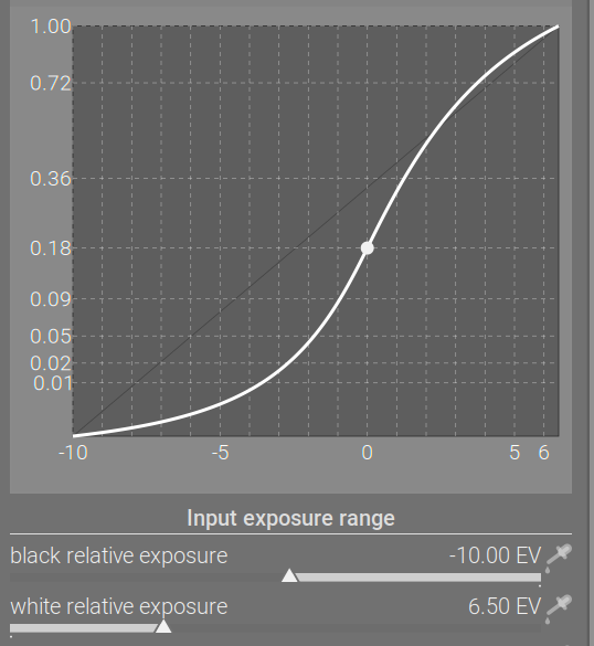
Curve Y Gamma at +5:
Contrast around pivot at +3.5

There is a difference, and you can see that the compression is in different areas. But it’s subtle.
Maybe the differences become clearer with other images and lighting situations, but certainly with everything else at default settings, there’s not a massive difference.
Thanks for the explanation @kofa , and maybe the next build will make it clearer.
But rather than just confusing, the graph just seems to show the opposite to what’s going on. Below are two screenshots showing a before/after for increasing Curve Y Gamma. Notice the difference between the waveform and the AgX graph.
Between the two screenshots, the waveform shows that the shadows have become more compressed - the shadows end of the curve moves down towards the X axis. But the AgX graph shows that the shadows have been lifted - the shadows end of the curve moves up away from the X axis.
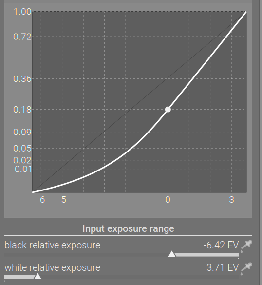
Default settings:
Curve Y Gamma increased to +5:
This just seems to be opposite of what is happening in the image. Maybe the graph is correct, but if so, it’s not helpful at all in this case to show what will happen to your image. This just seems to be the case for this particular slider.
Here’s the latest Windows executable:
3 Likes
The output in the waveform uses a fixed gamma, but you modify the gamma used by the curve display.
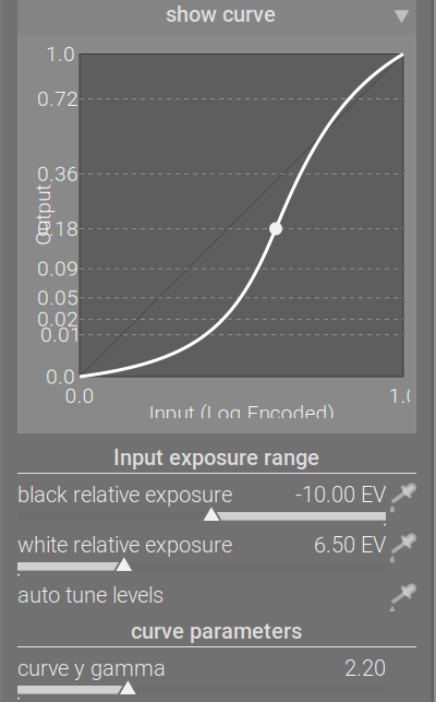
Check where (at what input X) the curve crosses the 0.01 output Y line.
1 Like
Ok, thanks, I think I got it. So, the graph is working correctly, it just isn’t showing the shadows compression because the gamma is lifted.
It still has the effect that the graph for this slider is not very helpful. It’s not really reflecting what will happen to your image. Otherwise, I find the graph to be incredibly helpful when tweaking contrast because it shows exactly what the sliders are doing.
The other thing I had noticed was that the graph seemed to show exactly the same curve for Curve Y Gamma and Pivot Y Linear. I even overlaid the two graphs in Affinity to see how close they were, and they were exactly the same. So I wondered if there was a bug and the graph wasn’t showing the proper display for Curve Y Gamma. But if you say it’s right, no problem!
As always, after pulling all these sliders and seeing “show curve” update, I’m thinking: Wouldn’t it be easier to just edit the curve itself? To me, pulling points on a curve is always the fastest and most intuitive way to edit a curve. Surprise. ![]()
But, would it just be a base curve module then? I guess there most be some other voodoo going on? Sorry for the layman questions…
Base curve maps 0…1 to 0…1. All these log-based tone curves (filmic, sigmoid, agx) map a user selected range, some part of (0…max] to 0…1.
In RawTherapee (probably also in ART, vkdt, Glenn’s rawproc), one can enable a simple log, and add any curve on top.
So yes, that is also a possibility, if someone wants to implement it.
Thanks! Implementing editing the curve itself?
Creating a module that does log + an editable curve, or just a module to do the log encoding and then apply any kind of curve you want on top.
Sounds like a dream come true. ![]()
You should be able to split out the log encoding from this module to create the log mapper, just remove all the curve and matrix stuff.
Personally, I don’t need them. I don’t really need to know any of the numbers. What I find helpful is the shape of the curve and seeing how its shape is affected in real time when dragging sliders.
1 Like
Yes, but not that many. I think 0.01, 0.18 and 1 are sufficient as an orientation in the output where the pivot is.
4 Likes