![]()
![]()
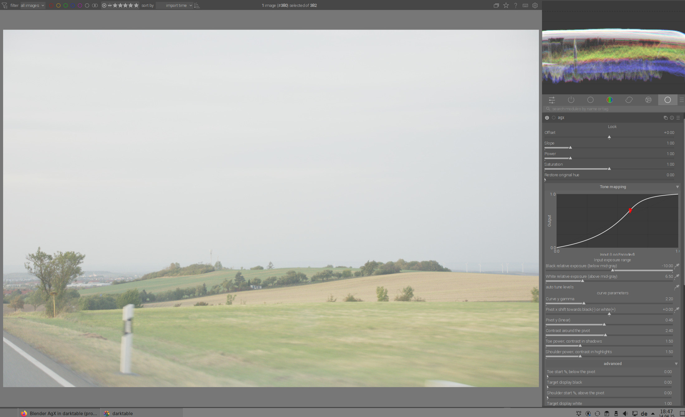
I think offset, slope and power are the main over-sensitive ones. I took a well exposed image with full histogram but no “sun in the shot” drama to see what reduced value ranges might work. First though I checked Exposure was ballpark for the mid tones before switching on AgX. I came up with these suggestions for the slider limits, bearing in mind it’s easy to increase the limits if necessary (but AFAIK not reduce them).
offset -.5 to .5
slope 0 to 2
power .5 to 2
saturation fine as is
pivot x -.4 to .4
pivot y 0 to .5
pivot contrast fine
toe power fine
shoulder power fine
I think these would make mouse movement more comfortable but are still plenty of range for a typical image.
Another thought - you say Blender has a fixed curve. Presumably a fair bit of thought went into deciding the parameters for that. Perhaps AgX defaults could be the same as Blender, seems neat to me.
I use luminance though the default is a combo of them. I think luminance and gamut are quite different issues and the gamut can be checked with its own button. I’ve never bothered with the other two settings.
It depends what you want to check for but do note that it uses the histogram profile so that will determine what you see for clipping…that defaults to the working profile but others sometimes will set it to the output or something like srgb…
Our defaults are the Blender settings, exactly because they probably put enough thought into it.
However, in Blender the author has complete control over the lighting in their virtual world. With the camera, that is not the case, so I think it’s good to have flexibility. You don’t need to adjust all the sliders all the time. ![]()
Thanks for the range suggestions. If the others agree, I can add them.
Oh, and @MStraeten has even sent code for UI updates (thanks!), they will be in the next build.
2 Likes
The suggestion is ok. But I would define it as a soft limit.
1 Like
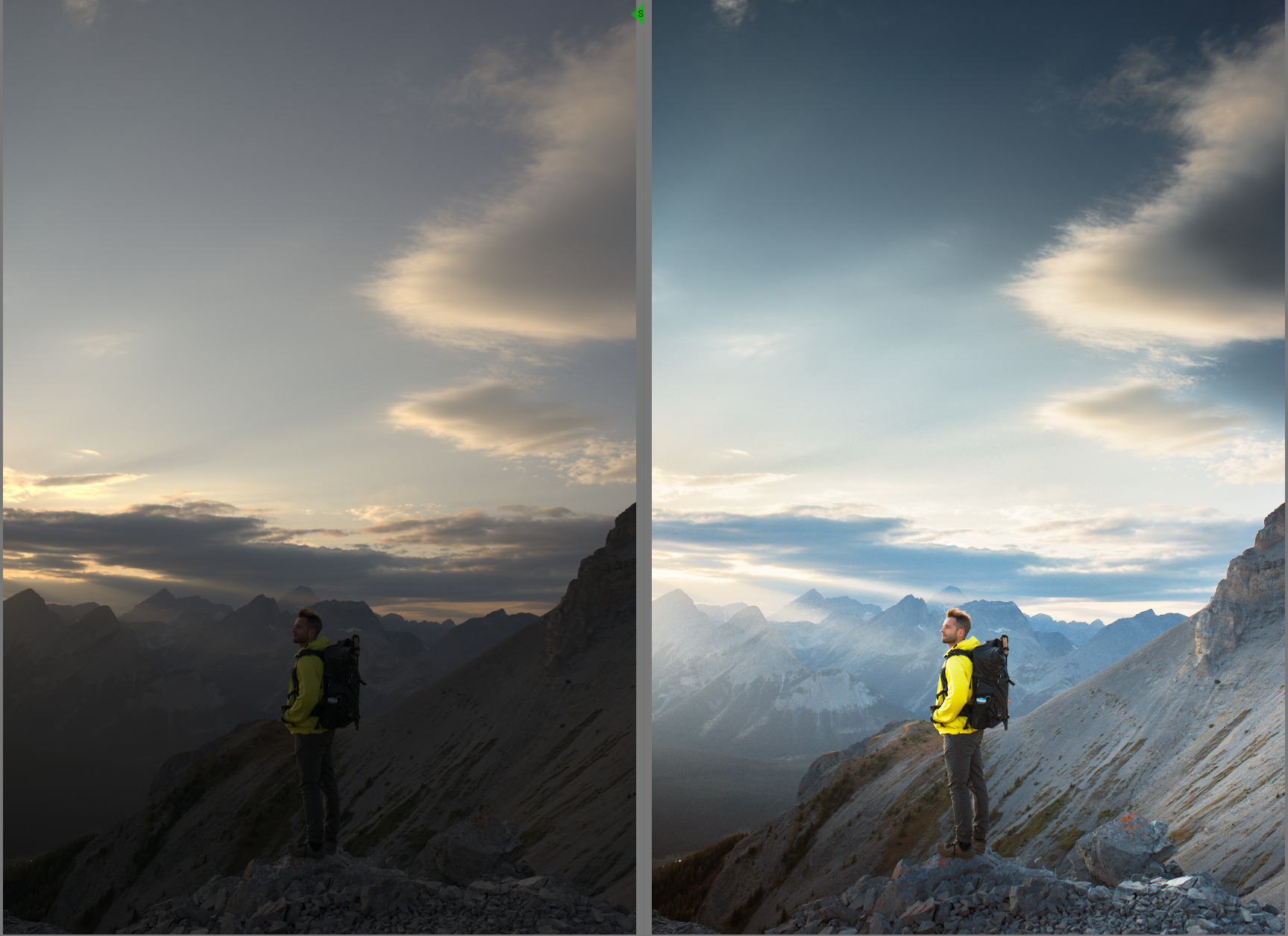
For all those who have difficulties finding a clear approach because of many sliders, the last version offers a relatively direct and easy way to the goal.
The prerequisite is that you clearly define/select the main subject in the photo, which serves both for the exposure correction and for the focus of the contrast. This can of course be the entire photo or a specific motif.
In this example, we see the woman and the child in the evening sun. For us, the main subject is the woman’s smile, so that should be the focus for exposure compensation and later in Agx for contrast.

First we select the woman’s face in the exposure module with the color picker to be able to brighten this area optimally (to bring it into the middle gray range):

In Agx, we set the pivot x (contrast focal point) on the face with the color pipette and increase the gamma:
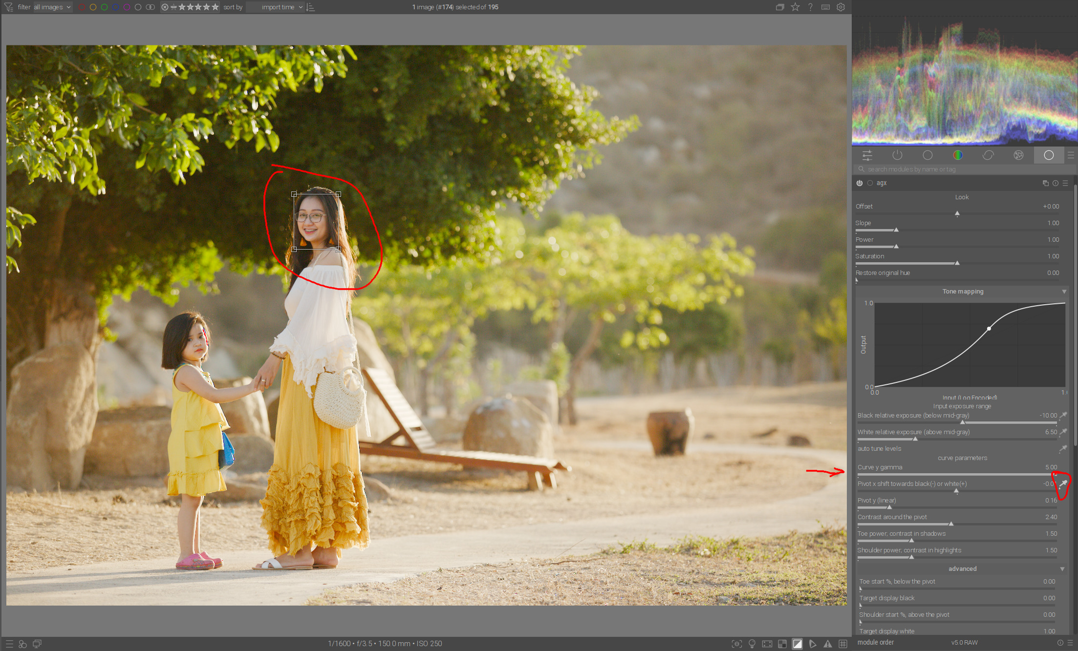
We can also increase the contrast around the pivot to get even more contrast in the face:

And at the end, we use the auto-tune level color picker to set the black/white point and/or prevent clipping:

This completes the basic processing.
In this case, however, we can darken the highlights a little with TE to bring back the details on the road and to achieve even stronger contrasts in highlights with the shoulder power in Agx:

26 Likes
Thanks for the mini tutorial @s7habo! I just have a couple of small questions:
Most of it makes sense and aligns with what I’ve been doing, but I’d just like to hear about your reasoning for “increase the gamma” at the step when you did it. Are you just going by sight/feel at this point, or is there more of a technical reason for using this slider? There are a quite a few ways to control contrast in the current version of AgX, and I’m still experimenting to find out which I prefer.
Also, I notice you auto tune levels after doing everything else, whereas the slider order, and in Filmic too, would suggest doing this earlier. Just your preference or do you feel there are important reasons for doing this?
Would it make sense to have the “tone mapping curve” be in its own drop down, rather than being open all the time in the tone mapping area?
It would save space and yet be available if needed.
No, with gamma you can first increase the contrast in general. Pivot x helps you to set the contrast point exactly where you need it most.
Let’s take this example here:
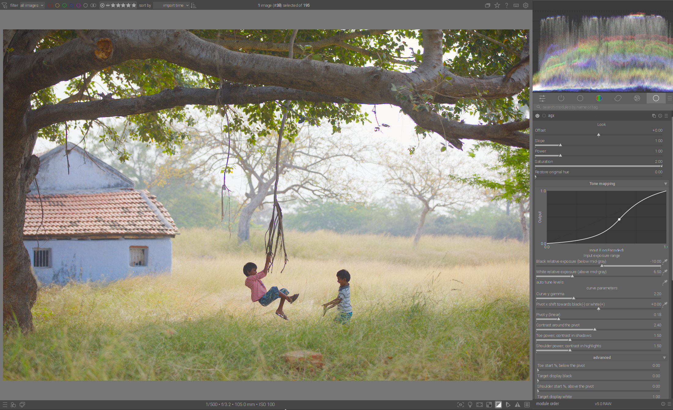
I can now take the average value for pivot x from the entire photo.
You can see how the contrast focus and also the contrast itself has been shifted in the direction of highlights (e.g. grass gets more contrast):

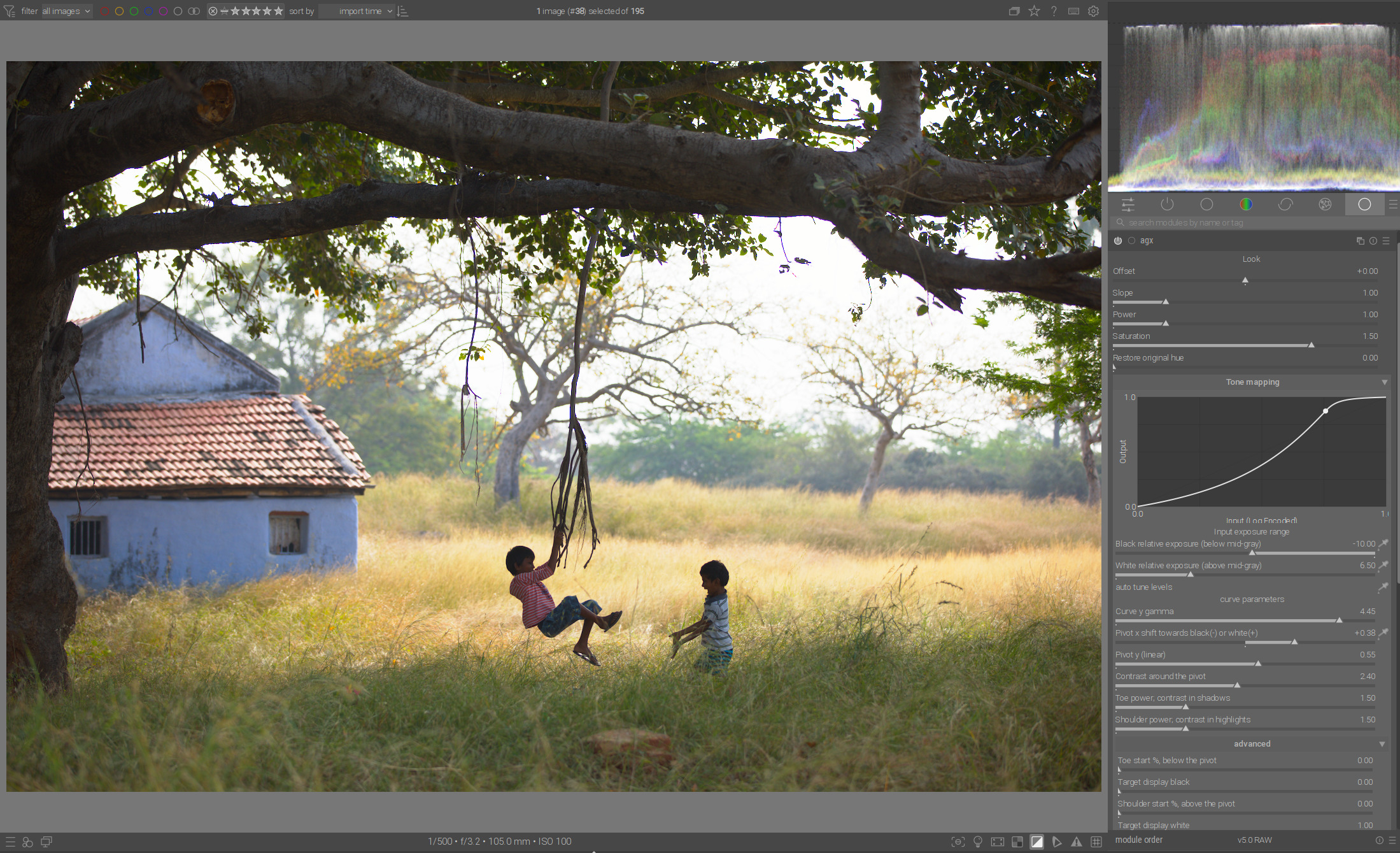
If I now increase gamma, I get good contrast in the grass and the whole photo becomes correspondingly darker:
But that’s not what I want. I want good contrast in the area where these two children are playing, so I put pivot x right there:

Now the children have the strongest contrast. Notice how the grass and other highlights get paler.
If I now need more contrast in this area, I can increase it with contrast around pivot. This type of contrast only applies to the middle part of the curve, around pivot, and accordingly, as a side effect, increases compression in the highlights and shadows. That’s why I only use this contrast when gamma is not enough:
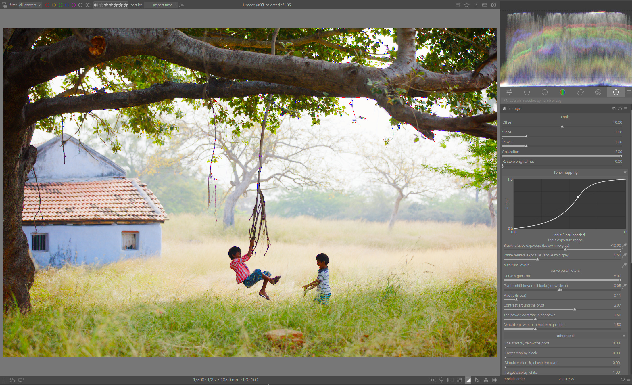
Increasing contrast also increases the dynamic range. That’s why I do it at the end, because after that I use the auto tune to set the white/black point.
10 Likes
That’s one of the changes @MStraeten provided. Careful, he can read you mind! ![]()
1 Like
How do you mean that? The output range is always the same, 0…1. The input range is whatever you select (via sliders or picker).
Now I have enough contrasts, and I can increase the range with autotune up to the limit:
But sometimes I don’t want that. I don’t always have to fill the entire histogram if I want flat highlights or shadows, for example.
2 Likes
I think this is what I’m unsure about. Certainly, the effect while looking at the image is that overall contrast is increased. But the graph shows the curve doing almost the exact same as what “Pivot Y” does, i.e., it moves the pivot vertically along the Y axis. This means increasing it should actually raise the shadows, not compress them.
Is the graph mapping this slider wrong? Or am I not understanding something?
Can anyone else confirm that the graph in the latest build seems to show Curve Y Gamma and Pivot Y doing similar things?
But as I said, look at the graph. They look almost the same, whereas the image itself is very different.
For me the question is, if it makes already sense to discuss workflow in deep.
For me the module feels quite matured, but I have no clue, how @kofa and the other developers see it. I understood, that the module is not mature enough to make it in the next stable. But the question is, what speaks against? Is it quality of code or the wish to still change major parts.
@kofa, do you still think the module is in the stage of proof of concept?
If so shouldn’t we wait with tutorials or howtos until at least the most parts are fix and there is just code to be improved.
From my side it would be nice to get some insights, what the next steps will be and when can we expect AgX to make it to the master branch.
This is in no way meant to bring any hurry or pressure in. I’m just very curious how @kofa is estimating the progress so far.
Yes, the @kofa has to answer that ![]()
Yes, I realised you didn’t, and deleted my question. Now I realised you deleted your response, too. ![]()
Pivot Y is adjusted so the selected region ends up where it would end up if pivot X and Y were set to 18% (so, starting with 18%->18%, the brightness should not change (much) after the first pivot pick, but if you then pick another pivot point, the brightness will be matched against the pristine state, not the one set by the previous choice of pivot). In your case, that is a tad below mid-grey (0.16). BTW, in movies and shows (series), it is now becoming common to map mid-grey lower (sometimes much lower – I’ve read about values as low as 11%, but cannot find the page now), to achieve highlights that seem to be brighter (a kind of HDR look). Of course, if you look at photos processed like that outside of darkened rooms, they may appear too dark.
3 Likes
This is an important creative element.
It always depends on how you want to interpret the scene.
In this case, for example, the main motif, the man in the middle of the scene, is also a little lower than middle gray, which helps to maintain the space for “drama” of clouds and rays in the sky, which formulates the framing of the scene:
That’s why I think it’s an advantage if you have the appropriate freedom to set the accents in the right place with pivot functions, as you have done so far.
9 Likes