It certainly won’t be removed: the code to configure it is already there, it does provide a bit more freedom. The question remains: do we need gamma controls among the basic parameters?
I agree with you. I went back to some of my images with ‘keep pivot on identity line’ unticked. I tried with the checkbox on and could get very similar results to the previous edit. So I think I could do with the gamma control not in the basic parameters.
For me, what @Soupy mentioned under his point 3 works best and most directly:
I also think that you can leave gamma on 2.2 and hide it because it only brings confusion.
3 Likes
Thanks for sharing your opinions. It’s a bit confusing, but hopefully we’ll find a solution that suits most. I’ll post the voting on Thursday or Friday, and then I can implement what we decide on during the weekend.
1 Like
I still don’t understand what the gamma curve does exactly !
I always thought it was something to set at 2.2 for apple kit, and 1.8 for windows…
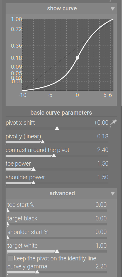
Screens do not have light output that is directly relational to the signal they receive. A screen calibrated for sRGB, for example, has a light output that can be described (approximated by) the following formula:
light = signal ^ 2.2.
Therefore, before we send the signal to the display, we have to encode it with a ‘gamma’:
signal = light ^ (1/2.2).
Here is a simple tool to plot how x and y are related, depending on the power.
Using a power function, such as in the power in the look section, allows you to darken (power > 1) or brighten (power < 1) the image. That is because between 0 and 1 (screen-referred output) an exponent < 1 increases values, > 1 decreases values. Let’s take 1/2 (square root) and 2 (square) as examples.
| x^(1/2) (square root) | x | x^2 (squared) |
|---|---|---|
| 0 | 0 | 0 |
| 0.1 | 0.01 | 0.0001 |
| 0.316 | 0.1 | 0.01 |
| 0.707 | 0.5 | 0.25 |
| 0.837 | 0.7 | 0.49 |
| 0.894 | 0.8 | 0.64 |
| 0.949 | 0.9 | 0.81 |
| 1 | 1 | 1 |
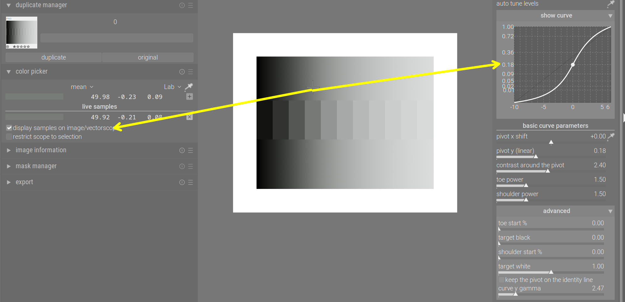
The curve used in agx (and also in Blender’s AgX) was originally designed to produce values that could be sent to the screen directly. It means its design had a gamma of 2.2 ‘built in’. In other words, the curve maps 18% mid-grey not to 18% output signal, but to the gamma-encoded value representing 0.18. That value is 0.18 ^ (1/2.2) = 0.4587 (approximately). That is why the horizontal dashed line representing output = 0.18 on the y-axis (actual light output from the display) appears slightly below the midline of the graph (this uses gamma = 2.2, as indicated):
Changing the gamma slider does not affect the output brightness of the chosen pivot (here: 18% mid-grey). However, it does affect other values, adding or reducing contrast (the effect of the power curve). (Note: 18% mid-grey is the same as Lab L = 50.)
Gamma = 1.0:

Gamma = 10:

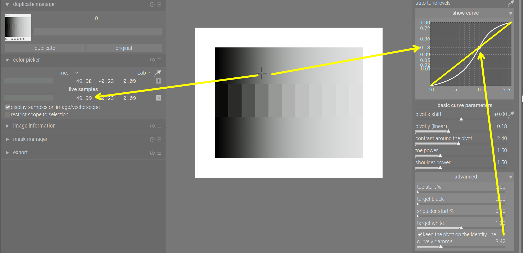
Gamma = 2.474 puts the pivot right in the middle (because 0.18^(1/2.474) = 0.5):
And Gamma = 3.42 puts it right on the identity line:
You can also use the contrast slider to manipulate contrast directly, and achieve very similar results. E.g. gamma = 1 and contrast 2.4 vs gamma = 10 and contrast 0.8:

Why I think using auto-gamma is a good idea:
intuitively, we think of a curve that runs under the identity line as darkening the corresponding input values, and running above the identity line as brightening them. However:
- the pivot’s brightness is always preserved
- any input left of the pivot is darkened
- any input right of the pivot is brightened.
If we put the pivot on the identity line, the graph actually reflects that. But check the plots where the gamma was less than 3.42: the pivot appeared below the identity line, even though it was not darkened; and for high gamma (10), it appeared above the identity line, even though its brightness was not changed.
6 Likes
This is your module @kofa, and you should design it how you envision it. I think we should be careful that this module isn’t a classic case of “designed by committee”, which rarely works out well.
It’s great to get feedback, but only a handful of people are actively providing feedback in this thread, and many of these people are “power users”, so the votes will probably favour users who are happy with complexity. If you’re happy with this, then great, but if you feel it would benefit from being more streamlined, then you have the final say.
8 Likes
I thought the reverse that it was older apple kit had that gamma…I don’t think that is true any more??? I could be wrong…
Thanks for clarifying, it was really confusing me. I find it’s effect really pleasing coupled with contrast around the pivot.
Excellent explanation @Kofa.
I found this part interesting:
I think what did baffle me a bit was that the curve in the graph does not seem to reflect what is happening in the image. Increasing the gamma increases contrast as you pointed out, but the curve doesn’t make this clear.
These images show what I mean:
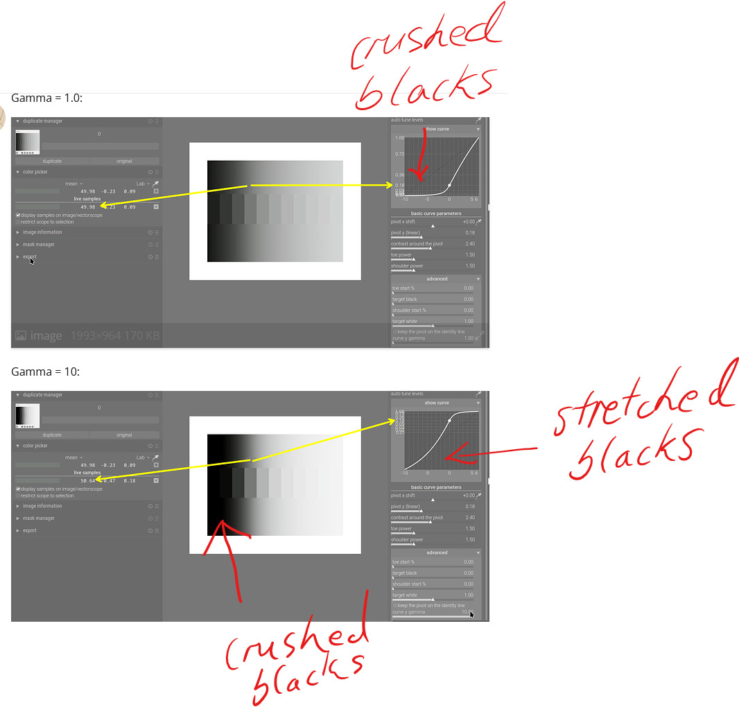
In the second image, the blacks are clearly crushed, but the curve in the graph seems to depict stretched blacks, which would have less contrast.
I know that this is because the Y axis is getting stretched rather than the actual blacks, but it superficially shows the opposite of what is happening with the image.
Other than that, I had to read up on the identity line to find out why it’s called the identity line. It’s because it’s related to the identity function, which I then I had to look up. It’s called that because it maps every element to itself, which I then had to look up…
I think I would have intuitively understood it if it was called the x=y line or 1:1 line…
3 Likes
Sorry about the ‘identity line’. And you are also correct about the discrepancy between the apparently lifted blacks, when in fact they were compressed. The graph is not that useful, it seems, and while the auto gamma moves the pivot onto the identity line, it does cause other issues. Plus, if pivot y was used to modify the mapping on the pivot, it’ll still be mapped to the line, I think, even though it’s brightness is modified. I’ll have to check that.
1 Like
If I understand correctly, the “keep pivot on identity line” thing is basically “assume the image is originally formed for a display device that has the same native middle grey as the log curve”?
If we think of the entire process:
0 stop Exposure 0.18 → encoded into log curve, default middle grey is 0.6 → sigmoid which maps 0.6 into the display’s native middle grey (image formed) → linearize the image with the assumed transfer function
If I understand correctly, keep pivot on the identity thing, is basically, figure out which power value will produce the same middle grey as the log curve (for the default log middle grey of 0.6, the power value is about 3.42?), and then assume the image is originally formed for the display with such transfer function, then linearize the image with such assumption?
Kind of a weird thing to do, I do find it interesting that it can be used as a tool for “contrast” adjustments though.
3 Likes
Thank you for your question and analysis. To be honest, I never really sat down to think about what tweaking the gamma would do; I just added a slider and noticed it worked as a contrast control. Same for the ‘auto-gamma’ / keep pivot on the identity line. It was (is) completely unscientific quackery.
I am simply too tired to think today. I’ll have a day off on Thursday, and hopefully can think it over.
There’s also something I’ve been meaning to ask you for a while: darktable’s internal pipeline used D50 as the illuminant, so your rotation/insetting values do not produce the exact same matrix as in Blender. I assume I can simply take your matrix, and derive the parameters back from that (find the inset / rotated primaries by applying the matrix to the primaries in D50-adapted Rec 2020, take the respective distances to the D50 achromatic xy coordinates to find the inset value, and use a bit of trig to find the angle at the achromatic point, using the original and matrix-transformed positions of each primary). I don’t expect a huge change, but that would be the process, right?
3 Likes
Or could you convert the image to Blender illuminant at the start of the module, and back to D50 at the end? In between you could then do the same maths/matrices as Blender? If Troy S subsequently revises his process, you can easily revise yours? (if you wanted to)
Theoretically yes. But in practice I doubt whether you can get the exact same matrix.
Basically, assume the inset matrix to be a combination of “Inset Primaries to XYZ matrix” and “XYZ to Rec.2020 D65 Matrix”, then you can remove the well-defined “XYZ to Rec.2020 D65 Matrix” from the mix, isolating the “Inset Primaries to XYZ matrix”. And since the math to calculate “RGB to XYZ Matrix” from xy coordinates is also standardized, you can work your way backwards to get the Inset Primaries xy coordinates. And then you can try to approximate the parameters to try to match the Inset Primaries.
I actually tried this, I couldn’t get the D50 version of the parameters to spit out the exact same matrix, so I gave up on that. Or maybe you can try that if you have time.
(EDIT: Wait, maybe it’s never going to be the same matrix… Because if you think of it, XYZ D50 to Rec.2020 D50 is a different matrix than XYZ D65 to Rec.2020 D65 in the first place, despite the fact that they have the same primaries coordinates. Maybe there’s just no point of doing this anyways. I wouldn’t stress too much about this, I don’t think this would go anywhere.)
Edit Again: Okay, I think I wrapped my head around it a bit more now. Basically, I used the exact process I described above to derive the parameters for Rec.2020 D65, The process makes sense, because blender matrix was supposed to be applied to Rec.2020 D65 In the first place.
But this process doesn’t quite make sense for deriving a set of D50 parameters. The reason is that, the exact matrix was never supposed to be applied to D50 in the first place. I guess It could work if you assume the matrix to be a combination of Inset Primaries D50 to XYZ D50 matrix, and XYZ D50 to Rec.2020 D50 matrix, But that really doesn’t make much sense, because the matrix was never supposed to be interpreted that way.
I think using the parameters we are using now is good enough.
1 Like
So, I’ve gone through the code and my memories. Using the auto-pickers for the black and white relative exposures, and subsequently rescaling the contrast internally (*) to maintain the same effective contrast around the pivot (this is not reflected on the UI) cause the curve to lose the sigmoidal (S) shape. The custom pivot (x and linear y output) controls can have the same effect. Here is a pair, where only the black and white point pickers were used (before/after):

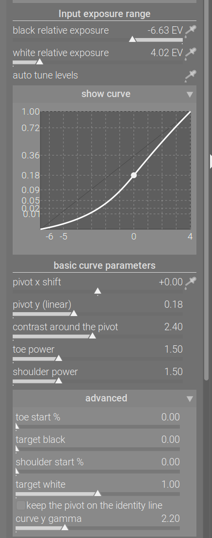
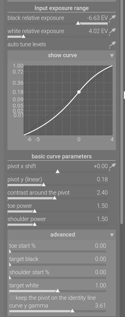
By adjusting the gamma, the pivot could be moved higher, while maintaining the original output value, restoring the S shape. The same could be achieved by increasing contrast, which basically counters the internal contrast scaling (the graphs look different because of the y scaling, but the processed image looks very similar):

That’s all there is to it. I never thought about it in terms of the native gamma of a display (probably an imaginary one).
(*) About rescaling the contrast: one of darktable’s other tone mappers, filmic, also has that feature. People (including me) always complained about mid-tone contrast being affected by changing the black / white relative exposures (and therefore the exposure range covered by the x axis). Dropping the contrast is exactly what leads to losing the S-shape. It can happen with filmic, as well:
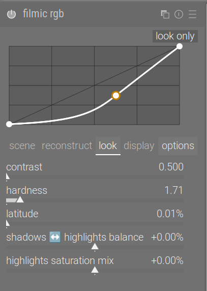
filmic also has this ‘keep the pivot on the identity line’ feature, there it is called auto adjust hardness (and is enabled by default). Internally, the parameter is called
output_power.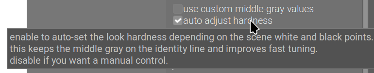
1 Like
Please add a ‘like’ here if you don’t or hardly ever use the gamma slider (all/most of the time, you either keep the default, or have it set to auto), and would like to keep it tucked away in the advanced section.
14 Likes
Please add a ‘like’ here if the gamma is an important part of your workflow (you find you cannot achieve the same result using contrast), and would like to have it added to the basic controls.
3 Likes
@kofa, I would like it tucked away with the default at 2.2, the “identity line” unticked. I would fiddle with it only in outline situations. Thanks
1 Like