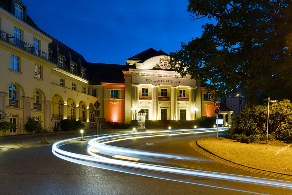
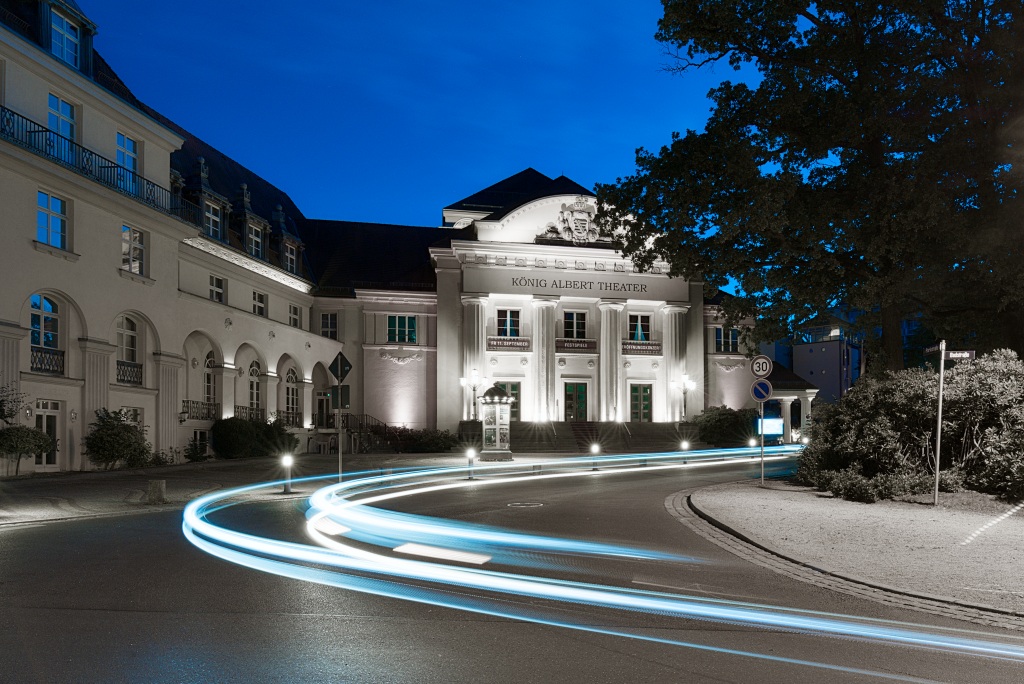
I wanted to share a quick creative grading technique I’ve been playing with recently. We all love a classic Blue Hour shot utilizing a natural complementary color scheme (warm artificial yellow/orange lights cutting through a deep blue sky). But what happens if we intentionally disrupt that harmony?
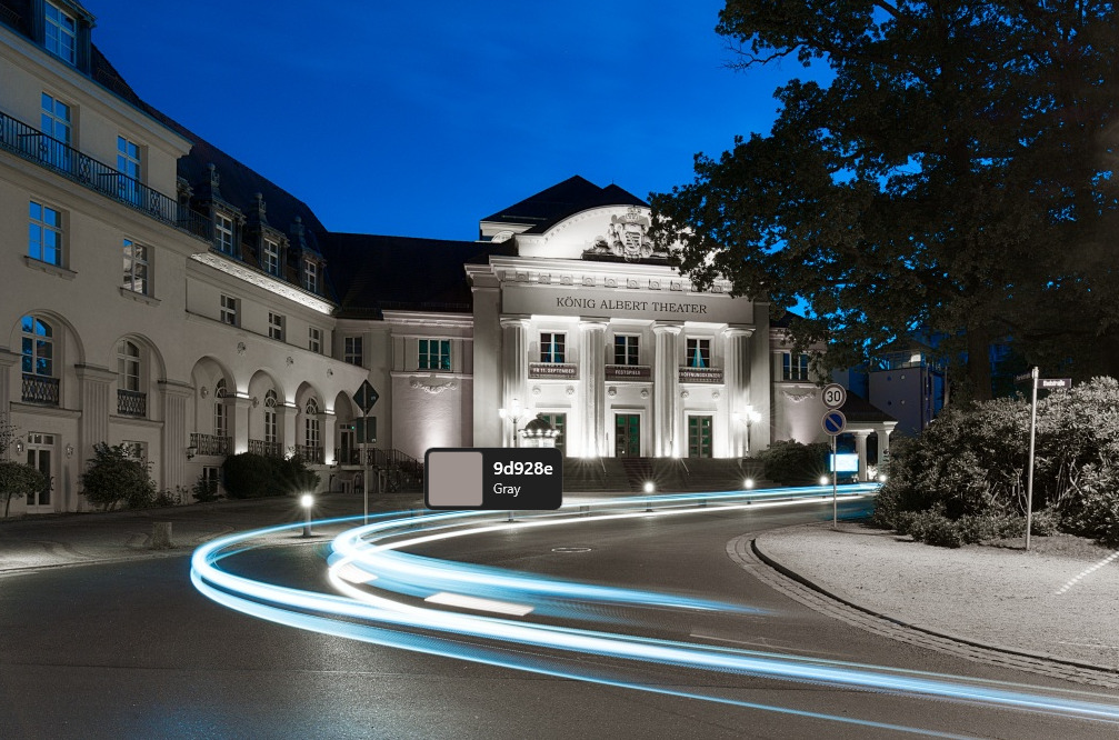
By targeting one of the complementary colors—in this case, dropping the yellow saturation straight to zero—we can create a surreal, striking visual style that sits right on the edge between monochrome and full color. It instantly strips away any postcard-like cheesiness, giving the image an incredibly clean, modern, and razor-focused architectural look.
Also, have you tried to shift the hues of the reds, perhaps oranges as well towards pink? in some scenes (particularly modern downtown areas), it could be a cool cyberpunk look. Maybe not globally, to make it look a bit more natural.
Could you share a screenshot of the settings you used? I presume you are using the color harmonizer module and I am unsure how to achieve this. Or did you use color equalizer or or colour zones?
My honest conclusion one day later… It’s a nice option for altering the colors in images. However, in this extreme application, it only manages to grab attention because it’s different. I have also come to the conclusion that the color harmonizer module is not intended for such extreme use.
Looking at this image comparison today, a day later, I am drawn back to natural colors that are complementary and reflect the real environment.
Maybe someone will write an educational article on color harmony sometime. I think it’s great that this module is now available; it truly has a lot of potential for shaping colors.
It’s good to know what the color harmonizer module can do, but it’s even better to know how to apply it. So, it’s about keeping on experimenting and trying to learn. On top of that, it has once again confirmed to me: never hand over the design of an image to anyone else—or to something that is just chasing a new style and thrills you for a brief moment. Keep the control yourself. When you learn what colors mean, you will also shoot more mindfully.
I tried it a few days ago, think I posted it on a playraw. I think it’s a great technical/scientific piece of processing and certainly don’t have a grudge against it. However I personally don’t see the attraction of simulating an imperfect process. It’s handing your processing over to third party technicians (albeit historic ones) like using the camera jpeg.
Well, I would hapilly hand over my processing to Kodak if they did accurate aerochrome/kodachrome emulations. I definitely trust them more than I do me.
Also, to bring this around back to this thread - I would rather a Kodak “3rd party” technician process my photos than having Peter here re-invent selective desaturation with fancy new LLM explanations (no offence)
That’s right, I use LLM models to express myself because I don’t actually speak English. And in my experience, even if the models’ suggestions are a bit unusual at times, it’s still a great way to have what I want to say clearly explained in English.
I used Colour correction module after colour Harmony for some nice effects. I don’t get the obsession with film look (I have LUTs for this). Most of us grew up with 6 x 4 truprints where the results were just for memories. I had a spell with 35mm film slides but again expensive and you had no control. I didn’t know anyone with a darkroom. As soon as digital began I was there like a shot. Total cntrol and possibly artistic results. And the cost? Minimal. Mind you I hailed cds as I really despised spending a fortune on a hi-fi set up to be totally ruined by poor pressing, clicks dust and hum!
How is digital any different? It seems to me like the imperfect parts were only shifted elsewhere.
But this is a problem of the distribution medium: prints, screens, cds, etc. What does good hifi reproduction do us if the music itself being distributed sounds bad? I am not saying purely digital music production(recording, mastering, etc) is bad, for the contrary, but where would music as a whole be without the electric guitar, tape, synthesizer, etc?
This is a very simple per pixel algorithm I implemented a while back on Android phones with a pixel shader:
parameters:
target color => to HSL => target hue
tolerance => how close a pixel color is to the target hue
interpolation band => same as tolerance but will interpolate
Target desaturation => how much of gray scale effect if out of hue range
for each pixel :
convert to hsl
if hue is in tolerance band => keep pixel
if hue is in interpolation band => blend desaturated and original colour
if out side both => desaturate and convert back to rgb
Can even use multiple target colours if distant enough on the HSL colour wheel
I like your original picture very much and prefer it to the desaturated version. But the experiment is still valid, as is the experimental use of new tools.