I’ve been experimenting with the color harmony guides again.
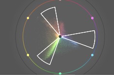
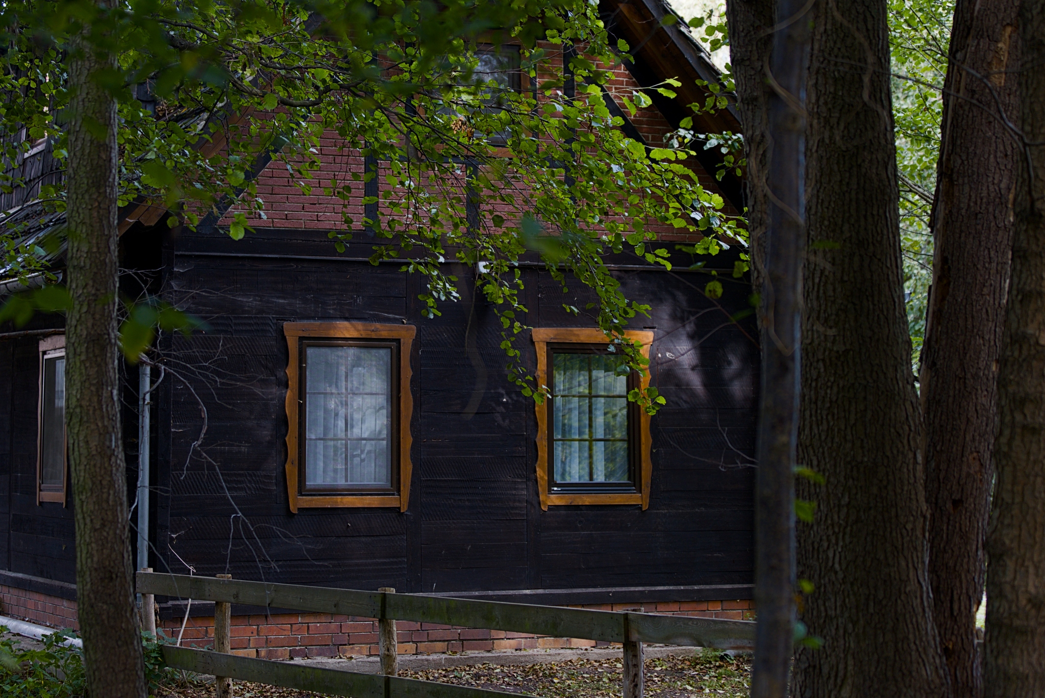
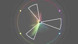
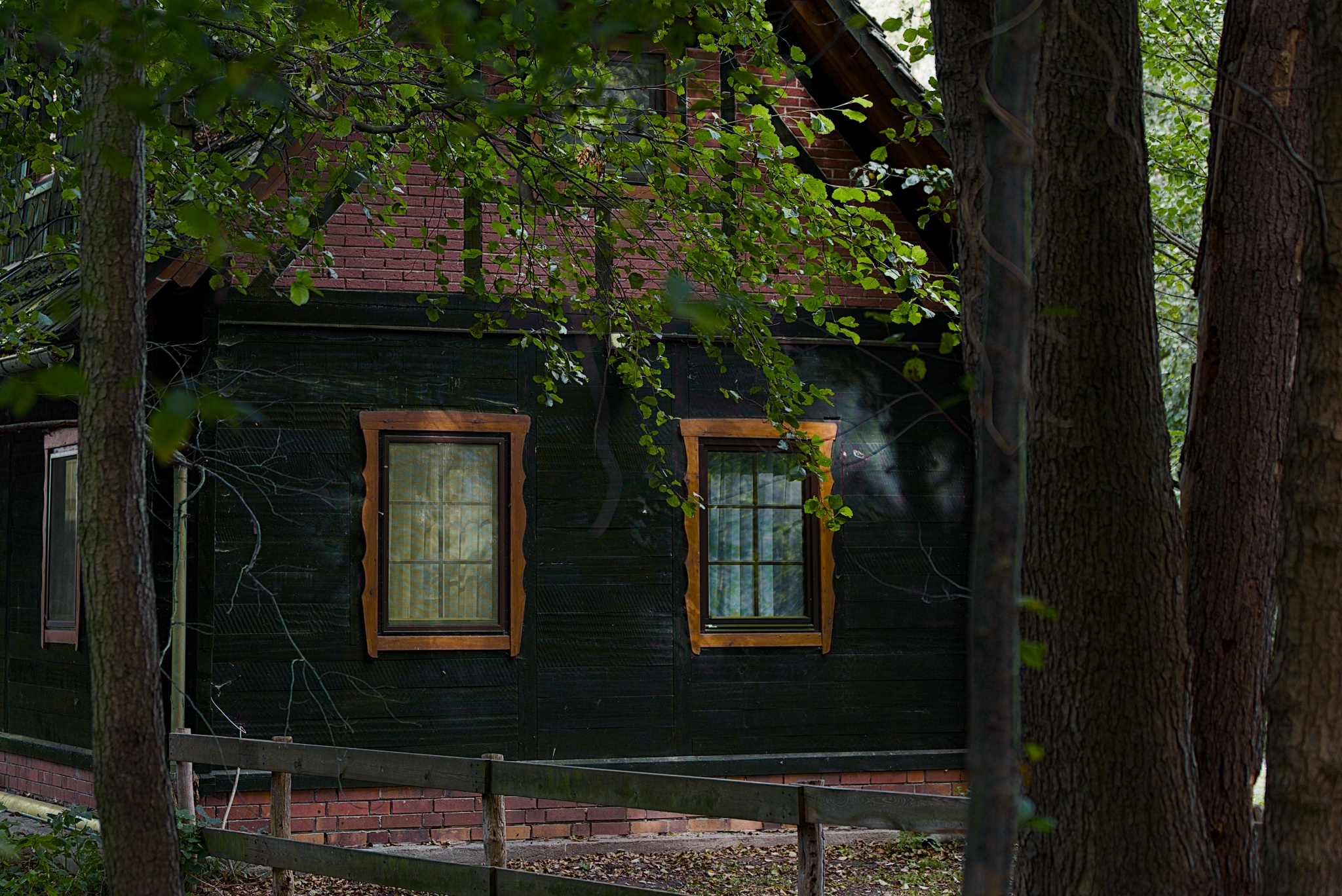
The first image shows my “standard” edit. For the second one, I displayed the color harmony overlay => it showed a triadic scheme with a subtle amount of light in the blue/violet spectrum. Then, I simply used the color equalizer to shift the blue hue towards yellow/orange. I think this newly created color mix turned out really well.
3 Likes
That doesn’t really work for me I’m afraid. I think it would be better to make the left window and the downpipe (if that’s what it is) the same hue as the right window.
3 Likes
On this edit I feel your tweak makes the windows look like the are reflecting the forest itself more while the first edit looks like the classic blue shadows syndrome. Ultimately you are the artist and you decide what you like best.
I appreciate the way in which you have used the color equalizer module to achieve this and I am inspired to try this “trick” on some of my images and see if it helps control colors.
2 Likes
Interesting approach. I love the color equalizer module since it was introduced, because it allows both very subtle and really heavy adjustments. For me personally, it’s a little too much of green in your edit, but this of course is up to you, as @Terry already said.
I’m wondering, if you are running master (5.7)  ? If so, you could also give the color harmonizer module another try (just meant to show you a possible new toy you may play with
  )
)