Can I disable show all modules when second clicking on module group icon

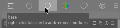
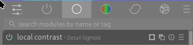
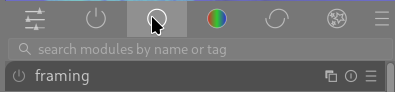
I am teaching a DT class to students and realize that one source of confusion for the students is clicking on the module group icon.

In the user guide it states “Click once on a module group icon (including the active group) to show only the modules in that group. Click a second time to show a list of all modules that are currently active or present in any group.”

But this second click is a great source of confusion for the students as they often unintentionally do a second click and are overwhelmed by all the modules present in any group being shown. While this is an intended behaviour I am wondering if there is a preference setting or any way of disabling this feature.

3 Likes

I agree that the behavior can be confusing, or at least a little annoying when done on accident and then I have to click a module group icon again in order to reduce the visual clutter. However, I think the behavior does make sense from a logic point of view. Maybe there is a reason there is a disconnect…

Random Thoughts on Why the Current Behavior Can Be Confusing

The current gui for module groups looks similar to icon tabs common in software, especially mobile, and their usage is very similar, except in one way: nothing happens when you click a single tab multiple times in any other software, but in darktable clicking toggles the tab “on and off”.
Icon Tabs

The current behavior is actually identical to how a “group filter chips” ui works, where each group button represents an underlying filter. When you click a chip the underlying filter is applied to whatever list of things you are viewing. When you click the same chip again, the filter is turned off. Some allow selecting multiple, etc. Please note, I am not saying darktable’s modules groups should use text instead of icons, this is just a random screenshot I found.
Group Filter Chips
While this might seem like a small issue, people are actually very good at picking up on the usage based on minor UI clues. I think when people see the module group buttons they assume it functions like tabs, because of the visual presentation.

Potential Solution

If we put each module group button into a pill shape, or even a rounded rectangle, the usage would become immediately clearer to most users. Why? Because very few softwares ever present tabs in pill-shaped divs, and chip-style filters are almost always presented that way. Users understand these two different gui constructs (even if it is subconsious) and it feels like something might be broken or at least magical, when those subconscious expectations are subverted.

I also hope that this would be a relatively easy ui improvement… @Pascal_Obry

2 Likes

I’m not sure about this. I don’t find this confusing or only confusing the first time. After that it seems quite natural for displaying all modules. I’m not sure changing the buttons to be in a pill will help. But well I’m not a UI guy.

EDIT: Maybe some alternative solutions.
Click : select and never unselect
Ctrl+click or double-click : to unselect

?

2 Likes

Oh, that’s why I sometimes see a list of all modules? It has never bothered me to be honest, but I have seen that view every now and then without knowing how it appeared.

I think this is an interesting point. I agree that I learned the behavior relatively quickly, but I am also really interested in darktable’s philosophy and ethos, and therefore motivated to put up with “quirks”. I can see how this would be a greater frustration for people who “just need a RAW developer and don’t have the financial ability to buy a paid-software.” Especially people who are unfamiliar with FOSS.

Additionally, I think that people usually don’t need any “ramp-up” time to understand tabs/group filters in software. They are pretty ubiquitous. I think the fact that the module group icon buttons are sort of just floating in space, with only a little highlighting when selected, makes their usage vague, and I am not convinced that it needs to be vague.

I have read many people saying that they don’t use darktable because the “ui stinks”. While I don’t think there are any glaring issues with the UI, I do think that enough small inconsistencies or vague gui components eventually pile up enough to give people the impression that the software is clunky or difficult to use because it is just not high-quality.

TLDR

I think the more small improvements that can be made to the ui: improving space utilization, clarifying component usage, etc., the more that people will see how truly awesome darktable is. The high learning curve in darktable should arise from the amazingly feature-rich processing that can be applied to images via the modular pixelpipe, not due to a bad GUI experience.

1 Like

I just fully agree with that.

But then as I said maybe another way to display all modules, with keys as proposed in my previous mail or another tab (optional) that can be selected in the workspace editor?

1 Like

I’ve recently had a somewhat unpleasant exchange on reddit about Darktable’s UI. I asked what exactly was so bad about it. In the end, they mentioned that the main point of contention was simply that Darktable has too many slider. The more I think about it, the more I think that’s actually correct. People are simply bewildered that Darktable has too many sliders.

But that is just inherent to the toolbox nature of Darktable. Oh well.

2 Likes

My thought is that the current behavior already fits a common GUI feature.

I think the simplest way to improve things is to make small ui changes to make it clear what behavior the module group buttons already have.

I am not trying to add another to-do for you. You devs do great work and I am very greatly. I am just trying to point out a potential area for clarifying the ui.

I think this is what people think is wrong. There are other things that lead to this impression. For example, not enough vertical spacing between the sliders (recently a fix was put in by @Pascal_Obry to improve this), in addition to other visual clutter.

By comparison lightroom CC has lots of sliders, maybe a little less than darktable, but everything in LR’s ui is super minimal which give the sliders more breathing room and makes it easier for a user’s brain to process the controls they are seeing. Also, the capitalization on the text of controls and control sections is helpful for differentiating controls and making them look less like a wall of sliders.

1 Like

I agree with a lot of @thumper’s points.

This behavior annoys me sometimes but I don’t think this is a HUGE issue and maybe doesn’t need a ton of effort put into it, but it is an opportunity for a small improvement for anyone who has strong feelings on UI/UX stuff.

Maybe there could be some additional states when hovering.

Hovering and the group is active
Screenshot from 2026-02-20 10-32-56

Not hovering and group is active
Screenshot from 2026-02-20 10-38-36

After clicking to disable, still hovering, group is inactive
Screenshot from 2026-02-20 10-33-04

If there was a visual distinction when hovering on an inactive group it might help. I can’t tell if there’s any difference between not hovering on active group or hovering on an inactive group.

Hide more modules by default and hide the search bar. IMO, there should be the “power” panel and one other panel that has ~10 modules. that’s it. No search by default. Force newbies to see those modules.

1 Like

I actually use the search bar constantly. I only use the active modules group and the search bar to pull in any modules that I need beyond that. I dislike switching between lists and then having to visually scan to find modules.

I never use search bar because I want that pixelpipe is always visible.
Just a quick look at it and I know what I already did and what I still need to do. If I don’t see it, I’m lost. :grinning:
But hey, that’s me, a visual guy!

Of course, I didn’t say “remove the search bar from darktable.” But rather hide it by default.

If the criticism is that there are too many modules and too many sliders, then the only real option we have is to not show so many. We won’t remove modules completely, I don’t see any other way. If we present a very slim set of modules, and say “learn and use those, those are the best general purpose, most flexible modules we have” would that not solve that criticism?

Once you have the hang of things, sure do whatever you want, search bar, all the modules, that’s your choice.

1 Like

I don’t actually know what the default behavior is, but I think that if we ensure the default behavior is to start new users on the “active modules” group, or whatever it is called, that is a simple enough start. With the new AgX workflow, the starting active modules gives the user access to all basic adjustment except crop and rotate: exposure, white balance, contrast, saturation. The search bar can stay. It doesn’t take up space, and users will naturally search for something if they don’t see it already. The alternative to a search bar is giving the users a massive list of modules to look through.

Obviously there are many ways to accomplish a cleaner UI. I am not trying to give an objective absolute path forward, just my opinion.

I build styles to fit my different workflows and the styles only include the modules I use on a regular basis.

My most common view of the modulegroups is the active modules with all modules visible, since I have modules in the style that are turned off by default, that I enable as I need them.

I use the search bar for the rare situation where I need another module.


Custom modulegroups are your friend.

As a dt beginner the module group ui never bothered me - but I do imagine that the hover-over pop-up at that time informed me that doucle-clicking would display an expanded list (?) – or may be it just was that I’d read the manual …

But I agree that when the modules list under a tab suddenly is inadvertently populated by the total modules list, it is one of the things that are able to make a new user confused.

So, if we can make that list somewhat more hidden, but still available to the initiated ones, (or at least make it more obvious that it’s triggered and/or give direction for the way home), this will be a good thing.

What else can I do than ask the usual question: Can we include a setting for this in Preferences?

Amazing what one learns on this forum! I never knew about this.

It has, so far, never accidentally happened to me.

For what it is worth, I don’t want it to! When I click on a tab, I want and expect to see only modules in that group, because that is what the tab is for.

Again, for what my humble UI expectations are worth, if all modules are to be displayed, I’d want there to be an all-modules tab. Because, as I said before, in my mind that is what tabs are for.

Extra stress on my view being that of just one guy! Although, thinking is never unique, so I’m guessing that there are now at least two or three of us ;). But…

The customisability of the tabs is super. Lets add a little bit more: I support the option to make the all-modules behaviour optional. Alongside the show-search-bar option.

And maybe, even, have an all-modules tab.

Oh Wait…

As I waffle, I have realised the logic, as explained in a previous post. The tab is a filter, and no-tab is an option, so click to select, click to unselect, and no-tab-selected means no filter.

OK. I get it. Which doesn’t mean I like it, but hey… don’t mind me :slight_smile:

Yeah, this is why I think the ui should be adjusted slightly to make it clear that the module group buttons are NOT tabs, but filters. I am trying to clone the repo right now to see if I can hastily do a quick change and at least have screenshots to share of what my proposal would be.

I am not suggesting a huge UI change here. I have created a custom module setup and I know where to find each module I need. I don’t see the advantage of this double click behaviour but I can learn and adapt to it.

1 Like