Can we make RawTherapee look less complex on very first sight (for brand new users)?

One comment I see quite often when people try RT for the first time, is that it looks way too complex to them. Of course RT has many controls, but maybe not that much compared to Darktable, which often people find less complex on first sight than RT.

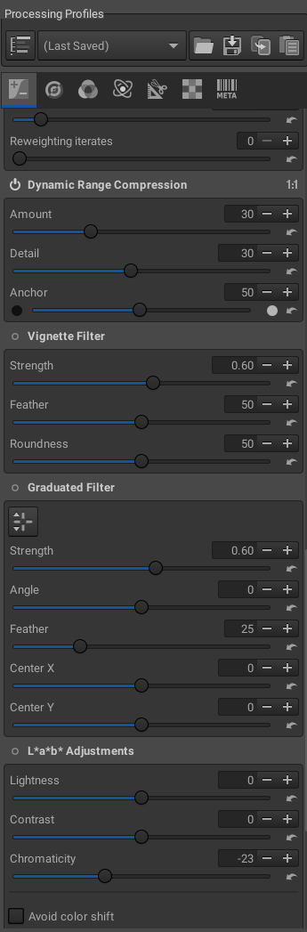
I think that this first “bad” impression comes from the fact that on first launch and opening a image in the editor, all the modules are unfolded, showing all the controls. The tool panel looks like this on first launch:

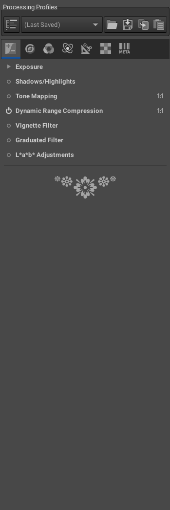
Yeah, I can see why first comers are lost. So, I thought that maybe RT could be made to unfold all its modules by default, so that on first launch it would just show the modules but not their underlying controls. It would look like this:

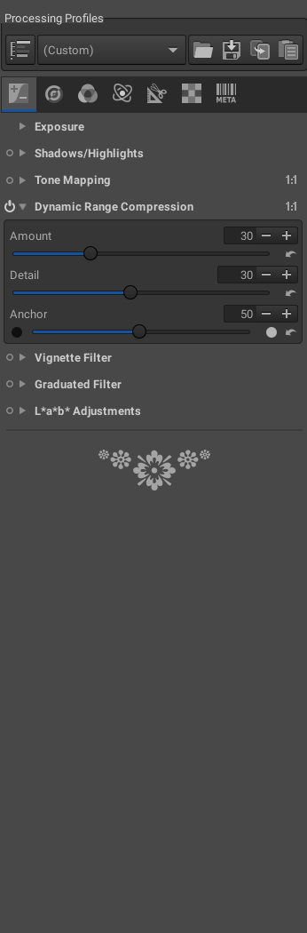
Way easier on new eyes. But then, I thought that those new users would understand that the top control (Exposure) can be unfolded, thanks to the arrow head icon. But they could not see that all the other modules can be unfolded as well, because they don’t have the same arrow head, just the ON/OFF icon. If they just click on the ON/OFF button, they can turn on the modules, but at least some of them have default controls set to zero, so it would appear to new users like the module doesn’t do anything. And they could abandon there, if they don’t have the idea of clicking on the module’s name to see it unfold.

So, my second idea is to simply add an arrow head icon to all the modules, to make it clearer to new users that the modules can also be unfolded. Here’s a basic mock up of how it could look like:

.

I think that could help solving the “RT is too complex” problem.
Just my 2 cents.

13 Likes

Salut Sébastien,

Yes, I agree.
At least partly…

I very much appreciate all the tools that we have at our disposal.
Like RawTherapee, darktable, ART, The Gimp, Le G’mic, &c, &c, &c.
Great fun to click around in each of them.

Doing it the click-around-way, I will never achieve full knowledge,
and I would never be able to use them to their full potential.

Would it be too much to ask a new user to have a look or two in The
Manual?

Have fun!
Claes in Lund, Sweden

I agree completely. All tools should start collapsed on first install.

I do agree there is an inconsistency here and room for improvement, but that looks like UI bloat and would lead to slightly slower start times. To improve consistency (and just because it would be good), I’d rather every tool have a power button. Besides, every user absolutely should read Getting Started.

There is also the problem of the unintuitive file tree.

Of course it’s not too much to ask to look at the documentation, yet most people like to try first, and then according to their first impressions, they may decide to go further, or turn RT off and delete it.
That’s that first impression that seems important to many first users.
I just wanted to raise the question and propose this idea of a small improvement, but I sure won’t fight over it.

Unfortunately many users need a lot of assistance, and to be taken by the hand.
On RT’s new webpage, there’s a link to rawpedia. Good. But the root page of rawpedia is an impressive table of content, and “Getting started”, is not that noticeable, even if it’s at the top of the “General information” list. Maybe a word and a direct link to “Getting started” could be added to the “About” section of RT’s home page?

I agree.

“Getting Started” is the very first article, it’s also the first thing you see when you run RawTherapee for the first time:

RawTherapee is not for all people. Facebook comes pre-installed on phones for a reason, Instagram thrives for a reason.

Good idea, we’ll look into that.

While nosing around in the RT manual I discovered the right click feature to open only one of the modules while all others are closed and like it greatly!
I would appreciate if there would be a possibility in the settings to have this as a default behavior for the left click. It feels somewhat cumbersome to use right click to “initialise an action” with the right mouse button where I usually use the left one.

In any case, I as a beginner RT user prefer the collapsed vs the all modules expanded view .

I have introduced several newcomers to RT @sguyader and have had similar feedback regarding the issues you have raised. I think your proposed solutions would be very helpful.

2 Likes

Hello @sguyader,

I totally agree with you as regards the difficulty of approaching Rawtherapee at first sight. It is such a powerful tool, with so many options that it may be indeed quite overwhelming at the first approach…
I have started working with Rawtherapee when it was still a freeware, only available on Windows, but I do still consider myself a beginner…
Maybe its “difficulty” is one reason why there are so few tutorials on YouTube compared to Dartkable…

As Darktable is concerned, in my personal view, it is judged more easy to learn mostly because its GUIs is much more similar to Lightroom. Consequently, many photographers and advanced users are alreaday accostumed to both workflows.

As far as I am concerned, I do find the Rawtherapee interface much more professional compared to Darktable. It is not a case that, with the 2.7 version its GUIs has been vastly improved by Aurélien Pierre…

Another improvement for future releases of Rawtherapee might be having a GUIs to chose easily our own preferred tools [1]. Now you must write into a text file to select them, which looks quite complicated (“nerdy”) for the casual user…

As for your suggestion: “on first launch and opening a image in the editor, all the modules are unfolded, showing all the controls”, be ready to be surprised because…
On Linux Pro, an Italian magazin, this year, a contest among 5 graphic softwares (gimp, darktable, rawtherapee, lighzone, pixeluvo) has been proposed, trying these 5 applications with many tasks (each one with a final score).
As regards the best GUIs Rawtherapee has been judged better than Darktable because its tools are already unfolded which is somewhat different from what you are proposing, as regards the underneath controls…

Here is a screenshot in Italian (I am sorry about that but as a French I am sure you are able to undertand it…):

In all truth, I think that all comes down to personal preferences and taste.
IMHO, it is vital to read the manual (e.g. RawPedia) before approaching a professional software. And yes, I am fully aware that most users do not follow this principle at all!

Unfortunately, with open source software there are usually very few developers, at hand, to improve the GUIs. Even worse the documentation is quite often lacking many parts or, worse, quite outdated (but again, with Rawtherapee, the RawPedia web-page is quite accurate on the whole, IMHO)…

But, to conclude my looong rambling (sorry about that…), I do agree with you that there is always room for improvement as regards the GUIs!
I am hopeful that the recent fork of Rawtherapee [2] may be useful to explore all avenues. By doing so, both softwares are going to improve, in the long run :slight_smile:

[1] GUI for adding tools to Favorites tab · Issue #5256 · Beep6581/RawTherapee · GitHub
[2] My take on RawTherapee

1 Like

You cited a magazine aimed at Linux users. Linux users tend to have less trouble “getting their hands into the grease” (it’s a French expression, but I’m sure you’ll get it) than “regular” users who often come from the Windows world in which they expect everything should come as is, clear and easy.

Hello @sguyader

You cited a magazine aimed at Linux users. Linux users tend to have less trouble “getting their hands into the grease.

I beg to differ about this :slight_smile:

I suppose I understand what you mean but as regards the graphical applications I am confident that many Windows users might surprise you about their personal skills.
If you think about the Adobe products, CaptureOne, Affinity photo etc they all run on Windows (and Mac) but not on Linux…
Therefore, we are talking about probably millions of users who, on Windows, can get “their hands dirty” on such applications and make a living out of it…

As regards Linux, most of its users are programmers not graphical professionals… :slight_smile:
And yep, I have also worked myself on Linux in the past (mostly Kde stuff).
However, I am quite long in the tooth and I always come back to Windows in the end (out of habit mostly…) . Actually, I have started dabbling with Rawtherapee because, at its very beginning, it only ran on Windows (not Linux) :slight_smile:

I would keep everything closed except for Exposure. The other categories under it look enticing to click and are very discoverable.
I don’t think it is needed to give those a ‘triangle’ as their style is very recognizable, and they look like clickable buttons.
But a default of ‘all closed except one’ might be an improvement.

@Silvio_Grosso what I meant by getting their hands dirty is rather that the average Linux users tend to not just ditch a program (not just for photography) that doesn’t look or work “right” out of the box. They’re more inclined to search, setup, personalize, get the code and compile,… and read the doc, than the average Windows users. That’s my impression, but I may be wrong.

2 Likes

I see this comment all over the place (substitute the application names for any other application) and it always strikes me as something that doesn’t really mean anything.

What does it mean to you?

4 Likes

Today’s Dilbert…
https://dilbert.com/strip/2019-09-18

6 Likes

I think I understand what he means. Darktable’s GUI looks less refined, more of a work in progress. RT’s interface is complicated, but the quality of the graphical elements is higher. When you first open each application, RawTherapee looks to be professional software, i.e. you would pay for it. Whereas darktable looks more like free software.
Of course this has nothing to do with their respective functionality or performance.

The problem I think I was getting at is that nobody ever explains what these things mean in such detail that it could result in someone from the project taking action to improve things.

“Looks professional” is completely subjective and without further explanation is pretty hollow.

I mean no offense to anyone, but if you have concrete ideas, please share them.

1 Like

True, it’s very subjective. See the thread about the new RT website, although most of us think it’s fresh and great, some (or at least 1) think it doesn’t look professional.
But it’s impossible to please everyone, and not everyone has the same idea of what looks professional.

You’re right, without detailed explanation, no one will be able to make improvements. But the average user is not a designer and they don’t always know why something “feels” this or that. You might get the impression that someone looks shifty, but you can’t put your finger on exactly why.
But I can have a stab at pointing some things out, bearing in mind this is very subjective.

darktable:

  • I’m not a fan of the darktable decision to have everything lower case, even the first letter. This does not look professional at all to me. My day job is an editor and translator, so these things really stand out for me as ugly.
  • Lack of 3D effects in the GUI: to me, this makes the interface look like a mock-up or work in progress. Almost all other imaging software I use has some kind of depth to it, which helps with ease of use.
  • Borders and spacing: many elements are squeezed up next to each other, which makes for poor usability. Expand a parametric mask and look how close the channel labels are to the output slider (v.2.7).

If we consider RT and Lightroom for example, they do all the above in a better way, in my opinion. They have a more refined interface, 3D effects, clearer borders, better separation, cleaner fonts and capital letters.
I think RT is still too cluttered, but it does look more polished than darktable.

1 Like

[quote=“Morgan_Hardwood, post:6, topic:14105, full:true”]
“Getting Started” is the very first article, it’s also the first thing you see when you run RawTherapee for the first time[/quote]

It’s here: http://rawpedia.rawtherapee.com

And IMHO it’s written quite terribly. Lot’s of random stuff patched together in no order.

Example: Tone Mapping
It’starts with: The effects of this tool are visible at any zoom level. However, due to the nature of the algorithm, only the 1:1…

IMHO it should start with a simple intro of what it is and does.

And please, let RT start with all menus collapsed.