I am going to print some big prints of at least one of these soon to put on my wall. I would love to hear thoughts, feedback, etc. Thanks ![]()
10 Likes
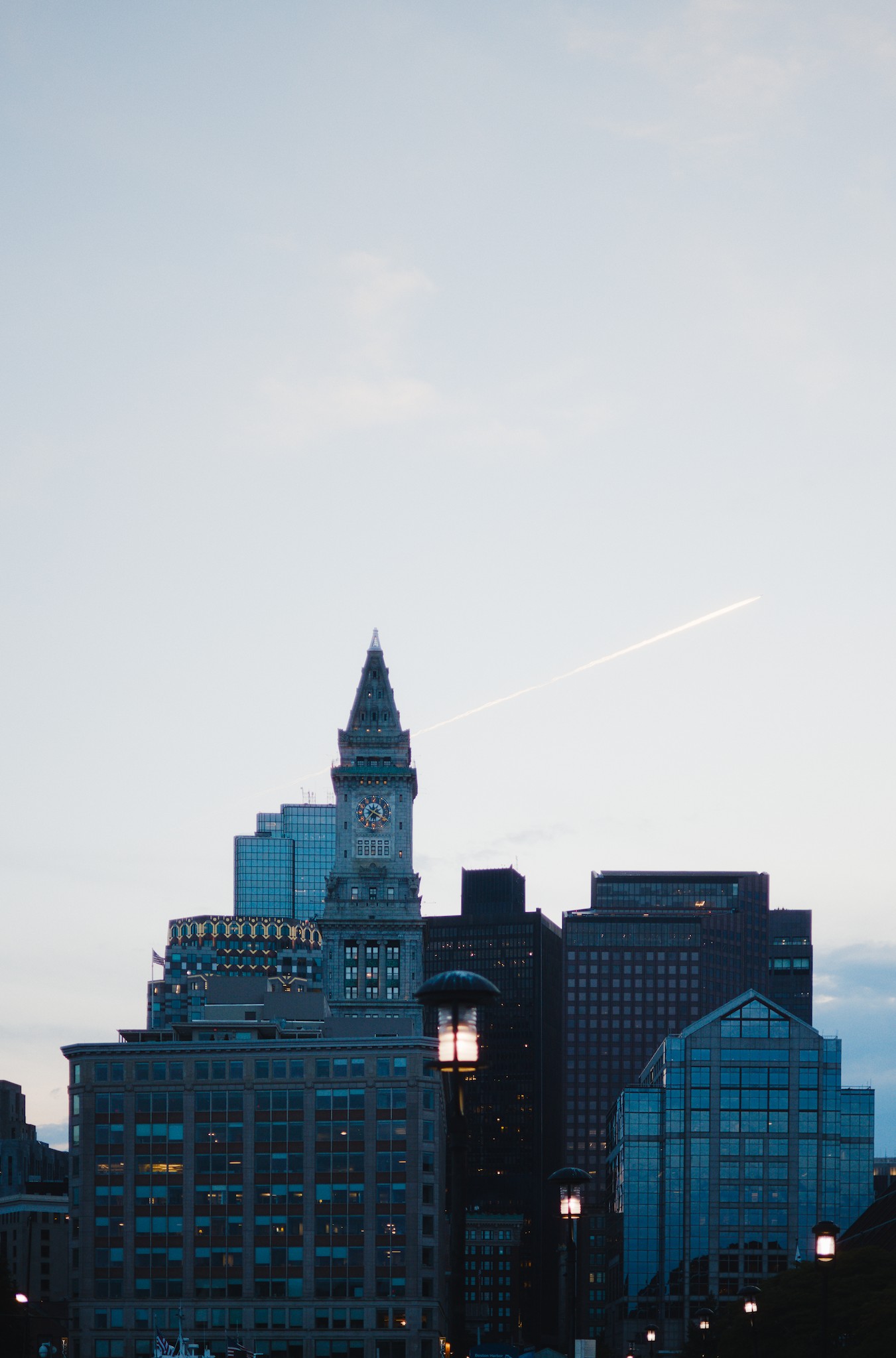
I think they would all look great in a big print. Only the skyline would not do it for me personally, since there is so much sky… but the second more moody shot can be really nice in the right room!
1 Like
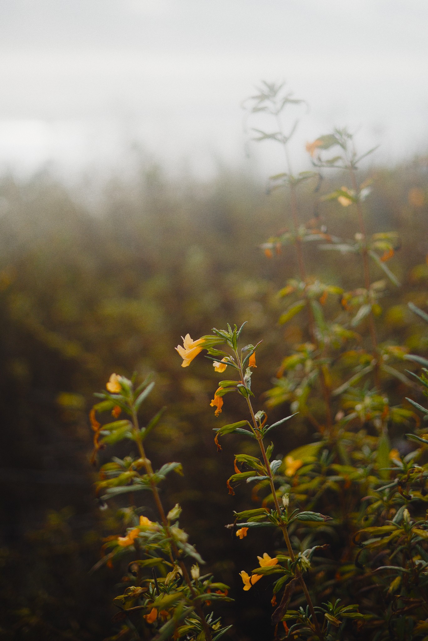
The yellow flower ![]() great atmosphere.
great atmosphere.
1 Like
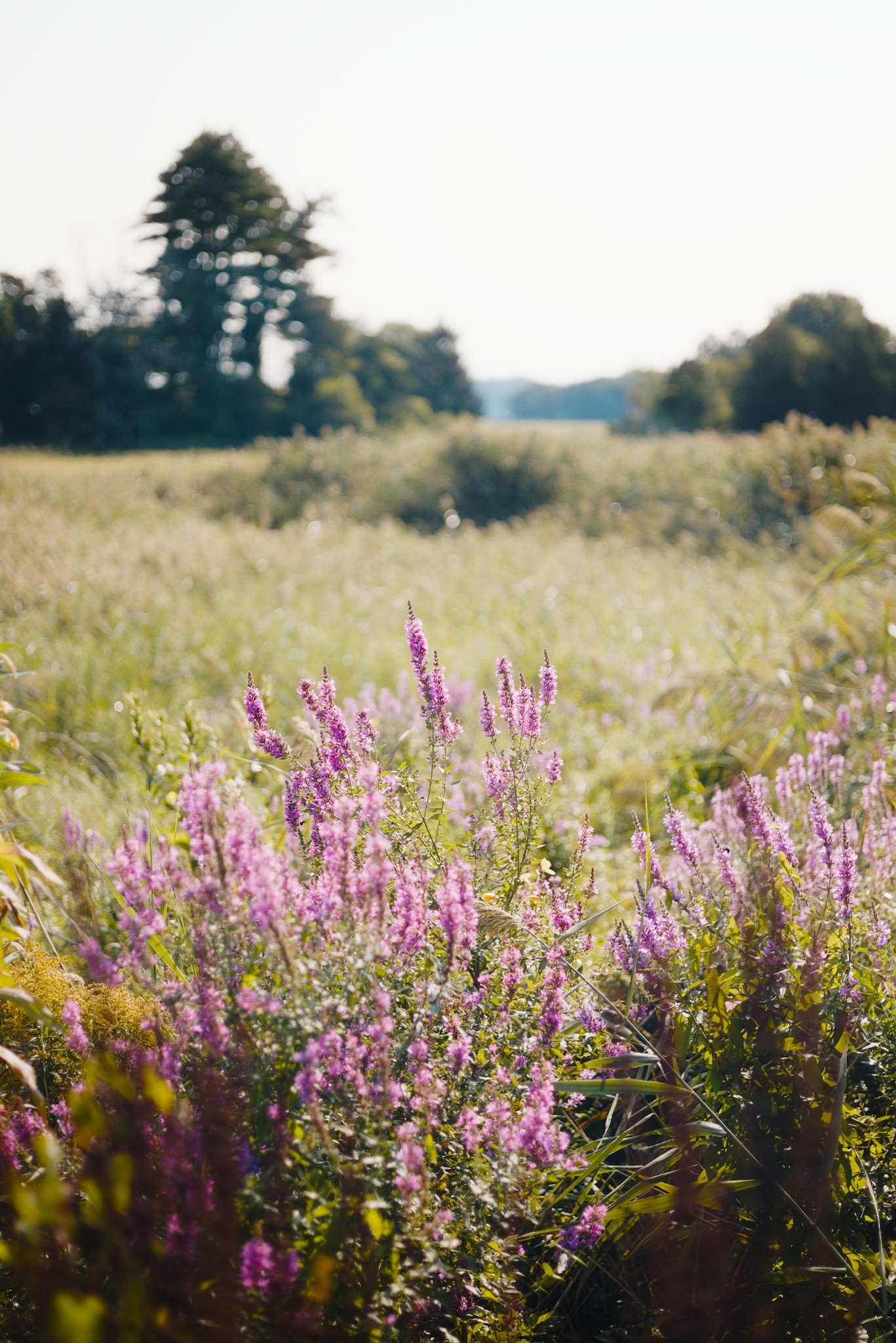
I like the fourth one, the purple weeds.
1 Like
Yeah That is one of my favorites ![]()
Yeah, I love that one.
That is another top contender ![]()
Interesting how they are in the portrait orientation. Thanks for sharing!
Which wall and how big? What kind of print (and framing)?
I like several of these. Its hard to pick 1. Have you printed them small(ish) and taped them to the wall in the room they will live? It is amazing, to me at least, how different images can look depending on the room and light.
Unfortunately, I have almost zero experience with landscape photography, but when I do take landscape photos I somehow end up liking the vertical ones that I have taken more for some reason.
Bedroom wall, probably like 20x30, I’m thinking matte or semi gloss with a stained wood frame.
I haven’t but that is a good idea. Unfortunately, I don’t have a working photo printer and I am in a time crunch since it is for my wife’s birthday…
But that is a very good idea…
Please forward extra-large, framed prints to my address, and I will assess. ![]()
On a more serious note, I think these are great!
2 Likes
Hahaha, thanks ![]()
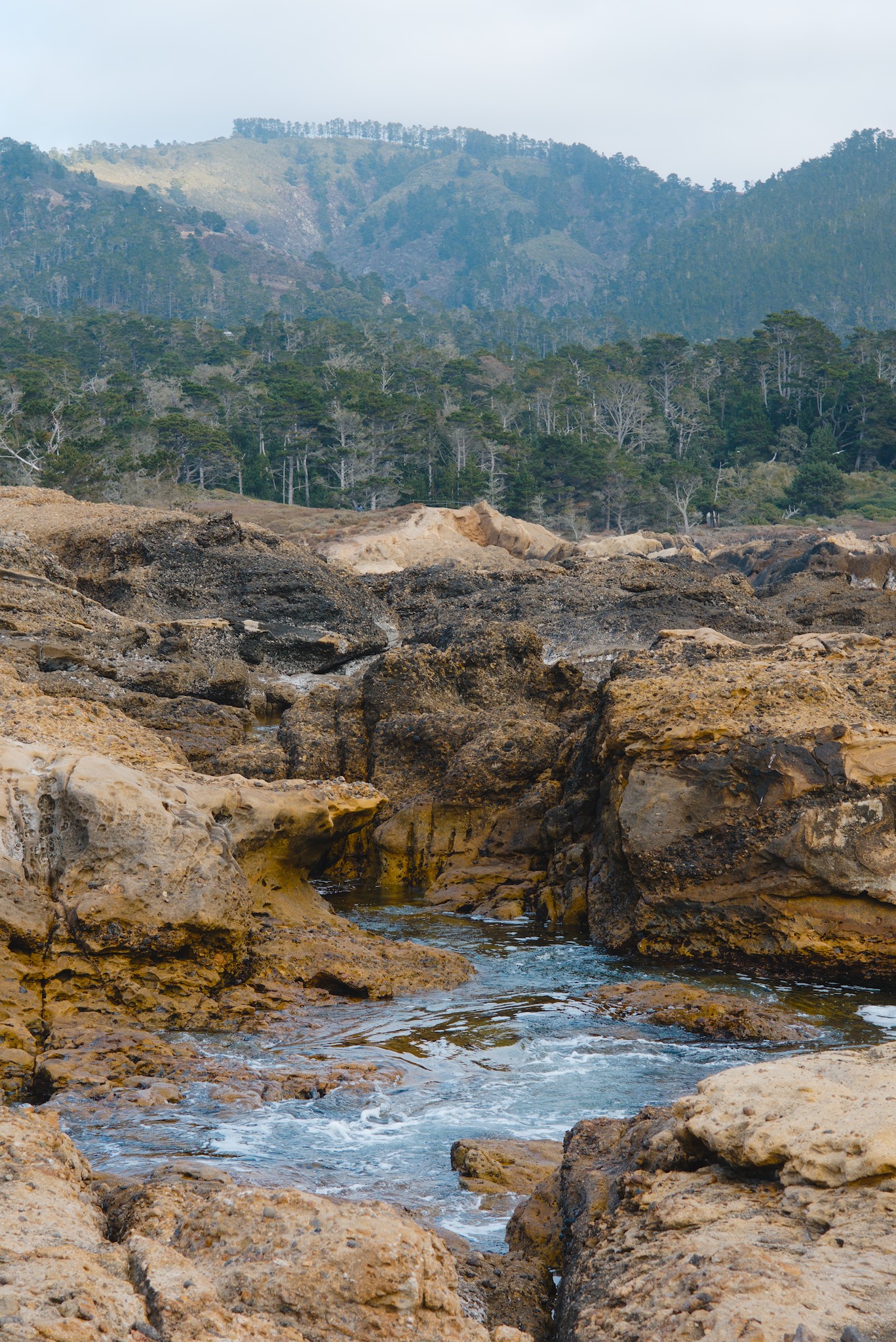
I would pick the first (river) one. It has a nice color gradient that you’ll pick up from afar, and lots of tonal detail that you’ll notice up close. The vertical format can look really cool if you have the space for it. If you can print it human size, a picture like this can look like a door to another world.
The second (yellow flower) might also work. But the it is mostly a single color, and might look bland from afar. The subject is a fairly small object, so printing it large creates a distortion of reality. It would look more artificial/artistic than the first.
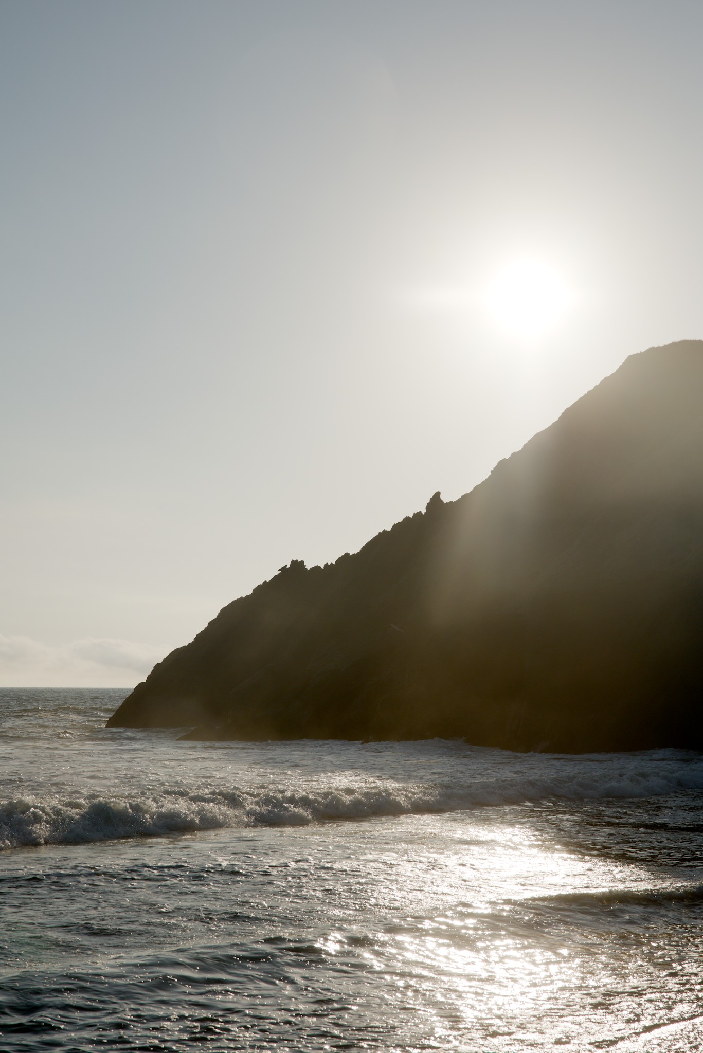
The other ones have too much contrast, I think. Prints don’t show contrast like a screen (unless you put them under a spotlight in a darkened room). The sunset and the city will just appear black and white in print. Similarly, the sky in the heather picture might look too white and just appear empty. I’d pick a picture with more midtone interest.
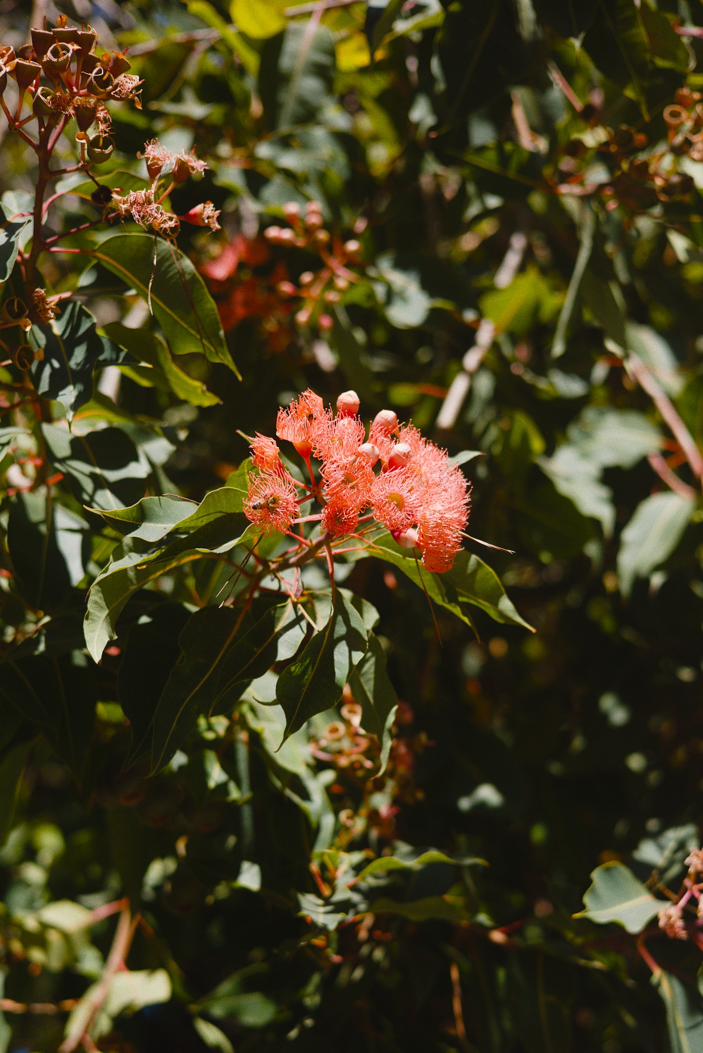
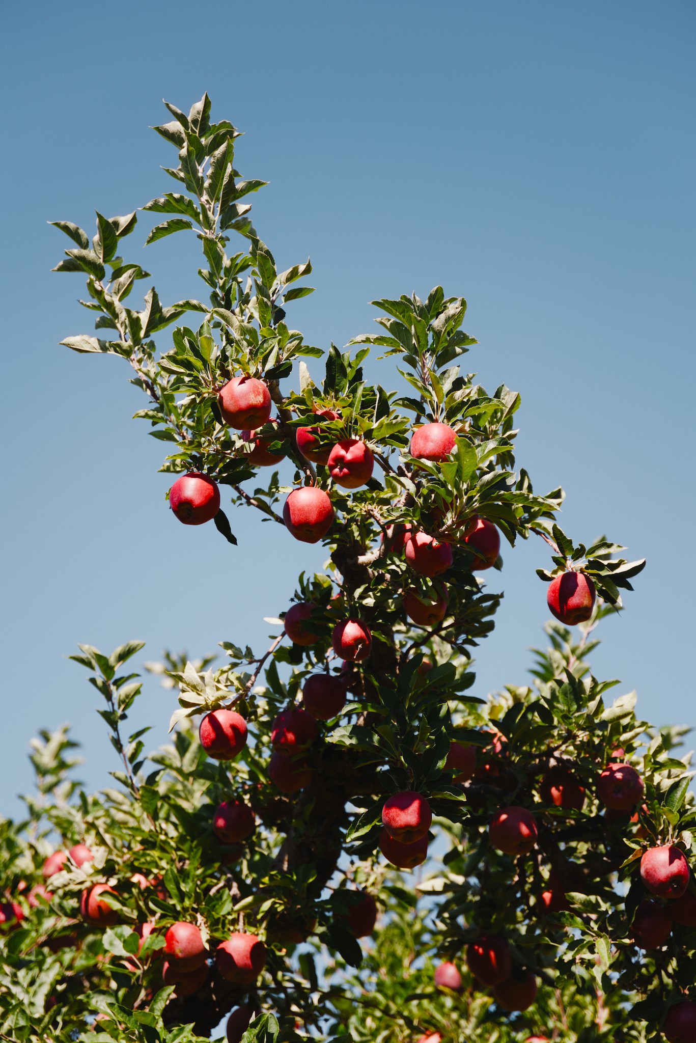
The apple tree and the red flower were seemingly taken in bright midday sun, with their deep black shadows. But that impression can clash with the low light of typical living spaces. So I wouldn’t pick those. (Or really emphasize their bright colors and print a glossy color screamer! But these are perhaps not the subjects for that)
But whatever you do, order a small proof print first, and place it in the intended spot. Color perception varies with the environment, and usually needs adjustment. Check that the contrast reproduces like you imagined it, and probably add some local contrast or sharpening that fits the paper.
What material were you thinking of using? I’d think a matte surface like canvas or foam board would look good for these low-contrast subjects. Photo paper or glossy surfaces would probably look better for deep-color high-pop subjects.
Finally, don’t listen to me. It’s your print, so your opinion matters, not anyone else’s.
2 Likes
@thumper A square crop may work for most of them.
Since they are all pretty great, perhaps place them in other rooms as well, including the kitchen and washroom (sealed for durability). ![]()
![]()
1 Like
Oh yeah, the print might move around, but initially it will probably live in a bedroom ![]()
My choices: the mountain (1597), the field (2368) & the skyline (3114). But you know your wife better than any of us!
Perhaps show her a bunch of these photos (your choices & several more) and ask her what she likes. You don’t have to tell her why - just say you’re thinking of entering a photo contest & she won’t suspect it’s for her birthday!
1 Like
I ended up going with the yellow flower and the red flower ones. They are my wife’s favorites, and I think they will work best for our home. I’m still waiting to see how the prints turn out. This is my first time ordering big prints from an actual dedicated photo print business. I’ll post here with the final result.
3 Likes