patrakov
February 7, 2026, 2:51pm
21
Photo critique:
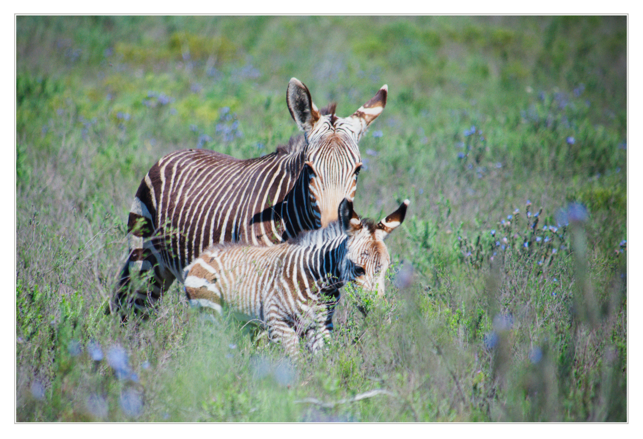
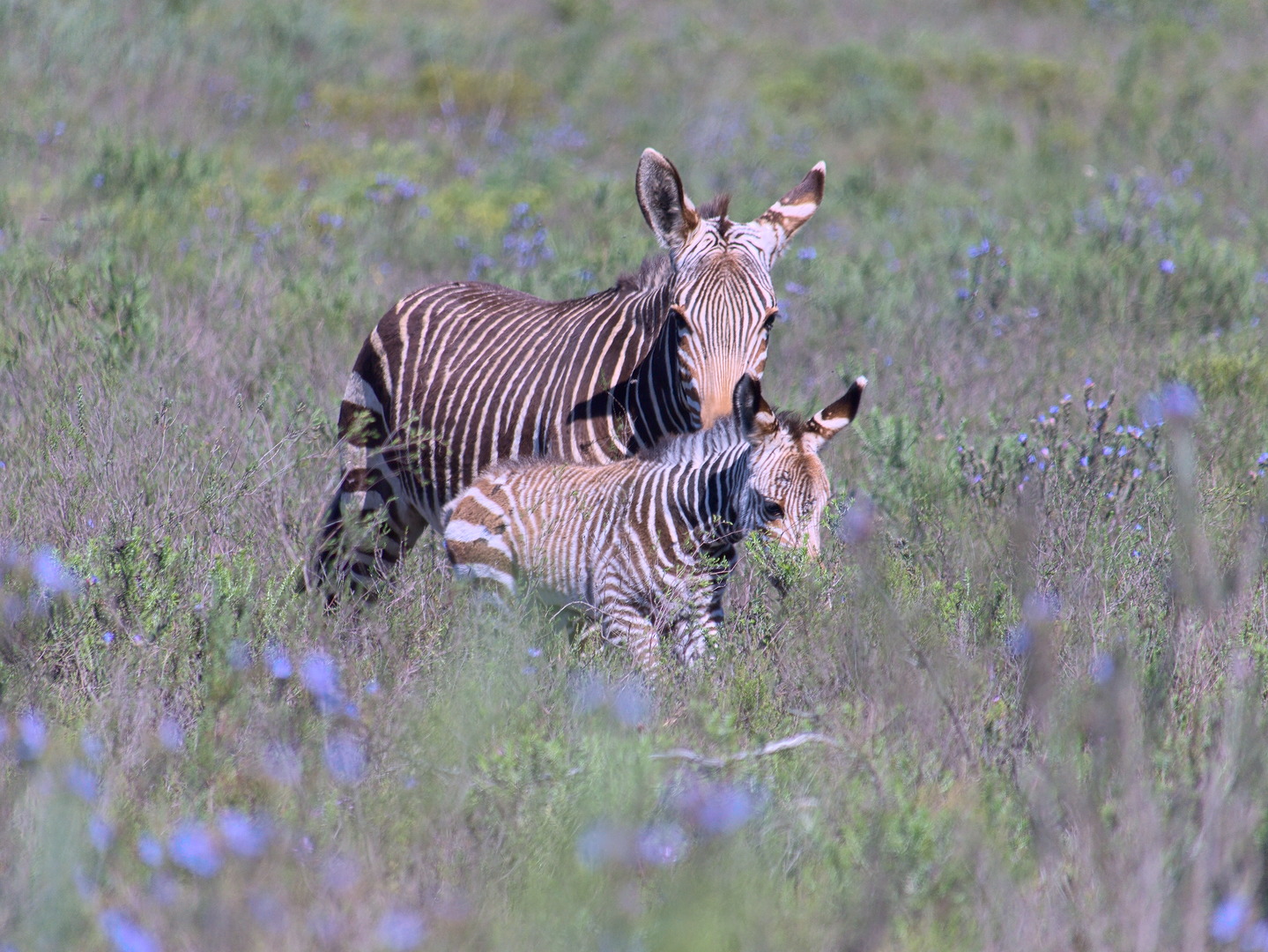
It needs cropping to follow the rule of thirds or something similar and to provide some empty space for your zebras to look into.
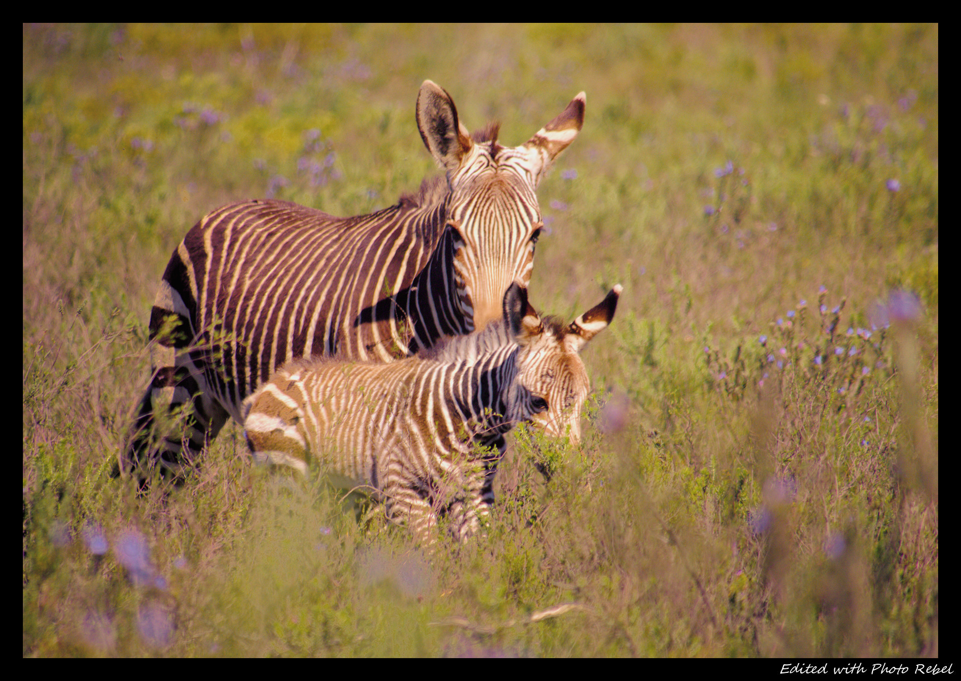
The rule of thirds is too hard to follow here, so I followed “harmonic means” by placing zebras’ eyes on the appropriate horizontals.
In general, in shots made with a long lens, it is necessary to add a gradient indicating the light direction.
The light comes from the right, so I brightened the top-right corner and darkened the bottom-left one.
Color temperature looks wrong - too much blue cast.
There appears to be some haze.
Compensated by the “soft light” effect.
The color of the grass doesn’t look good: not enough contrast with the subject.
Made it more green. Note that @Dito_Budi took the opposite approach, which is also valid.
Needed to add a bit more saturation to the blue flowers to match.
The fur looks a bit too soft.
I sharpened the most important part - on the ears and the head of the young zebra.
Below is my attempt to address the criticisms using ART.
P1110374-ART-v1.jpg.out.arp (19.7 KB)
1 Like
SCHA
February 7, 2026, 8:37pm
22
Great rendition… And I like your workflow/thought process. Thanks for your edit.
priort
February 8, 2026, 6:01am
23
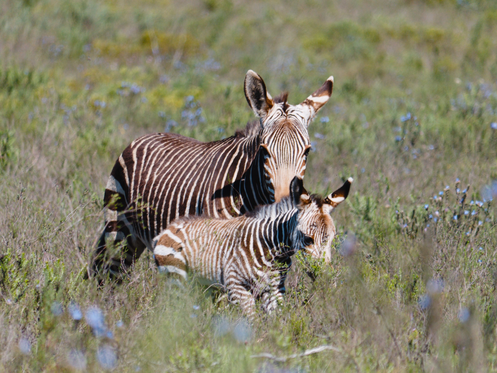
Using Christian’s LC and Basecurve test modules
Likely need to tone down the contrast some…
1 Like
P1110374_15.RW2.xmp (78.7 KB)
Picked a spot in the middle of the big white stripe on the mother’s left ear to color calibrate on.
2 Likes
durierem
March 27, 2026, 7:36pm
27
My take
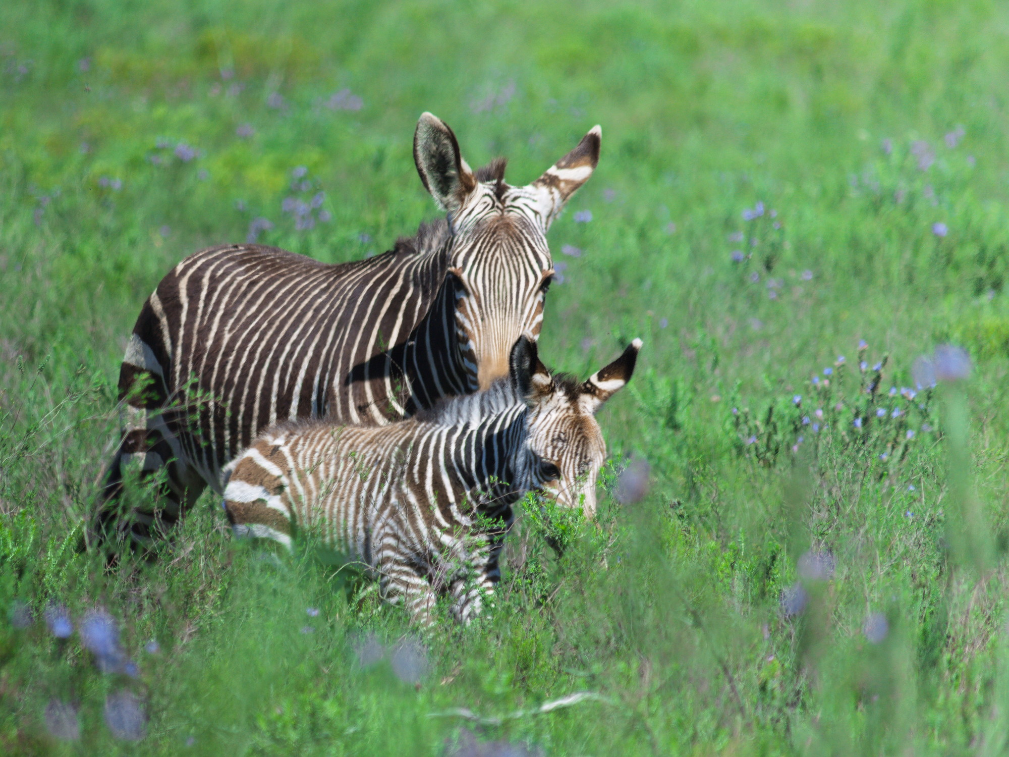
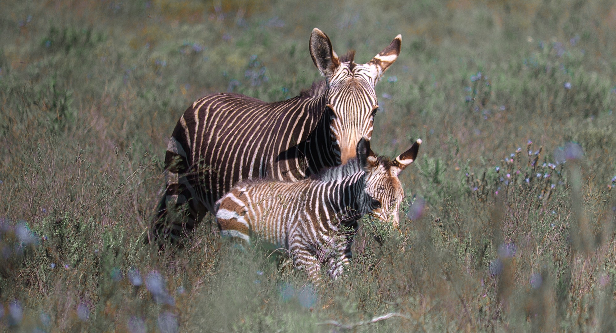
I didn’t know exactly what color I wanted for the zebras but either way I tried to desaturate the greens to make them pop a little bit more.
I also played a bit with the contrast equalizer to diffuse the grass details.
P1110374.RW2.xmp (17.4 KB)
3 Likes
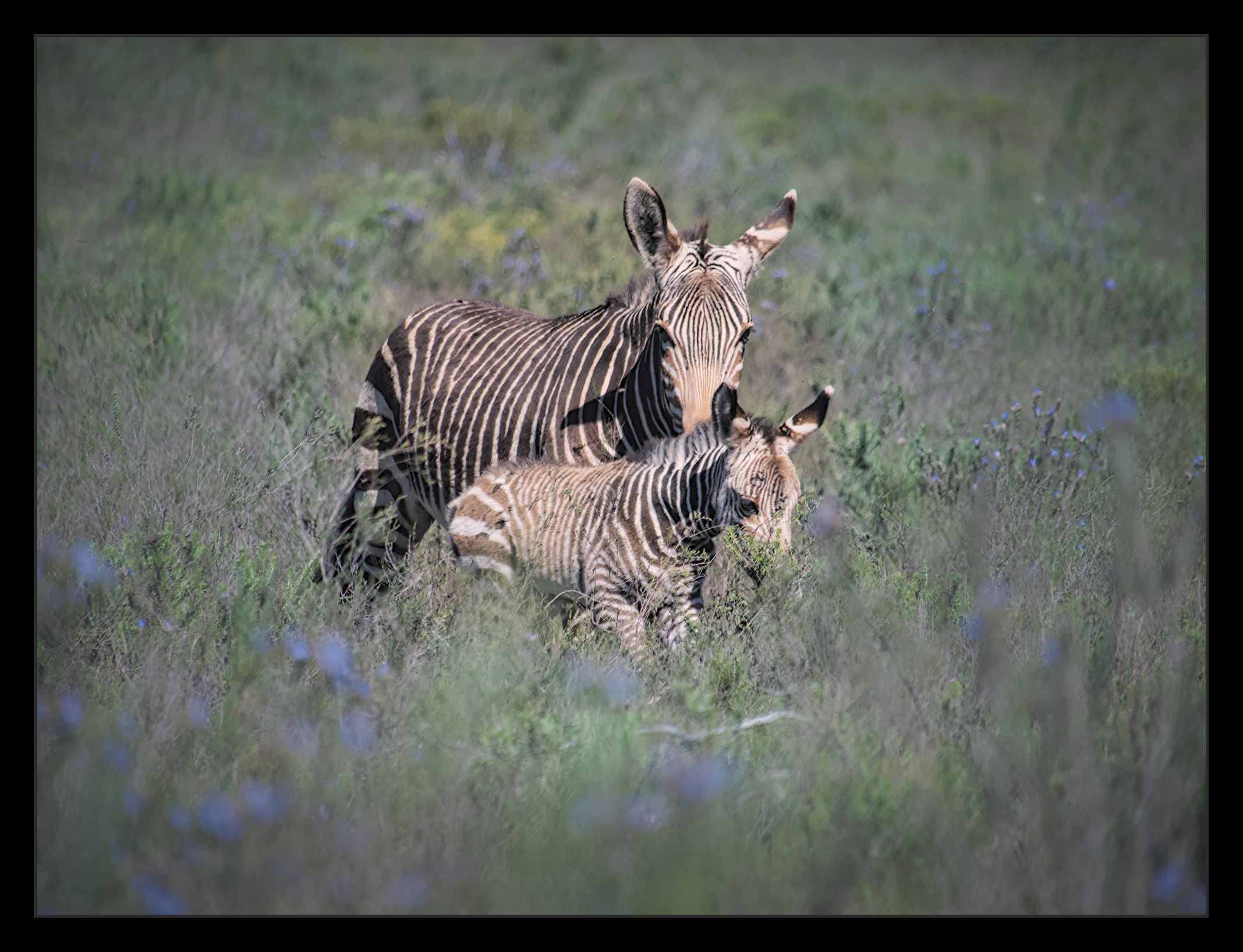
Not so tricky, imo…
I tried to keep natural colours…
2 Likes
Tim
September 30, 2026, 3:17pm
29
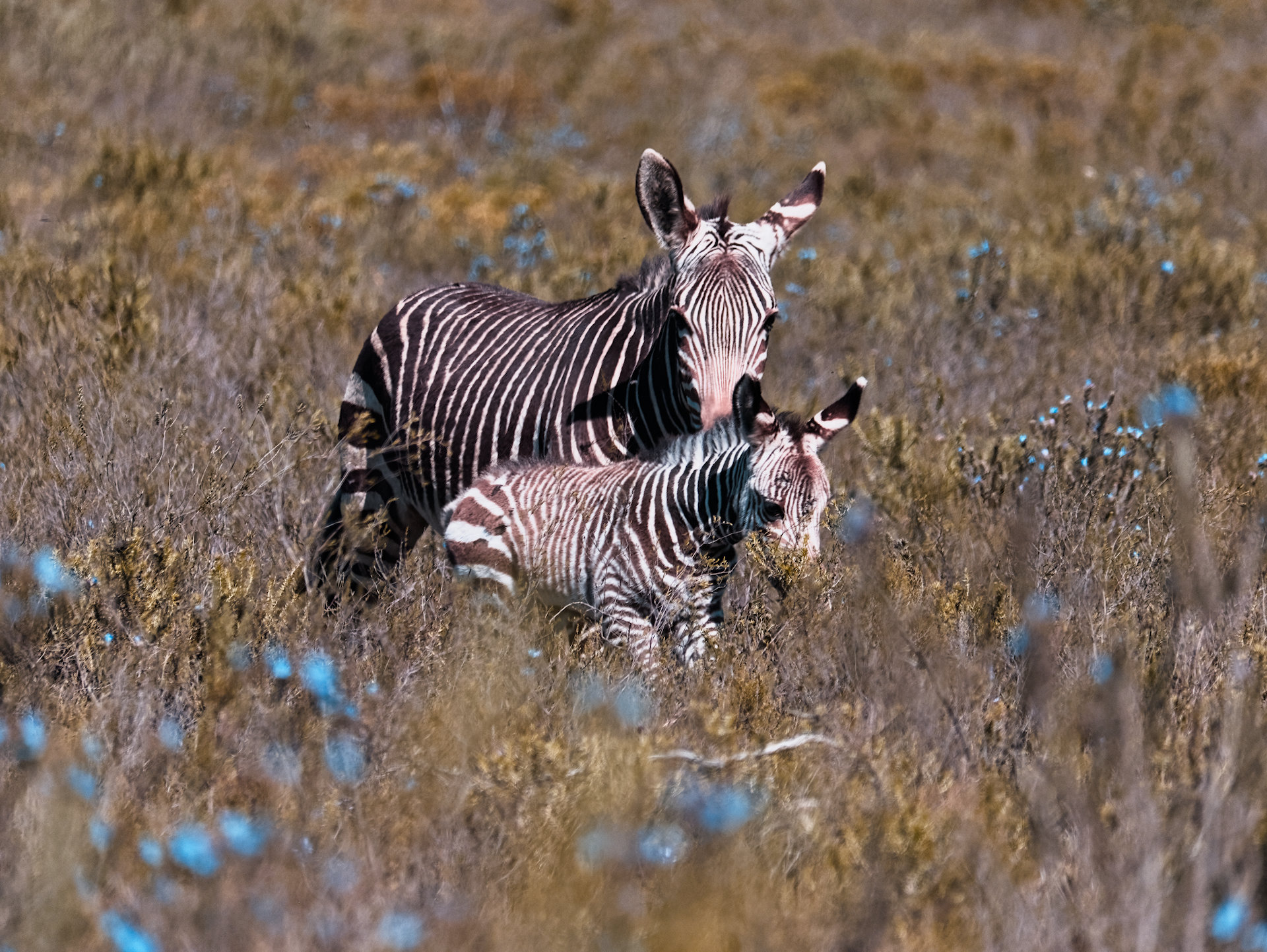
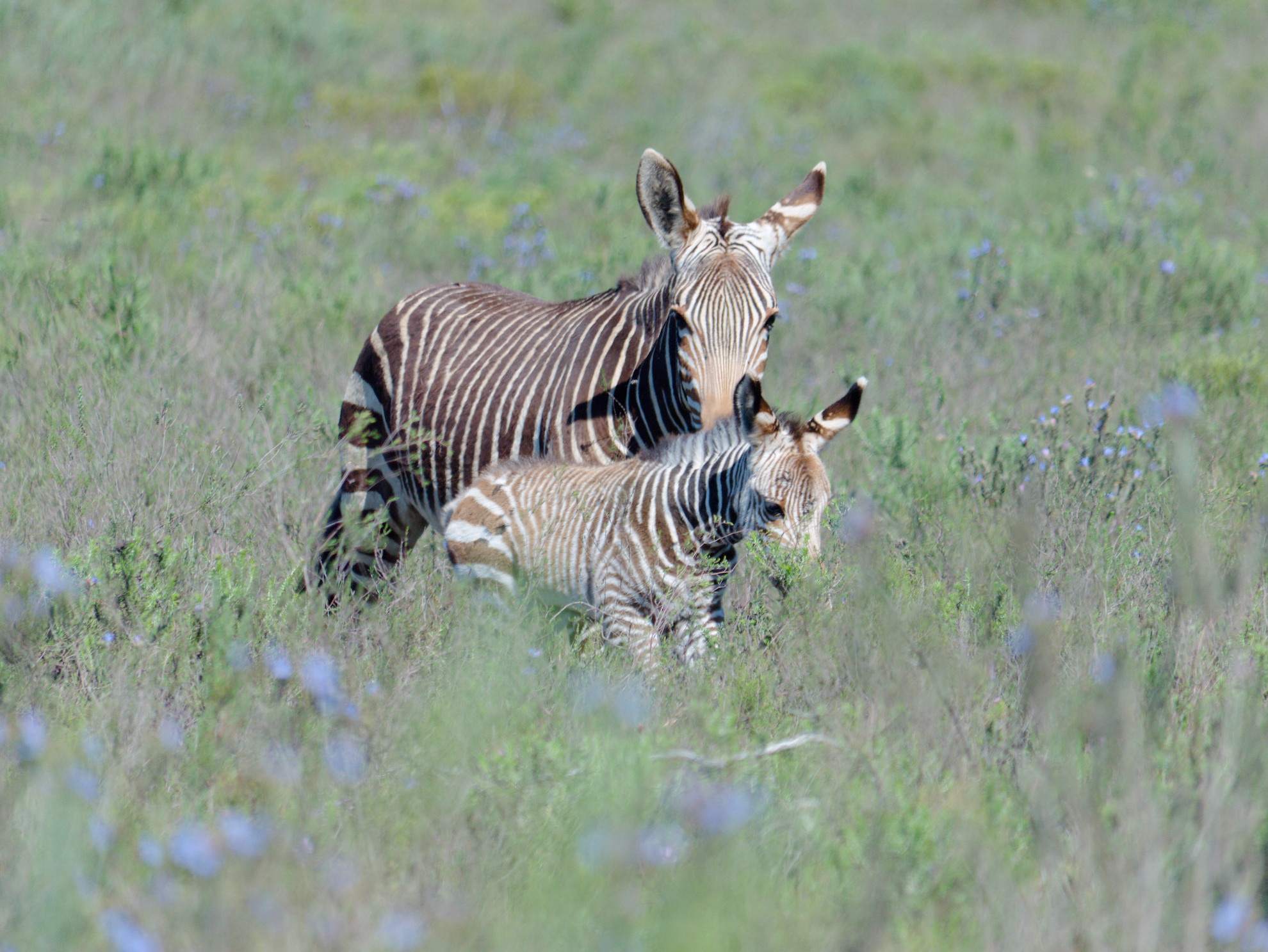
I recently re-processed this one, too. I got a much better result than the one I did months ago. To me, the big trick was getting a good white balance on this image; there is something weird about it.
P1110374_04.RW2.xmp (8.7 KB)
2 Likes
gwbarn
September 30, 2026, 9:50pm
30
Yeah it tends to feel quite blue even after manual white balance.
P1110374.RW2.xmp (27.0 KB)
2 Likes
Tim
September 30, 2026, 11:19pm
31
I like my bluer rendition. Look at mine from Feb 6. It was all yellow.
SCHA
October 2, 2026, 7:20am
32
I’ve just gone back to revisit this one… interesting, now I know so much more about processing, a) it isn’t quite so tricky b) i’m confident now with white balance, and choose this time round ‘RGB grey’ (RT 5.13 Refinement option for WB) and got pleasing results… thanks for revisiting this.
P1110374.jpg.out.pp3 (19.2 KB)
1 Like