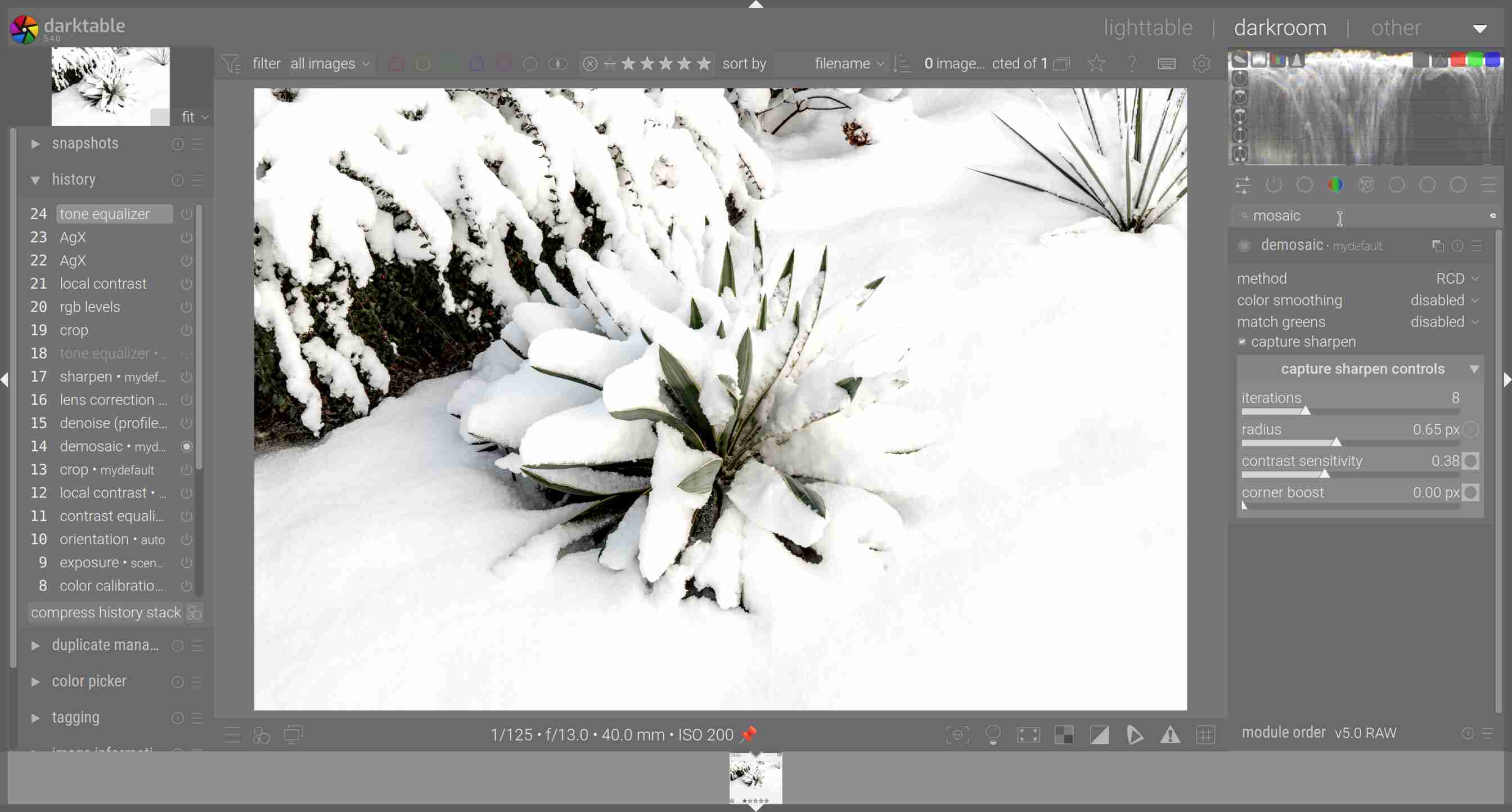
I think the sharpness of the yucca leaves is ok, but the snow is a little bit blurry. Maybe it is not a matter of sharpness. Is it possible to improve the “look” of the snow with the capture sharpen controls?
Actually it is not important to improve this image, I just want to learn these new sharpening options.
In the image you show, I see no details in much of the snow. If there are no details, there’s nothing to sharpen…
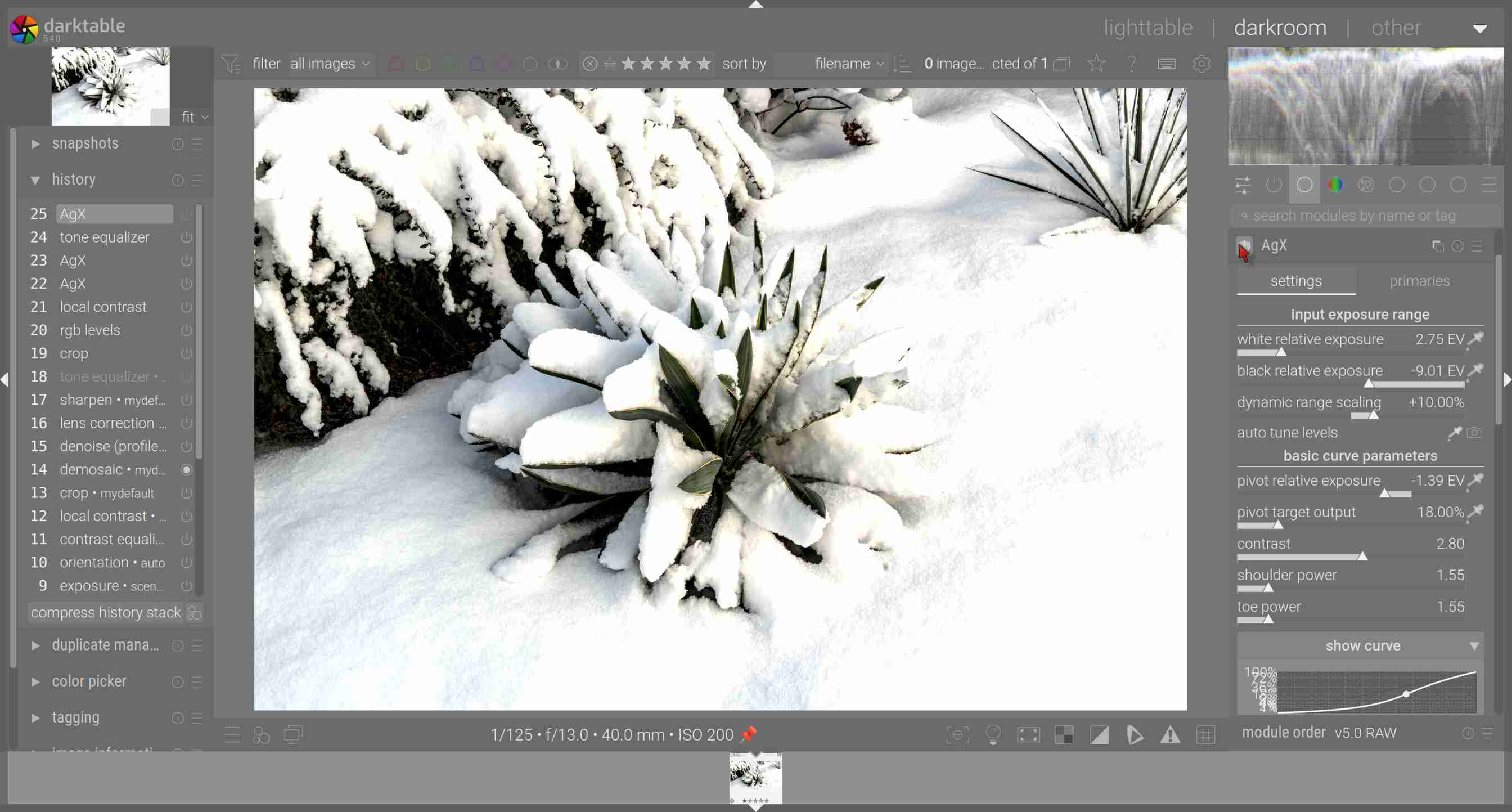
The lack of details could be due to AgX brightening or flattening the highlights too much, or you could have them blown out (clipped) in the raw already. Impossible to say from the provided screenshot.
It was one of the 1st photos of a series of underexposed snow photos. I forgot to use the tone equalizer a while and used “pivot relative exposure” only. At the moment I am doing more or less “learning of agx”. I have to be careful to use “pivot relative exposure” not too much and use tone equalizer too, which I did later.
I think the solution is to draw the slider in the opposite direction to the right. This produces shadow in the snow. And as a 2nd step the tone quealizer.
Shock and horror I read the user guide about capture sharpening yesterday and this quote from the user guide suggests that capture sharpening is not trying to be a be all and end all sharpening tool but rather to set the path for good additional sharpening as required. I really like capture sharpening and incorporate it into all my edits.
“Capture sharpening is not intended to be used as a general sharpening / local contrast enhancing tool. It should instead be understood as a way to increase micro-contrast in structures with lots of detail, and leads to better results for further processing. Excellent examples would be details of surfaces like wood, brick walls, hair etc.”
As I understood it the role of CS is to correct or offset loss of resolution/sharpness that results from the demosaic process. So that fits with the description. I suspect people will still crank it up as a “sharpening” tool.
I think I’ll raise a feature request to ship clown_vomit.dtstyle and activate it automatically for all edits, new and existing. Contributions are welcome.
Not surprised the second band is a brutal death metal band. I’m convinced that it’s requirement to be a brutal/intense metal band if your band name has the word vomit.
If I were you, I’d open an image, adjust the sliders Hanno mentioned, and see if anything ugly shows up if I push them to hard. Then, if I still don’t understand what he means, I’d make screenshots and ask a specific question.