I’m quite new to Darktable, so forgive my ignorance and sorry if this question has been answered before. (Though I haven’t yet stumbled across an answer in my search thus far.)
I’m looking to print some previously edited photos and trying to figure out the process to attempt getting something somewhat similar to what I’m seeing on my screen. Fairly sure this is nearly impossible from what I’ve read so far, but maybe certain steps can help to get closer to a good result?
I downloaded the ICC/ICM profiles from WhiteWall here. I can select one of these as the soft-proof profile. With the gamut checking utility, I can see which colors are clipped according to the soft-proof profile I selected. So far so good.
I thought that checking the clipping indicators would also make sense. When I activate the soft-proof with clipping indication on, the entire image turns red or blue depending on the soft-proof ICC selected.
So two questions: does it make any sense to toggle clipping indication while in soft-proof mode? And more broadly, is this a logical step towards printing a photo?
When I modify the display profile to one of the downloaded ICCs, and then activate the clipping indication, I am seeing a more nuanced result, i.e. the entire image is not turning red/blue. So (if what I’m doing makes any sense) is this the correct way to check the clipping indication, by modifying the display profile?
This is a really clever approach that I have not tried yet. Is there a description of a tried printing work flow? I think that the difference I get between what is shown on the screen and what is being printed is still the biggest problem in my work flow.
First off, welcome to the FOSS side and to pixls.us!
To answer the specific question regarding clipping indicators: As @priort mentioned that comes from the histogram profile. You can set the ICC profile as the softproof profile and the histogram to use softproof profile and that should set things right (with some caveats). Just remember to set the softproof back when you are done.
No image ever prints exactly as you perceive it on screen. Its a game of what is close enough for you. This goes double for softproofing profiles (i don’t find them that useful except for tonal range and overall contrasts). Test prints are your friend…even though they hurt your wallet! Without more info about what is different from the screen to print, your color mgmt, and what specific printer/paper you are using, it is hard to give anything but general advice.
So make sure you have properly calibrated AND profiled your monitor. You can compare rendering intent differences with exported TIFFs, viewed in a color managed viewer.
One easy to overlook option in darktable is activating the LittleCMS option. Without it activated, the perceptual rendering intent will not work. Depending on the image, and what is out of gamut, this can create a noticeable difference in output image.
As far as I understand things, those ICC profiles you can download from the paper makers are mostly useless if you are printing from darktable (and from linux boxes more generally). You may want to look into TurboPrint to help with this.
EDIT: Also, read up on the use of the vectorscope in darktable. The information you get from that is super useful!! Finally, you need to be aware that the clipping tool has thresholds that it uses to indicate over/under. For prints (only) I recommend setting this somewhere in the -6.5 to 6.75 area for luster papers. You may need to adjust it depending on the test prints on your printer/paper combo. Higher/lower values for gloss and matte respectively.
And even then only if the profiles support it with the correct lut tables to do so…the DT profiles are not as far as I know able to export to different rendering intents as they are I believe all matrix profiles…
This is a good caveat to be aware of. I grabbed the aRGB icc a long time ago (and the newest sRGB v4 more recently) and they do have the necessary info…at least as far as I understand it.
TBH, I rarely have images that have large sections that are out of gamut. But, I also know that certain images are going to be a nightmare on certain papers (ie. high saturation darks on matte papers) and switch paper choice. I also dont print color on some of the lowest gamut papers like washi.
I hope I am not just adding noise to this discussion. My previous work history included owning and running photographic printing labs during the decades of color film. I have applied my experience and skill set to now printing my digital prints using inkjet printers.
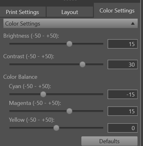
The way I get my printer to closely match what I see on screen is to setup color settings in my printers interface. In the screen shot here you can see that I have had to increase brightness, contrast, and magenta while reducing Cyan. The result is very close to the look of the screen. These settings hold true for the same paper across multiple prints from multiple images.
I personally have a Canon printer and use the Canon DDP software to print from . Many years ago I abandoned trying to get Photoshop, GIMP or any other program to directly print my images. Over the years I have had HP, Lexmark, Epson and Canon printers and I always presume they know their own printers best so I print from their software. I am a Windows user and therefore this is possible, but on a linux machine I am unsure.
I print from Epson Print Layout (windows box) on my Epson P800 for much the same reason. I have always wanted to calibrate the printer itself, but lack the necessary gear to do it properly. I was able to get profiles for a few papers from Keith Cooper @ NorthLight. Or, rather, the prior owner got them and passed them on to me.
I also use the manufacturer software under Windows to do the actual printing, but prepare the image in DT. I get quite decent colours using this workflow -