This posting likely reveals my lack of understanding about color theory. Perhaps in asking my Qs the answers might also benefit others who find themselves in my shoes.
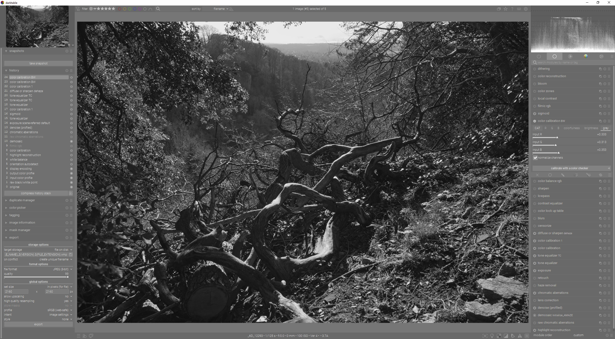
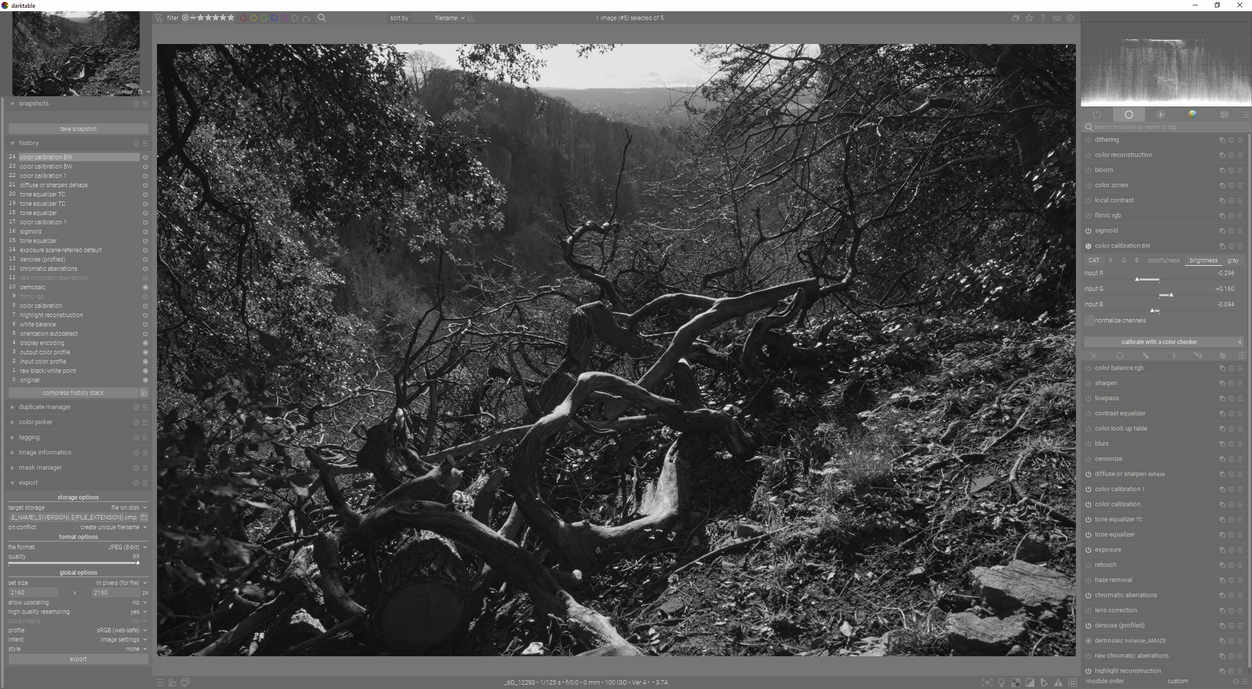
I use the Color Calibration module to convert an image to B&W.
To keep things simple, let’s say I use one of presets that come with darktable: B&W-Luminance based.
On selecting it I find the effect is as if I, under the grayscale tab, had slid the G to its max, left R and B in their default (min) positions. The sliders under Brightness tab are left untouched.
If I were to adjust the R, G, or B sliders under Brightness, I see the overall brightness of the image change accordingly, i.e., increasing or decreasing the brightness of the pixels that correspond to those colors.
My Questions now:
a) is there a recommended approach to adjusting the sliders under the Brightness and Grayscale tabs? e.g., adjust those under grayscale first, and then adjust those under brightness? the other way?
b) what is the interplay between the sliders under grayscale and brightness? e.g., if the slider for a certain color is to the right (extreme) under grayscale but to the left (extreme) in brightness? or, both to the right (extreme)?
c) I understand Red smooths skin (and good for women/children; less so for men), Green is good for details, Blue can show skin blemishes; and it depends on whether the subject’s skin has ‘texture’ that I’d want to highlight, etc. This Q concerns aesthetics, there’s likely no simple answer, but let me ask it anyway. To convert to B&W a portrait image, should I start with, in grayscale, increasing the ‘other’ color (e.g., green if subject’s skin has lots of red)? where to start if subject is “darker complexioned” than Caucasian skin tone? the goal being to maintain a realistic and good skin tone that is not washed out or too artificial/unrealistic.
Thank you in advance for reading this and your suggestions, recommendations, answers.
This is hue preserving so will say impact R colors ie those with a lot of red the most when you adjust the red slider but all pixels will brighten or darken to attempt to maintain the ratio and thus the hue…
So, if I understood right:
a) if I increase the R slider under Brightness, red would be most affected but all will brighten;
b) if I then decrease the G slider under Brightness, green would be most affected but all would darken.
c) if the two are slid in opposite directions the same amount, the red and green would be most affected leaving the blue unchanged but the overall brightness would be back to what it originally was.
All colours containing red will be affected, the more red they contain, the stronger the effect will be.
If a colour contains no red, it will not be affected (quite rare in “natural” images)
Same reasoning as for red
That, on the other hand is not certain: an image with a lot of green, and little red would probably show a net darkening (think forest scene, grass, …). An image that’s mostly blue would be little affected, as would be a “gray” (low saturation) image.
And the two groups of sliders have different purposes:
the brightness sliders are for a colour image, hence the hue preservation;
the gray sliders are expressly meant to create a neutral gray image, using the different channels in different proportions. A bit like the use of coloured filters with black&white film (except experiments are easier and cheaper with digital )
Both groups also have a “normalise channels” option, which tries to keep the global brightness constant. So that would mean that if you brighten one channel, some colours would actually darken …
I’m not even sure the brighness sliders are very useful when you aim for a B&W image, other than to get an optimal image before conversion. Then again, I’m not doing a lot of B&W.
This is an Aha moment for me!
I fiddled with the brightness sliders because, in one of his videos, Boris used them too.
What I just realized: he used them to “get an optimal image before conversion”.
In my naivete I kept fiddling with the brightness sliders during and after the grayscale conversion.
Further, a simple test of the various color film presets (Fuji Acros, Ilford Delta, etc.) in Color Calibration confirm they only impact the grayscale sliders and leave untouched the brightness sliders. That informs me is you are again right: “the brightness sliders are largely irrelevant” during/after the B&W conversion.
Rvietor: I’m now more sure about what you said. and believe you should be sure too!
Thank you for your detailed explanation and response, it helped me directly and indirectly “grow”!
I can’t find any reference at the moment, but I seem to remember reading that the whole color calibration module is basically a channel mixer with some GUI bells and whistles added to make use more comfortable.
While that’s a very short (and simplified) summary, it does mean that there is overlap in the functionality between the tabs, except for the CAT tab (due to the different white balance models in there). That’s not to say you want to do everything it can do with a basic channel mixer! But there is a certain overlap between the tabs.
My mental model of darktable is: like the Unix system–modulo some adjustments–there are modules/tools that each do a specific thing and you can pipe the output from one as input into another.
I use the Color Balance RGB module to “prep the color image for conversion to B&W.” I adjust the hue, saturation, etc. to taste.
Then I use the Color Calibration module “to convert to B&W.”
Of course in using the Color Calibration module if I just used the grayscale sliders I’d be ok. However, for reasons detailed in my previous posts, I mucked around with the brightness sliders. The adjustments I make under brightness slider in Color Calibration are not just irrelevant to the B&W conversion; they undo/overdo the changes I made in the Color Balance RGB module. It is best I make those adjustments in one place: the Color Balance RGB module.
So the “overlap” between the modules and also within a module can confuse…and mislead…until you know what’s going on…in which case you disregard “the bells and whistles intended to make us more comfortable”. But that takes going around the block a few times and getting whacked on the head a few times…
p.s. I concur with Bill re the “Colorfulness” tab as well. For what I was trying to do it made no difference…and left me wondering what I was doing wrong!
From your screen shots it appears a little darker which is what your sliders might indicate…but moving just one red green or blue still imparts a significant change in my hands at least… obviously the use of normalize vs not impacts this and the changes are not as sensitive as you might see in the gray tab but still I see changes…
Or maybe you actually mean colorfulness but you seem to be showing brightness… I wasn’t 100% sure
The OP has said brightness was irrelevant to BW conversion. I may have misunderstood that as meaning having no effect, and I was just showing that it does. It wasn’t supposed to be an example of a good edit.
Sometimes when I convert to BW, a image that I have edited to look good in color lacks “drama” in BW. One way to play with that is changing brightness. It’s just an additional technique, along with all the other modules.
It was likely me that was also confused because you hade mentioned colorfulness but then you were talking brightness and I hadn’t processed exactly what you were saying…