Color Harmony with RYB

Inspired by the good very videos of Boris s7habo on youtube at youtube.com/user/s7habo I had a look on the history of color harmony. Apparently the ideas of color harmony are quite old and came from painting, when CMY paint was not available and RYB paint was available. I learned RYB also in school.

A couple of websites or tools about RGB , CMY and RYB are terribly wrong or do not inform about the assumptions of conversions. For example complementary colors with RGB/CMY like Red-Cyan or Blue-Yellow have nothing to do with color harmony, because with RYB, the harmonies are e.g. Red-Green or Blue-Orange. And the RYB colors are totally different from RGB/CMY colors if you like to see them in sRGB color space. The reason of confusion is, that RYB cannot be converted to RGB, because RYB is paint and subtractive addition of paints does require detailed knowledge about the spectral properties of the paint. Calculation can be done with this, but the integration based on the properties of the human eye is quite complicated, There is no simple formula, even when the paint is defined.

Therefor, to my humble opinion the RYB color wheel based on sRGB primaries is nonsense. If you have a look on good RYB color wheels like the one from Johannes Itten at en.wikipedia.org/wiki/Johannes_Itten you see that the colors are different. Especialls the blue is much darker and the opposing colors really look pleasing and in harmony. A key question is:

  • What are the sRGB colors of the color wheel of Johannes Itten?

Of course Mr. Itten did not know, because sRGB was known and standardized much later. And maybe there was later never an agreement about the colors of his wheel? In Wikpedia and on various websites, there are used a lot of different sRGB colors. Quite good is not only the collection from David Briggs on www.huevaluechroma.com/113.php but even more the content of his whole website.

I will mention here only the yellow color as an example. On the Wikipedia page the SVG image is with yellow sRGB =(224,228,54) = #f4e436 and on other websites you find the values sRGB = (244,229,0) = #f4e500. I do not really care about the difference, because the basic principle of RYB color harmony is important.

With this in mind I will now reach my main question:

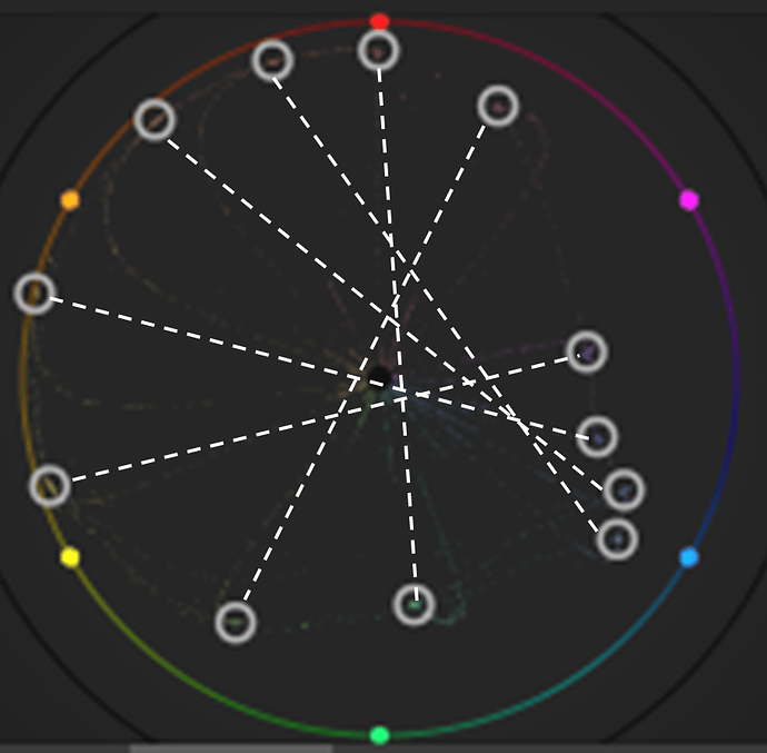
  • Why is the Itten color wheel not displayed with pairwise opposing colors in Darktable RYB vectorscope?

For some colors the opposite placement is nearly correct, but for others not.
See here my screenshot taken in Darktable v4.4.2:

I have added on this screenshot some dotted lines to highlight the opposite colors from the Itten wheel. You see that some colors are more or less OK, but other colors are more far from beeing opposite. An no dotted line does really go through the center. Is it my fault or what is the reason for this?
My test file generated with Processing.org is here:

If you need the Processing file, I can place it here in the forum.
3 Likes

For the vectorscope purposes, I would think the hue only is important, not the darkness.

I’m not the guy to answer your other questions as I don’t know the math for conversion, however it would be interesting to make a colour wheel using darktables ryb scope, with all lines passing through the middle, to compare with itten. A bit hard to say one is more pleasing than another without visual comparison.

Thank you Tim,
in the meanwhile I experimented with a RYB wheel based on pure sRGB colors. I think that is near to nonsense, because it is not really pleasent for the eye. In addition I was not sure, if it is better to used linear or nonlinear sRGB mixtures (e.g. 000 + 255 is averaged to 128 or better 187).

Nevertheless, the result is a little bit shocking, because apparently the RYB vectorscope seems to be based on something like that. I hesitate strongly, but please try it with the following test file:

More colors are now opposite, but is this real harmony?
Not easy to make some reverse enginering to find the colorwheel Darktable is based on. May be the RYB math behind is wrong or too simplified. Basically you need to stretch and compress a RGB wheel to RYB. I know some people who do this with stepwise math formulas, but not based on color harmony.

Just for completeness, here is my calculated Itten wheel with the sRGB colors from the mentioned Wikipedia page. In fact no big difference to the previous one and no big difference in the darktable vectorscope:

Here are the colors identified with ColorPic v5.2:

color yy = color(224,228, 54); // #f4e436 yellow
color oy = color(254,197, 48); // #fec530 orange-yellow
color oo = color(243,141, 43); // #f38d2b orange
color or = color(236, 96, 39); // #ec6027 orange-red
color rr = color(230, 31, 36); // #e61f24 red
color pr = color(198,  0,122); // #c6007a purple-red
color pp = color(110, 57,136); // #6e3988 purple
color pb = color( 67, 78,150); // #434e96 purple-blue
color bb = color( 36,113,173); // #2471ad blue
color gb = color(  0,150,195); // #0096b9 green-blue
color gg = color(  0,141, 93); // #008d5d green
color gy = color(138,186, 55); // #8aba37 green-yellow

Source: en.wikipedia.org/wiki/Johannes_Itten#/media/File:Farbkreis_Itten_1961.svg

Just in passing the scopes are usually related to the histogram profile which is often rec2020 … I am not sure if this is the case and how this plays in with the ryb. There is also some gamut voodoo that goes on to try to preserve hue in the face of tone mapping so there could be small influences there but I would have to try to go back to the code to see what actually goes on… there was indeed some discussion back when the scopes were introduced on github that might be useful to you if you do a search…

I am not really sure if this issue about how DT reports color in the colorpicker and thus the scopes as well was ever really sorted …it may…

There were are few threads around this

and

If it has then you can trust color values I would assume but if not there could be linear / non linear issues at times as well…

Thank you Todd,

this is the Github discussion I have read through:

I recommend also the referenced papers from Gosset and others.

Quite interesting are also the publications from Sugita about
“Paint like Compositing based on RYB Color Model”.
But I do not fully agree with Sugita’s simple conversion of
RGBCMY between RGB and RYB.

1 Like

Here is a collection of online color harmony and RYB web pages and tools:

  1. W3Schools: w3schools.com/colors/colors_wheels.asp
  2. Adobe: color.adobe.com/create/color-wheel
  3. Paletton: paletton.com
  4. Rasher: rasher.dk/lab/farver

All pages show different color harmony values.
It is a pitty, that the math behind is hidden and not mentioned.

Number 4 is quite nice. Use the complimentary scheme and toggle the “paint” switch. Switching between paint (RYB) and no-paint (RGB) does show the difference of complimentaries quite impressive, when you choose basic RGBCMY colors with the sliders. The help page is here: rasher.dk/lab/farver/color_tutor.html and the origin of this tool is here: siteprocentral.com/html_color_code

1 Like

I was trying to follow things with the numbers using this

https://convertingcolors.com/mass-conversion.html
https://convertingcolors.com/ryb-color-128_200_77.html?search=RYB(128,%20200,%2077)

What is the after image complement of red?

the darktable colorwheel is like those used in video production - using established standards isn’t the worst decision.
Conversion between different color representations costs performance - so just makes sense if there’s a valid usecase for it…

Not exactly sure how you created this but it doesn’t exactly align with what darktable is doing:

This is with rec 2020 working profile. As you can see, none of the color picker points are directly opposite each other in the RYB vectorscope.

This is with srgb working profile. Closer, but still not a match.

(PS. I think its a worthwhile discussion to have.)

Hello Tim,
the brighter wheel is created with some sRGB primaries and mixtures. Just a silly trial in order to check the DT vectorscope for complementary colors. Your screenshot has different colors, than my original:

yy = color(255,255,  0); 
oy = color(255,192,  0); 
oo = color(255,128,  0); 
or = color(255, 64,  0); 
rr = color(255,  0,  0); 
pr = color(255,  0,128);
pp = color(255,  0,255);
pb = color(128,  0,255); 
bb = color(  0,  0,255); 
gb = color(  0,187,187); 
gg = color(  0,255,  0); 
gy = color(187,255,  0); 

Of course the Itten wheel in my first post has other colors (posted already).

Yes Martin,
color conversion does cost performance. My first intention is to understand fully the RYB vectorscope of DT and not to ask for changes in DT.

Leonard,
you ask about the after image complement.

  1. Is this the RGB complement?
  2. Is this the same as Itten or other color harmony complementaries? I doubt this.
  3. And what about the sRGB-complement to white respectively gray with (sum-R, sum-G, sum-B)? This formula is simple, but I think it is wrong (see 3.).
  4. The correct complement to white/gray in 2. would require linearization of sRGB values (according to IEC sRGB standard). And perhaps the additon of both linearized complementary sRGB values has to result in the same or similar perceived lightness?

I am now confused about the “real” color harmonies. May be it is the same with music, that the harmony is individual and cannot be fully understood and calculated. The senses of eyes, ears and tongues all have complex models, spaces and gamuts! That is why professional artists, componists and cooks are doing a good job sometimes based on intuition.

Stare at something red, and then a white wall. Is that “real”?

Thank you Leonard,
motivated by your questions I searched more about color models and found strong and justified criticism of Itten and others. Meanwhile I am convinced, that it is best to throw Itten and RYB and most of my above colorwheel tests and DT interpretations away. Sorry for the confusion I did create.

Obviously Munsell and Hering are the right approaches (-> NCS, Lab) and on the german version of this wiki page en.wikipedia.org/wiki/Opponent_process you see the white wall test image from your question.

There is a good youtube video from Melanie Schimpf youtu.be/QzeMof8Kt0s about color vs paint. Unfortunately only in german. Does anybody know a similar convincing video in English?

So, what remains from my original posting/questions?

  • Throw Itten and other three color wheels away!
  • Are the RYB vectorscope harmonies in DT inline with Hering?
  • I will try to find the correct sRGB values for opponents in the RYB vectorscope.
1 Like

I didn’t check out your videos but reading through this fairly straightforward breakdown of RGB vs RYB and the notion of additive and subtractive colors and primaries it might seem that the notion of opponent colors as a mathematical nullification that you see with RGB is not a directly applicable model in line with the physics of color for RYB so you might use color harmonies in DT with say the simple 2 region opponent harmony but green is not the true opponent of red, cyan is. So in using it I think you just embrace the notion of spreading and grouping a set of colors as displayed in the representative RYB vector scope and in doing so hopefully achieve the notion of a prescribed color harmony as defined in the classic methods of working with pigments of paint.

https://www.scantips.com/lights/rgb.html#:~:text=Black%20is%20the%20zero%20value,an%208-bit%20byte).

1 Like

Thank you Todd and all others. For the moment I have to give up and do some more research. I still do not understand how a couple of mentioned website tools do the color harmony calculation.

The most simple and popular but wrong approach is to reach for white color when adding the input color and the complementary color. For basic primaries RGBYMC like green #ffff00 with complementary #0000ff this might look correct, but not if one of max(R,G,B) is below 255 = #ff.

The target could be to reach a gray value instead of white. The level of this value can be max(R,G,B). I have tried this with both nonlinear simple addition and with linear addition according to IEC 61966-2-1:1999 sRGB standard.

Compare the following results for input (1) with a light blue color:

  1. (051,128,204) = #3380cc Input color blue
  2. (204,127,051) = #cc7f33 Nonlinear complementary to white (000) = #ff
  3. (204,130,051) = #cc8233 Complementary www.rasher.dk/lab/farver
  4. (153,076,000) = #994c00 Nonlinear complementary to gray (204) = #cc
  5. (199,167,000) = #c7a700 Linear complementary to gray (204) = #cc
  6. (255,171,049) = #ffab31 Complementary www.paletton.com
  7. (255,160,000) = #ffa000 Complementary color.adobe.com/create/color-wheel

Hopefully I did not make a mistake on the website tools or in my formulas. I find it strange that 6 an 7 give the maximum red value of 255. Is’nt this too bright? Apparently everybody has a different opinion and/or formulas regarding complementary respectiveley harmony colors.

Here is a visual comparison of previous mentioned colors (1 to 7) from left to right:

  • What is you harmony preference to the 1st color?
  • 2
  • 3
  • 4
  • 5
  • 6
  • 7

0 voters

I have only lurked in this thread so far, but I’ve got to say good job on researching these things with great enthusiasm, and sharing the results with others.

Just a couple of quick notes regarding your latest post:

Of these ones, I think the “nonlinear complementary” is not relevant at least on a theoretical basis. If this means you’re calculating the complementary from the nonlinear sRGB values, it just doesn’t correspond to anything. The stimuli won’t add up to neutral.

Regarding the linear complementary, there is this very interesting paper from Kodak research available:
David L. MacAdam: Photometric Relationships Between Complementary Colors, 1938

It establishes so-called “moments” which allow calculating the required ratio of intensities of two complementary chromaticities such that they add up to neutral.

For this comparison / vote you posted, I would like to request an alternative where each of the candidate complements have the same articulation with the input color patch. Meaning, do six pairs of these swatches where the input and the complement candidate are always side-by-side. The articulation matters a lot, and definitely it’s not easy to compare based on the row of colorful circles.

All in all, keep up the good work!

4 Likes

Thank you Sakari,
the paper from MacAdam is very interesting and a proof, that most of the web pages and tools, which are calculating with nonlinear RGB values and even the “white target” are completely wrong. Very nice is, that the “after-image complementary” is also mentioned.

I also had the idea, that complementary colors shall have the identical perceived brightness, but then the linear addition will not be always neutral gray in the limited sRGB space. Figure 1 of the paper does show this perfect. With this, other methods for complementary colors in sRGB space are required (similar to rendering intent).

What a wonder the eye and brain are with all the other nonlinear human senses!

1 Like