You can work around e.g. switch which monitor is primary for the moment darktable starts, or e.g. put the profile into darktable profile dir and select it in gui.
That’s pretty much what I have done in the end:
It seems to work well so far. This might be the preferred way for when I switch to different monitor, I just swap the profiles in darktable and XnView.
1 Like
Sorry, but aren’t the profiles called preference and appearance?
The white papers for the two (https://www.color.org/ICC_White_Paper_26_Using_the_V4_sRGB_ICC_profile.pdf, https://www.color.org/whitepapers/ICC_White_Paper42_Using_the_sRGB_ICC_v4_appearance_profile_2014.pdf) are waaaay over my head. There is a short page about the two, where they say about the preference profile:
A typical use case would be to print sRGB images captured with a digital still camera. In this case a user could open the image in Adobe® Photoshop®, assign the sRGB v4 profile […] The user would then convert the data to printer specific values with the sRGB v4 profile as source, the v4 printer profile as destination, and selecting the perceptual rendering intent
About the appearance profile, this page says:
Produces more color-consistent results in color reproduction on display.
I just use them because I like the option to do the different rendering…to me sometimes one looks better than the other. I felt with the default profile in DT I often needed to punch up the blacks to get the result I liked whereas the relative render from the preference-perceptual beta profile would give me that…I agree from what I read the appearance one is supposed to offer a good result when going from a wide color space to a smaller one and so it might be the best choice… THe preference one has a stonger effect so I often use it when I want that…I really haven’t settled 100% on one or the other but I do use them now for some time for exports in place of the DT one…

Any thoughts on eizo display test? Is it relevant?
I wanted some test for a slightly darker area on the bottom by displaying pure white (to see if the screen is darker up to 1cm from the bottom edge). Maybe it’s normal as I haven’t seen anything like that online (and maybe I’m just worried too much).
I tried my Asus with the eizo test and apparently switching to Default mode matches gamma 2.2 closer than sRGB preset mode which looked more like 2.8.
Edit: phrasing
I have an EIZO CG279X running darktable. What is an EIZO display test?
Those test images may help detecting issues. They do not test anything by themselves. And especially for the gamma test, the angle at which you view the screen can influence the results a lot.
It is still not clear to me if we are dealing with a colour management issue or a processing issue (like scaling, either in darktable or the viewer, affecting the outcome).
If your display has a wider colour space than sRGB, it is possible that darktable’s darkroom view will use display colours that cannot be represented in the sRGB output. This is not a bug, it’s just the real world, and there are different methods (like the different profiles and different intents they support), each with its own pros and cons, to ‘compress’ the colours into the sRGB output.
To test whether this is valid for your case, you should export at full resolution to e.g. floating point Rec2020 TIFF, then load it back into darktable, open it in the darkroom, and create a snapshot or take a screenshot. Then, for the raw file, also in the darkroom, enable high-quality (full-resolution) processing, and see if there is a visible difference (either by comparing the snapshot of the TIFF, or by taking another another screenshot).
Then, repeat the same, but this time export as a non-floating-point sRGB image (16-bit TIFF, for example). If there is no visible difference with the Rec2020 TIFF and the raw, but there is a difference between either and the sRGB image, colour management is at play. You’ll simply have to find the best colour management settings for the image. perceptual processing compresses the whole gamut (in-gamut colours also get altered); relative leaves those unchanged, and clamps saturation for colours that would be outside the gamut. See Color management - Wikipedia.
If you don’t see a difference when altering colour spaces, you may try exporting at different sizes, and different settings for high-quality resampling, loading the results back into darktable, and doing a comparison similar to the one above. You can also compare your viewer to the darkroom. If any scaling is involved, it may change contrast and colours. Some examples (not darktable-specific) are provided here: Resizing or Scaling -- ImageMagick Examples
1 Like
OK, thanks. I had no idea.
1 Like
Well… Before we continue, there is a big problem. My system was updated and besides Intel Graphics Command Center there is also Intel Graphics Software. Today I decided to redo the calibration of my monitor, but I was quite unpleasantly surprised at what I got. Only 90.2% of sRGB… Any ideas what could have happened?

Ok, I finally got to try this.
There is the same difference - exported (and re-imported) image has colder colors:

There is just a very small difference between sRGB and Rec2020 in bright and saturated reds, but overall the image has the same feel - it does not have the same differences as TIFF vs darkroom RAW - nowhere near that.
I can not detect any visible difference comparing darktable darkroom preview and exported image (jpg sRGB + attached xmp) using Geeqie viewer and ocular inspection of results side by side on monitor.
My monitor is calibrated and I make sure darktable and Geeqie use the same display profile icc file as pointed out by @paperdigits.
Ah, so you are using Linux right? I’m on Windows 11 and I heard that color management is buggy on it…
I wonder, what does the picture you see look like when you compare it to my two screenshots? Is it closer to the one with cooler colors (the left image in a side-by-side comparison)?
Yes, I am using Linux Debian 12.9.
I am away from computer right now. I will compare with your original post in a couple of hours.
I am not aware than Windows 11 color management has any general issues. It should work. Any OS and driver set has some issues also Linux, but in general win11 color management is ok.
1 Like
Hello again @Vente,
I stand corrected! I did not pay attention to the xmp file and compared darktable default settings after import. When I do use your xmp, then I see the same thing as you:
- The exported image as rendered by the viewer (Geeqie in my case) has a different color to the sky, similar to what you post.
Screenshot below. Geeqie left and darktable darkroom preview with high quality processing on, to the right:
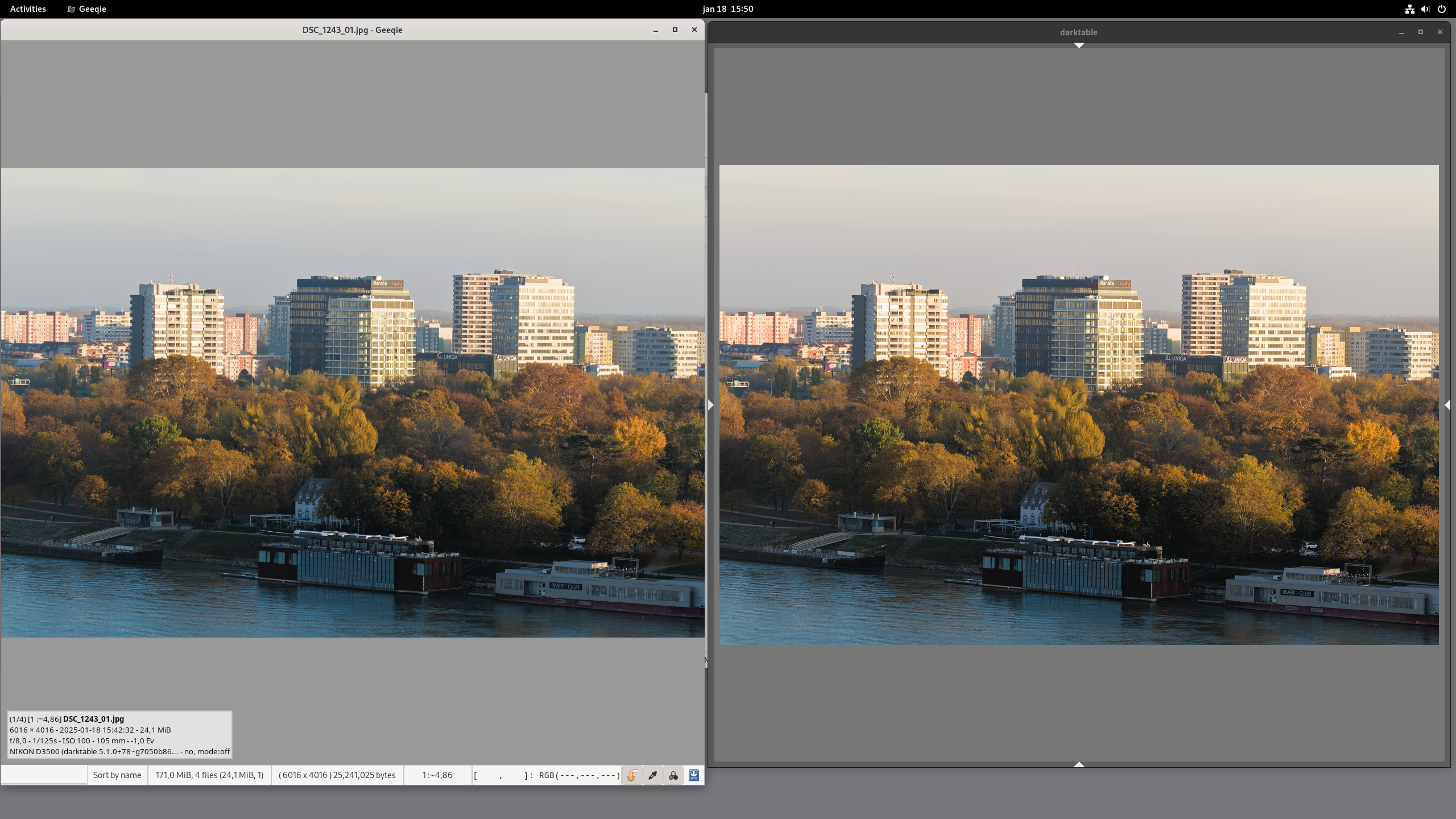
EDIT: As I stated above. I do not see this when I compare darktable default import (no xmp). Somehow the edits done triggers a visual difference on my system as well.
EDIT2: Ignore the darktable 5.1 commit number. It is not relevant comparing git master. I have local commits for my camera.
Hm, interesting! So I’m not the only one who has this problem.
The thing is, so far, I have not found another image that has this problem, it’s only this one… I thought that OpenCL might be at play, but that’s not the case. I wonder then if it’s a problem on darktable’s end or something…
Somehow the edits done triggers a visual difference on my system as well.
Looks as if haze removal could be responsible for the difference.
You’re right. I can replicate that on my machine - no difference if haze removal if off ![]()
How did I not notice this before… I remember trying to turn it off.
Thanks, @pass712. I see the same thing. No haze removal =>
geeqie rendered jpg == darktable darkroom preview.
Now, I wonder how this can happen?
How can a function in the darkroom pipeline of modules suddenly break export in such a way that export no longer is a faithful representation of darkroom preview with high quality processing?