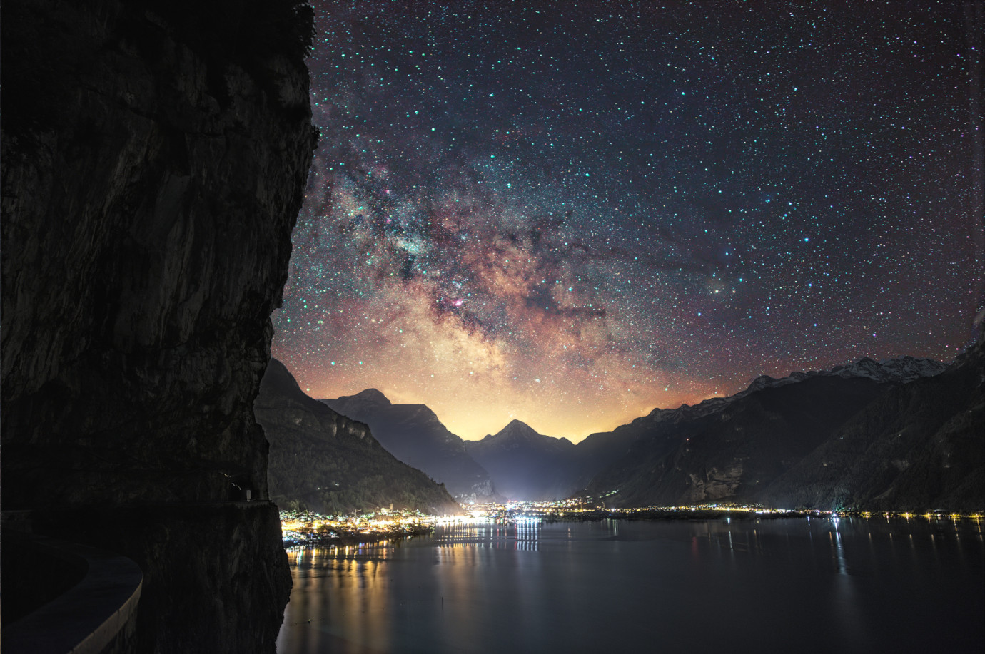
9 exposures of 15 seconds each at F1.4. Samyang 24/1.4 in front of a D810. Processed in RawTherapee, Stacked in Sirirl and then edited in Gimp with G’MIC.
Technically I’m fairly happy with the shot. It’s reasonably sharp, and getting the timing right meant quite clear air.
The bit I’m still struggling with is getting the colors ‘right’. I want to bring out the color variation that there is in the stars, dust, nebulas and due to the airglow. My goal is obviously not to bring it out ‘as seen’ but at the same time I don’t want to add any information that wasn’t there in the picture. Oh one more thing, the result shouldn’t look like unicorn diarrhea either.
Here are a few more of the various iterations I went over:
One more bit I’ve been struggling with is the lack of adjustment layers in gimp. Some of these variations I just couldn’t recreate anymore. I guess Krita would be my main alternative there (well other than photoshop).
Anyways, feedback is very much appreciated. In what direction would you take the shot?
I really like the first image, the colour and detail match what I’d expect based on other images seen of the MW in general.
Myself personally I’m very guilty of pushing the saturation or WB or the RGB curves to suit. I’m still to stack any of my MW images, so usually work from a single captured image.
I can’t offer any real advice on what you could do to improve the image, as I really do like your first version. You’ve managed to contain the brightness of the lights of the town/city, but if there’s any room to do it, I’d try to drop the really bright cluster near the middle.
The light pollution across the top of the mountains isn’t at all an issue for me, it leads nicely into the core. I like the subtly of the processing of the MW, it’s always too easy to push it a little too much trying to make the MW standout more than it should.
I let someone else comment first because I share in this commentary
That said, the second image does have better bloom control than the first (which has more impressive colour). The edges have a little haloing. Whether it is due to real light (back light) or not I am not sure. Lastly, the reflections on the lake are a bit distracting, especially the streaks on the right side going at an angle different from the ones on the left.
Which has totally wrong colors. Only 1% of the stars in the night sky are blue. Most of them are yellow or orange. Jonas wants to create a milkyway picture with psychedelic colors, like a landscape photo with pink trees (who doesn’t like pink trees …)!
So the first and third version are probably the best (worst) candidates
So each exposure was a “consolidated” one, for both the sky and the earth?
I’m absolutely no expert on this, but most of the shots like this I’ve seen where the capture was described used a separate exposure for the terrestrial part, and mask-combined it with the sky stack…
I see three distinct areas which I would have treated separately. I would take the skyscape from 4 and composite it with the mountains/city and water from 2 and then lay the left side foreground from either 3 or 5 over all of that.
That said, your shot is awesome!
Lastly, the reflections on the lake are a bit distracting, especially the streaks on the right side going at an angle different from the ones on the left.
Good point, I could try to re-project the image to make them straight. Not sure if it would improve things but could be interesting.
Which has totally wrong colors. Only 1% of the stars in the night sky are blue. Most of them are yellow or orange. Jonas wants to create a milkyway picture with psychedelic colors, like a landscape photo with pink trees (who doesn’t like pink trees …)
There is an interesting discussion to be had about how such a scene would be perceived by a human if it was brighter or our eyes more sensitive. But that’s not my goal here. Neither do I am for it to be psychedelic, I’m just trying to cram more data into the picture in a pleasing way a bit like what HDR does for dynamic range but applied to the colors in the image as well. I don’t want to distort things for the sake of distorting them or make the result look like the viewer is on a trip.
@ggbutcher Yes it’s one set of 9 exposures. I then align and stack them once for the foreground and once for the sky. Process them independently and blend the results together again.
@grsnovi Nice idea with blending them. I guess some care would be required because they have a different white balance in cases but could be interesting.
Roger Clark, an astronomer who posts on the astrophotography forum at DPReview, has advised folk to set daylight WB for the capture and to use that as the reference for “realistic” star color. Kinda makes sense to me, as it’s just pretty much daylight from far, far, away… His photographs tend to be warm-ish, not so much from the stars but from the dust and clouds.
Hello. Nice images.
I can give you a tip.
Except for some objects, comet, planetary nebula, Aurora … There’s no green hue in the sky. Here, your stars are a bit green. There is a algorithm in SIril you should use to remove this hue. But apply it on the sky only (so make a composition with GIMP masks).
I’ve spent quite a bit of time on his website. I think there is some point to using daylight as reference specially if the image is viewed in complete darkness or to make image comparable.
From what I understand Chromatic Adaption / Color Constanct is a fairly complex process in the visual system depending on more than just the adaption of our cones and rods. But as mentioned above, I don’t understand enough to make a robust argument regarding that. But just picking a single global fixed white balance for all capturing and displaying scenarios seems to be a bit simplistic.
@lock042 Correct me if I’m wrong but at least in theory air glow would be contributing green no? Airglow - Wikipedia
Makes sense, thanks for the feedback! I think that could be turned into an interesting constraint, to try and keep the color of the stars on the color spectrum of black body radiation.
I think that’s the thing with photography and final images, I’m not so technically focused, rather I like to adjust things until I see something I like.
It’s a bit like Wine, I drink what I like, mostly based on what the label looks like, but many are well versed in the intricacies of wine making and can deconstruct the subtleties that I simply quaff.
I did have another look at the two images and can see what you mean… the control of the bloom in the lights did mean less colour in the MW. For me, the MW in the first image overcame the bright lights in the town.
The moonless night sky is rarely or never black or blue. Actually it is really colorful! The colors in the night sky have a physical reason, but most night sky pictures you see in the web have an artistic color grading, mostly blue. Most of the time people don’t know how to fix light pollution. The easiest way is to make the image blue!
The reason why our sky is blue during day time is Rayleigh Scattering. Rayleigh scattering increases in efficiency as the wavelength of light becomes shorter. Blue light has a shorter wavelength than red, green or yellow light. So our daytime is blue due to the scattered light, the moonless night still has a tiny amount of blue scattered light, but it is much fainter than the starlight. There is also Airglow and in the very south or north aurora light, which is brighter than the Rayleigh scattered light from stars.
To capture natural color of the moonless night sky, set your camera to daylight white balance! A lot of people use artistic values of 3800K but then the stars do not have their natural color nor the night sky. Well if you want to have an artistic night sky then you can do that, but why should I change the beautiful colors of the night sky and turn them into blue? Do you make trees pink in your landscape photographs?
For fixing colors you can use the stellar classification of well known stars you see in your picture and convert that value to Lab or RGB. Then check it in your image and adjust it accordingly.
(HINT: You can find the Stellar classification in Stellarium …)
…but then the stars do not have their natural color nor the night sky.
The funny thing is that objects or point sources do not have a ‘color’ in isolation because color involves perception by a human - and things get tricky at night for the Human Visual System.
Pretend that you have a camera with Spectral Sensitivity Functions identical to cone fundamentals. Its output is then one single matrix multiplication away from a colorimetric color space like Adobe RGB. During the day that matrix multiplication can be roughly broken down into two components: one from cone fundamental space to Adobe RGB, one to account for human adaptation and the fact that said human is most likely not bathed in D65.
Question: what is the Human Visual System ‘resting’ adaptation in the dark?
In a dark room with a red led on? Under the moonless night sky?
When I ask this of Color Scientists I usually get answers with a lot of hand waving and many words like psycho-visual field, local energy, scotopic/mesopic thresholds, etc. They then typically abruptly walk away muttering equations under their breath and the need to perform qualitative/quantitative studies. They disappear in their labs, never to be seen or heard of again. Word is that many have since gone mad.
Any of you scientists out there willing to take this challenge up?
First of all… This capture is so gorgeous! Great work.
I like the second one best. In general, I’m a bit thrown off by the color of stars, but it’s not too weird. Just a touch, which can be still very pleasing for someone.
Anyhow… there’s a thing I want to ask. As I first looked at this picture, I’ve had immediately the impression that the location looks familiar. It’s a couple of days now that I’m trying to figure out, but I can’t grasp yet… Could you share what lake and town they are?
I really think I know it but it doesn’t come to my mind… Getting mad…