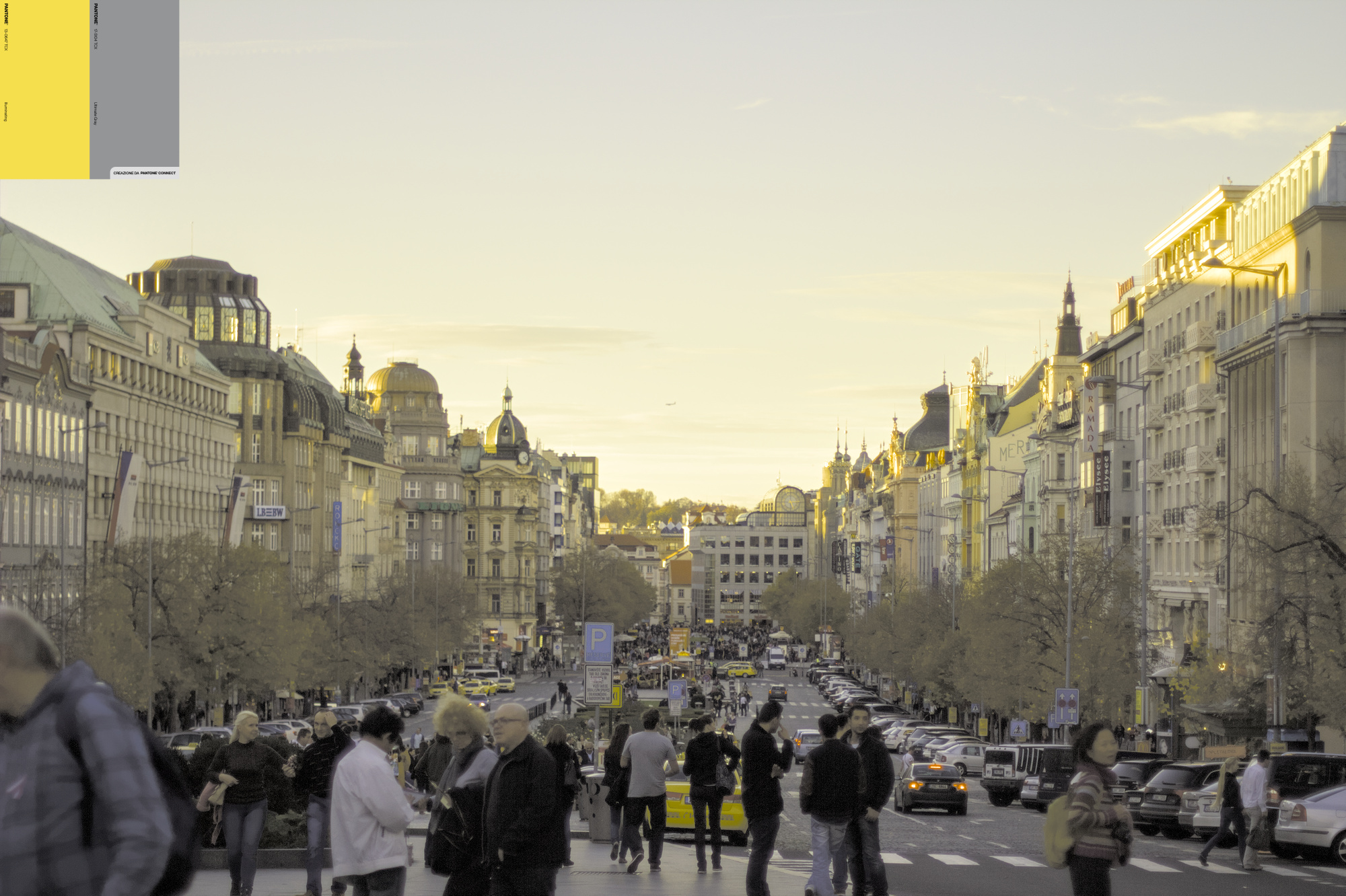
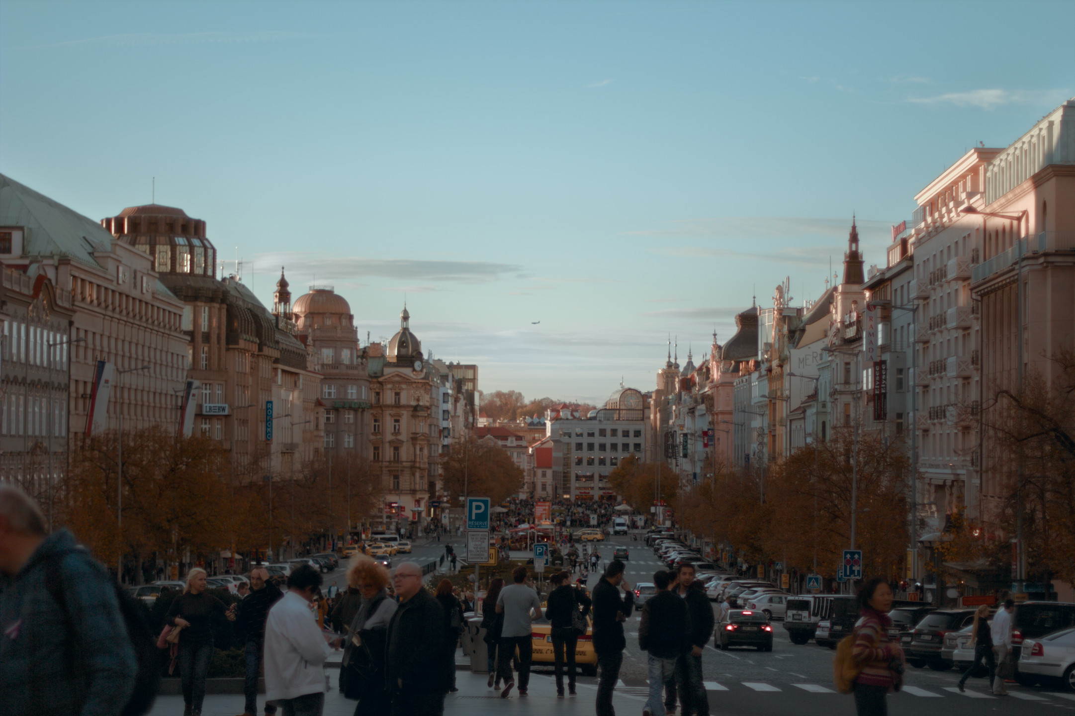
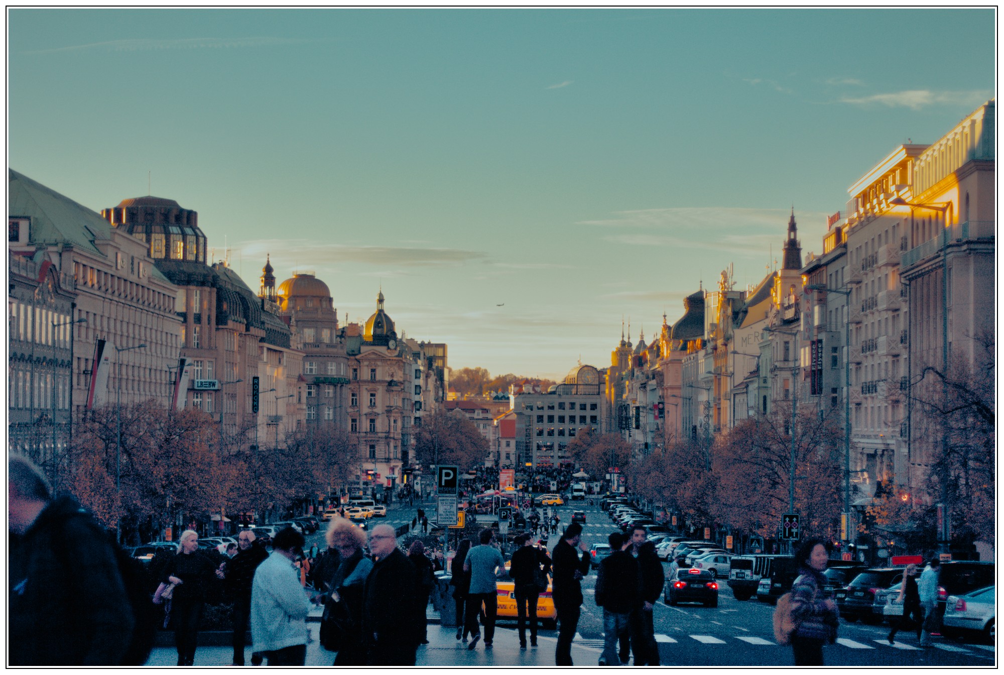
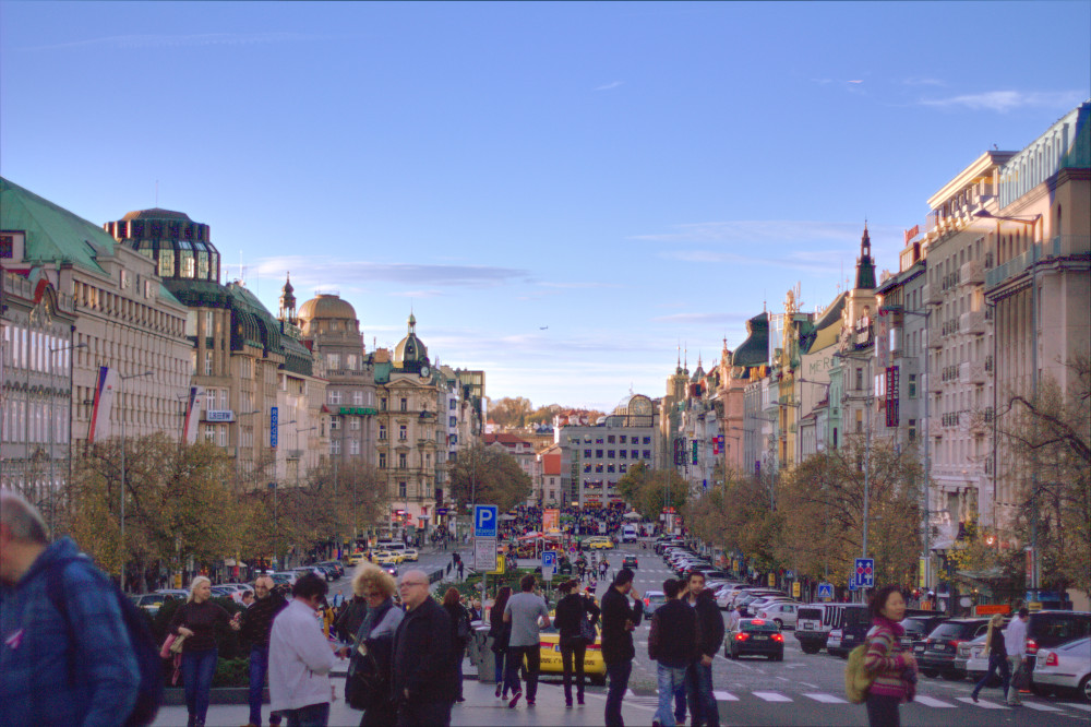
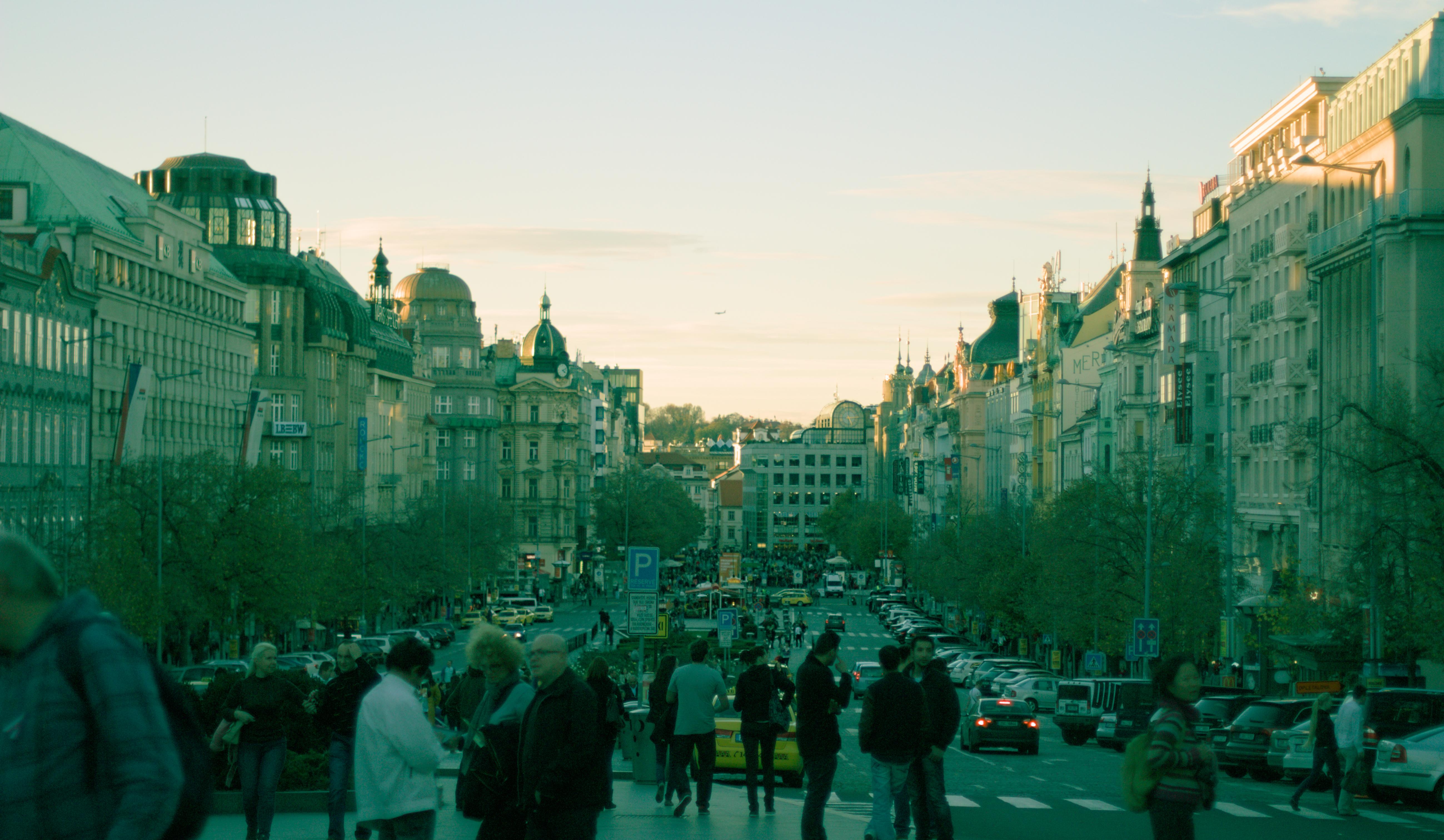
One of the (very) old image I often use to experiments with different looks/grading. Not an optimal camera setting (underexpose, shot while walking, wide-open aperture, soft, bloom + CA everywhere, don’t zoom it in very often, you’ve been warned )
I hope to see a different colour grading style, but feel free to edit it as you wish, this is Play RAW after all.
Purple and yellow should work together but I find it rather hard to get that to work. Thought this is a nice image to try this colour combo as overtones with, together with slightly washed-out shadows.
Using LUT is fine (sometimes I use it too), as long as we’re not dependent on it too much, experiments on different grading is better IMO because that way we can understand the tool we used better.
Agreed: I was mostly joking about LUTS. I can’t live without them for video work.
You are correct: another great reason to use darktable (or, any open source software). Your understanding of the process yields better control, quicker paths to what you want, and more pleasing results. I’m a fan.
Same for me too, I used it a lot in video works (especially FPE), what i mean is a lot of the time someone just searching for stylized LUT/preset, slap on the image and call it done without knowing what it’s happen to the image .
 )
)


 .
.