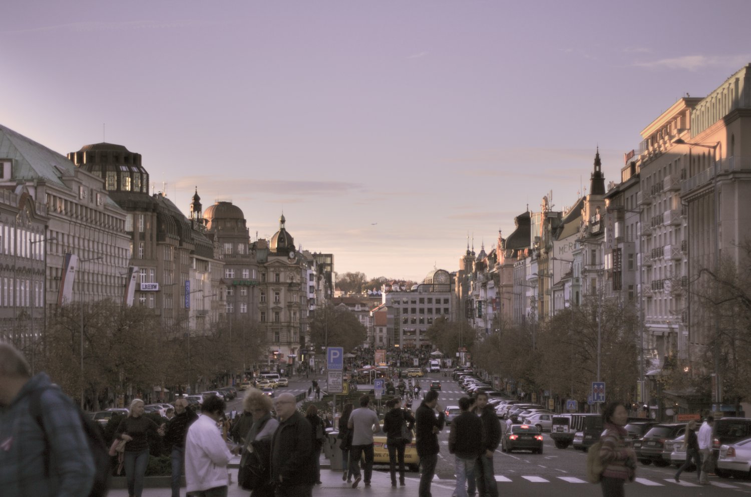
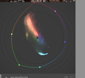
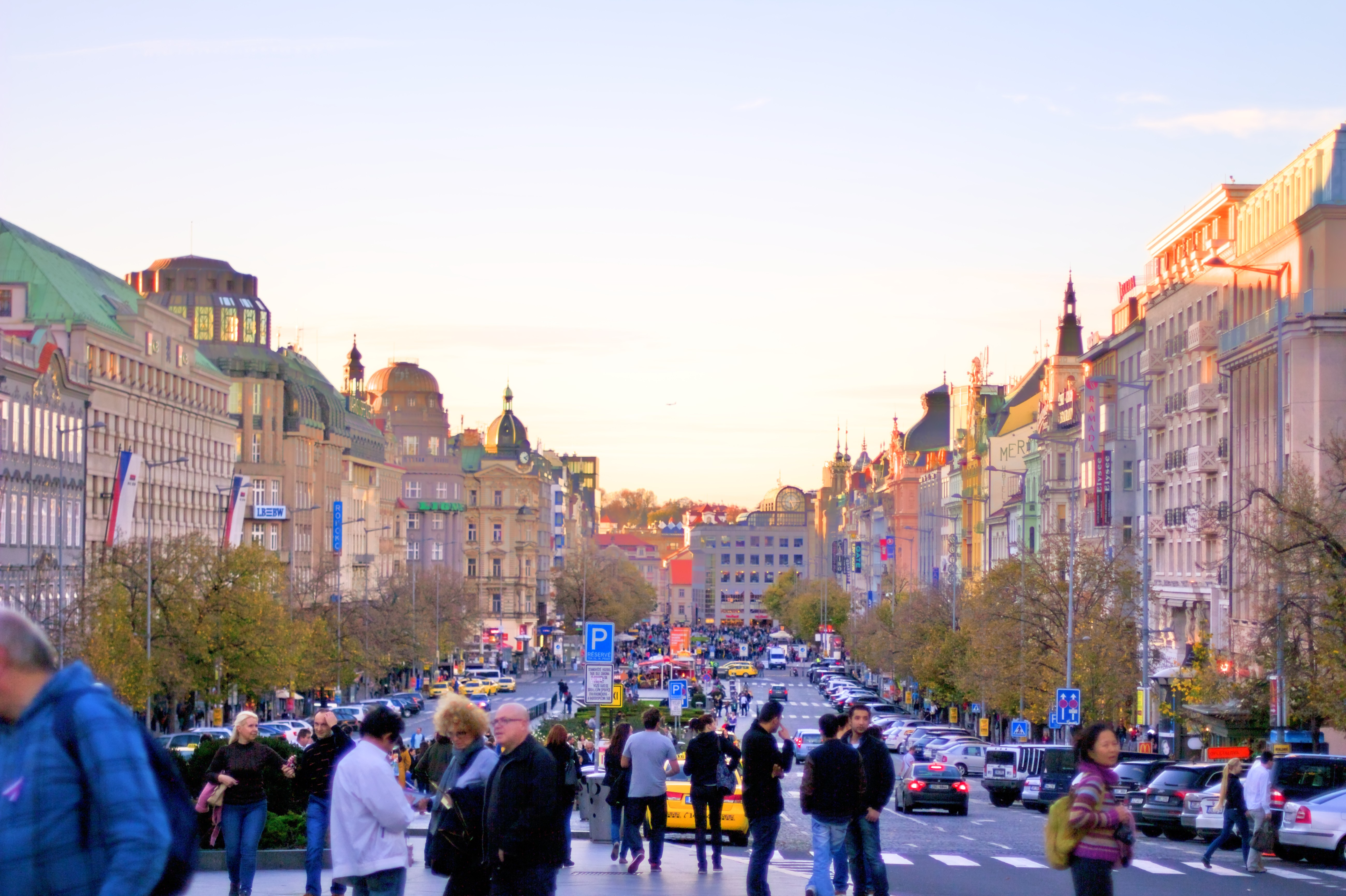
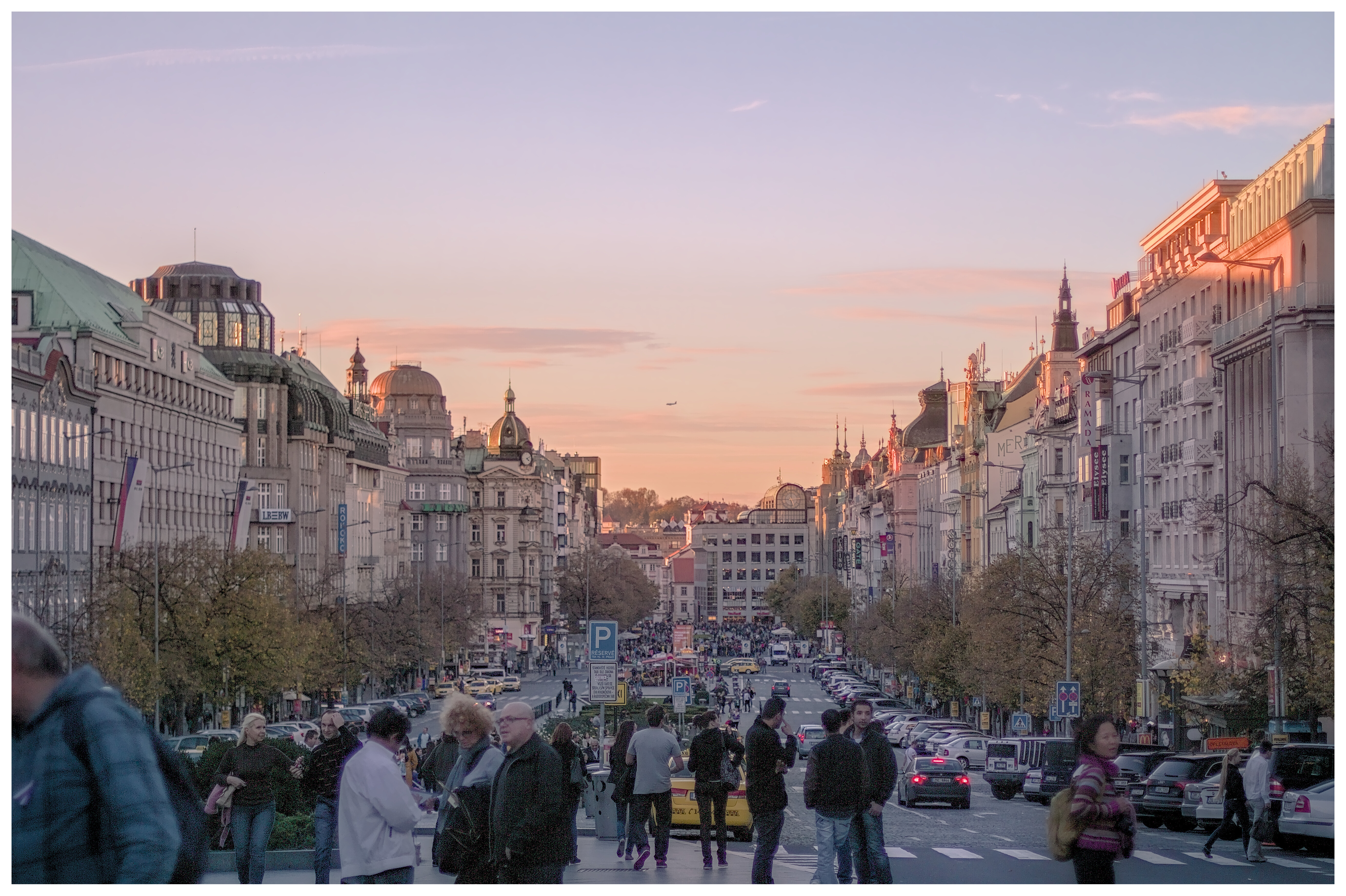
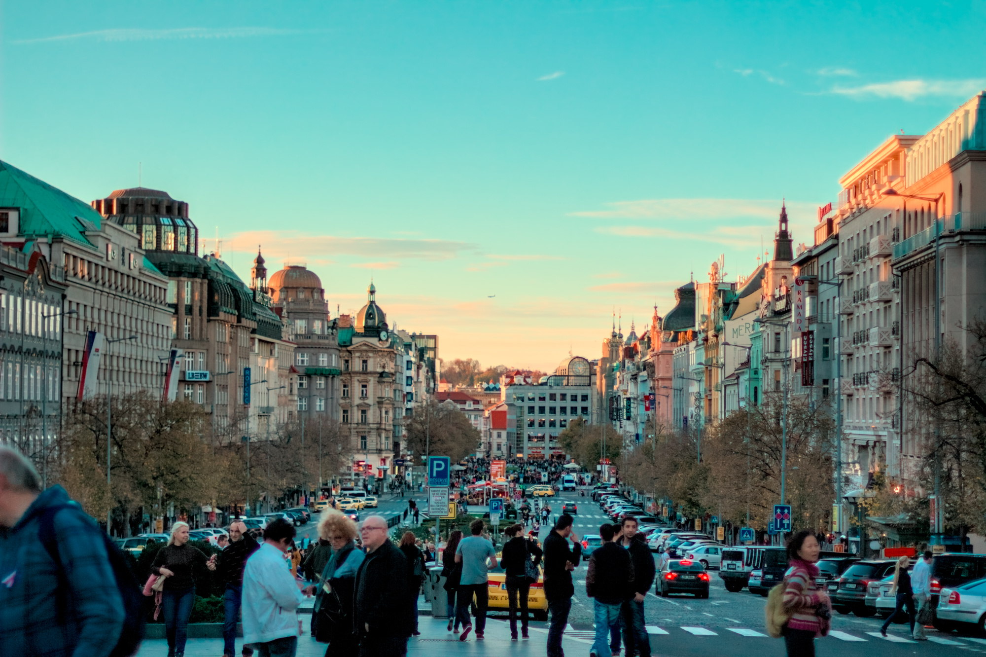
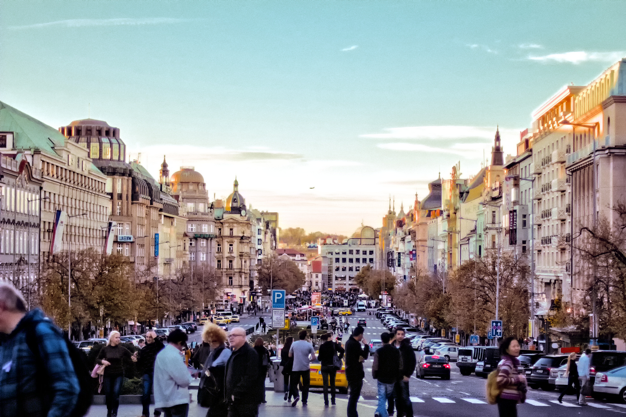
I was trying to follow Boris’ method of using Palleton to do color grading. I tried to get three analogous colors for the warm tones. Then I obtained the RGB of a largish, rectangular area in the middle and used another color guide site to get the complement to it, a shade of blue. Then I played with the blue color a bit to get something that looked good to me. All that trying this and trying that put a lot of steps into the history, and attempting to follow it might drive you crazy.
It wasn’t too hard to follow actually…and the result was clear…
1 Like
Yes, I just saw this with another photo, really I was trying to increase to get sharpen, but using the denoise: fine after is the opposite. I need to study the new d & s module because have a lot of options.

Where did you get the LUT for the first one?
Yes, I already understand how to implement colour when editing photos (and already have a preferred workflow to achieve that), I am just curious how other people achieve their results because there are many different steps to achieve the same image, right? 
I’ll dig it up…I don’t often use them but thought I would experiment…
Sorry none of my comments were intended to imply anything about your skills or understanding…my apologizes if that was the case
1 Like
I love this image, I just wish the dof was either larger or completely shallow and focused on some subject.

3 Likes
A different approach! Having largely removed the colour cast on my previous try, I have now made a couple of versions using my colour cast plug-in. It leaves pure black and white unchanged and adds a colour cast to intermediate tones.
Very late to the party here. I am drawn to these types of photos because I like to see how I change the colours. In Gimp.
1 Like
It is a pity that we cannot (on darktable) follow your method … certainly quite interesting results. Very ‘clean’