I’m not on Ubuntu myself, but a good search engine
will show you this:
Two additional questions:
Monitor?
Graphics card?
I’m not on Ubuntu myself, but a good search engine
will show you this:
Two additional questions:
Monitor?
Graphics card?
Display: 32" 4K Samsung LS32BM701UUXXU
Gfx card: NVIDIA GeForce GTX 1660 SUPER
OS: Ubuntu 22.04
Connected via HDMI.
I won’t be spending any money on this (hardware or software). I appreciate the colours might not be “perfect” but I’m not making money from photos or hunting for tumours in x-rays. I’ll be happy if they look about the same on the monitor as they do on my phone/tablet/laptops/tv.
I use this monitor for work (usb-c connection to a lenovo laptop) so I’d rather make a software change in ubuntu than make changes to the monitor which would require changes as I switch between PCs.
Then you won’t be able to profile your monitor, you’ll need some hardware to measure the colours on your screen(s).
And not profiling your monitor means you won’t be able to ensure images can look the same on all devices. The best you can hope for is to set your other devices to approach your 4k screen (or vice versa).
Been there, tried that, failed (getting all three colour channels correct is hard/hopeless).
If you still want to try this only in software, http://www.lagom.nl/lcd-test/ provides a series of test images you could use.
Again, while this might give you something similar on your devices, what anyone else will see is a gamble (it is even possible that what they get to see is worse than before you tinkered with your screens, as there’s no guarantee that your new settings are closer to “correct”).
Thanks. Like I said, I appreciate they won’t be perfect/correct but seeing as the proportion of people who’ll view my (any, really) images on a calibrated display is probably around 0.5% it doesn’t bother me in the slightest.
At the bare minimum, you should adjust your display brightness in the monitor. Most new shinny LCD monitors are shipped with very high brightness (nits) that is not good for photo processing. Since the monitor is so bright, you end up processing the image darker (it looks fine in your monitor) when viewed in other devices.
A color checker device is nice to get the colors to match, but lowering the brightness to me is the most important step. Even using a color checker, you need to tell the software to target the 120 cdm2.
This webpage can get you close without a device for brightness, LCD monitor test images Mainly the white saturation test.
edit: I just noticed that rvietor pointed you to the same webpage. I normally adjust the monitor brightness in the monitor first, before using the color checker I have.
I’ve adjusted the monitor, making sure it’s sane on both windows/usb-c and ubuntu/hdmi.
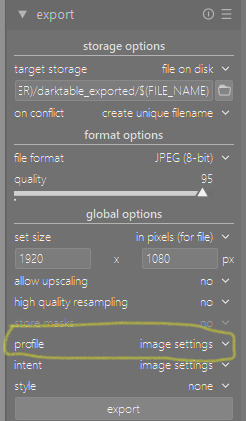
Then I’ve used my graphics card settings in ubuntu to set the brightness and “digital vibrance” (looks like saturation to me) down a little and I’ll then bring up the exposure (brightness/filmic/etc) in darktable per image to compensate for this, then check out the images on several devices. I was just hoping there was some sort of frig I could apply in darktable - for example maybe profile or intent on the export options - which could be set once and applied to all images.
In your case the best thing you could do is at some point get a color checker. The Spyder is not too expensive… Use it when you shoot anything you care about. Then you can use the CC module with the colorchecker section to nail the colors… This you can apply to images shot in the same conditions and you can make one from a general daylight shot and then save that as a preset making CC set to as shot… This can be a general color correction… Now this does not guarantee they will look good on your screen … if they do then your screen might be in good shape if not then likely the current settings on your screen are not generating very accurate color… that part has to be assessed with a calibration device but that is not an option for you…


You say everything else looks fine; the problem is that when you export from darktable, the images look wrong.
The surroundings can have an effect on how we perceive images. For example, an image edited using a dark theme in darktable, when displayed on a webpage with a light background (Facebook, Instagram) could look wrong.
Another possibility is that darktable uses the wrong monitor profile. Have you checked that? If all else fails, you could just set it to sRGB (provided that your display is close to sRGB). See:
https://docs.darktable.org/usermanual/4.0/en/module-reference/utility-modules/darkroom/soft-proof/
Is your output profile set to sRGB?
https://docs.darktable.org/usermanual/4.0/en/module-reference/processing-modules/output-color-profile/
And is image settings selected as the profile in the export module? Is there any style applied in the export module that could alter the image after you edit it?
If all of those are OK (not using a very dark theme; display profile is not set to some wrong value by accident; output & export profile, export style OK), you can try the following, without any hardware or expenditure:
Hopefully the JPG still looks ‘right’, and identical to the raw snapshot.
Now open the JPG in a browser (or whatever other software that you use). Does it look wrong?
Take a screenshot of the image, as it is displayed in the darkroom with an external tool. Take another screenshot of the JPG as it is shown in the browser/image viewer. Import both in the Gimp, resize to the same dimensions, add them as layers, switch the merging mode to difference. Is the image completely dark (= 0 difference), or are there areas showing discrepancies?
It’s not the surroundings. Like I said, I’m looking at the photos on my phone, chromebook, tablets etc and the issue is limited to just the photos I’ve recently processed on this new monitor; all other photos are fine on the different devices.
I’ve set the colour on the monitor so that I’m happy with it in windows, and I’ve tweaked the colours on Ubuntu using the NVidia tool. I’d like to replace that with a profile on ubuntu. I’ve not spent long on this yet but I suspect it’ll be the usual Linux rabbithole of deprecated software, old/misleading info on the net etc. (Ubuntu seems to think I have an 85" monitor - how does it get it so wrong?).
When you say “And is image settings selected as the profile in the export module?” did you mean “…as the intent…”? Because otherwise I don’t see the difference between that and your previous comment about setting output profile to sRGB. I’ll play around with those two values and see where I get to. This is the approach I was hinting at in my original post and I believe it’s the right one, so thanks!
I meant profile:
I seemed to recall that filmic massages colours to fit into the output profile, and that would mean that if your override the output profile during export, you may get different output. However, I cannot reproduce that effect. Using image settings for profile and intent means using whatever is set in the output profile (not overriding them).
DisplayCal (actually, its usage of Python 2) is deprecated, but when using the FlatPak, you really don’t need to do anything special. You’ll need a hardware device to calibrate and profile the monitor, though.
Can you check what profile Windows uses for your display? And what Linux uses? On Ubuntu, are you on Gnome or KDE? Xorg or Wayland? (AFAIK, colour manager is not fully functional on Wayland, but I could very well be wrong; I use KDE on Xorg, and have no Wayland experience.) Can you take a screenshot of your Linux display settings?
What monitor did you buy? Is it wide-gamut? If so, does it have an sRGB mode?
While it’s probably the perfect solution, I think that current monitors can send a minimal profile (like primaries, gamma, resolution, dimension) to the host if requested (“better than nothing”).
Most importantly for calibration you need some sensor that is supported by the software.
Still valid for a very basic “calibration”: https://poynton.ca/PDFs/Brightness_and_Contrast.pdf
Actually (falsely assuming that all monitors of the same type are identical) you can save the time and money if you find someone that does the calibration for you and sends you the profile plus monitor settings used (Getting the correct brightness depending on the ambient brightness and the whitepoint can be rather tricky).
So why did you ask the question if “it doesn’t bother me in the slightest.” (when people have a different, but calibrated monitor)
This monitor seems more like a television/gaming panel. I could not even find gamut supported in the spec for it on Samsung or the downloaded manual. And it has gaming modes and picture modes etc. These will change the appearance of the screen to suit video play back for games and movies but might not really be the best technical solution for photo editing… I’m sure its a nice monitor but given what it appears to be targeted for this could explain why you are seeing some of the differences that you are… Monitors can be notorious for having a bunch of settings for color and sharpness to boost things using names like supersharp or vivid etc . These enhancements are not going to be available on other devices so they will of course be different…
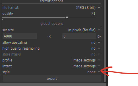
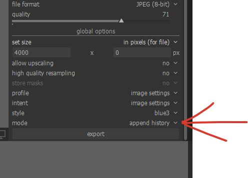
If you read the OP again, you’ll see that @dave is actually asking for a way to automatically add contrast and saturation on export… not about trying to profile the screen. Dave, what you can do is open an image, in dt, apply the saturation/contrast boost (prob. in colour bal rgb), then in your history stack at the base click the ‘save as style’ button.In the dialogue de-select everything except the adjustment module you used, then name it and save.
Now in the export module, select the style you just created in the 'apply style menu"
Then, important, in the new option that appears below this one, select ‘append’ otherwise your export will loose any other adjustments you made before.
Hope this helps
Edit: it’s just occurred to me that doing this will overwrite any previous color bal rgb settings… should I have created a new instance of the module to start with?
If you read more he talks about having issue not viewing the same on devices as in the past…that is for sure some sort of profile issue… I honestly suspect that his monitor has some gaming modes or other settings that are creating a unique look that is not transferred when he looks at the exported edits on other devices… that is my take… bottom line I think is if you don’t profile your devices then you cant really custom tailor edits image by image to look the same…that’s the whole job of the profiles… and this doesn’t even speak to the point of what apps are being used to view the images on certain devices and what that might also do…
I do agree actually… I just thought if he wasn’t too concerned his plan of compensating for it might work.
I just think image to image any compensation like that might not be consistent … in the end the technology and workflows are there to get a fully calibrated workflow from camera to printer if you want to take all the steps and if not I guess you decide when where and how to bend the rules… 
Yes, absolutely. I have my screen calibrated, but not my printer… kind of wish I did but the extra cost of a colorimeter (if that’s the word I mean) that could do reflective readings as well as transmissive was a bit too much considering my printer only cost $90 and I don’t print much!
@Ulrich_Windl , I’d like to apologize for the tone of my reply to you - I was in a bit of a bad mood, not that that’s any excuse 