I was perusing @lhutton’s thread on Public Photography, privacy and changing attitudes this morning. A sign of a fun topic is when it gets me thinking about it when I’m nowhere near my computer and just sitting (having a cup of coffee and a pipe this morning for me).
It had me thinking about some photographers whose work I really enjoy, and it’s probably no secret that one of my favorite working photographers right now is Dan Winters. I love people and portraits and his work is just stellar in general.
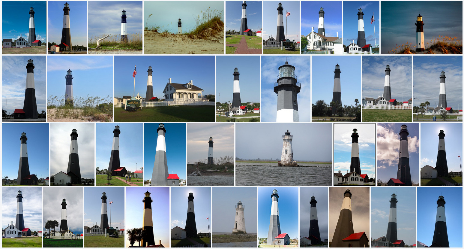
On that note I was looking through his work again and came across this awesome shot. (Bear in mind, today is the celebration of Independence Day here in the U.S. - so the flag caught my eye immediately). The Tybee Island Lighthouse on Memorial Day:
This is a shot of the Tybee Island Lighthouse - one of the few colonial-era lighthouses still standing. It’s located at the entrance of the Savannah River in Georgia.
What I love about this shot is the approach taken by Dan in capturing such a highly photographed subject. If you peruse Google images shots of the lighthouse you get a feel for how most people might photograph it. The average person wants to capture the entire lighthouse in most cases I would guess. Even looking at the Flickr search for the lighthouse shows most if not all of the images are similarly composed and shot.
In this case he has eschewed capturing yet another generic lighthouse image and instead may have focused on what he saw as defining characteristics of this lighthouse. The distinctive black and white paint and the hexagonal shape of the structure. We don’t even bother to see the light itself (again - a feature that all lighthouses share so not as interesting for this lighthouse). Those defining features plus the draped U.S. flag for the occasion. Just wonderful to me inspirational for myself to hopefully pay more attention to those little defining details of a subject the next time I get behind a camera…
Is this really a photo? To me it looks more like a painting or an artificially rendered picture.
Isn’t the right sky Part of the image too empfy? Otherwise I like the fragmented composition.
I like the photo – it conveys its message in a minimalist, graphical way. I especially like the way the subtle shading gives the tower volume and shape.
I find most interesting what was not done to the photo in post: there is keystone distortion, the flag is backwards, and the sky is a weird gray. Often, the price of technical perfection is sterile images.
This was a super interesting post, thanks for that @patdavid !
I also have a Dan Winters book on my shelf, I like his photographs. The point you’re making and the appreciation I have for this photo stands on his own even in isolation, but I’ve enjoyed the further investigation you’ve made and the comparison with the other takes of the same lighthouse.
It really shows how the little rules that are shared among “normal” photographers (look for interesting skies… only shoot at sunrise/sunset… never place an object bang in the middle… the stupid rule of thirds…) are really conducive to boring and insipid photographs.
And that also ties in nicely with Anna’s observation about the empty sky to the right; that’s really unimportant, I certainly don’t examine photos on the basis of a checklist, and I’d argue nobody should do that. The photo is excellent and stimulating, with a certain meaning given by the waving flag, it makes me realize that yes, you can indeed make photos of objects that have weight and interestingness (I wanted to say this because the usual feeling is that photos of people, portraits or street photos, are inherently more significant/important/dense than others, and that bothers me).
Dan Winters has once said: “Regardless of the assignment, there’s always a great picture to be made. Always look for that picture.” I think this image elegantly proves his point.
Yes. Those rules are only a guide for forgettable photos. They may help beginners but today people are often so image sawy that it’s to basic even for beginners.
I like how abstract it is. Without previous explanation that it was a lighthouse, I would never have reached that conclusion. But the flag itself looks huge, so it gives a feeling that the structure is big.
Is the sky question because it is empty, or because it is out of balance with the flag? Here in Portugal it’s common for skies to be completely clear and uniform throughout the day, specially in spring and summer. I guess some meaning could be derived from the lack of balance, specially with everything the flag signifies, if we wanted to look at it that way.
No, I think the “rules” are okay and tell you what is aesthetically pleasing. So, it is good to follow them. The important point is to know, when not to follow them on purpose to make a great photo.
If you can’t see the difference in accomplishment between the photo you link and the one posted in op I have to say you’re in trouble as a photographer.
If you send your image to any half respectable critique and leave your title blank or worse, have it be DCM_184737.jpg, that’s the first thing you’ll get called out on.
I actually think it’s overrated to be able to identify the subject. Only commercial images such as advertising sometimes really need to have a clear subject. For more ambitious imagemaking it’s often advantageous to have ambiguous or shifting subjects.
Consider written poetry, even when concrete the poetry happens between or outside the words.
I have the same opinion as @nosle and would like to add that sometimes some culture and context is needed to fully appreciate an artwork.
For example in cinema there are sometimes subtle references to other films or histories or pop culture facts that make the film more enjoyable when you know about those references. In the case of this picture I think it’s something similar.
I really don’t like Dan Winters. I find the work over cooked and over done in almost all respects. This lighthouse image was rather nice though. The light and colours are very good.
So it is possible to just look at what you’re seeing and think about it .

