Hi,
Is there some other way to increase the contrast or the way it is showed, when the modules are on or off? I think the difference is so small in contrast that it is almost impossible for me to see.
I have already set the theme to high contrast.
Hi,
Is there some other way to increase the contrast or the way it is showed, when the modules are on or off? I think the difference is so small in contrast that it is almost impossible for me to see.
I have already set the theme to high contrast.
Hi and welcome to the forum!
I think you could try and change the theme in the preferences. I don’t know if the default themes make any difference, but this one does:
Note that it changes the size of the button (for me it’s a bit hard to hit) and the UI of darktable will be quite different.
Alternatively, if you are skilled in CSS, you could alter the base themes yourself.
Thank you. The theme broke basically the darktable, had to go back to build in themes. Maybe it is not for 5.0 version.
Preferences → General → Theme → darktable-icons-highcontrast
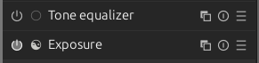
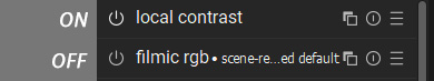
Tone Equalizer → off
Exposure → on
Found the css that gives me control over the buttons when modules as switched on…
#module-header .dt_module_btn:checked
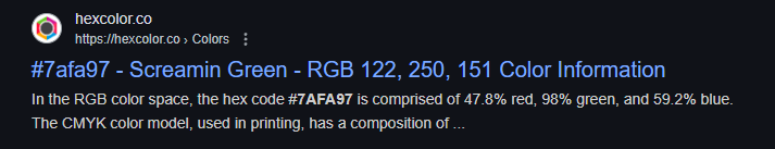
{
color: #7afa97;
}
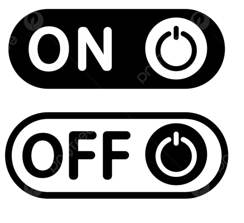
I agree that the on and off is difficult to see and I for one would like to see a clearer difference. Maybe changing the icon for on or off to a different looking icon for each. What about something like this image. including the word is great but if that consumes too much screen real estate then just reversing the tone of the circle would be very clear.
This should be the default for selected modules.
Well, that was just first green I could pick. ![]()
The css was more of importance! ![]()
Awesome, thanks!