ART has a module…look at the name… is there a “texture” slider?? At some point if you are going to create a module using pyramidal math that can be used to create depth/sense of texture then people should be able to pick that up one would think…
.
I’m good with any name. If a search pulls it up when someone goes looking for contrast and the name is not so long that it gets truncated when the panel starts to narrow or on a smaller screen then I can work with it…
Does it need rbg in the name to indicate that it is a scene referred contrast adjustment. Most modules that are newer and designed for the modern workflow have had that added but again not something that would impact me one way or the other but might guide “new” users
@Christian-B I’m with the others if you feel one name is a better reflection of your vision and application of the module go for it even if it doesn’t win a poll…
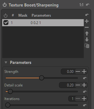
I will just say that none of the controls in that screenshot are named generic qualities, so fit with most any module names: strength, detail scale, iterations…
If there was a slider in there that said global contrast and a whole section under the heading “pyramidal contrast”, it would start to depart from the name of the module.
Interesting that in another thread there is push back against the terms shoulder and toe in AgX. But I agree Christian has put in the work and we are just users and should be grateful for whatever he decides in this module, AgX and any others he kindly provides us. At least Christian asks users opinions first.
I actually said in the other thread that I prefer the names of the controls in AgX as they are, but that there are other names that would have been more descriptive such as Shadow/Highlight Compression or something similar. I’m wasn’t saying they should have been made more descriptive, just that they could have.
Christian has already done plenty to seek people’s opinions and get feedback on the name of his module. At this point I think he is perfectly in his rights to pick the final name.
As a user for a few months, I only care which modules are recommended and which are legacy. Why would I need to know that color balance rgb replaced a non-rgb module with a similar name? I just want to know the newest, best working modules versus which I shouldn’t use. (The module default filter lists give that information.)
I completely agree. It does not tell a new user anything when “RGB” is appended to the end of a name. I don’t think “scene-referred” when I see RGB, I think Red Green Blue.
I’m not sure where RGB came to mean scene referred but I would love to know the story behind that, genuinely
Thank you, I forgot that “linear RGB” is the name of the space used in the scene referred workflow. Still, the ubiquitousness of “RGB” as a general image, light, color term makes its usage as a flag to show which modules operate in linear RGB maybe not the best choice. Unless users read the manual or come to this forum, they won’t really know that a suffix of " RGB" refers to a module’s color space…
There are several modules that affects contrast, so ‚contrast management‘ isn‘t a proper naming. It doesn’t give any differentiation to those other contrast tools.
So ‚pyramidal contrast‘ as in the first concepts seems to be more reasonable …
I’ve got to strongly push back on that. The darktable project as a whole should make the decision, not just the individual who happened to create an individual module. Otherwise there won’t be a consistent, coherent interface.
I just want to point out how humorous it is that @Christian-B implemented the bulk of this feature over a weekend and then he is spending one week figuring out the name
But jokes apart, names are important and they stick, and getting them right can actually be harder than a convoluted transformation in some high-dimensional non-newtonian super-duper wavelet space.
There is a voting with 3 options – and people keep suggesting new names. I think it should be understood that once the author has narrowed down the choices to 3 names, throwing in 7 new options won’t help this move forward.
Hello,
Correction, I’m not the one doing the work, I’m just counting the points.
More seriously, it’s an old reflex from my professional life. I can cite dozens of examples where simply changing a name or label color had an impact on a product’s sales figures.
I think it’s time to close the debate; contrast & texture came out on top in the vote.
I changed the original proposal, “pyramidal contrast,” because the module also has global and chromatic contrast.
From a purely technical standpoint, I agree with the proposal by @bastibe.
I would like to thank you for your help, and in any case, I will leave the final decision to the darktable team.
Have a great day, everyone.
Christian