Hello,
I would like to present a new module dedicated to « contrast management » in linear mode (scene-referred), designed to be independent of existing implementations.
This project originated from experimental ideas shared and created by @wilecoyote, whom I would like to thank (Experiments with a scene-referred local contrast module - proof of concept). However, the current module has been extensively redesigned to incorporate a new architectural and perceptual approach.
Position in the pipeline The module is placed in the linear pipeline, ideally just after color calibration and before any tone mapping (filmic, sigmoid, AgX, etc.).
Main objectives:
Unified management: Integrated control of global and pyramidal contrast (5 scales).
Perceptual approach: Use of a contrast sensitivity function (CSF) for natural distribution of visual energy.
Colorimetric fidelity: Work on luminance to preserve hue stability and saturation.
Optimization: Full OpenCL support for perfect CPU/GPU consistency.
Independence: Works without assumptions about the final tone mapping (display).
Fundamental concepts:
Luminance-based processing: Ensures consistency and avoids color drifts during high contrast boosts.
Multi-scale pyramid: Decomposition via edge-aware filters for excellent control (from micro-detail to large masses) without halos.
Global Contrast & CSF: A global term ensures the structure of the image. It is weighted by a Gaussian curve centered on mid-gray (0.1845), aligning the rendering with the sensitivity of the human eye.
Global ↔ Local Balance: A pivot slider allows you to decide which structure should dominate the rendering without breaking the stability of the exposure.
Colorimetric Contrast: It uses the difference between the Red and Blue channels to modulate luminance, allowing for enhanced separation of colored planes without introducing hue drift.
Noise Management: A noise threshold prevents the amplification of artifacts in areas with a low signal-to-noise ratio.
Status: The module is stable, optimized, and ready for thorough evaluation. It offers a visually consistent rendering that I hope will enrich the creative possibilities of darktable.
I look forward to discussing it with you and hearing your feedback.
It’s definitely very powerful, but I still think it still lacks better control of edges with large brightness variation.
Here’s a comparison with diffuse and sharpen with a higher edge sensitivity value (left). You can see how the local contrast borders directly on the hand and shadow.
In the example with contrast management RGB on the right, you can see a slight gradient at the edge with the hand and shadow without local contrast:
Personally, this doesn’t bother me at all, because I believe that you should be careful with local contrast anyway and not overdo it, and with moderate use, you will hardly notice it.
Thank you for your feedback. To be honest, I had never pushed the sliders that far before. At first glance, I wonder if I should adjust the default values in the fine tuning section.
I will think about it and analyze it more closely. If you have any ideas, they are welcome.
In this example, it wasn’t necessary to go that far. I deliberately exaggerated it to make the described effect more obvious so that it could be better illustrated.
I have no idea about the mathematics behind it, but maybe you can take a look at what the edge sensitivity slider does in DuS. With it, you can control the halos at edges with strong brightness variance very well.
Note that this does not just reduce the contrast (which only “masks” the halos so that they are not noticeable) but actually reduces the halos themselves.
Thanks for the explanation.
I was able to reproduce the effect on another photo, which will allow me to think about a solution and refine the default settings and distribution of the different scales, being careful not to create another problem because, as they say in French, “le mieux est l’ennemi du bien” (the best is the enemy of the good).
This also highlights an important point for any future user guide: don’t push all the scales to too high and equal values, because it’s like having five iterations, which I don’t think is the goal.
Thank you for your help.
Hello,
Let’s consider contrast not simply as the intensity between highlights and shadows, but as a model of light in the image.
Our eyes, like a camera, do not perceive contrast in the same way depending on brightness. We are very sensitive to details in midtones, but much less so in deep blacks or bright whites.
The CSF slider aims to adapt processing to this physiological reality: it enhances contrast where the human eye is naturally drawn, with the goal of creating more depth while preserving an organic and natural look. It is directly linked to the global contrast slider.
It uses mathematical modeling with Gaussian weighting based on the brightness deviation from this mid-gray.
Greetings from brussels,
Christian
I haven’t used it yet, just wondering if you would expect the global contrast section to replace (or be an alternative to) either a tone curve or tone eq?
I love the idea of this module since the very first iteration by @Wilecoyote, so I’m happy to have another go. A “thorough evaluation” will take more time, but this is what I think so far.
I’m now trying it the 2nd or 3rd time, but have not in detail read any explanations, so some of this will be exceedingly stupid.
when it works, it works easily, and well, and it allows for rather strong contrast enhancements with few artifacts
I expected that it’s “different sliders for different frequencies”, but that is obviously incorrect;
does every larger scale contrast slider always include all the higher-frequency/finer-detail sliders as well?
maybe - it’s in the name, “pyramidal”, it looks like it, and the artifacts I see with noise, and your answer to @s7habo - but … yeah, intuitive is what you know.
I resorted to “compensating” by negative adjustment of a finer level, but is that how it’s supposed to be?
it would be nice to document in the tooltip how the feature scale relates to the sliders; like “fine contrast at a feature scale of 2 is like local contrast at 1.2” or something like that - how much does it give?
Now that you named this module “contrast management”, I’d expect the default settings to be neutral (i.e. local contrast should not be at +25% by default)
Compared to LC or D&S, this module prefers to brighten the lights more (where D&S would instead darken the shadows), or vice versa. this means the effect will be different, sometimes. Is this something that could be “just another slider”? (not a request, but asking for a friend)
I still don’t get the CSF slider to do something for me. Needs more experimentation.
The colorimetric contrast can be fun, but I’d have to lie if I’d say its effects are expected. The effect in the recent “Pizzeria Neon Sign” play-raw is very pronounced.
Real problem in practice, for me, after obviously only short time using it:
Halos are an issue. I first thought, insurmountable, then I tought “oh, it’s just the stacking of the detail ranges”, but then, again, “once I push it were I want it, it halos”
See for instance the Play Raw “morning sun in Oman”. Building on what I submitted there, I deactivated the local contrast and diffuse and sharpen modules, and tried to work toward something similar again. It needs care to not make the palm tree from hell a christmas decoration, but hilltops etc. really take away a lot of the “it’s so easy and intuitive!” feeling from the module that it has when used on textures only.
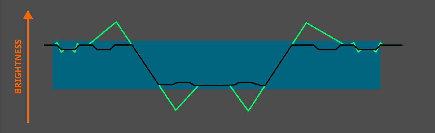
By the way, this is how I understand edge sensitivity in DuS, which I find very useful for reducing strong halos at edges with large brightness variations.
Edge sensitivity = 0
All edges are taken into account. Edges with large brightness variations produce large halos:
Thanks for your comment and for taking the time to look into the module.
I’ll take this opportunity to provide a brief “Getting Started” overview of Contrast Management RGB.
This module is a comprehensive contrast management tool. It does more than just accentuate details; it balances the image structure and its fine textures while protecting sensitive areas.
Understanding the Frequency Pyramid
The module breaks down your image into five levels of detail. Each slider acts on a different object “size”:
Micro contrast: For micro-textures (skin pores, paper grain).
Fine contrast: For fabrics, small details in foliage.
Local contrast: The core of the pyramid, for medium-sized structures.
Broad contrast: For larger shapes (rocks, branches).
Extended contrast: For large volumes and smooth transitions (clouds, gradients).
Adjust using masks (Visualization)
To avoid adjusting blindly and creating halos, use the mask visualization buttons (the eye icon to the right of each slider). The mask displays the areas where the slider will have an effect in white.
The referee: Contrast Balance
This is the most important setting:
Global Contrast: Sets the basic contrast energy.
Contrast Balance: This slider allows you to choose which wins. On the left, you favor the overall structure (volume). On the right, you favor the pyramidal rendering (local detail).
CSF and Halos (Example: “Morning Sun in Oman”)
For high-contrast landscapes where fringes (halos) may appear:
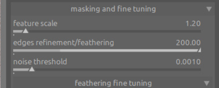
Open the fine tuning drawer.
Increase « feathering » (filter softness / damping / scale smoothing). This makes the masks more flexible on sharp edges, eliminating halos.
CSF adaptation: This setting weights the overall contrast according to human vision. If the sky is too bright, reduce it to gently reduce perceived contrast in very bright regions.”
Colorimetric Contrast
This slider modulates luminance contrast using chromatic opposition between warm and cool components, derived from the red–blue axis.
It enhances perceptual separation between warm and cool regions without directly altering hue or saturation, preserving colorimetric integrity.
Sorry I had a little hiccup in my build after recent updates …here is a portable windows version… unzip and run using the little bat file that keeps everything running in the folder you unzip to…