I tried, the link provides for arm64 and not compatible with intel_64:
In the past could not build with brew. In last few weeks because of update to new Xcode I was able to build DT with brew.
I will re-try to build from source and follow your direction.
THX so much for making the dmg accessible for us …
Installation worked flawless … very cool .
I was and I am only a bit puzzled about the version number … version darktable 2.1… etc .
But the module is showing up … now time to have a play
Again big thanks for your effort !!!
Cheers Andreas
1 Like
As noted above there are instructions and scripts for arm and Intel that I think we’re updated as little as 2 weeks ago in the packaging folder of the source code…It might be a good place to start if you run into issues with what you have been doing?? I don’t have access to a mac sorry I can’t help out…
@Christian-B , congratulations on this, your maths must be good!
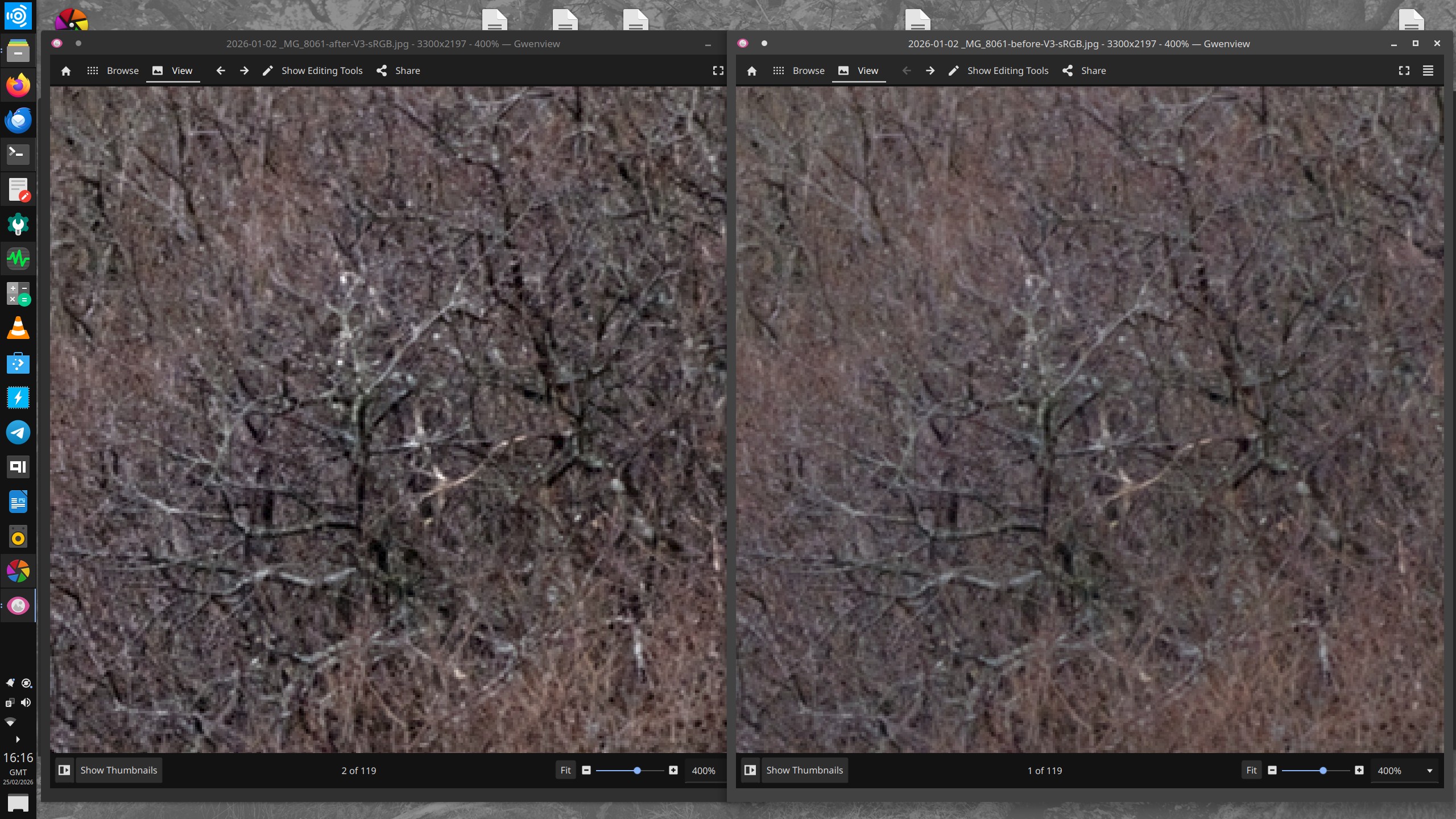
I’ve had a little play with it and I have a query. I think the pyramid levels are intended not to overlap much with each other. I gave an image a dose of extended contrast thinking this would work only at the “macro” level but I think it’s also working at a fine level. This screen grab shows two versions, with and without the extended contrast (and that was the only slider I used). I have zoomed into the resulting jpegs to see the detail.
I’m having trouble uploading the relevant files, perhaps too big.
Here is the XMP. Your module was simply switched off for the “before” version.
2026-01-02 _MG_8061.CR2.xmp (41.3 KB)
I will now look for the raw…
1 Like
the playraw post - but is it good?
P.S. I used Darktable-f4fd936823-dirty-x86_64-20260223.AppImage downloaded from your post.
1 Like
Its related to the chosen scale I think so if you set that higher then what is defined as extended would move away from the branches… you can see it in the mask…but maybe this is not what you are asking…
1 Like
I assume you mean “contrast scale”. I can see this makes a difference, but everything started at default values so I would not expect the lowest frequency adjustment to affect fine details.
Also there’s something a bit weird going on, maybe nothing to do with the module. At 100% zoom, the image clearly changes with extreme changes to contrast scale. But at 200%, there’s little difference. I thought the rule of thumb was that at 100% and beyond, the image is accurately rendered.
1 Like
I noticed this too. The larger scales act on larger features but tend to include the smaller details as well.
2 Likes
Hello,
@RawConvert Thank you for your test and your comments. I also realize that I still need to work a little on noise in low light.
In response to the comments about overlapping scales, this is inherent in frequency pyramids. It makes perfect sense that the base of the pyramid (extended contrast) carries its tip, the details (micro contrast).
It should also be noted that the ‘Extended Contrast’ slider acts effectively as a Dehaze (anti-haze). Since it works on the very low frequencies of the image, it reduces atmospheric haze and restores depth to distant landscapes by stretching the dynamics of large light masses without creating artifacts on fine details.
As Todd noted, this slider “contrast scale” changes everything, and I can confirm his intuition: it is not a simple “strength” slider, but rather a proportionality factor (multiplier).
When you increase it, the “Extended” layer (the modeling) rises faster than the “Micro” layer (the sharpness). The goal is to preserve the “natural” look. If everything were increased at the same rate, the image would have a “cardboard” appearance (if my translation is correct). So the more you push the slider to the right, the more you widen the local contrast and the more you spread the 5 frequencies.
At this stage, I am taking inspiration from the approach proposed by @jandren (see his implementation here: darktable/src/iop/local_contrast_rgb.c at local_contrast_rgb · jandren/darktable · GitHub
). I am considering moving toward a multiplicative ratio applied equally to the three RGB channels, instead of the current additive behaviour. This should help preserve chromatic relationships and reduce potential color shifts, especially in high-contrast areas.
I would also like to improve noise management in low light. I hope to come back this weekend with a new version, and I think we are getting close to the final goal.
Greetings from the Luberon,
Christian
2 Likes
This is from your “Getting Started”, item 19 approx in the thread, and why I thought the last of the 5 sliders would be at macro level only.
Tonight you’re saying altering at the base of the pyramid naturally affects the tip. I guess if you want to build it that way then that’s your right!
If altering the base affects the tip, are the intermediate levels not also affected?, and if not, why not?
I think it’s better if the levels are discrete. Surely it’s a valid use case to increase “macro” / large area contrast without sharpening up fine detail? And if you want fine detail as well, then obviously that’s available with the other sliders.
Kofa did some polls to help bottom out decisions on AgX - that might perhaps be a useful tool here?
1 Like
I understand the confusion, but it is important to distinguish between independent controls and mathematical interdependence.
Imagine the image as a theater set. Extended contrast is the general lighting of the stage (the spotlights that shape the scene). Micro-contrast is the small spotlights that illuminate the textures of the costumes and scenery.
If you increase the power of the spotlights, everything on the stage becomes brighter, including the areas already lit by the small spotlights. The intensity of the spotlights has not changed, but their final rendering is carried by the overall light.
This is the very principle of a pyramid: details are “added” to the overall structure. By modifying the structure (Extended), you move the starting point of the details.
I hope that with a ratio calculation method, even if you change the general lighting, the color of your small details will be better preserved.
Here is a short video, which is certainly more telling than a long speech.
Greetings from the Luberon,
Christian
1 Like
To me the edge protection has a strong impact and users would need to experiment…if you max it out then the module adjustment is extremely blunted and dropping it from say the default of 2.5 to 1 will boost a lot the effect so in addition to managing the pyramid level the dance between contrast scale and edge protection vary the result a lot…
1 Like
Just thinking out loud some names that might communicate this a bit better than “Contrast scale”.
Scale proportion
Scale spread
Scale differential
Scale width
You could also use “contrast” instead of “scale”.
1 Like
Good. Do you understand your module might be confusING!
If you say so!
I’m not sure this analogy works. I once did some stage lighting and if you altered the fader for a floodlight, it didn’t change any spotlight’s fader.
I agree of course that colours must be respected, and you mentioned colour previously, but I see this as quite separate from the fundamental way the 5 sliders work.
I think the module is risking being a bit like DorS where many or most users don’t relate to the complexity. I think it should work intuitively and predictably “out of the box”. You can use the Global Contrast and often that will be sufficient. I think everyone gets the idea of contrast changing at large scales, small scales and in between, so if you want some of that, you use one or more of the 5 sliders expecting each slider to be heavily weighted to just its own scale. Then if you’re discerning and know how to drive, you can open up the fine adjustments.
1 Like
THX so much Christian , for putting all your effort into this module with all the endless options to use it … creatively and even more important purely from the technical side of contrast management or enhancement .
I am impressed by the shear endless options … quite overwhelming .
At first look it looks kind of chaotic … to me . But I think I will get my head around it … to make it suit for my needs .
The only suggestion for improvement from my side would be an option to implement a highlight and shadow protection to avoid any clipping .
It does work when you can use parametric mask … yes … but it does not work when one wants to use a raster mask created by i.e. SAM3 or PS , for example a subject mask .
Not sure if that´s too much I do ask for .
Other than that … all works very well for me .
Personally I would use the module in multiple instances …
step1 global adjustments
step 2 subject adjustments
step 3 foreground and/ or background adjustments
step 2 and 3 only applied through a mask to avoid any potential haloing and/or adding any noise /grain to OOF areas in the image .
Hope you find a decent solution for the all the various thoughts and suggestions that are floating around here in this thread .
I just lift my hat …
Kind regards Andreas
2 Likes
Looks very interesting. I would drop RGB from the name, though, as that is normally used to signify a module that has replaced an older Lab one with the same name.
That’s a rather different beast to this. It pulls and pushes colors towards and away from a target color. I actually have a fairly complete design doc/outline for a DT implementation - just waiting for me to learn C ![]() But if someone wants to have a go at it before then, let me know.
But if someone wants to have a go at it before then, let me know.
6 Likes
You are absolutely right, I will remove it.
Greetings from the Luberon,
Christian
1 Like
Hello,
Thank you for your kind post and encouragement!
Regarding highlight/shadow protection: in a scene-referred linear workflow such as darktable’s, clipping is generally handled at the end of the process by Agx, Sigmoid, or Filmic.
However, I understand your concern. In this module, for overall contrast, I have implemented weighting based on the contrast sensitivity function (CSF). This naturally reduces the module’s impact on extreme highlights and deep shadows, focusing contrast enhancement where our eyes are most sensitive (around mid-gray). This avoids “blowing out” the values too much while maintaining a natural look. You can also simply lower the Extended and/or Broad slider slightly. This is one of the advantages of a 5-level structure.
I prefer not to add a rigid “clamping” or “protection” slider inside the module in order to avoid breaking its linear processing, which often causes artifacts.
Greetings from the Luberon,
Christian
1 Like
Counterpoint on the name: Contrast RGB! Contrast Management doesn’t have a great mouth feel ;-).
1 Like