is there a way to style the timeline in the lightable. I would like to change the background color to a darker tone. Due to my age I find the contrast of the UI is too low and is straining my eyesight. I have manage to change the majority of the UI so that its darker and and visual contrast is higher so that easier on my eyes. the only part that I am unable to change is the timeline. here is the css i have added to the preference panel.
Contrast is always better for a really dark theme like the one you do but be careful that dark themes are not the best to correctly work on photos. It’s more pleasant and make images visually better quicker but with a dark theme, you have some issues. Most software use dark theme and that was more for marketing reasons than anything else. Aperture by Apple was using a grey theme and first lightroom versions too. We explain some things about that in darktable 3.0 article when we released it with the actual UI and the whole new grey theme (less contrast as it i grey but better for working correctly on images). Just read the following extract of the darktable 3.0 article (could be read entirely in darktable.org blog):
Apart from any aesthetic considerations, the recommended interface color for color evaluation is middle grey (interface L = 45, background L = 75), close to ISO 12646:2008. Indeed, visual perception is affected by ambient brightness, and a low brightness of the interface causes all kinds of illusions:
exaggeration of the exposure perceived in the image (highlighted by the experience of the Adelson’s checker shadow illusion): the image seems clearer than it is,
decrease in the perceived saturation in the image (Hunt effect): the colors seem less rich,
About timeline, it’s not possible to change anything with CSS actually. I checked again before writing this post (I’m the main CSS developer for darktable). I suggest you to post a feature request in darktable GIthub repository to request some update in code if possible to see possibility to style this part with CSS: Issues · darktable-org/darktable · GitHub
Thanks @Nilvus for the reply you are right it’s best to edit with the grey theme. I have tried it working on darktable for long session (approx 6-8 hours). Due to the low contrast it’s causing a lot of fatigue in my vision. My solution to this was to creat a much darker theme for the UI. But still keep the darkroom image background at 50% grey so that it would minimize the influence of the surrounding dark UI. And when I Need to be critical for judging color or luminosity I will turn off all the UI and turn on ISO 12646:2008 Feature. After that I can just tab back to the UI. I have read the explanation of the design choice and tried it. It’s just not conducive for me especially long session.
I will put in a feature request in GitHub to request for this. Hopefully you will consider this. And thanks again for the awesome job
Did you try the dark theme? It’s could be a better compromise between the grey effect and the convenience of your eyes.
About feature request, first part will not be for me. I have no skills in Gtk or C coding. I only have skills in CSS. And first step is to allow a part to be CSS themable with Gtk and C code. So you will need to hope that a developer choose to spent time on that.
Yes , I tried all the themes both the standard dark, elegant dark, elegant darker and elegant grey. Initial changes seems ok but after a long session it’s very fatiguing to the eyes.
As per your suggestion I tried to modify the grey theme by changing fg_color to gray_05 which would make the text much darker so that its more has more contrast . its seem be less fatiguing but i need to test it for a longer session to know.
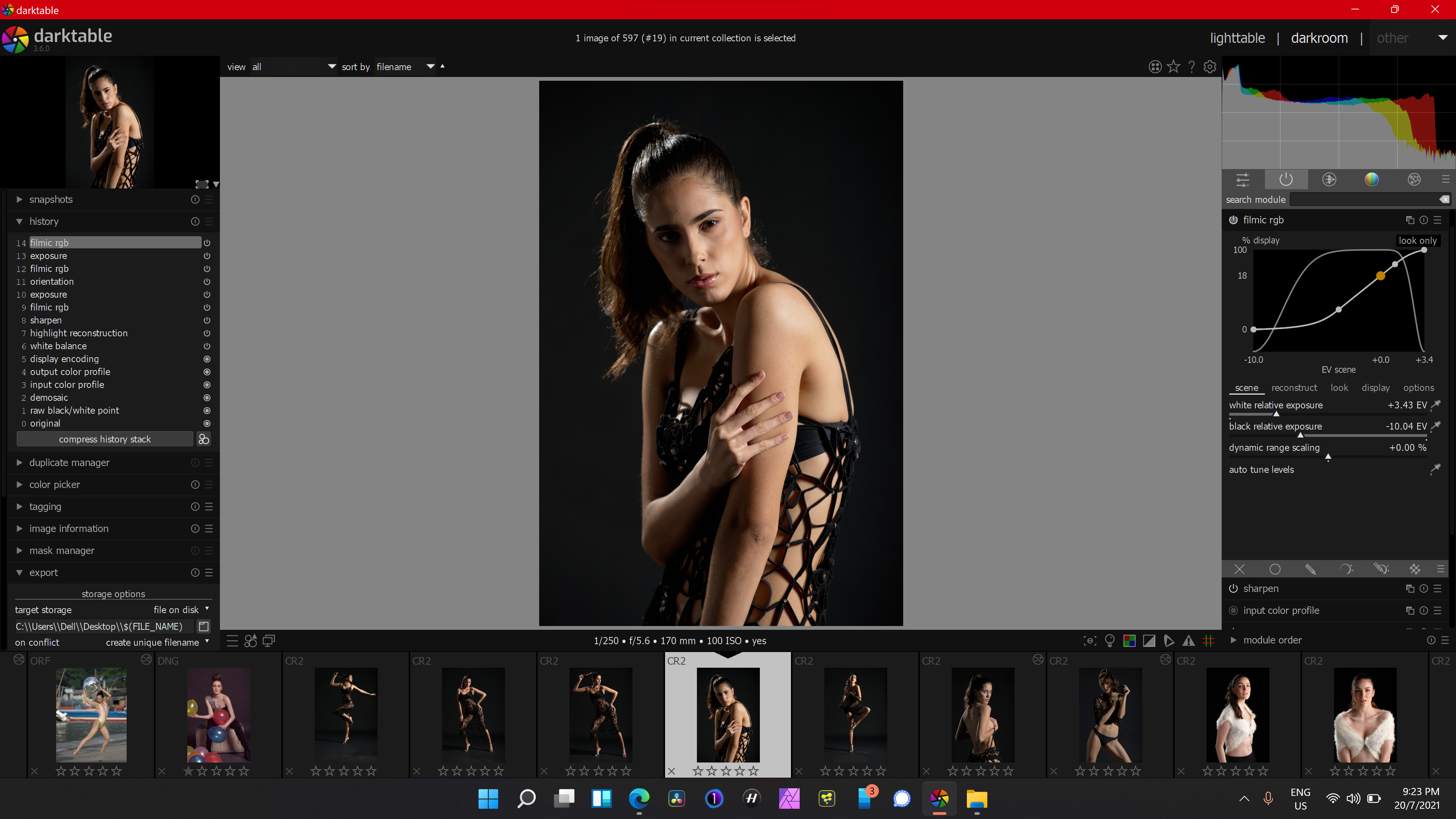
The issue is the timeline is still the same too little contrast to differentiate between the bars and the text as you can see in the screens hot below. and the timeline background is too light when compared to the whole ui.
I recognize and appreciate the excellent work in css and coding made by @Nilvus and the devs even more when they clarify us about the consequences of work with very dark UI.
In my case I spend a lot of hours in front of my PC, and I use almost every app I’ve in dark mode even in the firefox browser with an extension named “Dark reader”, is a plus to have the opportunity to tweak the css and change some values. I love the personalization level darktable have.
This is how I have my UI to work with the app.
I leave the .css feel free to change it as you please. darktable-Pro-v02.zip (3.1 KB)
@eyedear Your just the man I have been looking for. I know nothing about code. Let alone CSS. I was able to copy and paste your code and edit and now I have the perfect darkroom on my 40" 4K monitor.