Dark output files - overcoming personal bias?

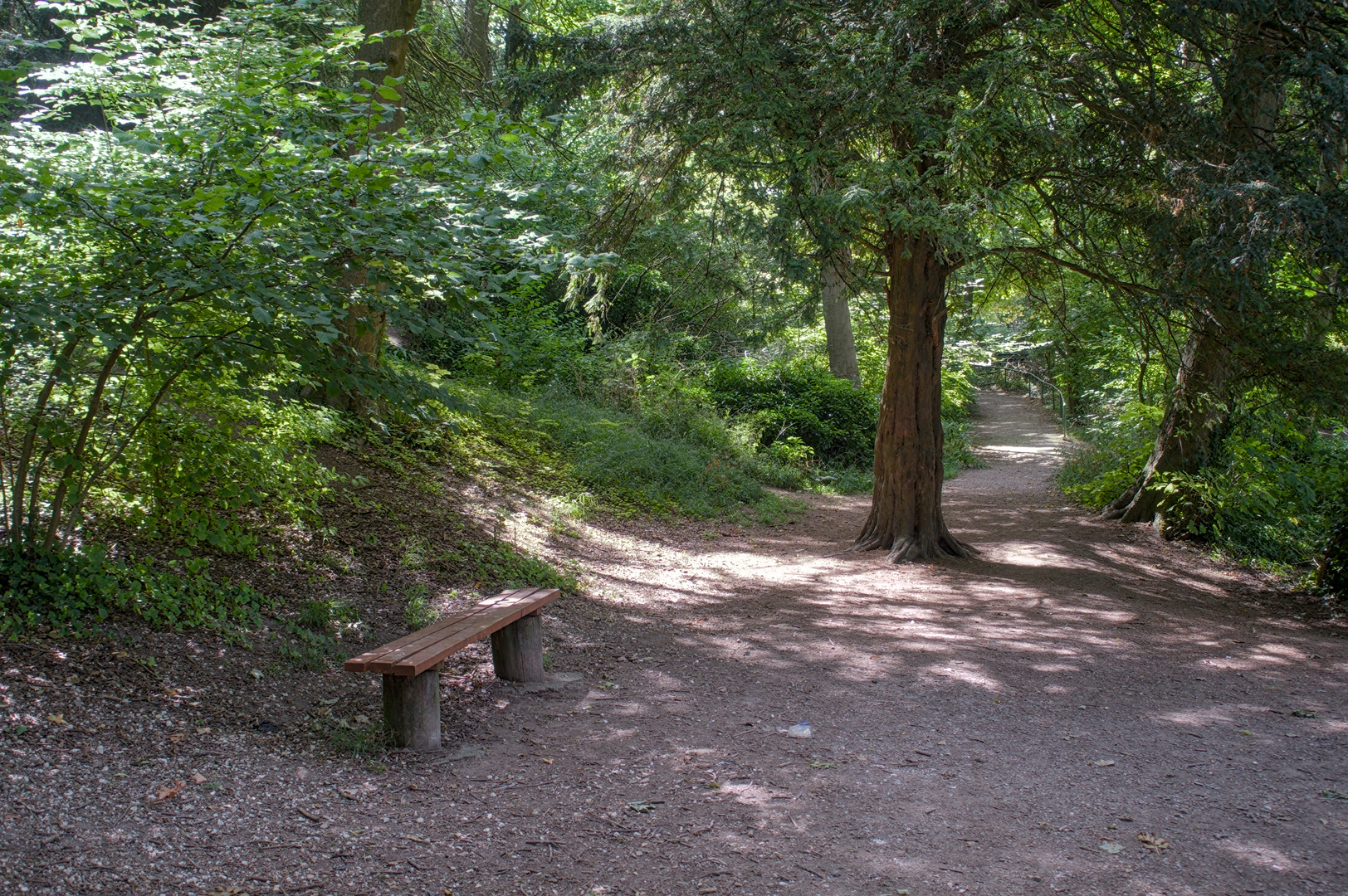
@PeteJC, good example image for what I’m about to explain, direct sunlight on a few small bits of the scene, but the rest only gets very indirect, dim illumination.

Such scenes present a far wider dynamic range than the camera can pleasingly record. In this scene, you have both blown highlights and the majority in shadow, so something has to give. Some of use say, should have exposed even less to keep the highlights from blowing, and that only pushes the shadows even darker. So, you increase exposure in Rawtherapee, but all that does is to slide the entire blob of data rightward; with that, you can only make one level of light “the middle”, all the others still suffer from their relative distance from that point.

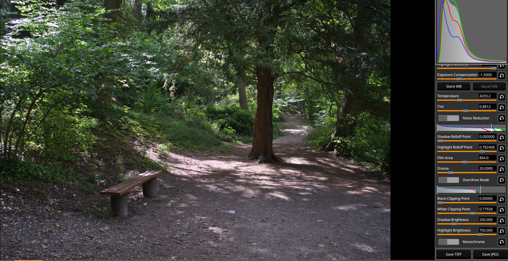
And so some sort of selective compression of the tone range is needed. That’s what a tone curve does, pulls some tone levels up, leaves others alone, maybe even stretch some out from each other. A lot of software just sticks one in the processing chain from the gitgo, giving you a pleasing initial condition, maybe. But that isn’t what your raw data looks like; this is:

I processed your raw with black subtract, white balance, demosaic, and stretched the data to the white point. I also turned off color management, because that introduces a tone curve. The magenta spots are blown highlights; you can see their spikes in the histogram. But the rest of the image is decidedly much darker; this is what the camera recorded.

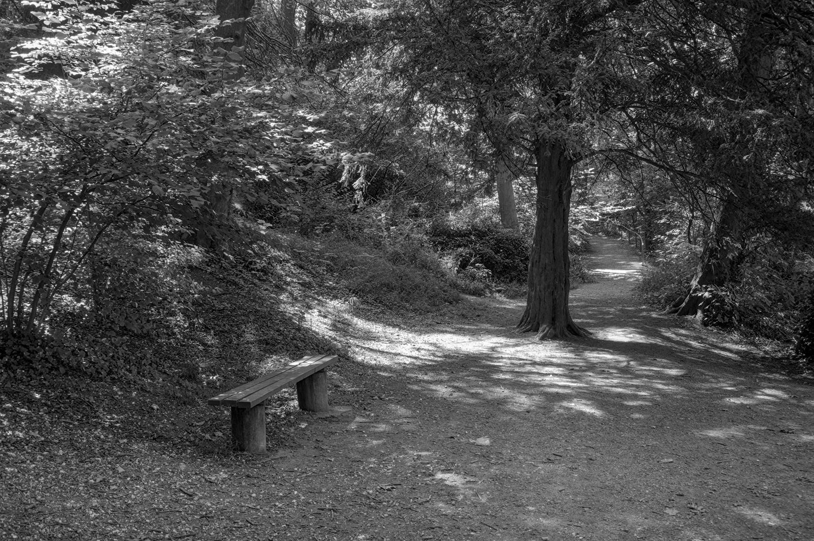
So, I turned color management back on and applied a tone curve tailored to the specifics of the image:

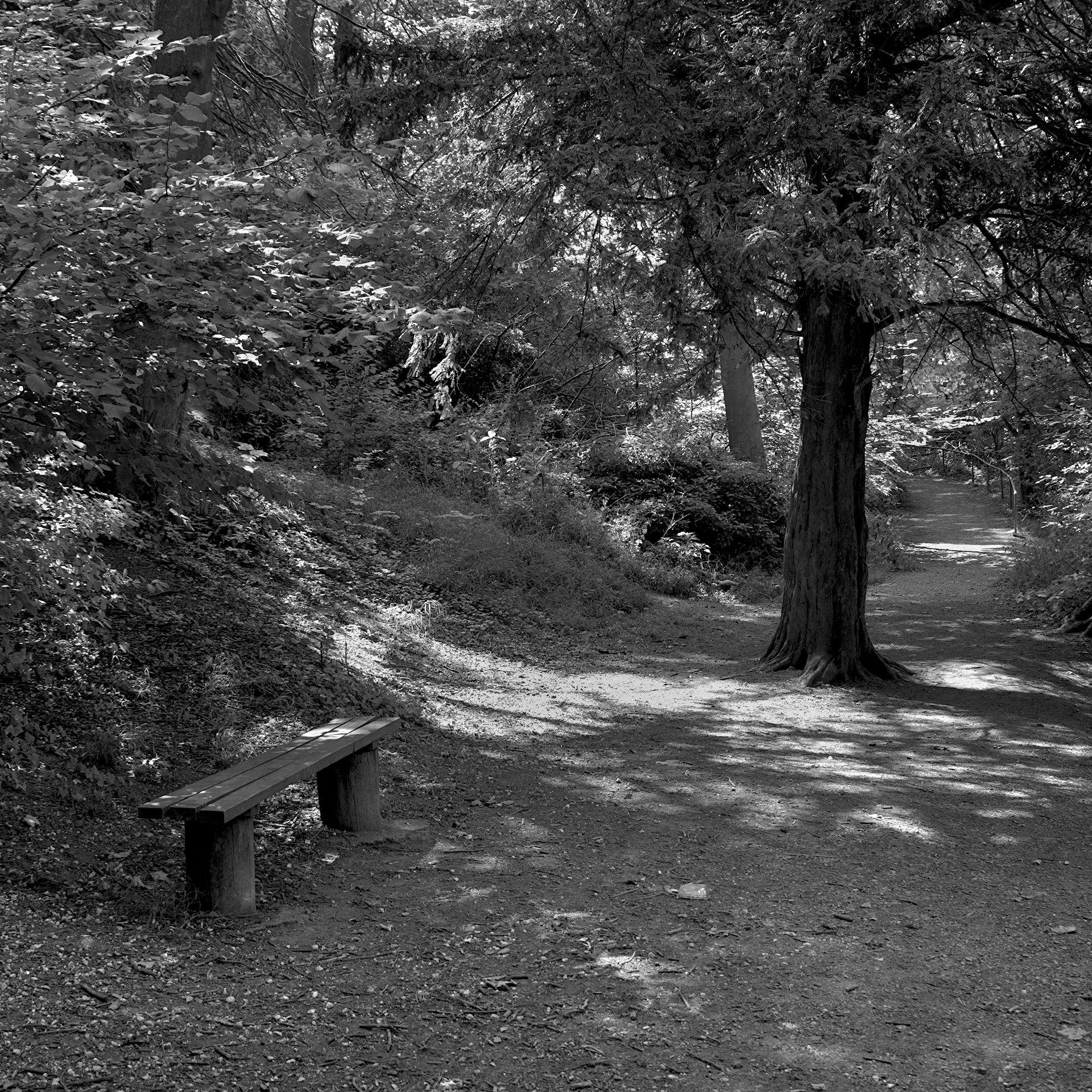
Oh, and I also adjusted the white point to just obliterate the highlights, as for some reason my highlight reconstruction algorithm didn’t take out all the magenta. Note that I kept the lowest parts of the tone range where the camera originally recorded them, and lifted the rest. This is not a “bright” subject, some of the gloom needs to be retained, IMHO…

The bottom line to all this is that you need to decide what sort of mood the image you captured requires in the rendition. The camera is going to record it linearly, and that may just work without modification - I’ve personally run across maybe two of my images that worked that way. But for the rest, you’ll have to shape the tone range to meet your need.

1 Like

I dunno about guru :see_no_evil::speak_no_evil: but i worked at Epson for 5 years and they do not change quickly :slight_smile:

Exposure bias is a thing i recognize , but i mostly have it the other way around in the edit.

Ever since filmic v4 i made edits that i liked , and was comparing them to my previous ‘go to workflow’. I noticed that almost always my darktable and filmic v4 versions came out brighter and a bit flatter.

Now looking at the older edits before darktable, i find them horrible strong in contrast and with too much darks. So much that in commercial software like ON1 or DxO i often now start by reducing the contrast slider.

I’ve wondered if that was 'just getting used to something ’ but i now often get remarks that they look nice and natural , and making small prints around the house they come over well … so i shrug and think it’s fine enough for me :).

But i still take the shot almost always at -1ev or even more underexposed. But - maybe the nerd side of me - i see the camera as a 'light capture device ’ , and the computer and software as ‘making the photograph’. The shot i take (as in, what the camera shows on screen as the jpg) doesn’t need to be close or similar to what my edit will look like. I record the scene , and have - sometimes :pensive: - an idea of what i want to do with it later.

So, my brighter exposure bias has surely not come from taking overexposed shots , because i underexpose like crazy. It did teach me to feel unrestricted in what the exposure slider in Darktable ‘needs to be’, so i just start dragging to see what i get.

I don’t think there is 'a correct exposure ', so also no way to teach yourself the ‘correct’ exposure.
If you tend to make dark edits , and you like it, be done and happy :). If you tend to make dark edits , and later notice you like them brighter , start with a higher default exposure in a preset or something , to make yourself get used to brighter pictures.

Sure. Don’t worry about that. We even have a category called PlayRaw, where people can share raw files for others to ‘play’ with. If you stay around longer, and wish to contribute to the hosting costs, you may do so.

So you just wrote your own raw processor… :slight_smile:

Interesting,thank you. Yes, I was pushing it with dynamic range. And this path is really quite gloomy at the best of times. A darker image is probably truer to life. Regarding the highlight, I was struggling to try and not overexpose it whilst trying to keep the image lighter. Given the choice I’d take sensor dynamic range over resolution any day.

I’ve had another go with the image using the Lab controls a bit more as well as retinex and have tried to make the centre, non highlight part lighter and with a bit more contrast. I think the problem here is the undergrowth to the side of the path is starting to look cluttered and distracting when lighter and with more contrast. Probally in need of more work with layers and masks if I were to want to make more of this. Or go and take the image again…

I suspect that some image makers are more comfortable making high-key images, while others tend towards low-key. Image viewers may have similar preferences.

Some words that I associate with each:

  • High key: joyful, active, optimistic, pretty, airy, growth, …

  • Low key: calm, passive, pessimistic, reflective, peril, threatening, ugly, honesty, truthful, death, …

These also depend on subject matter, of course. Similar associations come with high or low saturation, and where the points of interest lie within the image, and so on.

If a photographer tends towards low-key images and wants to break away from that, I suggest exercises that start by considering paintings. Rembrandt or Cezanne? Munch or Manet? Which resonate most, and why?

Then take photos that are deliberately high key. Frame the image so only a small proportion of the image is in shadow. Imagine a gray card in the scene, and ensure that most of the scene is lighter than the gray card. Then edit the images accordingly.

Hmm. I opened this in darktable, and it wasn’t all that dark or contrasty.


I didn’t use any modules (like tone equalizer) to compress the dynamic range. filmic is set to black: -4 EV, white: +4.4 EV:
image

If I auto-set both black and white:


It’s somewhat difficult to brighten up this image and keep the contrast because of the high dynamic range and the clipped highlights. That’s how I would do it:


DSCF9100.RAF.xmp (8.9 KB)

And this is Filmulator, without lifting the shadows:


With drama dialled all the way up:

Yes, I got tired of trying to figure out what software was doing to my images under the hood. With this program, it’s all laid out in the upper left-hand pane.

I still use a default toolchain, but I can select any tool for display of the image up to that point. Being able to see the linear starting point of the image has been immeasurably helpful in understanding raw processing.

I 100% agree that you want to avoid highlight recovery. I recommend with digital images to take care of the highlights in the camera as you can do miracles with shadows later in the processing. However, brightening an underexposed picture increases the noise so I suggest exposure as bright as practical without blowing the highlights.

While amount of brightness is a subjective thing, there are objective guidelines that are helpful in many scenarios. Either

  1. make the average brightness of the whole image = middle grey. This is what certain auto exposure meters in your camera will do. The plus side is that it typically avoids dark images. The downside can be highlight clipping. To get the best of both worlds, expose to avoid highlight clipping, then boost exposure in raw editor. I don’t know about raw therapee but in darktable all scene referred modules are unbounded, meaning you can boost values past clipping point in one module and bring them back in range with another. The data is not lost. Exposure + filmic is the basic starting point for this.
  2. same as 1, but instead of exposing so the average of the scene equals middle grey, expose so only your focal point equals middle grey.

In darktable, exposure module will automatically do this if you use the auto button. Just draw the rectangle around the part of the image you want to equal middle grey.

Why middle grey? Because our eyes are capable of seeing up to ~24 stops of light, but only ~14 at a time. We adjust up or down pending how bright the scene is. When we adjust, we tend to make the thing we are looking at fall in the middle (unless it is too dark - night, or too bright - the sun). So we can use exposure module in editing the same way. Alternate to exposure is curves and tone equalizer, which are more selective about which parts get brightened.

Hi Pete,
I do have a calibrated screen, (only for the last 6 months :slightly_smiling_face:) and your photos look fine to me. Sure, some on the darker side, but they look to me as if that’s how they should look… if that makes sense! I don’t have any real knowledge of printing, but when I print my own photos on a basic Canon printer, I have settled on a couple of tweaks in the printer setup, otherwise they come out too dark. I don’t know if this is because I don’t have a proper printer profile or just because of the different (reflective not transmissive?) medium.
Probably not much help, but I wanted to add my 2c worth…

If a photographer tends towards low-key images and wants to break away from that, I suggest exercises that start by considering paintings. Rembrandt or Cezanne? Munch or Manet? Which resonate most, and why?

Hmm. Not really thought about looking at paintings. Not like it is difficult with the internet now. Thanks.

Then take photos that are deliberately high key. Frame the image so only a small proportion of the image is in shadow. Imagine a gray card in the scene, and ensure that most of the scene is lighter than the gray card. Then edit the images accordingly.

I have thought about that. Most examples in books are portraits, which apart from the odd family snap, is not what I do. I need to try that. Thanks.

@123sg Thanks for that confirmation.

@PeteJC, i did a quick test, load your pic with the sidecar-file and tried to follow your description on a calibrated screen.
The edit is quite dark, due to vignette and tone curves, the histogram is located correctly and the pic looks dark but fine.
Then i sent it to my standard printer, to see, if there is a big difference.
Result: contrast on screen was more visible. But the print was the same level of brightness like on screen.
Thus i guess, there could be a inconsistence in your settings or hardware-pipeline.
Hth.

1 Like

@marter Thank you, appreciated.