Background: I tend to underexpose my photos, I am paranoid about blowing out skies, so I tend to produce raw files that are underexposed by a stop. However, this carries across in my processing of my raw files in Rawtherapee. I adjust the exposure so that the histogram covers the whole range from the blacks at one end to the whites at the other, I just avoid clipping. So, in my view the ends of the histogram are in the right place (for typical images). However, after I have completed a session of processing raw files and especially if printing them, I note that my images are often dark. For most of these they could probably be improved by taking the exposure curve and dragging the middle upwards to lighten the mid tones.
I think that this is my under exposure bias repeating itself and that I mostly edit photos in the evening so my perception of the brightness of the image on the monitor is biased by the lower ambient lighting conditions. I suspect many of my histograms are left skewed.
Has anyone any thoughts on how to fix this? I’ve wondered if there is something like a ‘lightmeter’ option to try and give a value. I could probably write a script to do this (python) on exported jpgs and re-edit. It looks like the Lab* adjustments may be helpful, especially the histogram associated with this may be helpful. I find the spot metering tools under ‘NAvigator’ less helpful, perhaps it is because these focus on a point or small area. The more aware I make myself of this issue the more I am likely to fix it. Do other people have similar issues? What do you do?
Monitor: Not calibrated. I appreciate that if I’m looking for accurate colour reproduction work or doing this for a living then calibration would be appropriate. But these monitors seems fine subjectively (I have two identical side by side). I have seen grossly out of adjustment or plan broken monitors where users have sworn they are fine - but I don’t think I’m in this situation.
Printer: On line service. I only have a b&w laser which I (obviously) don’t use for photo printing.
Would highlight reconstruction handle blown out clouds? Perhaps I ought to try exposing a bit more for a bit?
Does the response ‘Output profile?’ help? I’ve not really looked into this. It looks like the default is on RTv4_sRGB. I don’t do much printing, mainly looking at the output on my monitor. I’ve just looked at the service I used most recently, they do not provide ICC profiles and expect you to use sRGB, stating that they have set up their equipment for that.
However, I’m wondering if this is not my setup, how the images display on the monitor nor the printing service - more than a personal bias for under exposed output.
An ordinary photo encoded as sRGB has values distributed between 0 and 100% of maximum, but with most values somewhere in the middle. The distribution is something like a bell curve, a Gaussian distribution, so the mean and median (and mode) are somewhere close to 50%.
The numbers in parentheses are on a scale of 0 to 1. Note the mean and median. Also note the standard deviation, 0.15. I generally like an SD beween 0.16 and 0.20.
Of course, a photo may be low key or high key, etc, so take all these numbers with a pinch of salt.
B&W images seem to give a slightly different output format, it appears to be a colour mapped image with a B&W map.
magick 1920x1080_DSCF3814.jpg -verbose info:
Channel statistics:
Pixels: 1749600
Gray:
min: 0 (0)
max: 255 (1)
mean: 106.707 (0.41846)
median: 39 (0.152941)
standard deviation: 73.4298 (0.28796)
kurtosis: -1.45671
skewness: 0.230453
entropy: 0.957799
Colors: 255
The means are around 0.4 which is a little on the dark side but interestingly the medians at 0.18 and 0.15 presumably mean these images are rather dark in tone?
if your images are to your taste on the screen, that part is fine.
but your images can still come out too dark in printing, because paper is a different medium than screen:
the one is reflective (depends on environment light), the other emissive (provides light). So it’s not all that rare that prints appear darker than screen images. Prints may also have a smaller dynamic range. But both of these can be corrected for…
If the skies are important in your images, I wouldn’t increase the exposure, as even the best highlight recovery is worse than a properly exposed image (and it’s often a lot of work to do the recovery…). Highlight recovery is nice to have (sometimes you cannot avoid needing it), it’s not something I want as a standard part of my workflow
A median of 0.176 means half the pixel values are below 17.6%, and half are above that, so the overall impression is “dark”. The mean (aka “average value”) is higher because many of the pixels are much higher than the median. The SD is large, suggesting that the bell curve is somewhat flattened, with many pixels at extreme brightness rather than tailing off at each end.
A histogram is a graphical mechanism that explains the numbers:
As we can see, most pixels are less than 50%. The histogram resembles a straight line, skewed to the left, instead of a bell curve.
I love numbers, but they are no substitute for feelings, emotions, impressions, mood and so on. These subjective quantities are difficult to express in numbers. I would not say there is a systemic problem with brightness on the page you linked.
My experience is different. I agree that color calibration is not that off, but most current monitors defaults have a very high brightness. For photos that you want to print, the target brightness is 120nits. I think an iphone can go above 600nits up to 1200nits for perspective.
Why don’t you post a sample, along with a sidecar showing your processing settings? Others could then give more appropriate advice, and even provide their processed versions, which would allow you to see if others really prefer a brighter look, whether you like the look they prefer, and learn how they achieved it.
Monitor calibration isn’t subjective though. And “calibration” is probably a bad word. “Normalization” I think would be better. If both your monitor and printer are calibrated, it means you can trust what you see on screen will come out of the printer-- no guessing.
“Looking OK” != calibrated. In fact. Often when I first calibrate my screens, to me they look worse, dimmer, duller color, subjectively speaking.
My post processed image, the rawfile and the side car. I hope there is no issue in uploading a file as large as the rawfile?
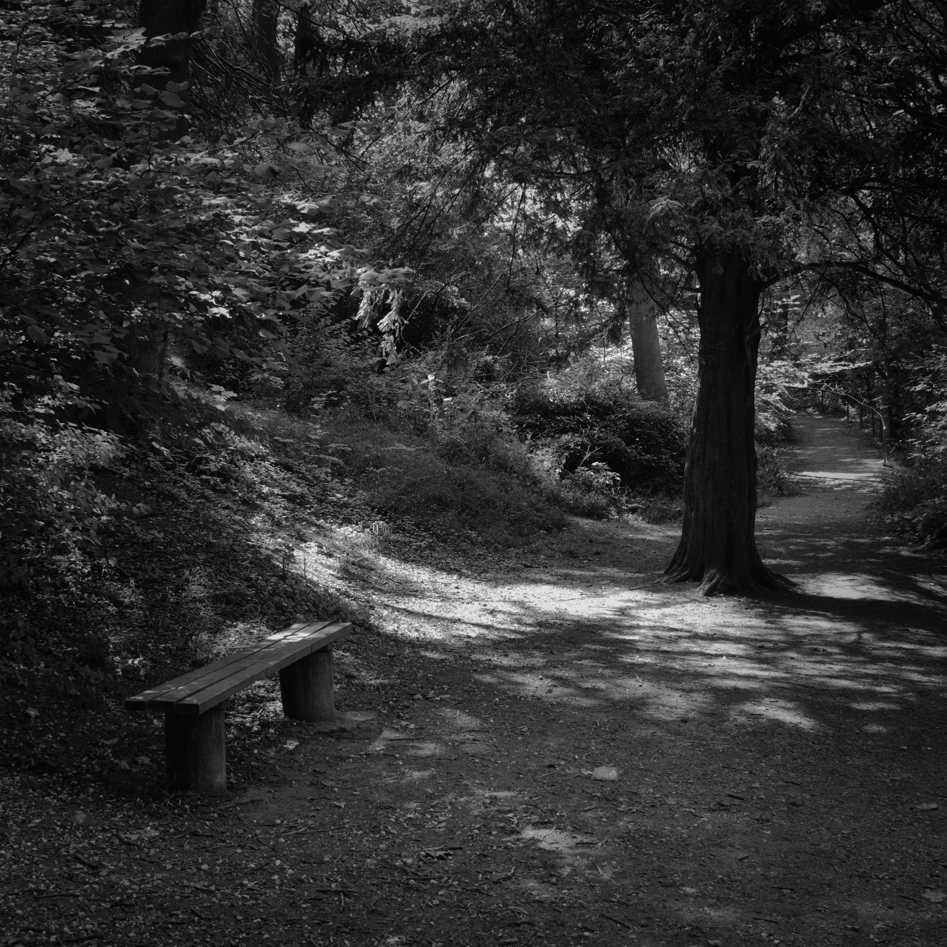
Looking at this one, he print is definitely a bit on the dark and gloomy front, and it is a bit challenging with the light coming through the trees. I think it could be a bit lighter with a bit more contrast, keeping the vignette. My initial impression each time I come back to this one is it is a bit dark and muddy.
@Claes : What I am saying is - what looks right to me at the time of post processing looks dark when I come back to view it later and especially so as prints.
But you are correct, its a matter of taste. If working in colour I often go for higher contrast and then reduce the colour saturation. If I’m using Gimp, as opposed to Rawtherapee, I often process the image as black and white and then use a copy of the original layer over the top using it to colourize the original image. I think that is what I did here. Note, this image, in hindsight is a bit dark.
I love numbers, but they are no substitute for feelings, emotions, impressions, mood and so on. These subjective quantities are difficult to express in numbers. I would not say there is a systemic problem with brightness on the page you linked.
Quite. But I just have the feeling that I’d be better served if I brightened things up a tad as I think it is a bit of an issue rather than a style thing?