Darktable 4.0: preserve chrominance in module filmic rgb

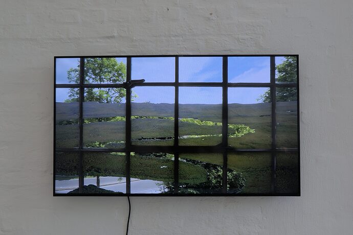
Recently I started to edit documentation photos of an exhibition. There was a video running (very slowly) on a LCD display. I took several images of it. When I opened it in DT, the sky shown on the display looks heavily bluish. The highlights are not blown up in the RAW file. The DT’s raw over exposed indicator (shift+o) does not show any over exposed area in that image. I attached the RAW file and the corresponding XMP file. The preserve chrominance was set to “max RGB” (v6 2022) by default.

Now, if I change this setting to “RGB power norm”, some region of sky becomes over exposed (clipping indication is active) and the sky color is still slightly bluish. Setting to “luminance Y” shows very similar result. When preserve chrominance is deactivated (no), then the color of the sky becomes natural and no clipping occurs.

Is this behaviour normal or did I miss something? I noticed that in the module “exposure” there is a new feature “compensate camera exposure”. When I deactivate it, the exposure will be decreased and the effect I illustrated above is less striking.

Any help and explanation are appreciated.

Regards,
Mustafa

_DSF2680.RAF.xmp (8.6 KB)
_DSF2680.RAF (28.1 MB)

The jpg file shows the image with the bluish sky in the video. The setting of preserve chrominance is “max RGB” of v6 (2022) in module “filmic rgb” as I explained in my previous message.

If preserve chrominance is deactivated, then the sky looks natural and no clipping of highlights occurs as shown below:

From the manual (module reference)

There is no “right” choice for the norm, and the appropriate choice depends strongly on the image to which it is applied. You are advised to experiment and decide for yourself which setting gives the most pleasing result with the fewest artifacts.

As you have no raw clipping, any “clipping” you see on changing “preserve chrominance” is easily corrected in the “scene” tab of filmic.

This is a good example of paying attention to the norms…The as shot WB is very strongly blue and impacts the highlights …this is magnified by maxrgb… You can do a white balance only on the panel area and this is now more balance wrt the image in the panel and you will see not so strong an effect of maxrgb in that case…also you can tweak this in the new model by desaturating the highlights with the extreme lum saturation slider…

As Shot
image

Spot area on the panel

image

1 Like

Thank you for the hint, Todd. I noticed also that the display has a strong blue component. But, I adjusted WB referring to the white wall behind.

I experimented with other pictures that have highlights in other colors. In that case the highlights get different color cast. “Preserve chrominance” is an estimator I believe depending on the choice (max RGB, RGB power norm, etc.). I think, if the highlights are not clipped, then I do not need this tool and I can set it to “no”. Am I right?

How do you desaturate the highlights? I do not know lum saturation slider.

Thank you for the explanation! Depending on the parameter selected “preserve chrominance” gives a different response. However, It is irritating that for one choice the highlights are not clipped (for example max RGB) and for another (e. g. luminance Y) suddenly the highlights are clipped, i.e. they are magnified

Well often the highlights will get clipped from editing as you will be bumping exposure quite a bit to set your midtones…this is the scene-referred way and so then when you apply filmic there is a correction to map the DNR…so these are not sensor clipped but you will drive them and the norm can then come in to play. I usually start without filmic. I like to see where I stand…that and the histogram will sort of indicate if the default norm will exaggerate anything. There is a bunch of work going on with HLR now so there may be some new advice and approach soon. I have posted on it.

I find you can use a trick of using the tone eq as you can target the highlights and then blend one channel at a time or as needed…this can be a nice tweak if needed . In the case of your image the blue channel.

Also using the pickers in the 4 way tabs can be nice to remove cast like that… if I have a difficult image i often find running the auto pickers there in highlights shadows and then midtones and maybe tweaking a bit the strength of one or more of those results can often give a nice overall white balance.

In fact for a subtle but annoying cast often just the autopicker for highlights with an adjustment does a nice balancing job by removing the cast…

As for filmic…there used to be a midtone saturation slider…this has been replaced with as slider for the estreme tonal ranges…ie highlights and shadows…you can bump or desaturate a bit using this slider… and of course you can set the masks up in the colorbalance to define your tonal ranges and then use the sliders there …so you have a few things that you can do…

I decided to take a fresh read of the user guide in regards to filmic the other day. It clearly states that correct white balance is important for filmic.

" If you plan on using filmic rgb ’s auto-tuners, use the white balance module to first correct any color casts and obtain neutral colors. In RGB color spaces, luminance and chrominance are linked, and filmic rgb ’s luminance detection relies on accurate measurements of both."

Also, LCD screens transmit light with a non-standard white balance so the wall may best be excluded if doing an auto WB based on image area.

Scenes with mixed lighting are good candidates for two instances of color calibration wb, masked. One for the screen and one for the wall/surrounds.

If it is the raw clipping indicator you are looking at, changing the norm in filmic should not change which parts display as clipped.

If it is the luminance clipping indicator, then simply readjust White relative slider in filmic until clipping is gone.

But what you describe is ‘supposed’ to happen. And those chrominance modes of filmic are there to toy around with. People often find they prefer one over the other… I find mine switches on a day-by-day basis :wink: .

Trying to dumb it down (and probably going to mess something up, but trying to keep it simple here): Filmic is mapping a huge portion of brightness information (more than your screen can show you) and arranging it in a limited range that you can display on a monitor / print. In other words, a sort of tone mapping.

Now, messing with the brightness will mess with the color interpration of it. Those two are just linked. Now, filmic is good (and sort of unique if I understand it correctly) in how it preserves ‘what’ color things are. As in, the sky is blue, and even if you increase in brightness, it will not turn cyan, or yellow, etc… So whatever chrominance mode you pick, it will map the brightness and it will (try to) preserve what color things are.

What it leaves open to you, is how to preserve ‘how much of the color should be there’. If something is very very bright, do you want it look almost white or do you still want the color to be in there? It’s up to you. So what it tries to preserve is how saturated things are, in simple terms.

‘max rgb’ will try almost anything to preserve color. That means it will try really really hard to make something that has a kind of blue in it, stay visible blue. And that means that it probably limits contrast. But if you want your bright blue sky to stay blue, it’s awesome.

;luminance Y’ mode leaves the amount of color up to the amount of brightness, which means that very bright parts will turn white.

The other norms will use some math to try to make another nice mix of it. (rgb powernorm and rgb euclidean norm are popular among users I believe).

The ‘no’ will just not try to preserve the chrominance (ahem, saturation / ‘how much color’) at all. Which will very often result in an image where you go ‘hey, where is all the color’. But it will give you a natural look. You could use ‘color balance rgb’-module to bring the color back how you like it, for example.

Since filmic is mapping (too) bright parts to fit within your image, messing with the exposure fill (of course) alter the result! Changing exposure will change how bright things are, and will change how filmic maps them. More importantly, changing exposure will change the ‘middle’ point for all modules that need to know what are shadows, mids and highlights. So often you need to set exposure to what it truely is (things you call shadows below 50%, things you call highlights above, and the middle neatly set) and then you alter how it looks and maps with ‘tone equalizer’ and/or ‘filmic’ or other modules.

So, ‘max rgb’ having a ‘clipped’ appearance but still looking blue, is correct. It will try to stay blue and not turn to white whatever the cost, sort of.
Since we’re talking about blue, this might also have something to do with the gamut mapping that filmic does. It could be that you captured an amount of blue that is not clipped in your sensor, but just doesn’t fit properly in sRGB space. Raising the ‘gammut compression’ slider in the ‘color calibration’-module to something at or above 2.0 is a nice test to see if it changes anything.

But most important of all: What does it look like? Why do you check ‘clipping indicator’ ? There is no ‘real’ clipping indicator (Except for the raw-overexposure-one). It just shows you that something is at or close to a limit. But what’s wrong with that?? That might just be what you want.

I’d say leave exposure where it was, and mess with the ‘relative white exposure’ slider in filmic (or hit the auto picker next to it to set it) and then see what the different ‘chrominance modes’ do.
But look with your eyes, not through a clipping indicator.

Do you want ‘some white’ in the clouds? I’d switch away from ‘max rgb’. Do you want some punch? Dare to make something ‘pure white’ / clipped white just a little.
Do you want more details in the clouds, it might be that you just need more local contrast to bring out the details in the highlights. Mathematically they are there, they are just smushed together, so you don’t see them.

Can be all these things.

Set exposure ‘correctly’ , use the filmic white-exposure slider and the preserve-chrominance mode to adjust the basic look. Don’t forget you can use ‘color balance rgb’ to bring saturation/vibrance up if you think you need to (and/or use one of the ‘default colorfulness’ presets in that module).
1 Like

Thank you very much for your detailed explanation that I fully agree. Based predominantly on art photography I try to keep a picture as natural as possible regarding colors and contrast. I understand now what other parameters (like WB) influences preserve chrominance mapping.

Thank you for the hint regarding tweaking by using tone equalizer, raster mask and blending RGB blue channel. Indeed, I can manipulate via tone equalizer by lowering the curve in the highlights the color of the sky without touching preserve chrominance setting. Those are such fine tricks. It is almost impossible to discover them alone.

1 Like

I noticed the same phenomenon with in some of my pictures. Is there a way to easily see these ‘blue highlights’ in your images? In the clouds it seems rather obvious, but I had couple of images of my son wearing a stripy shirt. Only to realise weeks later that he was not wearing a blue-gray stripy shirt, but a white stripy shirt…

None of the indicators warn me here (as there is no actual clipping happening).

There are many ways including using a picker and looking at the display with parades or a vectorscope. Also often you can pick these things up using the waveform histogram as it will show regional distribution of color. For a quick thing you could select the auto picker in in highlights in the color balance module. That will identify the cast and select a hue 180 opposite to negate it so you can use this in conjunction with the scopes to assess and manipulate this sort of thing…

In the end correcting WB should catch it but if not you can fine tune things…

1 Like