I’m having a great fun using Calibration module in Darktable 4 along with my SpyderCheckr48 and ColorChecker Passport charts. The module does work and if you’re patient enough you can improve the color fidelity of your calibration profile. Really appreciate the developer’s passion to make DT better. Thanks for that!
My suggestion can help making this tools a little better, IMHO. I suggest adding an improvement allowing users to visualize calibration result in slightly different manner than with current chart overlay frame (the dynamic one).
Actually chart overlay is great thing but it doesn’t give you a clue about the real color differences since it’s overloaded with white frames and lines. Human eye needs cleaner picture to see the difference.
I suggest having to separately visualize standard colors of a given chart with the colors taken after calibration. This can be done after the user applied and carefully adjusted the overlay chart on the photo. IMHO, it may give users the idea of the real color difference and drastically increase calibration productivity.
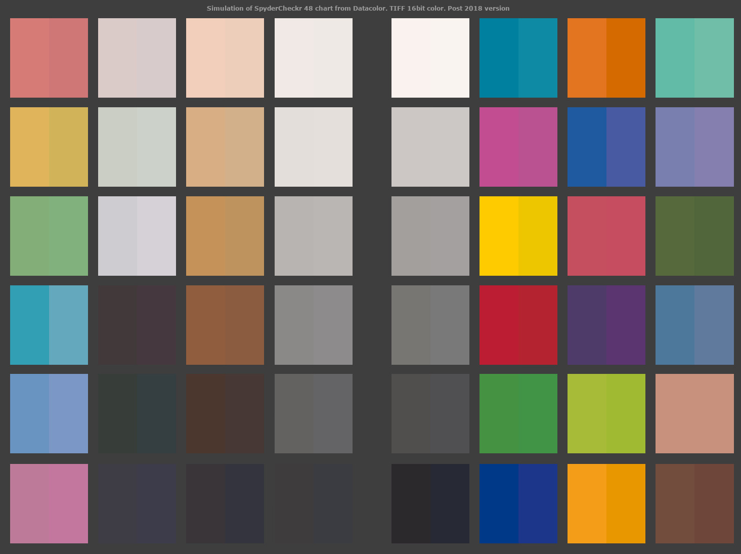
Here we can see both colors. On the left side of each square we have a reference color and on the right side we have a pre-calculated new color. So in addition to working with numbers after pressing round arrow icon (Recompute the profile icon) I suggest simulating this kind of comparison chart.
I’m sure this method can help users assess different calibration (optimization) strategies when working with very delicate colors.
I’m now having a bunch of such comparison charts on the disk created manually (which is painfully slow btw ))). When you look at them in a row you can see the difference between optimization strategies.
For example, it would be great if you could save such a comparison chart in 16bit tif and then visually compare strategies. E.g. comparing “Average Delta E” with “Sky and water color” optimization strategies and pick up the best for your needs.
As a proof of concept I’m posting this comparison chart that was made after adjusting Expose levels to meet normalization suggestion. Can you see the difference between this one and the one I posted above? )))
In this example I decreased Black point level and adjusted Exposure level as Normalization values section suggested. The resulting numbers can be better. You can even have better color shades but the final result can be far from what you might expect.
In this example we gained in shades but lost in brightness.
Sure I can. I can just clone a single raw and apply different optimization strategies and then compare snapshots of the resulting images. However it doesn’t answer the question how close the color of a patch to the reference patch. Attached comparison charts were made by picking mean color from each patch of the photo after accepting a strategy and then filling the right half of the patch with this color to be able to assess how the resulting color matches the reference one.
I’m not talking about any artistic application here. This is just to match resulting set of colors to the reference one as much as possible to create an appropriate precise profile. And since we have kind of a compromise when we select different optimization strategies during calibration, we will be able to select the right strategy by looking at above mentioned synthetic color charts.
Partially this task can be done with overlay chart which you apply on the photo of calibration chart, but my solution may help simplify visual assess of color differences between many strategies. If the resulting comparisons charts are of the same size and within single standard it is much easier to visually compare them.
I suppose. I guess when I have experimented I just set the base image to the live one and then walk through the snapshots using the compare slider… if you stop half way through a column or rotate and do a row then you can assess those visually in a similar way. I have seen in lumariver this sort of display as you can try to tweak one or more patches. I suspect there may be a use case. I have usually found trying neutral, average and or maximum give the lowest delta. Trying to further tweak a single patch with channel mixer settings and not end up playing whack a mole on other patches might be a challenge but I suppose again someone might want to try…
I see what you mean. Yes, this is a great way to see the difference between several snapshots that can be saved after accepting several calibration strategies. But how can we see these differences in connection to reference values of the official chart? This is what may interest us most if we want to achieve scientific precision (which is, I agree, not needed for most of the users. This is for those who look for the closest colors to the original.)
Also just curious why not have another optimization strategy in this module for magenta patches which can be extremely difficult to tweak for most cameras? Skin tones, sky and foliage colors do the job but there’s no magenta. Just a thought.
because that’s not implemented. Each optimation needs to be implemented, and if the developer didn’t had such optimation in mind it wasn’t implemented. It’s just a result of priorities… and time
Y’know, the 24-patch ColorChecker is a rather limited source for dE assessment. How 'bout references like the Munsell or Lippman spectral datasets, more access to appropriate patches of colors relevant to specific needs, e.g., skin tones.
dcamprof has a test-profile command; haven’t messed with it much, it can bang a profile against a .ti3 file of spectra and produce such dE TIFFs…
Well I think the dots in the color checker are the reference values so before you apply you can see how far off you are visually and again once you apply the calibration you can see how much closer they are… also the graphic overlays show good fair and poor matches… but not the numbers ie delta E per patch
Yes, I know. It does almost what I suggest but you can’t do a quick assess of different strategies without making screenshots. If I need to compare 5 strategies or 10 strategies this may become a nightmare. And those white frames and diagonals do not allow to visualize the whole picture at once. As a quick compromise if DT could allow users to switch off the white lines and make dots the size of square (with one click or a hotkey). I mean toggling the frames on and off. This will help improve the visualization process a little.
Like this
**Note: Also it might help to adjust white and black points visually by looking at these squares. Which is now problematic because of the white frames. See how easier you can distinguish the colors without white frames.
And it would be much easier if we could generate synthetic comparison charts before accepting calibration **
But having a set of exact standard pictures of any number of comparison charts will be much better anyway.
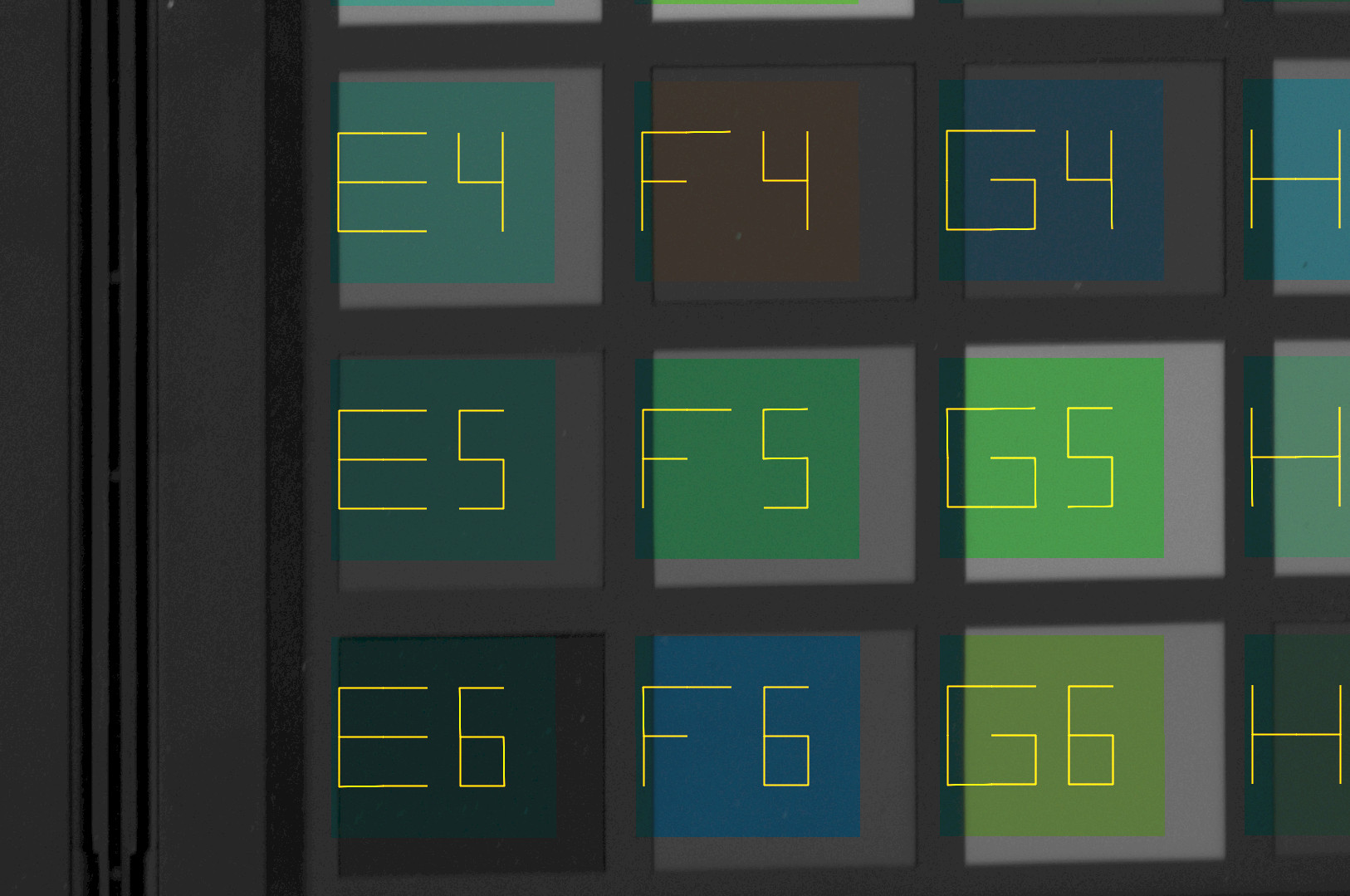
I’m now playing with dcamprof. I have a problem. Scanin just doesn’t work for me. It doesn’t recognize patches correctly. Looking at *diag.tif file I can see this (NOTE: I made it lighter here)
Some patches are overlapping. Is there any GUI for linux to apply overlay pattern on the image?
Unlike darktable’s workflow the “Rawtherapee → tif file → dcamprof → Rawtherapee” approach looks much longer and just awkward. Any suggestions how it can be simplified?
Even without any extra development DT solution looks more usable. Unless I make dcamprof creating more precise profiles, I see no reason to use it yet.
scanin: /usr/local/lib/libtiff.so.5: no version information available (required by scanin)
Scanin, Version 2.0.0
Author: Graeme W. Gill, licensed under the AGPL Version 3
Kudos go to you for trying dcamprof. It’s my go-to for all camera profiling, to include making profiles from spectral data for the camera.
Yeah, command line is a pain. I guess since I’m old enough to be Dennis Ritchie’s younger brother it’s like second nature to me, so I have to temper my irk with the GUI crowd, present company excepted
For me, the dE text reports are good enough to evaluate ColorChecker-trained targets, I even wrote in my profile script to sort the report on dE (see, there’s that command-line angst… ) I did peruse the dE TIFFs at the start, but soon got to know from the numbers what’s good and not-so. Max dE <= 5 is IMHO good enough for target shot profiles, IMHO; for my spectral profiles it’s < 3.
The dcamprof author used the dcamprof code to make a GUI version, Lumariver. It’s commercial software, but one of the few softwares I’d actually recommend buying. Don’t know how Anders presents the dE data, here’s the manual page for you to investigate:
It may be there’s appetite to put dcamprof wrap-around code in darktable. I’m not a dt dev, so that’s probably presumptuous on my part.
Oh yes, scanin can be a bit fiddly. Nothing to offer there except to shoot as square-on as possible, and crop to put the registration marks just inside the image corners.
I’m not that mature as you but typing a couple of commands or creating scripts of any sort under linux isn’t a problem for me. Scripting might improve our life once you have created your own workflow )))
Under ‘crop to put the registration marks’ you mean white lines for colorchecker and white dots for spydercheckr? Like these?