I sadly recognized “contrast brightness saturation” module became deprecated status.
Regarding the manual, users should use color balance rbg module instead of the old one.
The problem is that i cannot reach the same effect with the substitute module than the old brightness setting.
Has anybody a useful method how can I increase the brightness now which gives the same effect on the picture?
It would be nice if the “contrast brightness saturation” be available again among the active modules.
It should be available to set on the quick access panel again.
This is the mostly used module for me and I cannot reproduct the same effect with the suggested “color balance rgb” module.
Darktable is the only one photo editor software I use and I was so happy to have an universal tool for picture editing.
The most cases the “contrast brightness saturation” covered the most of my need and now I cannot reach the same effect with the alternative methods.
Thanks a lot for this great job developing Darktable for us!
Regards.
Lajos
Maybe post a PlayRaw with a problematic image, processed with the deprecated module, asking people to emulate the look - and maybe also ask them to post a version which they process to their liking.
There is a list of deprecated modules which will allow you to find it and activate it if you need it.
Personally I am not sure why you liked this module. When you brighten an image the blacks go a muddy grey. There is a lot nicer control with other modules. The sample image below shows brightening with the deprecated module giving muddy blacks compared to brighening with the color balance rgb module.
Maybe share some image where you can demonstrate the superiority of the deprecated module.
It is ok, if I set the brightness too high, the blacks became grey. It is true if I use the brightness too much.
But if I use it with +0,1 or 0,2 values it gives me a simply brighter image without significant greyification on blacks, however creates a bit smooth contrast result. It is enough for me mostly.
If I use exposure it keeps the black and the shadows and create a big contrast which I don’t like.
Using the brillance in color balane rgb, it is the same, increasing the saturation too, which should be also decrease manually.
So, we can say, the exposure and brillance moves the histogram on a different way than the brightness.
It is a subjective thing, somebody like a smooth picture, others like the more contrasted result.
There is no problem.
I just simply don’t understand why is it necessary to drop a feature just because somebody think, it is not good for himself…
The more versatile the software, the better, I think.
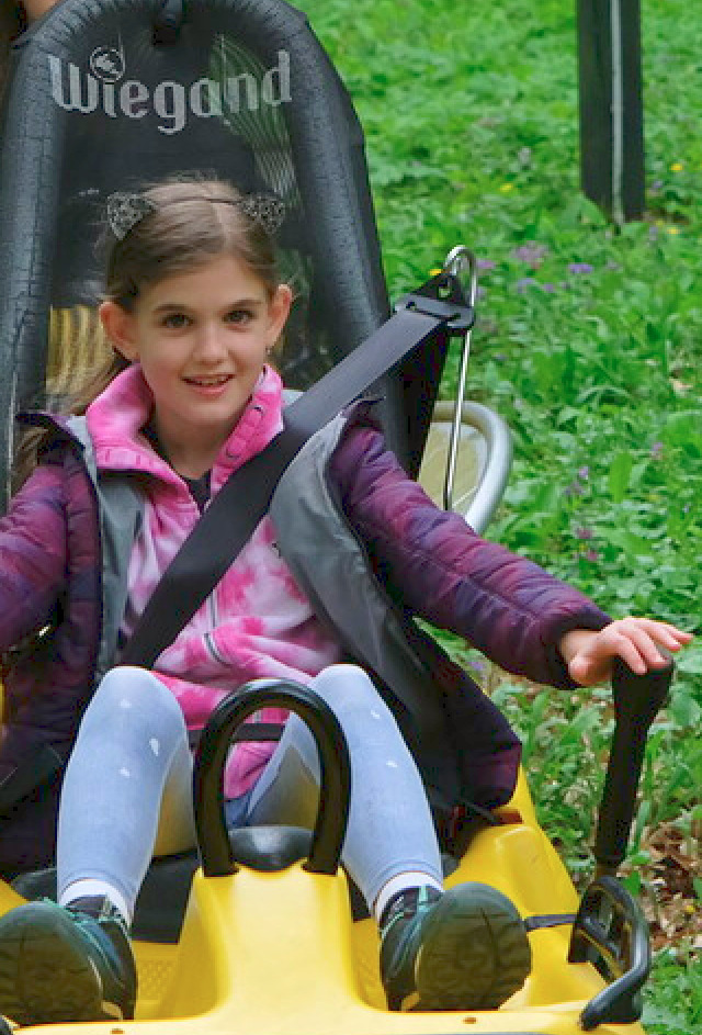
Here is a sample:
The original pic is too dark
There is a broad consensus among developers and the majority of users to replace modules that are potentially artifactual with “better” ones. Another important aspect is the use of the scene referred workflow into which the deprecated modules fit less well.
I have been using darktable for many years and I often revise old edits using the modern modules that work scene referred. The results are always (much) better. It’s really worth the work to familiarize yourself with how the “new” modules work. And to trust that the developers know exactly why a module is deprecated.
For a quick solution to your problem, you may find, that the global luminance slider in the color balance rgb module fills your need. Not entirely sure though.
I think you are reaching an inaccurate conclusion. Depreciating modules that are not as good as newer removes the burden of maintaining, testing and supporting them. This then allows the focus on other areas. It is like keeping a very old car around. You might use it for short trips but you will not spend money installing a new radio.
It reduces the burden (as in: no guarantees when it comes to compatibility and behaviour with newer modules and editing approaches, such as scene-referred was at the time), but as no module has ever been completely removed, not even hard-deprecated ones, backward compatibility has to be guaranteed: you should still be able to open an edit from darktable 1.0.
Your example looks like midtone brilliance did you try making sure that you are setting the fulcrums in rgb CB module…these are the two autopickers in the mask tab…
Then try midtone brilliance or the midtone luminance in the 4 way…
Seems just by looking that would be a similar adjustment…
This slider is a black offset essentially so it might not be what the user is looking for…unless it is to just take some crunch out of the blacks… You can see this nicely in the waveform…which I suspect you could use to see the behaviour of the depreciated module and then look to replicate in the newer modules…
I would add that the contrast slider in the CB module can be really nice…the key is to go into the mask tab and adjust the fulcrum slider either with the picker or manually… you can use this to define the set point for what gets made brighter and what gets made darker and it can really introduce a nice contrast…
I think people use the cb module all the time without setting the two fulcrum sliders and the adjustment often really benefit from doing so…
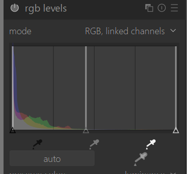
The supplied image was a JPG. Are you processing RAW files or out of camera JPGs? That could make a huge difference. However I looked at your jpg image and saw the issues you were having using the color balance rgb module. Then I tested the levels rgb module and I feel I get a superior result that should be pleasing to you. Just moving the middle triangle (what ever that is called) to the left brightens the image without increasing contrast.
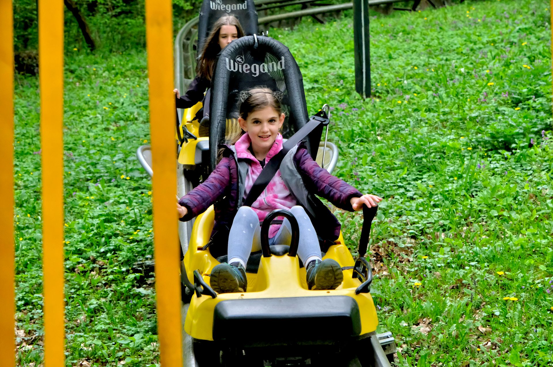
Some midtone and highlight slider on the jpg… in rgb CB… not so garish as shown by the OP for CB…but really it’s mostly a midtones edit that I think they are looking for and there are a few ways to do that…
RGB CB
Tone eq relight…great starting preset and then you can adjust if needed for shadows and highlights
Perceptual and Relative renders of Relight… color and contrast will vary a bit with rendering intent…
You can further soften the black and lighten the image… I have a preset I try sometimes that is an instance of exposure with a parametric mask feather from light to dark… I guess a bit of a luminosity gradient and I blend it in addition blend mode so the effect is stronger in the shadows and then I just hit the auto picker on 50% as I would to set my normal starting exposure…it the case of this image…and its a jpg as we don’t have the raw but here it adds about 0.6EV…maybe too bright with the blend mode so I will leave it at zero added EV and just use the blend mode .
This makes things a bit brighter and softens the blacks nicely…
Many thanks for the nice examples, and the good advices.
It is a happyness to find helpful guys in case of a problem.
Yes, I need a midtone effect where the rgb levels can give the closest result what I think.
In GIMP and other programs I often use the mid point triangle of levels as a brightness control. It preserves the whites, blacks and even the global contrast while allowing an image to be brightened or darkened. With darktable I first use exposure module to get the correct brightness when working from a raw file. Jpgs can be a different story. I am unsure if you are processing Jpgs or RAW.
@szaki It takes time to learn other tools. Some devs choose to keep the older tools around, while secretly tweaking things in the background. However, I favour the approach that introduces new ones, while softly deprecating others. It is more educational and changes things up for the user.