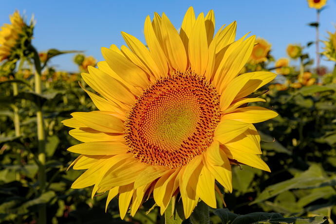
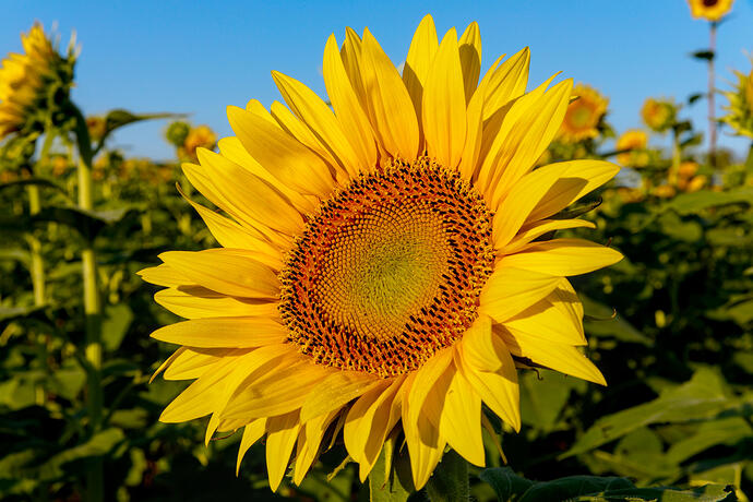
Why bother about an artistically effect is done scene referred or not. That boost to the sky isn’t natural at all, so it’s no longer about preserving the scene…
You can use base curve instead of filmic no problem if that’s what you want. It makes giving things a nice highlight rolloff a bit harder IMHO , and you have to work way more with tone equalizer before it to get your tones where you want them (and people have often said that module is also hard to work properly with te masking and stuff ). But for images where you want something like the SOOC punch and you don’t have lots of dynamic range in your scene it might actually be a quick way of working.
I generally just use filmic on everything , but every once in a while you get a problematic image , And this is one of the things you could try.
If you push a slider a little bit, it is technical, but a bit more and it’s artistic. I don’t care about distinctions like this so much. I invented a game where I win more whimsy dollars if I can get what I want and stay within the scene referred portion of the pipeline. Points are taken away though for overcooking the pasta.
Interesting use of the color lookup table :). You pulled back intensities of the yellows to get below the filmic v6 color breakup threshold.
So since brilliance tries to preserve chrominance, I found that with v6 i can reduce the brilliance of the highlights some degree using color balance rgb, and it delays the onset of the color breakup when increasing the overall intensity. But it still doesn’t get as far as I’d like, and if you try to do too much it just takes on that flattish look again.
v6 with petal highlights brilliance reduce using color balance rgb
0L0A3314.CR2 (filmic v6)-2.xmp (62.0 KB)
v5 (slight edit compared to original post)
0L0A3314.CR2 (filmic v5)-2.xmp (28.8 KB)
Hello everyone,
Here is my version, personally I prefer to use the V6 of filmic in synergy with the RGB colour balance and colour calibration module. I opted for more dynamism and contrast in the petals and to avoid a “yellow monochrome” tint.
I also made a warm/cold contrast with the colouriser module.
Although it is out of the scope of this post, I also propose a Black and White version.
Greetings from Brussels,
Christian
0L0A3314.CR2.xmp (16.7 KB)
0L0A3314_03.CR2.xmp (18.0 KB)
Usually better to boost it in highlights and drop it in the shadows for contrast…maybe tweak mids as well
Yeah I agree, but with filmic v6 this image is busted. Lowering the “brilliance” of the highlights is needed to just snuff out the color break-up and allow the image brightness to be increased a little bit so at least the historgram can go beyond ~60% before the colors start breaking up. So it only looks “mildly too dark”. “increasing brightness at a preserved chrominance” seems to be what is causing heartache for filmic v6 so reducing the brilliance of the highlights backs off the onset of the issue. However the trade-off is a lowered cap on contrast. I don’t know which look I like better, but neither compared to what I see using V5, even if chrominance is not preserved.
Something I don’t understand…
These sunflower pics are quite saturated. If I open one of the jpegs in DT, in this case the filmic-V6-2-75 above, it’s still out of sRGB gamut. How can an sRGB file be out of sRGB gamut? And it’s not as if the pixels are being interpreted as OOG simply because they’re at the maximum value because there are still OOG areas using AdobeRGB as the softproof, and still areas using rec2020 and prophoto. What’s the explanation?
Setting gamut clip in Input Profile to sRGB makes a very slight difference.
Also why is the thumbnail top left weird?
Ya I am on vacation so not able test an edit… Does it need filmic??
So a few things on this. Make sure when you open a DT-created jpg in DT that you have filmic disabled unless you really want that. Otherwise you get effectively a double dose of tone mapping, with the second one being in display referred space.
The low end out-of-gamut warning is a valid warning in general if you care about it, but it is not indicating it is out of gamut here with a jpg as it should be impossible.
The default warning for low-end out-of-gamut flagging in DT is -4 EV by default, which in terms of powers of 2, 1/2^4 = 1/16 = 0.0625. In terms of, say, HSV, if the image were monochrome, then I think you’d see the warning start at “V” values of 6.25.
If I poke around with the color picker in HSV mode, after converting the jpg image to monochrome, the transitions to flagged areas seem pretty close to “6.25” for V. You can adjust the threshold as low as you want in the warning settings, but if there are “V=0” values somewhere in your jpg, you will never be able to make the warnings go away no matter what the setting is. It’s kind of like Zeno’s paradox  .
.
I don’t know what is going on in the thumbnail, as it doesn’t look like this for me…
hi Brian. Filmic not involved!
I’d always thought the lower and upper thresholds were for luminance rather than gamut. Looking in the manual, the lower one seems to be just luminance whereas the upper one affects the gamut check. To be clear, I was using the gamut button (! within triangle) rather than the clipping button, which I generally have set to lum. only. With this config, using the gamut button, I see no difference in the OOG area with 100% vs. 90% upper threshold. That seems wrong to me.
OOG as shown by the clipping button does indeed vary with the upper threshold. But I’m not sure it’s telling the same story as the gamut button.
I’m afraid you’ve lost me re. the -4EV, V=6.25 etc and I haven’t time tonight to go further. But thanks for your reply.
Oh, yes sorry, I was talking about clipping really. I should not have used the term gamut. You said gamut and heard clipping :). I never use the gamut checker as it never seems to make much sense to me. I’m not sure it actually works like it is supposed to, based on some past comments from others.
and the -4 EV is what I saw with jpgs without me setting it beforehand. It’s different depending on the workspace profile I think.
If you set your display profile working profile and histogram profile to linear rec2020 then you can see true gamut/clipping …your image won’t look right but now you won’t be impacted by I intermediate clipping imposed by your display profile… at least it’s a method you can use to check if that is an issue
@priort Those actually are the setting I use  . I’m not sure what you mean by it making the image not look right, as it seems normal. And renders (jpg, tiff, png) generated look just like I see in the editing session.
What I was talking about is when I turn on the stand-alone gamut checker (triangle+! icon) and then most of the screen lights up as out of gamut. It just doesn’t seem “real”. I can’t make the out-of-gamut warnings go away until an image is extremely unsaturated- almost looking like I enabled the old “low light vision” module. I couldn’t believe that is correct, so that is why I never use it.
I just try to avoid positive clipping (as indicated in the clipping indicator tool) in the working profile, except for just a little bit sometimes if it doesn’t visually matter. And then use gamut clipping inside of specific modules when there is a setting to enable it, so that there are no “wrapping” issues on the low end of the number space.
The clipping indicator now does a full gamut check anyway (if you set the clipping preview to “full gamut”), and i think its gamut clipping indication is relative to the histogram profile. Then you let the software worry about mapping the working profile to the output profile. I believe this was also Aurélien Pierre’s recommendation if I recall correctly.
But if you want to see something that looks like the standalone gammut checker does, then you can set the histogram profile to srGB or your display profile and turn on the normal clipping check tool. But again this will basically “indicate” that you need to heavily undersaturate the image to make it happy.
If you set your DISPLAY profile also to linear rec2020 , and the output profile. Your image should NOT look ok, because i can be 100% sure your display is not working in linear rec2020 space :). Colors should be more muted and it should be way too dark, as a starter point .
Just a quick RT edit for people to compare. Defaults with tuned with exposure and custom abstract profile (gamma, slope which is only a sort of exposure adjustment). Kept it a bit underexposed because I felt the colours had more depth that way. A sort of dreamy look.
0L0A3314.jpg.out.pp3 (14.2 KB)
A sligtly brighter edit that trades contrast detail for yellows. Used Auto Temperature correlation WB and rather subtle LA log tone mapping + Contrast by detail levels.
0L0A3314log.jpg.out.pp3 (18.9 KB)
So back to my query: How can an sRGB jpeg be OOG with respect to sRGB ?
I’ve re-checked the V6-2-75 jpeg using rec2020 as you can see in the screen grab below. I have the upper threshold set to 100%, so even if this affects the gamut button (triangle and !), in-gamut areas should not be highlighted. The manual says the check is against the softproof profile. With this set to sRGB, there is lots of OOG. There’s still quite a lot with AdobeRGB. There is still some using rec2020 as softproof. So I am misunderstanding something here, or is the gamut button wrong?
The clipping button is with respect to the output profile (sRGB) and is showing no OOG.
There is this from the manual -
The gamut check module also provides information about clipping arising from image processing. It is based on the external littleCMS library, and is more or less equivalent to the full gamut mode in the clipping warning module. The downsides of the gamut check module are that it doesn’t allow you to distinguish between clipping caused by luminance and gamut mapping, and it is much slower than the clipping warning indicator.
“more or less equivalent” - it doesn’t seem so.
“distinguish between clipping caused by luminance and gamut mapping” - I thought the gamut button was gamut only, section 8.3.1.4 doesn’t mention luminance.
This area could do with a good tidy-up surely?
My interpretation with somewhat warmer colors (no filmic!).
0L0A3314.CR2.xmp (10.9 KB)
Great details:
Thanks for posting!


