Darktable: filmic V5 vs V6 sunflower challenge

Every year I travel to my favorite sunflower farm in rural Kansas to enjoy the radiant yellows and oranges of these beautiful flowers. For processing, this year I’m using filmic v6 by default (as I have been since it was made available) because I generally try to use the newest recommended features. So I’ve always found these sunflowers to be challenging in Darktable in general, but with filmic v6 I just can’t get what I want in most cases. I’ll mention that I’m not shy about trying all of the different chrominance preservation options, but in v6 none seem to get me what I’m looking for. With v5 usually “no” is my default setting, but I change it when needed.

In most “typical” photos I have been able to get more or less what I want from an image using filmic v6 (albeit with more effort than v5 in many cases), but not with these flowers and these bold colors. What did I see with v6? The forest level observation is that images look flatter, meaning, for lack of a better way to put it, less “local color contrast”. And although it’s not the main observation I’m trying to note here, some of my other tricks I’ve used in the past to blend diffused outlines of objects to a sky that I’ve darkened intentionally, don’t work as well in v6- no idea why.

Having said this, If possible I really want to use the latest recommended features in Darktable, so I want to see what others might be able accomplish with this type of image. If I’m just not approaching it right using v6 then I’d like to learn something. There are no clipped channels in the raw file, so that shouldn’t be a further complicating factor.

Here is the source raw.

0L0A3314.CR2
0L0A3314.CR2 (33.3 MB)

For reference, here are the xmp files and renders for v5 and v6.

filmic v5:

0L0A3314.CR2 (filmic v5).xmp (28.7 KB)

filmic v6:

0L0A3314.CR2 (filmic v6).xmp (27.5 KB)

So have fun- I’m looking forward to seeing how others approach it.

These files are licensed Creative Commons, By-Attribution, Share-Alike.

5 Likes

First guess: max RGB norm (that is the default now) is causing most of the artefacts you see. Try changing it to something else. The ”no color preservation” mose also works pretty well with filmic v6.

1 Like

I’ve tried all of them with V6 actually, and spent quite a while doing that on this image. With this source image, i found that selecting “no” is actually much worse, and quite the opposite of what happens with v5. With “no” selected on v6, the oranges and yellows desaturate and color-shift . In this case max RGB worked best in v6, but only to a degree. The colors still started to desaturate and color-shift; it just tolerated a bit more exposure pushing before starting to happen.

As a random note …
I often (ie, as a first attempt , not as the be all and end all of things ) use te auto white exposure picker on the whole image , but I leave the black level alone.

If the image has little whites or bright spots , it’ll probably set it wrong and you need to turn it back , but like 90% of shots this is just fine.

Aurelien in his fork had a commits where he changed some defaults . As i understand it, these are not in original darktable:

Exposure to 0.7 by default instead of 0.5.
Latitude to 0.01 instead of 0.5.
Filmic options tab, the shadows and highlight curves to hard instead of auto or soft.

This makes max-rgb much more useful IMHO, but there is no single correct answer. I still try the other chrominance modes and use luminanceY and power norm often as well, specially if you want a bit more white in your highlights instead of pure color.

Or i try a different curve mode for the highlights , if it’s cutting of too hard (often ‘auto’ will do then if hard is, well … Too hard )

Add a color balance RGB with the ‘default’ preset to get some colors back if they are too muted . I often find that filmic chrominance ‘no’ mode removes too much color, which I find hard to bring back with color balance RGB in a pleasing matter.

2 Likes

Yeah so basically using any of the preservation settings in v6, including “no”, the orange and yellow start de-saturating, or color shifting, and the only remedy I found was to keep the overall brilliance and/or brightness much lower than I normally would need to.

This is why I posted in play raw- wondering if someone likes a challenge and can show me how v6 can get results as good, or better, than the v5 render. With the xmp files, one can see the settings I used as well. At this point honestly I’m probably going to stop using filmic v6 and just stick with v5, as in most cases I just get better looking results, in less time too. But having said that I’m still interested in learning if I’m utilizing v6 incorrectly somehow.

Skip filmic…try an edit with only the tone eq…Often it is all you need in an image like this…I only have access to my phone this week so I can’t text my suggestion and provide a result…Use one or two instances as needed and then use one of the tone curve presets of the tone eq …Of course I mean in place of filmic…you may still want to add in other modules but you may have less things to address than you are seeing with filmic

2 Likes

@priort , your suggestion actually looks better than what I get using any combination of settings with v6, but still not quite as good as what I could get with v5. But admittedly I just goofed around with it for about 15 min, as I was eager to try it out to see if it could have any potential.

There were more color preservation changes made on v6 as I understand it, as well as removing the extreme luminance de-saturation. I hope that v5 and v6 could be considered “keepers” in the choices offered in filmic, as v5 just works better sometimes, jsut like “no” chrominance preservation works better in many cases.

My version…

0L0A3314.CR2.xmp (13.2 KB)

Darktable: 4.1.0~git272.5a1a1845-1

2 Likes

random observations while I was toying with your image:

  • you have highlight reconstruction enabled, yet nothing is clipped? (or is this because of a default in my config?)
  • you have denoise on, while the shot is at iso 100? (or is this because of a default in my config?)
  • I’m probably wrong on this: But I remember being told once that contrast-equalizer clips values above 1.0 so is not safe to use before filmic… this is wrong these days?

Anyway, after playing with your CR2 I didn’t see what the issue was… I was getting results I like more with filmic v6 vs v5 any way I tried it.

Then I loaded your filmic v5 XMP to load up ‘wait, what was he/she actually going for?’… and then ‘the issues’ started. I couldn’t match your v5 render anyway I tried.

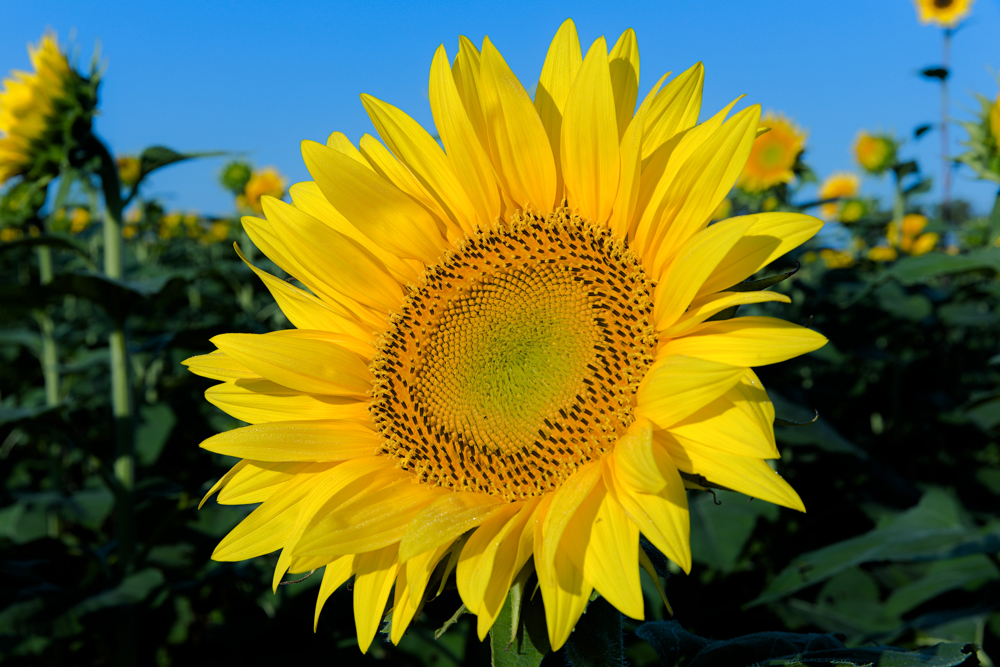
What’s happening is that you actually WANT a hue shift. Both the in-camera JPEG that’s inside the CR2 as the pretty much default v5 and v6 rendering, all render the petals more ‘orange’, so yellow with a colorcast from the sun I imagine.

By setting filmic v5 to chromance-mode ‘no’, you actually disable some of the hue-preservation in v5 if I remember correctly, and the tone will shift to be more yellow if they become brighter.
This ‘misbehaviour’ is ‘fixed’ in v6, and it now always preserves hue, even with preserve-chrominance set to ‘no’. But in your case, this is not what you want. But it is what filmic and other modules set out to do: Preserve the hue of the data at all cost.

It sounds like you want to use more something like a color module to push to hue more towards yellow, and then use whatever tone-mapper you want :).

But… if this is something that’s working for you, fine, use it. Nothing wrong with it! Just know that the result what you are going for is ‘shifting away from the hue that is captured’ , so people normally try to prevent that.

As an example, the sigmoid-tonemapper also renders the leaves as the orange color… unless Iower it’s ‘preserve hue’ slider all the way to 0, and then ‘hey, it is just as your filmic v5 render!’.

Loaded your v5 version in a snapshot and started toying around, and quickly came to the conclusion that I had to do what you did in your v5 XMP to get close, at least to an extent:

  • color balance rgb instance, masked to hz for hue to target the yellows, and hue-shift them more to yellow (away from golden orange).
  • color balance rgb instance, masked to hz for blues and a bit of Jz to ignore shadows. Had a hard time to match your blue-ish-ness for the sky. In the end settled on the legacy mode to make some crude adjustments.
  • color balance rgb instance, masked to hz for greens and Jz to ignore highlights, to get the background greens in a somewhat similar place

I ‘misused’ the filmic display tab (which I normall never do. Maybe play more with it. I right-clicked the target white luma and entered a high number (300% or so), so that the slider then goes to 300, and I can drag it around to get a feel and see what it does, settled on just over 200%. So I made filmic give a colorful look without ‘too much decolored whites’ in the yellow petals, then raised the display target to give it punch. The rest is pretty standard filmic v6 in luminanceY mode to be honest.

Added a local-contrast instance to boost details in the petals, kinda like a ‘clarity’ slider in other programs.
For the JPEG export I had diffuse x2 enabled for some sharpening, and denoise masked to chroma-only to get rid of chroma noise in the sky (kept the luma noise). In the XMP I don’t have them enabled / present.


0L0A3314_03.CR2.xmp (59.3 KB)

So, I sort of don’t know how to feel about this one :). If I just load your CR2 and look at the differences between filmic v5 and v6, I don’t find v5 superior at all. But if I want to go for the specific look you went for, I have to ‘misuse’ filmic-v5-no-mode which I consider more as a happy bug :stuck_out_tongue: , or like I showed in my XMP I push the hue towards where I want it and just use v6 like I normally do.

In my head, I like the v6 workflow more. ‘I look at the image, I decide I want the petals to be more yellow, so I add color-balance to push them to yellow’. I don’t know if you just stumbled on the yellow color by accident or if it was a conscious decision. But if it was a real decision, then getting there ‘by accident’ in a very specific filmic v5 mode doesn’t feel right to me :). But if it’s works, it works!!!

5 Likes

To me the yellow was a matter of taste when using color calibration. This is a filmic v6 edit, but I output rec 2020 and downsize in image magick, so the gamut mapping won’t be having much effect.

sunflower-challenge-0L0A3314.CR2.xmp (15.8 KB)
dt 4

2 Likes

In case it’s unclear, ‘gamut mapping’ is something quite different to ‘hue preserving’, which again is something different to ‘chrominance preserving’ :slight_smile: .

In very simple terms, ‘fit the used gamut into the output color profile’, vs ‘make sure something stays the exact shade of yellow even when changing contrast and exposure and what not’ vs ‘try to keep things as colorful as they were before mapping the whole dynamic range into the output range’.

Ya just a suggestion. I will have a go with an approach I sometimes use when I get back in case it is something you could use…Also with flowers the gamut compression in the cc module can come in handy… Dial in nice vivid colors overall and you know sometimes a few areas are then just too intense. Rather than a global edit or masking etc etc just playing with that slider can fix the few oversaturated parts nicely… you can enter a larger number than presented by the slider as well

1 Like

Tone eq blended in blue channel is great tool to boost sky add or subtract to areas that need it and then tweak opacity. You can do the same with greens

1 Like

Is this closer to what you have in mind?

Sunflowers can be tricky. They have some orange tones that can become quite prominent when compressing the dynamic range with filmic, and I don’t think they look particularly good.
I have tried to restore the local contrast on the sunflower, and increased colour contrast using color calibration. Still not completely satisfied with the colours, though. Used dt 4.0


0L0A3314.CR2.xmp (14.0 KB)

1 Like

First the random obs-

  • I always enable highlight recon, with reconstruct color as the method.

  • Yeah, denoise is on at .6 strength. This is mostly for the darkened sky, which usually becomes a bit specular after darkening.

  • I usually just leave the cont eq in its default pipeline position. Normally for a single instance of some module, I don’t move it from its default position to a location after filmic unless it’s a display referred module, like highpass for example though I rarely use highpass these days.

So your overall gist about desiring color shift being a goal for this image may be partially on target. 100% accuracy is not my goal- i want it to look good. You mentioned that in camera jpeg looked orange like the v6 render, but don’t really see this so much. To me the sooc image looks better than the v6 version, less flat and better contrast, and that is one reason I knew more could be achieved. If I can’t do better (yes subjective) than the sooc jpeg, then the tool is not much use to me, and that was part of my frustration. For those that can’t pull the preview from the raw, here it is-

SOOC:

You mentioned using other modules to pull the colors around earlier in the pipeline. I should have mentioned that I actually did some of this in my v6 pass, but did not have it enabled in the version i posted (sliders set to zero). I had pulled some highlights towards yellow artificially, and it did make some improvement. I will dink around more with this I guess. But what I recall happening is that you just can’t win. Any pipeline element that in effect increased the intensity of yellow or orange would start desaturating and color-shifting. I guess this makes sense since fimic is at the very end of the pipeline- it has the last word. I didn’t try moving any of these instances after filmic in the pipeline, but I’d like to avoid doing that (but maybe who cares).

One odd thing about v6 which also threw me and put me off, was that with color preservation turned on, well…it didn’t seem to preserve color very well. It actually seemed worse than v5 for preservation modes other than max rgb. From what I recalled reading about v6, it was supposed to not desaturate highlights like v5, but that is what it looked like it was doing. And the onset seemed to start at lower intensities that with v5.

In reviewing what you did, moving the target white luminance to above 100 is probably the single biggest factor in snuffing the color shifting and weird early-onset desat of the oranges, but it certainly is kind of breaking filmic as it pushes the upper compression region of the curve beyond where it really does much. I found I could mess with the shadows/highlight balance to help reduce the color shift/desat, but large adjustment was needed and really anything I did to keep the colors from shifting or going white also results in the dull, low contrast, matte-like v6 result I posted.

I didn’t get into the sky much with my original post, but that did not work as well as when I have done so using filmic v5 or earlier. When I do darken a sky, the transitions between out-of-focus “edges” of objects and the sky become very stark and fake looking. I have ways of dealing with this (you can see in color balance rgb instances named “transition to sky”), but when using v6 the trick doesn’t work as well as with v5. I don’t know why but perhaps it ultimately is related to color preservation differences. The trick is the isolate the fringe regions using chroma masks (as these transitional regions have less saturated colors), and to gently darken and/or pull the color of these perimeter areas slightly toward the sky color.

I get your sentiment but I don’t think of filmic v5 as a “happy bug”- it’s just how it works. v5 was pretty mature, and worked pretty well IMO. It handles desat of the extremes differently than v6 by intent, which to me makes it something that should be kept in the toolbox. For all of the past versions of filmic, desat of the highlights was one of key functions of filmic, and now with v6 it is not. OK for me. I think both looks are good for different images and i hope they both are retained permanently, even if renamed to something that has nothing to do with “a year’s particular color science” :).

Thanks for your comments taking a stab at the image- I will experiment some more with v6 on this image and similar ones, knowing the look I’m after.

I will have to try this, as this is not how I normally do it. Good to learn new tricks!

Sunflowers, as a category, are one of the biggest challenges I’ve faced using DT. But I’ve been able to get decent results eventually. I’m just wanting to see if there is a better way :).

ART

3 Likes

Here is a version that uses Tone eq as a tone mapper instead of filmic. I moved the instance to just after were filmic is in the pipeline, and filmic is disabled. It actually works pretty well, but I still have to say the v5 looks a tiny bit better in terms of a look I was after. Not using filmic gives up the built-in contrast adjustment that comes with filmic, so it would need to be done with some other std module. But overall it looks better than what I got with v6 to me anyway.

This image is haunting me now :slight_smile: .
Filmic v5 or v6, I was kinda disappointed by the lack ‘punch’. Normally there is a trick to adjusting the white level to be on the edge of clipping, or allowing a bit of clipping.

What happens here is that I like the petals to be full of color, and not have an area turn to white. Filmic does this, but you have to keep the white level a bit down, removing any punch. Turning white level up, and there appear white parts on the petals again. Any kind of contrast boost (in filmic v6 , in color balance rgb…) and the yellow turns to white again.

If I look at the histogram after filmic, I see the green and blue channel only coming to +/- 60%, and the red channel extending to 100%. So I kind of understand where it’s coming from.

I thought, ‘normally in Photoshop I do something with the levels control…’. So I added ‘rgb levels’, moved it all the way to the end (even after local contrast), and moved the white level there back. And it neatly punches the yellow up without turning it to white. Of course if you overdo it you’ll lose all the details in the petals, because you are clipping the gamut of course. But it’s actually an easy way to do it. It even has some of the ‘preserve color’ modes of filmic to try around what they do.

Not saying this is what you have to do, of course not. Just something to play around with. As long as you be aware of the fact that you are doing things in display referred after filmic, so you might shift some hues again…

1 Like